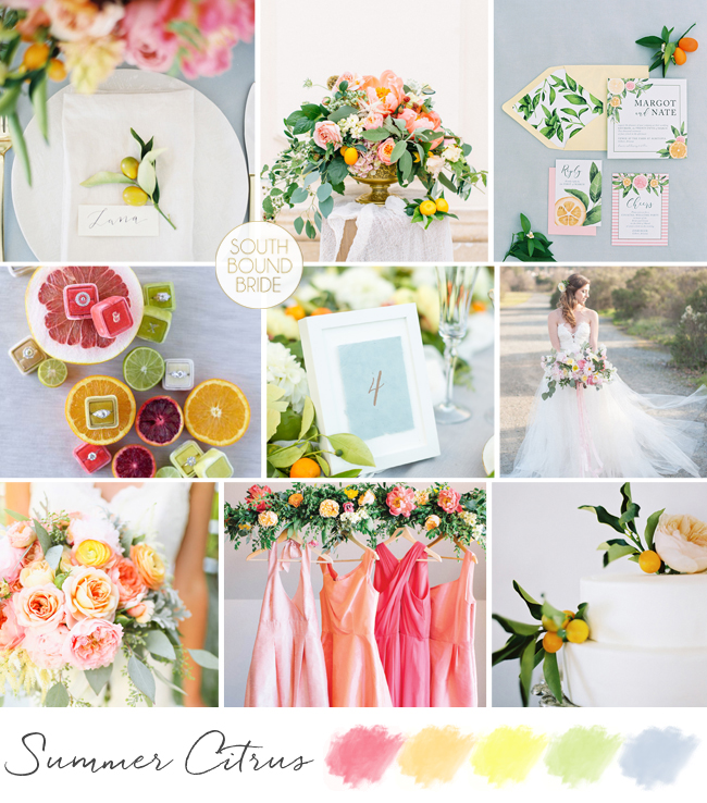
OMG seriously, how is October rushing past so fast, dammit? I have so much more bright and colourful inspiration to share before the month is out, and it’s high time we did some palette play. I’ve always had a bit of a fascination with citrus as a wedding element, and I’ve made a few boards using oranges and lemons before, but for today’s board it is citrus turned up to LOUD. Lemon, orange, tangerine, grapefruit acid brights. And yet, with a backdrop of soft blue and romantic details, it still manages to be elegant. This might be my fave summer board ever!
What would a month dedicated to spring pastels be without some spring pastels colour board inspiration? I never get tired of multicolour pastels, personally, because they always just look so darn PRETTY lined up together, and so fresh (which of course, is what makes them perfect for spring). The main selection to work with is of course blush, peach, powder blue, mint, lilac & lemon, but sometimes it’s fun to use just some of them and I think three is the magic number. Today I’ve mixed up peach, mint and lilac with a touch of darker purple and a background of bright white, and the combination is modern, airy and oh so sweet.
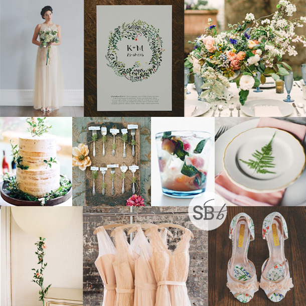
Happy Monday, lovelies! When I was putting together last week’s post on the Etsy Wedding Fair, I just fell in love with the gorgeous Liberty print shoes by Hetty Rose, and I thought how amazing they would be for a botanical wedding, which got me all inspired to create a new botanical inspiration board. I really love the unusual colour scheme I’ve ended up with – the soft vintagey peach and off whites, with tiny punches of orange, red, coral and blue. In larger colour blocks, they’d be overpowering, but here they have a lovely, mismatched but pulled together feeling. I’m especially loving the flowers in the image top right and the flower wrapped oversize balloon, and the cutlery escort cards – those little details that catch the eye and spark the imagination. Fun!
Colours: Peach, ivory, emerald, coral, magenta, orange, purple & blue
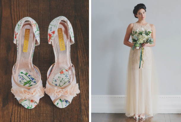
Let’s just take a closer look at those gorgeous shoes, shall we?
They’re created using Liberty botanical print fabric in five different styles, and are made bespoke for you, so you can adapt each style with a heel of your choice and other design features. You’ll find the full range in the Hetty Rose Etsy store.
Hello lovelies! We started our Monday with winter whites, but now it’s time to add some colour to your afternoon. Specifically, pastels, because we LOVE pastels, don’t we? I’ve done quite a few pastel boards before (and I’m especially fond of mixed ice cream pastels, let’s be honest), but today I wanted to do a little more of a grown-up pastel board, combining the soft rainbow of shades with elegantly rustic vineyard style. I am absolutely loving how it’s turned out, aren’t you? Here’s hoping this is one board I see brought to life by a real bride soon. (PS Find more pastel inspiration here!)
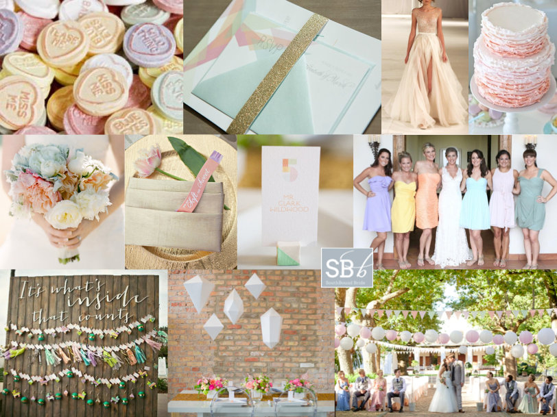
Pastel lovers, get ready, because today is your lucky day. I’ve really liked the ice cream pastels that have merrily floated their way into weddings in the last year or two – so pretty! Especially with mismatched pastel bridesmaids. This is a look that many brides have combined with a vintage (and sometimes rustic) look – baby’s breath bouquets, vintage books tied with lace, proteas, you know the drill. So today I wanted to reinvent the colour palette for modern romantic brides and grooms. A bit of a geometric detailing, a tiny touch of sparkle, and here you go. I think I have a new style crush :)
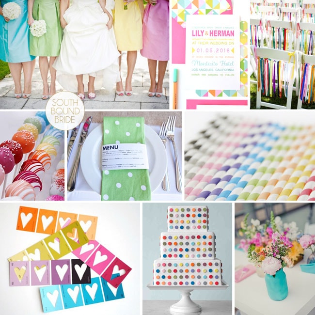
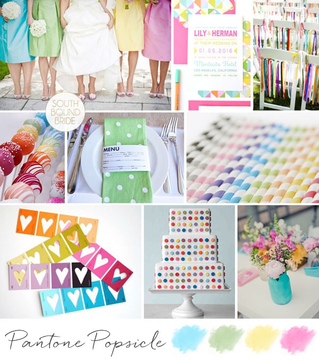
It’s been a colourful day on SBB! Here’s the latest in our week of inspiration boards, and this one was requested by bride-to-be Rita. She and her fiance are getting married in May, and are planning a modern eclectic wedding with a touch of elegance. They want white as the base colour, and then with pops of colour everywhere for their garden ceremony and reception. I personally love this look – even though it’s very colourful, the modern white base keeps it clean and stylish (much like the gorgeous styled shoot we featured earlier today). I love the idea of printed napkins (adding an extra layer of texture), coloured straws, ribbons on the chairs and a multitude of coloured lanterns. Just one word of caution – keep one part of every element plain to make those colours pop and not start looking too chaotic. For example, the bridesmaids below in their rainbow dresses with white bouquets (or change that for crisp white dresses and colourful bouquets), the white band against the coloured napkin, or the painted vases full of colourful blooms on a white runner. And how cute is that cake? Hope you like your board Rita!
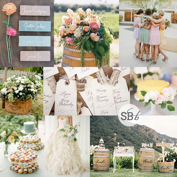
Never let it be said that I don’t love my readers! I know how sometimes planning can be overwhelming (especially bringing all your ideas together as the big day approaches), so when I got a wedding 911 from SouthBound Bride Stephanie, I put together this little board for her quick sharp. Stephanie had chosen a lovely deep purple as her main colour, with beautiful bridesmaid dresses for her girls. However, Stephanie was also in love with colour and fun, but was having a tough time convincing everyone else involved with her wedding that she could be vibrant and still classic and beautiful. Her dream palette – purple combined with coral, yellow and pink – was certainly unusual, so I immediately started looking for florals in this combo. As I suggested to Stephanie, if you’re working with bright colours but you want to make sure they don’t become too much, the best thing to do is keep everything else simple and let the flowers really pop. Because flowers are colours from nature, they have natural tones to them, so you don’t get the same hard colour block effect that you might with something synthetic. It’s a softer and more classic look. Luckily I didn’t have to look too long before I found the perfect inspiration shoot, and all I can say is WOW. Isn’t this palette stunning? I’m such a convert. Paired with simple place settings and classic stationery, the florals really do the talking (and they say “hello, I’m gorgeous”). You’ll notice there are a lot of peonies in the board – and yes, peonies are incredible, but they’re also hard for a South African bride to find. However, chat to your florist about other options, as there are many lush colourful flowers (ranunculus or carnations, for example) that will do a great job here. Another tip I gave Stephanie was not to try to bring all four colours into everything – combine two here, two there, and the result is cumulative.
So, what do you think? Stunning, no? Good luck with the rest of your planning Stephanie! I’m sure it will be amazing.
Colours: Deep purple, violet, coral, yellow & pink
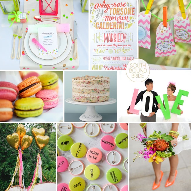
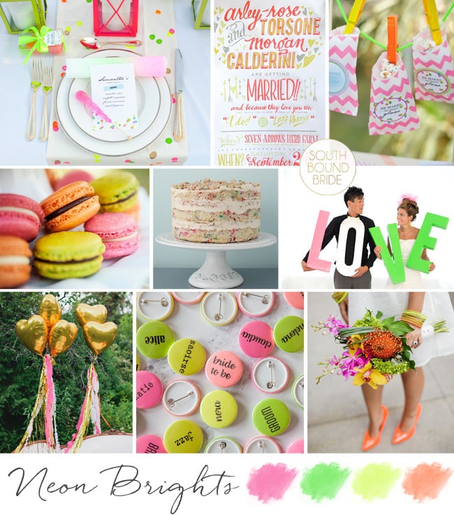
Today’s board is one I never in a million years would have thought I’d be doing. Neon. You know when neon was last cool? About 1991. In 1991, I had just started high school, and my dear mom hadn’t yet taught me that those of us cursed with curly hair could sort it out with a hairdryer (straighteners wouldn’t even be invented for another half a decade – God, I’m old); so on a good day, I looked a bit like Baby in Dirty Dancing and on a bad day, like Sideshow Bob. Which is appropriate, because I was also doing the Bartman, dressing in little minis we referred to as ‘Roxette dresses’, listening to Technotronic and perving over Richard Snell. Who was a cricketer. Happily, I can tell you I haven’t done any of those things since 1992 (sorry, Richard, wherever you are). And yet, here I am, reviving neon. Well, okay, I am not the one who’s revived it. Blame Fashion, because neon is definitely back. And I’ve surprised myself by liking some of the neon inspiration that’s been popping up in Wedding World recently, so I thought I would challenge myself to see if I could imagine it into a wedding. Result? I’m a convert. I think the key (as always) is a bit of moderation – neons look amazing when they stand out against a very white white, and bold mod graphic elements like black and white stripes or gold. It takes them from 80s throwback to Kate Spadey chic, and actually makes for a very stylish palette. The other thing I liked was the use of all the four acids – green, orange, pink and yellow – somehow bringing all four of them into the mix works better for me than just one or two. Put your bridesmaids in bold stripes with bright shoes and nail polish, invest in great stationery and unexpected, colourful flowers, use some bold graphic elements on your tables and then… leave everything else clean, bright and white. Perfect for a fun, city-chic wedding, and ideal with a short 1960s-style dress. So, what do you think? Would you ever consider neon for your wedding?
Colours: Neon orange, yellow, green & pink and white
Good morning friends! Today we’re all about pretty country shabby chic style, starting with this inspiration board (and come back later for something extra special!). This is actually a look I’ve seen quite a bit recently in the UK. It’s a really pretty alternative to the vintage look that was everywhere in SA this season, and is all about pastels and mixed floral fabrics (in this case inspired by Cath Kidston style). This board is a request from one of our lovely readers, Jenny, who is getting married in her local church and travelling on to the reception (in a tented marquee in a field) on a motorbike and sidecar – so cute! She’s made loads of bunting using Cath Kidston fabric, and will be serving sandwiches, pastries and cakes at their tea party. It reminds me of a village fete, and Jenny could even consider having some of the games and entertainment you find at a fete – tombola stalls, hay rides, etc. I really like the idea of having a cake table with lots of different cakes and labels for each of them, just as if they were a baking competition, instead of one cake. She could even use Cath Kidston cupcake cases to tie in with her bunting. Other Kidston touches that I love are the mini cake bunting, the escort card board, and the LOVE letters (you could also make these yourself into table numbers). Carry a beautiful rose bouquet (I’m in love with this one, which has a slightly wild, natural touch). Teacups should be a big part of the decor – collect random ones on eBay and place them at each table setting with a rose inside – this doubles as a favour. Another cute favour is the little button badges, which are just adorable. You could also pile teacups up under bell jars or hang them at different levels from the ceiling. Serve a range of teas, as well as lemonade (or better yet, this marital bliss special cocktail) and consider hiring in a specialist coffee machine – I’ve seen how popular these are! Hope you like your board Jenny – good luck with the rest of your planning!
Hello friends! How are you enjoying your Tuesday? Where I am (in Durban) it’s raining like mad… hm, time to head for the English summer again, I think. ;) Big thanks to all of you for the blog, facebook, twitter and email love for the new site – very, very much appreciated! This afternoon I have a fun little inspiration board for you, which was created especially for one of our featured brides whose sister is now taking the plunge. The plan is to have a sort of market feeling, celebrating ‘the abundance of life’. Guests will get to serve themselves from an amazing spread of market-style food – how fun is that? I just love this idea, and I was pleased to find that farmer’s market-style weddings are a growing trend across the pond. There are so many cute things you can do here, and you all already know how much I love including fruit and vegetables in your decor. So here’s my take, using bright colours and rustic natural textures. Mason jar lights are perfect here, as are the adorable vegetable escort cards (and a carrot as a boutonniere? why not?!), kraft paper and chalkboard details, and Bashews soft drinks. I love the idea of creating a whole market display, especially when guests are given brown paper boxes or tote bags, and able to take home produce as their favours. Flowers are mixed and natural, and I like the mix of little jars and potted arrangements. I can just imagine the bride wearing a pretty short dress, like the one shown here – so fun! Hope your sister likes this, Kerri – keep us posted!