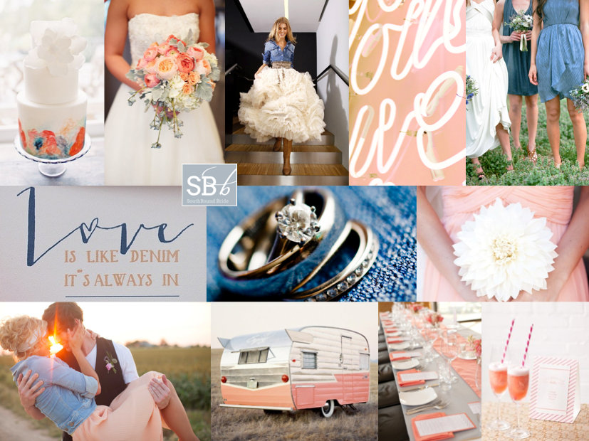
Inspiration Board: Denim, Peach & Coral

Peach and coral together are so my current fave. Or coral and blush. It’s that developing ombre-ness of it that really gets me. But the thing is, that these shades are a bit… well, I don’t know, tropical? without a bit of a cool base to ground them. A certain shade of indigo works wonders. So does navy. But today, I’ve paired them with one of my absolute best blues, because it not only comes with a pretty colour but with texture and chilledness too. I am talking denim, as you can probably guess by now. Denim, which you can actually make chic for a wedding, because, like burlap, it’s a surprising and interesting texture that can be softened or glammed up with the addition of more romantic tones. Play around with modern and classic, traditional and irreverent, for a combination that is 100% you. I love the mixture. But what do you think?

Colours: Blue, coral & peach

Top row (l-r): Cake {Sweet & Saucy Shop}; bouquet {Bryan Rupp Photography/Champagne Wedding Coordination}; bride in denim jacket; peach neon; bridesmaids {Tec Petaja}
Row 2: Love is like denim… {Brancoprata}; rings; bridesmaid bouquet {Brit Rene Photo}
Row 3: Couple {ee Photography/Sweet Sunday Events}; caravan; table setting {Elizabeth Scott}; cocktail {Rebecca Wood}.

 

Inspiration Board: Blood Orange

Good morning, lovely friends! I’m back in Durbs after a really lovely week away. After spending time with a few old friends (and new babies!) I headed to Kruger Park on Thursday with my mom, one of her best friends, and her daughter (who was my absolute bestie growing up). They used to live across the road from us in Johannesburg, so I have literally known them both my whole life. What an awesome girls’ weekend, enjoying the quiet and beauty of the African bushveld (in my element!), spotting game (no cats this time sadly, but I was so happy and relieved to spot some rhino), and generally chilling out catching up. Of course, there’s lots to catch up on now (when is there not?) but it’s always lovely to see more of our beautiful country. Even if you do land up driving home in thunder, lightning and in rain. Speaking of that particular witch’s brew, with Halloween happening this week, I thought it would be fun to create a bit of a spooky All Hallows inspiration board. Of course, this is a super elegant, totally non-cheesy version of a Halloween wedding, with the colour scheme of orange and black the only real nod to the holiday. For the rest, it’s black tie elegance with pops of bright citrus, and a bit of a formal vintagey feel. Don’t you love it? Of course, the black Vera Wang dresses just take the cake – so, so beautiful. Happy Halloween folks!

Colours: Orange, black and white

Top row (l-r): Black Vera Wang wedding dress {Jose Villa/Joy Thigpen}; citrus centrepiece {Belathée Photography/McKenzie Powell Designs}; groom {Magnolia Pair/Meade Wenzel}; outdoor wedding {Wedding Artists Collective/Gloria Wong Design}; blood orange cake
Row 2: Bridesmaids with black lace back dresses {Amber Glanville}; place setting {Krista Mason/Calligraphy Katrina}; citrus garland; black shoes with bow
Row 3: Blood orange cocktail; black calligraphy place names {Andrea Nay}; opera glasses {Brandon Kidd Photography/Amorology}; Vera Wang dress; centrepiece {Honey of a Thousand Flowers}.


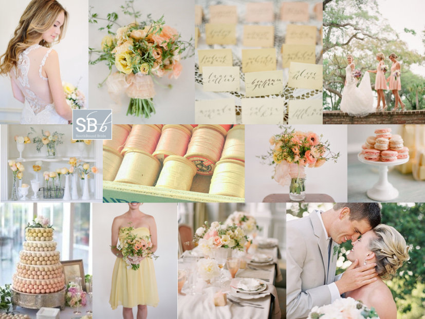
Inspiration Board: Lemon & Peach Sorbet

Time for some proper gorgeousness my friends. Peach has been beautiful in many ways this year, but today it is especially beautiful in the company of a soft lemony pastel yellow. It’s sweet and delicious, like a cup of cool sorbet on a summer afternoon. How amazing are the rananculus bouquets? Not to mention a bit of portrait lace back perfection on the bride. When you choose a colour scheme like this one, you don’t need to go overboard – choose a light, bright, white venue and fill it with pastel and gently ombre details and a bit of milk glass (real or imitation), and then just let the colours and the season speak for themselves. Awesomesauce.

Colours: Peach and lemon

Top row (l-r): Bride in Claire Pettibone dress {Annabella Charles/Everbloom Designs}; bouquet {Elizabeth Messina/Flowerwild}; ombre place cards; bride and bridesmaids {Eric Kelly Photography}
Row 2: Flowers in milk glass {Shipra Panosian Photography/Emily Grace Design}; threads; centrepiece {Elizabeth Messina/Flowerwild}; macaroons {KT Merry/Aisle Candy}
Row 3: Ombre ball cake {Emmaline Bride}; bridesmaid {Elizabeth Messina/Flowerwild}; table setting {KT Merry/Aisle Candy}; couple {source unknown}


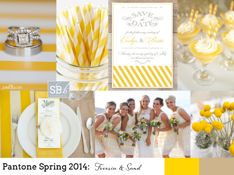
Pantone Spring 2014: Freesia & Sand

How I do love a new set of colours to play with! And I must say, I think the bold, bright yellow of Pantone’s Spring 2014 collection, ‘Freesia’, may be my fave. It immediately reminded me of the bold yellow stripes that characterise a great place I went to last week in Abu Dhabi, the Monte Carlo Beach Club – everything there is kitted out (tastefully) in preppy yellow and white stripes, and it looks amazing. Paired with ‘Sand’, another of Pantone’s 2014 picks, you have the makings of a perfect beach wedding, or even of a rustic farm look. As always, be sparing with the brights, let them punch out. And punch is certainly what this colour does! Love it.

Colours: Pantone Freesia & Sand

Top row (l-r): Ring {Joielala Photographie}; stripey paper straws; invitation; dessert {Grandes Fetes/Jessica Schilling}
Row 2: Place setting {Krissy Allori Photography + Courtney Jade Photography/Double Take Event Styling}; bridesmaids in yellow stripes; billy buttons {Nineteen Eighty Five/Christine Meintjes}.


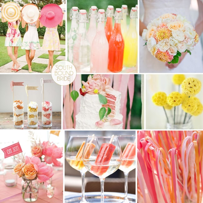
Inspiration Board: Lazy Hazy Days

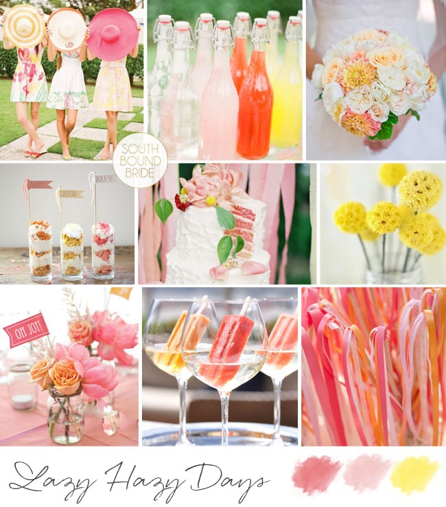
Some weddings are all tradition and formality and classic palettes. Invitations are engraved, etiquette is followed. They’re lovely, of course. But the other kind of wedding I love is when a couple takes their cue from their favourite kind of party: a brunch, a dinner party, a picnic,  a festival even. Or, in the case of this board, a summer garden party. Sundresses for the ladies, lemonade, alcoholic popsicles, ribbon wands. Red, pink and orange were a popular colour combo a few years ago, but they’re updated here with melon, pink and a punch of yellow – and how gorgeous is that bright citrusy table and bouquet? This would be such a fun wedding to host and attend, and is perfect for a couple who would like to keep things more lighthearted with their palette.

Colours: Orange, yellow, pink

Top row (l-r): Bridesmaids in sundresses {KT Merry/David Arthur Fittin/Lucia Paul Design}; lemonades {KT Merry/David Arthur Fittin/Lucia Paul Design}; bouquet {Cliff Brunk/A Bride’s Best Friend}
Row 2: Parfaits; cake {Anne Robert Photography/Dana FitzGerald/Blackbird Bakery}; billy buttons {Andrea Dozier}
Row 3: Table arrangements {Laura Jane Petelko/Cynthia Martyn Events Inc.}; popsicles in wineribbon wands {Cameron + Kelly Studios/Sedona Bride}


Lazy Hazy Days Inspiration Board | SouthBound Bride

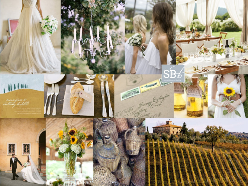
Inspiration Board: Under the Tuscan Sun

Okay, this is about to be a jealous-making post. Because tomorrow, bright and early, I’ll be jetting off to Bella Toscana for three weeks in some of the most heartbreakingly beautiful scenery on earth. Picture every Tuscan vineyard you’ve ever seen in a film? Yup, exactly like that. I can’t wait! I’ll be working hard under the summer sun, but I’m actually looking forward to it – and to my ‘farmer tan’! ;) As promised, the blog will continue as if nothing has changed, but please be patient if emailing me, because I am officially off the grid. In fact, that’s something I’m almost as excited about, since for the last few years I’ve been constantly connected to some kind of electronic or social media, and it’s time to switch off and just be in the moment. So to celebrate my trip (YAY!), I’ve created a Tuscan-style inspiration board. There were a lot of ways I could have gone with this – understated olive leaf and grey, lavender and green… But one of the things I love about Tuscany is its warmth and abundance, and the fields of sunflowers I saw for the first time from a train window many years ago. These flowers are gorgeous, but they can be overpowering, so I’d just use single blooms for the bridesmaids and then in sporadic arrangements in the reception venue. Include materials such as terracotta and linen, and the straw covered bottles that traditionally hold chianti (called a fiasco, how fun is that?). Fabrics are floaty, and an open sided marquee with long tables is a must (or just set up under the trees). Tuscan olive oil is the best (believe me, I plan to eat lots of it!) and makes the perfect favour. So there you go. And here I go! See you in a month!

Colours: Sunflower yellow, olive green & Tuscan terracotta

Top row (l-r): Dress {Jose Villa Photography/Joy de Vivre Design Boutique}; wire candelabra {Leo Patrone}; floaty bridesmaid dresses {Mint Photography}; tables {Collin Hughes/Shannon Leahy Events}
Row 2: Invitation; place setting with bread {Joy Thigpen/Toast Events and Design/Jose Villa}; stamped envelope {Ruby & Willow}; olive oil favours; sunflower single bloom bouquet {Buffy Dekmar}
Row 3: Bride & groom {Josselyn Peterson/Leonora Moss}; sunflower arrangement {Olivia Griffin Photography/Walton Event Design}; wicker Chianti bottles; Tuscan landscape.


Inspiration Board: Grayed Jade, Lemon Zest & African Violet

Hello lovelies! How has your weekend been? Mine was awesome, but stressful – only two weeks left to get everything done before I take my month off. The good news is that I have lined up a TON of gorgeousness for you on the blog while I’m gone – all fresh new posts, real weddings, trend roundups, inspiration boards etc. The bad news is that I feel like I haven’t slept since June. Ah, the things I do for my readers! ;) Anyway, it’s been hard to work with the sun out, and that same summery feeling is what I wanted to bring to today’s inspiration board. I’m still so in love with Pantone’s Spring 2013 colour palettes, and a combination I’ve been wanting to do since I first saw them is this one: grayed jade, lemon zest and African violet. I love how the three colours complement one another and are so fresh and pretty together. Greyed jade and soft purple together are so calming, but the pop of bright yellow really livens them up. Perfect for a summer wedding!

Colours: Pantone grayed jade, lemon zest & African violet

Top row (l-r): Dress {Elizabeth Messina}; cocktail {Best Photography/Jennifer Aquilia Events & Floral Design}; yellow macaroons; place setting {Elisa B Photography}
Row 2: Ring with button chocolates; grayed jade shoes; letterpress invitation; blue dress
Row 3: Hanging chandeliers {Elizabeth Messina}; lemon escort cards {Jose Villa}; mint suit; violet bouquet.


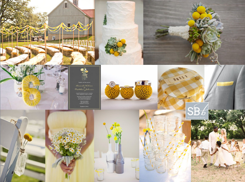
Inspiration Board: Sunny Afternoon

Hey friends! It’s been a little while since I did an inspiration board request, but today we have a gorgeous yellow board for reader Cheri. She’s planning a barn wedding (LOVE barn weddings!) at a rosemary farm, with the ceremony in a flower maze – how pretty is that? They’d like a relaxed, old farmhouse feel, with a palette of yellow, grey and white reflected in the flower combination of succulents, billy balls and baby’s breath. They’re also planning to use old jam jars and wine bottles, which I think is a great idea. I absolutely love yellow as a wedding colour, because it’s so happy and sunny and bright – it immediately sets the tone for smiles all day long. Succulents and billy balls make an awesome combination – isn’t this bouquet lovely, and that cake! – and I like the idea of recycled glass throughout. I’m especially a fan of painted wine bottles used as vases – they work beautifully here, don’t they? I’d add succulents in small wooden crates to the table decor as well. Although Cheri plans to use baby’s breath (which is lovely), I’m also a big fan of little daisies for this wedding theme – look how pretty the bridesmaid bouquet is below. And I also like the idea of a very, very subtle yellow gingham motif, perhaps for preserve favour tops and on the groom’s pocket handkerchief. Finally, you can really make the ceremony area pop with ribbon aisles, like the one above – they really add that carnival feeling. Hope you like your board, Cheri!

Colours: Yellow, white and grey

Top row (l-r): Ceremony area {Love Me Do Photography}; cake with billy balls; bouquet with succulents and billy balls {This Modern Romance/Honey and Poppies}
Row 2: Wool wrapped table number {Daffodil Waves}; invitation; rings with billy balls {Cameron Ingalls}; gingham jar top; gingham groom’s pocket {Johnny Miller}
Row 3: Billy balls on chair {This Modern Romance/Honey and Poppies}; daisy bouquet {This Modern Romance/Honey and Poppies}; grey and white wine bottles {white rabbit studios}; mason jars with striped straws {Callie V Photography}; bride and groom {Ryan Ray/Lavender Joy Weddings}


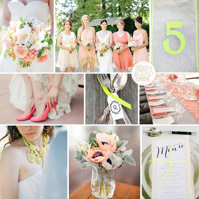
Inspiration Board: Love Shines Bright

Morning, lovelies! How was your weekend? I am still playing catchup with admin – sometimes it seems never-ending, doesn’t it? But I’m here with an inspiration board to literally brighten your morning. Okes, this might be one of my favourite colour combos ever. When neon brights started making their way into weddings, I was first a little horrified, then intrigued. I decided I liked them, but in a sort of graphic, modern way. But I’ve also been quietly intrigued as to how you could use them in a pretty, soft way as well, one that would suit more brides. And this is pretty much it. A palette of soft grey, coral and then a pop of lumo yellow. Sounds insane, but the brights really bring out the other colours and I just adore the end result! What do you think?

Colours: Mushroom, peach, coral and neon yellow

Top row (l-r): Bouquet {Shoot This Not That}; bridesmaids {Kate Harrison Photography/Enjoy Events Co. Inc.}; neon table number {Shoot This Not That}
Row 2: Coral shoes {Laura Murray Photography/Holly Gerard}; cutlery bundle {Shoot This Not That}; coral table decor {Elizabeth Scott Photography/Sweet November Events}
Row 3: Neon necklace {Imbue Weddings/Byron Loves Fawn}; flowers; menu with neon string {Kate Harrison Photography/Enjoy Events Co. Inc.}


Neon Rustic Wedding Inspiration | SouthBound Bride

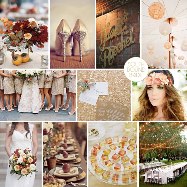
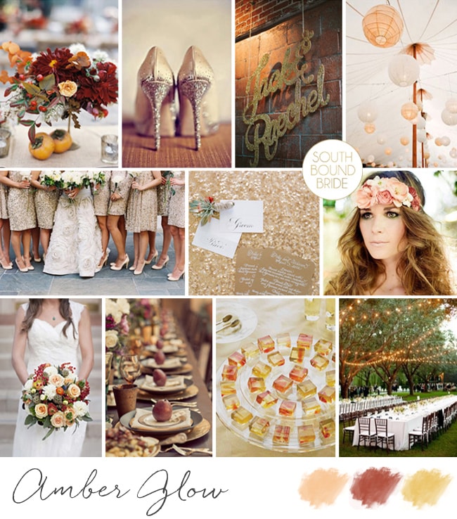
Inspiration Board: Amber Glow

And we’re back with another lovely inspiration board, yay! This time, we’re exploring the warm end of the spectrum, in a board that combines red, yellow, peach and gold. Reader Emily made the request for her romantic summer wedding, and I absolutely love it, don’t you? It’s the kind of palette that often gets used for autumn weddings, which is great, but I think also works perfectly for an intimate outdoor summer feel as well. As always, I love the inclusion of organic colour through fruits, berries and flowers, and you can have a lot of fun adding glitz – maybe some spraypainted fruit pomegranate placecards, for example? I’ve really gone for gold with the bridesmaids, all in spangly dresses, as well as a gold stationery suite – love this combined with the magical fairy lights! One of my favourite summer touches is the alcoholic fruit jellies – a fun but sophisticated dessert option! Hope you like your board, Emily and good luck with the rest of your planning!

Colours: Peach, red, yellow & gold

Top row (l-r): Centrepiece {Charlotte Jenks Lewis Photography/Poppies & Posies}; gold sparkly shoes {Tamiz Photography/Belle Destination Weddings and Events}; glitter names {Arrow & Apple}; peach and white lanterns {Lisa Lefkowitz/Rebecca Reategui Weddings & Special Events}
Row 2: Gold bridesmaids dresses {Tec Petaja/Bash, Please}; gold stationery {Jose Villa Photography/Kristeen LaBrot Events}; boho headpiece {Kym Ventola/Mignonne Handmade}
Row 3: Bouquet {Kari Crowe Photography/Kate Foley Designs}; table setting {Imagery Immaculate/Wedding Jeannie}; jelly shots {Martha Stewart}; outdoor tables {Stephen Karlisch/Meredith Commender}

Inspiration Board: Amber Glow