Not long ago, when I put together some inspiration boards for the new Pantone spring colour palette, I predicted that the combo of pastel green and blue would be a favourite, and that this might just be the key colour combination for 2014. Well, we won’t know for a while yet if I was right, but judging on the many Facebook likes and shares and Pinterest pins the board has had since then, I’d say I might have been on to something. So I thought there was no better pairing for a colour story! Here’s the original board:
Full credits here.
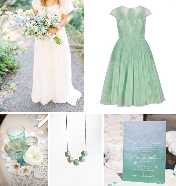
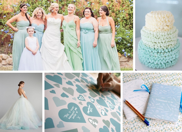
Those cool tones just meld together into perfect prettiness, don’t they? When you use two colours that are close to each other on the colour spectrum, another advantage is that you can easily create a sort of ombre effect with your colours, instead of going too mix and match. Mix your pastels with whites and neutrals – again, this gives you quite a lot of flexibility. And with blues and greens not being too girly, it’s a colour combo that your groom is sure to love too.
Credits (clockwise from top left): bouquet {Erich McVey}; green dress; invitation; necklace; votive holders {Laura Ashbrook Photography}
Credits (clockwise from top left): letterpress invitation; bride & groom {Laura Murray Photography/Pink Champagne Events}; place setting {Jose Villa/Beth Helmstetter}; paper straws; blue dress
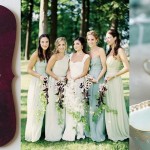
Credits (clockwise from top left): Bride & bridesmaids; cake {Half Baked Co.}; notebook for bride or bridesmaids; heart guestbook alternative; dress with ombre hem {Lazaro}
See more blue inspiration boards here.



Comments are closed.