

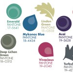
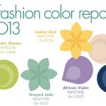
This isn’t quite breaking news, but while I was on hiatus, Pantone released their latest set of colours for autumn 2012, and I wanted to share them with you, as well as a few mini-boards showing how you might combine them into fresh takes on old colour palettes. Tangerine Tango (Pantone’s colour of the year) is still going strong (and I actually prefer these colour pairings for TT than those from spring), but for the less adventurous there are some softer colours as well as some bolds that pack a punch. Chatreuse, for example, can be used sparingly but to great effect. I suspect that of all of them, Rhapsody is the one we’ll see in more weddings this season, but I think (with the Olympics just weeks off now) that Olympian Blue must be my favourite. Which is yours?


 Source


Comments are closed.