Good morning, lovelies! You know, as much as I love a country wedding, and most of those I feature take advantage of the ample gorgeousness of our South African countryside, I do have a special love for city/urban weddings. Honestly, I wish more couples opted for them. But then, I do love me a bit of glam. So I am more than a little in love with today’s inspiration, for a loft-style city wedding with a matte pewter/dark grey and gold glitter palette. I’ve also introduced a bit of a feather motif – a lovely trend that’s been doing the rounds, including my absolute fave, gold-dipped feathers. So pretty! The feather motif is reflected in one of the bridesmaid dresses, the cake decorations and a gorgeous bracelet for the bride. It’s an equal measure of chic and whimsy – perfect for a rooftop soiree. Just add champagne!
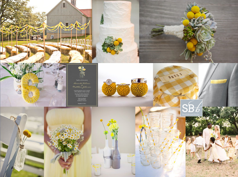
Hey friends! It’s been a little while since I did an inspiration board request, but today we have a gorgeous yellow board for reader Cheri. She’s planning a barn wedding (LOVE barn weddings!) at a rosemary farm, with the ceremony in a flower maze – how pretty is that? They’d like a relaxed, old farmhouse feel, with a palette of yellow, grey and white reflected in the flower combination of succulents, billy balls and baby’s breath. They’re also planning to use old jam jars and wine bottles, which I think is a great idea. I absolutely love yellow as a wedding colour, because it’s so happy and sunny and bright – it immediately sets the tone for smiles all day long. Succulents and billy balls make an awesome combination – isn’t this bouquet lovely, and that cake! – and I like the idea of recycled glass throughout. I’m especially a fan of painted wine bottles used as vases – they work beautifully here, don’t they? I’d add succulents in small wooden crates to the table decor as well. Although Cheri plans to use baby’s breath (which is lovely), I’m also a big fan of little daisies for this wedding theme – look how pretty the bridesmaid bouquet is below. And I also like the idea of a very, very subtle yellow gingham motif, perhaps for preserve favour tops and on the groom’s pocket handkerchief. Finally, you can really make the ceremony area pop with ribbon aisles, like the one above – they really add that carnival feeling. Hope you like your board, Cheri!
Morning, lovelies! How was your weekend? I am still playing catchup with admin – sometimes it seems never-ending, doesn’t it? But I’m here with an inspiration board to literally brighten your morning. Okes, this might be one of my favourite colour combos ever. When neon brights started making their way into weddings, I was first a little horrified, then intrigued. I decided I liked them, but in a sort of graphic, modern way. But I’ve also been quietly intrigued as to how you could use them in a pretty, soft way as well, one that would suit more brides. And this is pretty much it. A palette of soft grey, coral and then a pop of lumo yellow. Sounds insane, but the brights really bring out the other colours and I just adore the end result! What do you think?
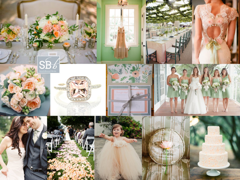
Good morning, brideys! How was your weekend? I’ll admit, I spent most of yesterday dying on the couch after an awesome day with my university girls – gosh, I love them, but when we get together it usually means a day of recovery! Anyway, in between feeling sorry for myself, I put together this pretty board, which was a reader request from Bonnita. I don’t know much more than her palette of peach, green and grey and while this is a combo I’ve done before, I always think that the balance of warm, sweet peach and cool, fresh green is so perfect for a wedding. Clearly Claire Pettibone thinks so too, because her gorgeous 2013 range has peach and mint accents like the back detail shown here. I’m totally in LOVE with the ceiling garlands at the reception pictured below – what a way to bring outside in for a marquee wedding especially, and I also love the handpainted feel of the invitations, with a chic envelope liner setting the tone. And I have to admit, I am coveting that ring, big time! Anyway, Bonnita, hope you like your board!
Good morning, SouthBound Brides, and a special welcome to all the new readers with Valentine’s Day proposals! You know, as you all start planning, some of you will find that you have a clear vision – a palette you’ve always loved, a style that’s distinctly your own, a venue that dictates where you go with your decor. But for others, it’s harder. You like some of this, some of that. I get the feeling that the bride who requested today’s pretty board falls into this category (and if you do too, worry not – it’s completely normal!) In her mail, Shylet asked for a board for her summer Zimbabwean wedding. She wanted it to be chic and contemporary, but she also wanted it to be vintage. She wanted extravagant centrepieces and a cake, but she also wanted DIY. It could be a bit of a mishmash, but I think I know what Shylet is after. See, what many brides now think of as vintage – lacey, girly, prettiness – doesn’t have to be old fashioned at all. And items can be DIY without looking crafty. It all starts with a great palette, and Shylet definitely has that covered – with purple, yellow and grey as her colours (I opted for a pretty violet that goes so nicely with a fresh lemon zest yellow!). In putting the board together, I immediately thought of this SBB wedding – notice how the tables have dramatic tall arrangements (made of baby’s breath, which saves a ton) as well as lower arrangements for colour. It’s a very effective look. The bride also chose an amazing cake, which was a replica of the stunning Peggy Porschen creation below. Team this with soft bouquets and frosted lemons on platters for a really elegant look. I’d limit DIYs to things like this pretty wall of table plan frames, or maybe to interesting favours (Martha Stewart’s Good Things are the perfect place to look for this sort of idea) – that way you can feel that you’ve made your personal mark without changing the overall sophistication of the look. Hope you like your board Shylet!
Hello lovelies, from sunny Abu Dhabi! My plan not to have any interruption in service went a bit wrong yesterday when this wedding missed its schedule, but hey ho, here it is now, and come back this afternoon for another of our trend roundups (don’t worry, I’ll be checking in electronically to make sure my server hasn’t gone wrong). I’ve been having a fabulous time here so far, spending time with my friends and their baby, and checking out the UAE. It’s so new here, it feels slightly weird, but the lifestyle is awesome and I am so loving getting a bit of sun! Last night I even got a bit of exercise, with a run around the Formula 1 circuit! ANYWAY, back to the wedding in hand, which comes from Cape photographer Maryke Harper. I just love the fresh winter style of this wedding – it has a lovely curated feel, like a sweet little shop that you might stumble across one afternoon and lose yourself in for a couple of hours. (And even better, Cara and her mom have made use of everything they bought in their homes – such a great budget tip!) There’s exuberant use of herbs, which must have smelled amazing, and just the right amount of a nod to vintage without going overboard. So pretty! I also love the handmade/craft details, like stitched table numbers and even a bit of string art! A soft palette of green, grey and taupe sits just right. I know you’re going to love this one, so here we go!Read More
Hello friends! I’m rounding up this afternoon with a reader request board – you’ll be seeing a lot of these in the next few weeks as I am trying to finish all of them off from this year as I know there’ll be lots of new requests for 2013! I do try to do all of them, but it’s getting tough to keep up with demand, so do bear with me :) Anyway, this one is for the lovely Stacy, who’s getting married at Shalwyn in Natal next summer. She and her fiance chose the venue because of the relaxed feel and open fields, so they’re looking to reflect this with an elegantly rustic wedding in shades of navy, grey and white. LOVE. And I love even more that Stacy loves chalkboard and succulents. They go together just beautifully, and with a cool palette, you have that combination of elegance and rusticity (is that a word? no? should be.). Chalkboard can be quite beautiful, especially when combine with calligraphy, but my favourite detail here is the altar platform decorated with chalkboard paint and words of love. Hope you like your board, Stacy – enjoy your planning!
Good morning friends! I have another very special inspiration board to share today – this time we’re featuring the photographs of photographer Jo-Ann Stokes. Going through a photographer’s portfolio to put a board together is so interesting, as it really allows me to get a sense of their style, and I love the way Jo-Ann uses shadows and light to create atmospheric pics that are a little bit fashion and a little bit cinematic. I couldn’t help but be drawn to some of the moody blue images, as they remind me of the changeable weather in the Cape, and all of that natural beauty. So that’s where we went with the board. I think this is such a good look for a local wedding – soft naturals, a whole range of shades from grey to blue, and again that interplay between shadows and light. I love it, and I hope you will too! Head over to Jo-Ann’s blog to see examples of her lovely work, and remember that she’s taking bookings for your big day!
Ah Friday. A thing of beauty. But before we all head off for the evening, I have another reader request inspiration board to share with you. This one came from a bride and groom – Andreas and Melanie – which is a first for me (love an involved groom!). They’ve chosen to have a simple, intimate wedding in McGregor at a fab venue I hadn’t come across before, Temenos, and are planning on a gorgeously subtle palette of silvery grey and earth tones. They want to create something casual but ceremonial, well-balanced spiritually and materially. I immediately thought back to this memorable wedding I featured a few months ago, including the bonsai trees that were on the tables (a simple, relatively hassle free, but very effective centrepiece that you can then give away or use in your home). I also loved the long tables and rustic Scandinavian feel of this wedding, including a teepee and a branch chandelier. Stone, feathers and wood are three more natural textures that add a bit of zen-like balance (as well as contemporary chic) to proceedings, and for an intimate wedding I really like the idea of lots of candles, creating an intimate glow. Dress bridesmaids in silvery grey goddess dresses, stick with creamy flowers, and use minimalist stationery. Finally, for an extra bit of zen, why not have your ceremony in the round? This is sure to be a beautiful wedding for a low maintenance couple – hope you like your board Andreas and Melanie!
Sjoe. I have been getting more reader requests for inspiration boards than I can keep up with, but I absolutely love hearing from you and will get to as many as I can, so please do be patient! Our second board for the week is for Kelsey, who is planning a summer wedding at the college she and her fiance attended. I’ve seen quite a few college weddings on US blogs, and I think it’s a lovely place for a wedding – something I sort of wish we did in SA. Mind you, I don’t think you could pay me enough money to get married at the ugly shoebox that was the Stellenbosch arts building! Anyway, I digress. Kelsey dreams of a wedding that’s delicate, simple and romantic, and wanted to include both lace (because of the pretty vintage factor) and stones, because her fiance proposed while they were skipping rocks on the Boise River. How adorable is that? I love this sort of personal touch, and luckily I have come up with some really cute ideas. Kelsey’s palette is absolutely dreamy, and incredibly contemporary – light blue and light grey are such an of-the-moment colour combo. LOVE. I’m envisioning a classic wedding with some pretty but not too fussy touches. I adore the idea of a blue or grey wedding dress, but bridesmaids in these shades are just as wonderful, and I’d recommend bringing in quite a bit of sheer fabric if possible (also a big trend for 2013). The lace motif comes in through a lacy wrap for the bride, pretty lacy stationery (I wouldn’t use too much actual lace on the tables, to keep it unfussy), a lace decoration on the cake and even a lace backdrop for the photobooth. Flowers are mostly white, as is the rest of the table decor I’m picturing. (If Kelsey would like to keep it simpler, she could scale down that table decor.) For a vintage touch, I’d include simple details like ‘something blue’ embroidery, piles of ‘love letters’ tied together with ribbon (a new take on the book table decor trend), and how adorable are these crochet covered stones? The stone motif was the most fun to include – I absolutely heart the runner, because it reminds me a little of a riverbed (so appropriate here) but other ways to bring them in are though giving your guests wishing stones to hold during the ceremony, or stones to write on as a guest book alternative, stones inside hurricane jars with candles on the table, or even stones covered in clay with names stamped in as place cards (although not all at once please!). The end result is so pretty and romantic, don’t you think? Hope you agree Kelsey – good luck with the rest of your planning!