Inspiration Board: Stormy Weather

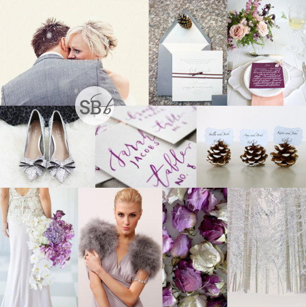
All of this month we’re bringing you boards inspired by the colours in Pantone’s Fall 2015 palette, but today, instead of combining two or more, we’re focusing on just the one. When I was looking up images for our Pantone bridesmaid inspiration post last week, I just fell in love with Stormy Weather, a beautiful shade of dark grey that I think is amazing for a winter or autumn wedding. I actually think it works well on its own, with some lighter shades of grey and cold weather natural textures, but I couldn’t resist warming it up just a little with a touch of copper, and oh my gosh, I love it! Cool, sophisticated and cosy, all at the same time. And with a bit of a romantic, Wuthering Heights feel too. So here you go. Stormy weather isn’t always a bad thing on your wedding day ;)

Colours: Pantone Stormy Weather, dove grey, copper & white

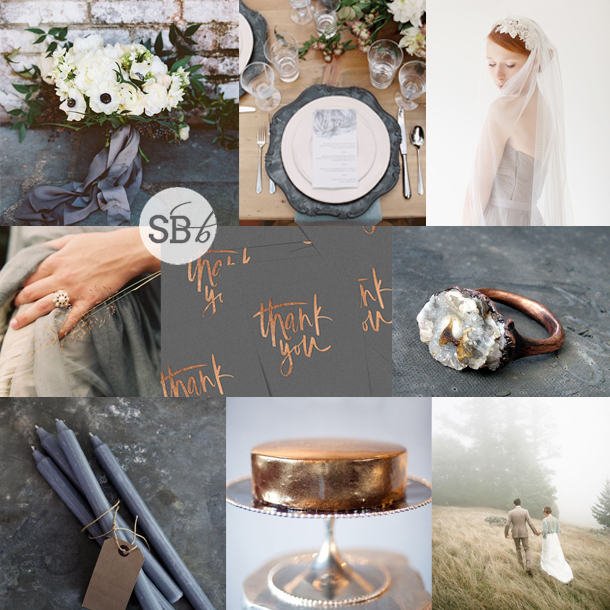
Top row (l-r): Bouquet {Adam Barnes/Amanda Gray of Ashley Baber Weddings/The Arrangement Company}; place setting {Cassidy Carson/12th Table/Kelly Lenard}; bride {Sibo Designs}
Row 2: Grey dress & ring {Brosnan Photographic/Pearl and Godiva/Claire Pettibone}; copper foiled invitations {Cocorinna}; copper ring
Row 3: Grey candles {Cox & Cox}; copper cake; bride & groom {Braedon Photography}


Inspiration Board: Pumpkin & Lavender

Happy Monday friends! As part of our month of autumn awesome, over the next few weeks we’ll be focusing our colour inspiration on Pantone’s Fall 2015 palette (be sure to check in this afternoon, when we’ll be introducing all the colours and pairing them up with gorgeous bridesmaid dresses). Today we’re starting with a combination of mustardy yellow and bright violet shades – absolutely perfect for a warm but very pretty autumn wedding. Add touches of soft purple and pumpkin shell orange to round it out, and you have a beautiful seasonal look.

Colours: Pantone Amethyst Orchid, Pantone Oak Buff, heather & orange

Top row (l-r): Bridesmaids {Stephanie Williams/Jenny Yoo}; place setting {KT Merry Photography/Clara Tuma Photography}; leaf
Row 2: Tablescape {Love Made Visible/De Liefde}; carved pumpkins {Laughter & Light}; mason jar centrepieces {Beaux Arts Photographie}
Row 3: Bride & groom {Amy Lashelle/Scenemakers}; wedding dress {Catherine Hall Studios/Holliday Weddings/Vera Wang}; bouquet {Anna Kidman/Mildred & Co + Lu Diamond Flowers}; naked cake {Paige Reaux Photography}


Marsala Romance by Nyx Photography {Plus Poached Figs in Red Wine Recipe}

Happy Thursday, lovely friends! It feels like the long weekend has already begun, but we have lots more inspiration to bring to your pretty faces first. Yay! I’ve been looking forward to sharing this particular shoot for a while – and it’s in this year’s hottest colour, Marsala! Okay, I have mixed feelings about Marsala, but I definitely don’t have mixed feelings about how lovely the Marsala tones look on this particular tablescape and dashing couple. The team behind the shoot, including Natalie Loots of Nyx Photography and Colleen from Lieflingkind Design, used natural berry shades from fruits like pomegranates and grapes, alongside the loveliest watercolour-style stationery – and of course, lush Marsala blooms, and dresses for the ‘bride’. The end result feels a little baroque without being over the top, and has a lovely sense of natural abundance. Plus! Natalie sent over a recipe for the figs – just for you!Read More

Inspiration Board: Marsala Blush

Hello again friends! This time of year, I usually do a whole special on the Pantone colour of the year, but this year, I’m saying no. And why? Because I think that this year’s colour, Marsala, is quite frankly, a bit shite. Now don’t get me wrong, because I don’t have a problem with Marsala itself – it’s actually a pretty awesome interior accent and I’ve even seen some fashion bits and pieces that I liked coming through. It’s entirely possible it will grow on me even more. But as a primary wedding colour… it’s brown. I don’t care how many times the internet says it’s red-influenced or muted claret or berry, it’s BROWN. And you guys, don’t have a brown wedding. Because in 20 years time, you don’t want to be looking at your wedding pictures with your children asking why your bridesmaids are in dresses the colour of poop, saying (for the hundredth time): “It’s NOT brown, it’s Marsala” while they roll their eyes and think “people in 2015 were SO DUMB”. Now here’s the good news. Claret and berry shades are actually pretty hot right now. So if you don’t get too intense about the colour matching charts and veer over towards burgundy or ruby, you have yourself a winner. And I suspect that’s where most of the ‘Marsala’ wedding inspiration that’s about to be all over wedding blogs will go. And that’s sort of where I’ve gone today, combined with blush, in the one and only Marsala inspiration board you will see on SouthBound Bride.

Colours: Pantone Marsala (ish), blush pink, gold & ivory

Top row (l-r): Bride with bouquet {Eric Kelley Photography}; shoes; bouquet with ribbons {Lucy Munoz Photography/Divine Blooms & Designs}
Row 2: Centrepiece {Lani Elias Fine Art Photography/Ashley Nicole}; tassel garland {Your Cloud Parade}; gold place setting {The Nichols/Clink Events}; ribbon with ring {Lani Elias Fine Art Photography/Ashley Nicole}
Row 3: Candles in gold bottles {Sonya Khegay Photography/Latte Décor}; serving spoons {Lani Elias Fine Art Photography/Ashley Nicole}; bridesmaids {Tealily Photography/White Runway }


Inspiration Board: Something Blue

Welcome back, lovelies! I hope you’re ready for a gorgeous new week. I’ll be spending the first few days of it away from my computer for once, enjoying some relaxing mom and daughter spa time in the Drakensberg. As I write this, I can’t wait – feel free to be made jealous by following me on Instagram. Anyway, in the meantime I’m turning back to the Pantone Spring 2015 colours I introduced last week, with the first of a few full inspiration boards that include these gorgeous shades. Today I’ve combined two of the spring blues – Classic Blue and Aquamarine – with the warm neutral, Toasted Almond. It’s a pretty, preppy mix, and absolutely perfect for a fresh, modern wedding.

Colours: Pantone Classic Blue, Aquamarine & Toasted Almond

Pantone Spring 2015 inspiration board

Top row (l-r): Bride & groom {Alea Lovely}; programme with blue ribbon {Laura Gordon Photography/Shine Wedding Invitations}; chair {Lane Dittoe, Fine Art Wedding Photography/Twine Events}; blue shoes {Kina Wicks Photography}
Row 2: Blue china {Taylor & Porter Photographs}; groom in tan suit {Lisa Berry Photography + Carla Ten Eyck/Jubilee Events}; cake with blue flower {Lane Dittoe, Fine Art Wedding Photography/Twine Events}
Row 3: Bouquet {Anastasiya Belik/PEONY Art Decoration Studio}; table numbers; blue ceremony chairs {Hazelnut Photography/Les Belles Affaires}; bridesmaid dress with bow {Blue Rose Photography/Simply by Tamara Nicole}


Pantone Spring 2015

One of my favourite times of year in the wedding industry is now, because after New York fashion week and ahead of the bridal shows, all the new collections start coming out (one day I WILL make it to New York to take up my invitations there!). And it’s also when Pantone announces their Spring palette for the following Spring – while the autumn colours are gorgeous, the Spring ones are always just a little bit more wedding-worthy, and it’s lovely to see and dream how things will be looking next year. So today I’m sharing the ten new shades, as well as mini-palettes to give you some ideas on how to combine them. In the coming weeks, I’ll be creating some brand new full inspiration boards in these colours – can’t wait to play and have some fun!Read More

Inspiration Board: Sangria

Happy Monday, lovelies! Next week I’ll be bringing you news of the brand new Spring 2015 colours from Pantone, but first I wanted to give a little love to my favourite of the Fall 2014 colours. Sangria is the sort of plummy magenta that’s the perfect compromise between classic burgundy and on-trend berry shades. I absolutely love it. All kinds of mixes would work, but for today’s board, I’ve just decided to infuse this fab colour on its own into a bold and beautiful country inspiration board. It works beautifully for cold weather, but just add a soft pink and you’ll be set for spring too.

Colours: Pantone Sangria

Top row (l-r): Magenta dress {Pearl & Godiva/Corbin Gurkin/Maria Lluisa Rabell}; bouquet {Jesse Leake Photography/Brown Paper Design}; fig cake table {Landon Jacob Photography/Spencer Special Events}
Row 2: Stationery suite {KT Merry Photography/Three Little Words}; bride with flower crown {Blush Photography/Tinge}; dress & bouquet {Maree Wilkinson Photography/New Bohemian}
Row 3: Place setting {Brushfire Photography}; bride {Erich McVey}; bride with flower {Michelle Boyd Photography/Sweet Sunday Events }.


Inspiration Board: Radiant Winter

It’s been a little while since I did an inspiration board with this year’s Pantone Colour of the Year, Radiant Orchid – while this lovely bright lilac-ey purple immediately lends itself to a summer wedding, I wanted to show that it’s just as much at home in the wintery months. In fact, paired with a few other purple tones, grey, white and silver, it’s absolutely perfect for the bride and groom who want to create a winter wonderland with a trendy touch. Add a few pinecones and a smattering of snow (well, we can dream, can’t we?) and you have the makings of a beautiful wedding – a radiant one, in fact!

Colours: Radiant Orchid, plum, lavender, silver, white & grey

Top row (l-r): Bride & groom {Steve Gerrard Photography}; invitation suite {Aneta MAK}; place setting {Greta Kenyon/Leaf & Honey}
Row 2: Silver shoes; purple calligraphy escort cards; pinecone place holders
Row 3: Radiant orchid bouquet {Fleur le Cordeur/Catherine Mac}; purple dress & feather bolero; dried roses; winter landscape {Fiona Conrad}.


Pantone Spring 2014: Placid Blue & Hemlock

Time for some more inspiration! And I must admit, I am excited to see the reaction to this one. In the last while I’ve been noticing a drift toward the pairing of pale green and blue, and even though Dazzling Blue is the lead colour for this collection, the combination of Placid Blue and Hemlock is my tip for the perfect contemporary wedding look and one I think we’ll be seeing quite a bit of in 2014. It’s such a cool, fresh combination – so chilled and so elegant, and I love how it combines with elegant country details effortlessly, including lots of organic greens and blues. Like diving into a cool pool of water at the bottom of a shady garden. Don’t you love it?

Colours: Placid Blue & Hemlock

Top row (l-r): Bridesmaid’s bouquet {Anna Kuperberg}; dress {Scott Piner Photography}; bridesmaids {Judy Pak Photography/Bella Bridesmaids}; bouquet {Scott Andrew Studio/Tracy Taylor Ward Design}
Row 2: Cake; flowers in bottles {Pobke Photography/White Room Events}; macaroon with ring; bottles.


Pantone Spring 2014 Colour Report

Happy Wednesday, friends! Today we’re continuing our celebration of the new Pantone colour report with even more fresh inspiration. The great thing about these reports isn’t that anyone expects brides to slavishly follow the new colours or feel like the ones they already have are ‘out’. But it’s a chance to take a fresh look at the colours you’re using, play with new combinations if you haven’t chosen a palette yet. But best of all, it’s an insight into the colours that are coming into homeware and fashion. Why should that matter? Well, as anyone who tried to find coral bridesmaid dresses three years ago will tell you, it does. When Emerald first made an appearance last year, I’d only seen it on celebrities – this year I have been spoilt for emerald images and bridesmaid dress options – even wedding dresses. So picking one or more of these colours might make your life easier if you’re planning a wedding in the next year. So those are the practical aspects. But for today, we’re just going to enjoy the colours. I really love this year’s choices – they’re not far off what we’ve seen before, but a bit more matte or with a bit more depth, or a bit lighter. Pastel blue and green are a big trend for 2014 in my view, and Hemlock and Placid Blue are perfect for that. The neutrals are also lovely – Paloma and Sand – just with a bit of warmth for grey and taupe shades. There are two very pretty purples – Violet Tulip and Radiant Orchid. And then some fabulous brights – Cayenne (LOVE this red), Celosia Orange and a gorgeous pop of Freesia yellow. But the colour that leads the collection is Dazzling Blue, a cousin of the blues that have been showing up for a couple of years now, that has really come of age. Get ready to see a LOT more of this one. This week we’ve already seen two full boards using the Spring 2014 colours, and there’ll be even more later today and Friday, but here I thought I would do some mini boards to inspire – which is your favourite combo?Read More