Inspiration Board: Moroccan Lemon

Happy Monday, lovelies, and welcome aboard SBB Airlines, where we’ll soon be taking off for gorgeous Morocco with today’s North African-inspired board. It’s been a while since I did a Moroccan board, but as destination influences go, it’s still one of my favourites, and this time I’ve pulled together a fresh palette of turquoise and lemon to keep things interesting. Preserved lemon is actually a traditional Moroccan dish, and would make a great favour, but I also really love the way that actual lemons add that punch of colour and life to cool whites and blues. Hire in your favourite Moroccan pieces – lamps, chairs and cushions, tented breakout areas, tea glasses, and then add some intricate detailing inspired by Moroccan doors and tiles to your stationery and linens. It’s a million miles from feeling like a theme party, but still exotic enough to wrap your guests in a jasmine-scented fantasy.

Colours: Turquoise, white, lemon, brass

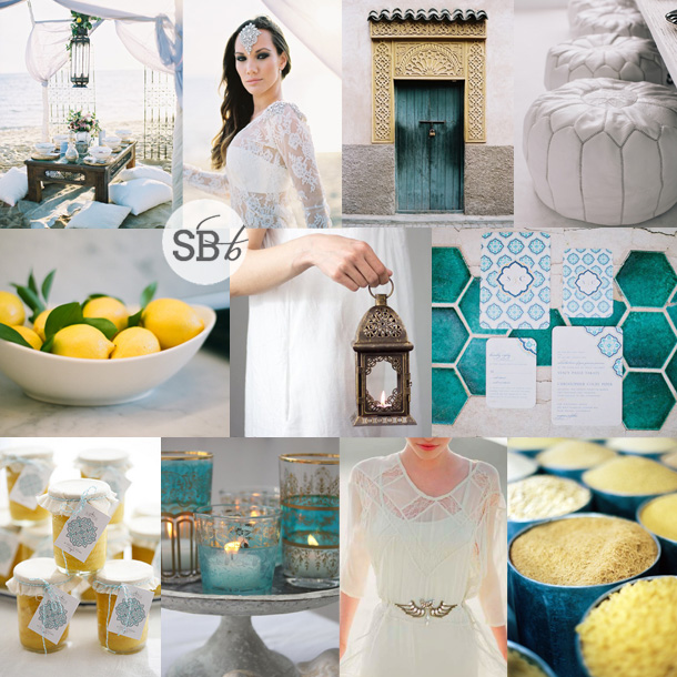
Top row (l-r): Beach table setup {Stewart Leishman Photography/Intique & Co}; bride in jewelled hairpiece {Stewart Leishman Photography/Intique & Co}; door {Birgit Hart Fotografie}; seats {Samara Leung/The LANE}
Row 2: Lemons {Christine Dovey/Yazy Jo}; bridesmaids’ lamp {Open Vintage Shutters}; Moroccan stationery suite {Laura Goldenberger/Stacy Paige/Wedding Paper Divas}
Row 3: Lemon preserve jar favours {Thoughtful Day/Karen Mordechai}; tea glass candles; dress with belt detail {Jose Villa/Canvas & Canopy/Bona Drag}; spices {Birgit Hart Fotografie}


Real Wedding at The Farmhouse Hotel {Leigh & Andrew}

Sometimes weddings are like London buses – I went for ages without a lovely beach wedding to share, and now I have two in a row! Well, no complaints from me, as I absolutely adore a toes-in-the-sand, head-in-the-clouds, chilled out beach do and today’s wedding is one of the most chilled I have ever come across. And you guys, an ombre wedding dress. Seriously, I LOVE. Leigh and Andrew are the picture of Cape Town surfey gorgeousness, and their love story had so much to do with Langebaan that they couldn’t help but decide to get married in this special seaside town. They chose a super fun palette of turquoise with a pop of colour-of-the-moment neon, which not only worked with their wedding style but reflected their complementary personalities. My dear friend Monica Dart was there as the photographer, to capture all the life and movement and colour, as only she can. What a lovely wedding.Read More

Real Wedding at Pecan Manor {Andrea & Ian}

One of the things I love most about wedding planning is that inspiration can strike at any time. Some brides have everything planned down to the last napkin fold, with Pinterest folders and a DIY schedule, and no surprises to deal with. For many, final decisions can be made even days leading up to the wedding. My favourite was my friend Abbie who didn’t want a garter, so after we joked in the car on our pre-wedding errands that her surfer husband-to-be would probably prefer a surf leash, that’s what we ended up buying! We put it on under her dress at the last minute and Phil had no idea – it was so fun. And I’ve never seen so many men try to catch a ‘garter’! So I wasn’t completely surprised when reading today’s story from Ian and Andrea, how the idea of a ribbon ceremony backdrop was a last minute decision. Well, I’m sure you’ll agree, it was an awesome one! I really love a focal point to an outdoor ceremony, and hanging ribbons are just SO pretty (and easy)! Plus, I love how photographer Wesley Poon went ahead and used the ribbons for the couple shoot as well, resulting in some spectacular pictures! The decor for this wedding is awesome – shabby chic with pops of jewel tones. I love love love the blue glass, the hanging bottles, the birds. And of course that ribbon, reflected again in the pretty long ties for the bridesmaids’ bouquets (nice twist on the ice cream pastels trend, no?). So much loveliness, and the moral of the story is, don’t be afraid to indulge one of your last minute whims – it may land up being your best idea!Read More

Real Wedding at Die Opstal {Ilze & Louren}

Good morning, SouthBound Brides, did you have a good long weekend? I took a couple of days off for the first time in AGES – although, by “took off” I just mean from the blog, not from work sadly. But sometimes it’s good to give yourself some time off, and I’m back refreshed and renewed for a week of sheer loveliness! Yay. Anyway, speaking of sheer loveliness, today’s wedding is just full of softness and sweetness and stealable details. For example, one of the first that caught my eye when photographer Nadine Aucamp sent over Ilze & Louren’s lovely wedding was the doilies placed delicately under every plate – such a simple way of bringing shabby chic styling to the table, but so effective! I also loved the collection of ceramic vases of all different shapes and sizes that Ilze put together – such a sweet twist on the milk glass and silverware collections we’ve seen a lot of recently. And I love the bird-on-a-wire table listings! As I said, sheer loveliness.Read More

Inspiration Board: Trading Post

Okay, I have to tell you, I’m in love with this board. Which is a surprise, because turquoise and chocolate hasn’t always been a favourite combination of mine. I think it’s because I’ve seen it done tacky too many times, but when bride Klarissa wrote to tell me about her wedding, I knew this girl had style. After all, she chose an awesome venue – Searle’s Trading Post in Greyton. It’s super quirky and rustic and fabulous, and Klarissa knew well enough to work with its eclectic feel and just accent it with her colours. I adore the idea of a trading post ‘theme’ – a mix of found objects and rustic textures like wood and burlap. I started thinking about the sort of things you might have found at a trading post (or at least ones you might have found at my fantasy imaginary one!). How about pretty birds eggs in nests, for example? (Love these for place holders, or as part of the table decor, and they’re a fun DIY.) Old tins full of flowers. Mason jars, old door knobs, suitcases. I stumbled across this image of a poshokkie (what is the English for that, anyway?) with brown paper packages wrapped up in string – wouldn’t this make an ADORABLE escort card display? I also loved the idea of string decorations (this SBB couple did this brilliantly) and a statement turquoise necklace for the bride. It’s kind of a case of ‘anything goes’, but natural textures are the key to making it work – fortunately in a venue like this one, Klarissa will have no shortage of them. Thanks for waiting patiently, Klarissa – hope you like your board as much as I enjoyed creating it!

Colours: Turquoise & chocolate brown

Top row (l-r): Eggs in nest {Pottery Barn}; bride with turquoise necklace {Intrikate Designs}; suitcases {Retro Images on Etsy}; table setting on rough wood {P: Courtney Dellafiora; S: Valerie Metrejean}
Row 2: Blue dyed mason jar; burlap backed invitation; flowers in vintage tin {P: Heather Saunders Photography; D: The Parsonage}; poshokkie; piano
Row 3: Turquoise dress; mason jars with acorns {Pottery Barn}; cake with string ‘love’ topper {P: White Wall Photography}; vintage doorknobs on burlap runner {S: Elissa Keno; P: Kellie Kano}.


Inspiration Board: Pretty as a Peacock

Afternoon, folks! We’re rounding off a pretty awesome week here on SBB with one more piece of pretty and awesome. I’ve been getting tons of requests for inspiration boards from all of you, so I’m working double time to try and create as many of them as I can. Reader Kristin has been waiting a little while for hers, but I hope it will be worth the wait! Kristin is getting married in a hall in summer, and she’s looking for turquoise accents to classic black and white, with peacock feathers and a general air of chic. Initially I was just going to send Kristin over to a board I created right at the very beginning of the blog (you can find it here), which was when the peacock trend was taking off. But then I thought about it, and I thought maybe we could bring the peacock theme a little more up to date. One option would be to go for a very art deco look – peacock was a key motif during the period after all – but instead I decided to add a bit of glitter to the teal, black and white palette – a look that’s very of the moment. The focus is less on actual peacock feathers – although they’re included in select spots: a boutonniere, with the bouquet, and on the bridesmaids’ headpieces – and more on beautiful peacock imagery. I am so in love with the place settings using peacock plates, gold cutlery and an ornate charger – if hiring this isn’t an option, consider a custom printed menu that fits inside a plain white plate, to give you a similar visual effect. I also adore the letterpress invitations pictured here – stationery is a great way to ‘brand’ your wedding in a sophisticated way. Add a bit of glittery texture – if not on the wedding dress (although I always seem to go back to this gorgeous wedding dress!) then maybe on one bridesmaid’s dress, and how cute is the little packet of sequin confetti? Teal/turquoise shoes and BM dresses are a must, but beyond that I’d stick to classic black and white. And there you have it. Hope you like your board, Kristin!

Colours: Turquoise, black, white & gold

Top row (l-r): Bouquet with peacock feathers {P: Jared Rey Photography; C: Gretchen Rose Events}; BHLDN wedding dress; peacock place setting {P: Ryan Ray Photography; D: Razzle Dazzle Event Decorating}; peacock boutonniere {P: Abbey Hepner Photography; C: GuGuLy Event Planning}; letterpress peacock feather invitation {Bespoke Letterpress}
Row 2: Feather with rings {Stacy Reeves}; sequin confetti {P: Greg Blomberg; D: Bows and Arrows}; teal bridesmaid dress; bride {P: Chrystal Cienfuegos Photography}
Row 3: Peacock plate place setting {P: Ryan Ray Photography; D: Razzle Dazzle Event Decorating}; teal shoes {P: Ryan Ray Photography; D: Razzle Dazzle Event Decorating}; teal bridesmaid dresses {P: Elaine Palladino Photography}; bride and groom with sparklers {P: Amy and Stuart}


Inspiration Board: Santa Fe Love Letter

I’ve been lucky enough to travel to a few places in my time, and I hope I’ll be able to add many more to that list before my time’s up. For most of them, I try to take everything in because I accept I probably won’t be back again, but there are some places that I love so much that I have to have a second helping. Santa Fe was one of those. A few years back I spent a week there for work, and fell head over heels for the desert – for the adobe architecture, the artists’ haven vibe and OMG the margaritas! It’s one of those places I wish I could have a chance to live in, just for a year or two, and it’s definitely on my return visit list. So when I decided to do a travel-themed board for today, Santa Fe just seemed like an obvious choice for me. I’ve gone for soft, muted desert colours, and of course, succulents (will the love affair never end?). I love the chilli ristra necklace and the papel picado garlands and I LOVE the idea of a bride wearing bold South Western turquoise and silver jewellery. And how pretty is the bouquet? But I think my favourite detail is the farolitos – paper bag lanterns that are a Santa Fe feature during the Christmas season and look amazing in bulk lining roofs, doorways and pathways or making beautiful patterns on the ground. Sigh. Somebody send me a plane ticket! ;)

Colours: Muted teal, green, turquoise, and sienna

Top row (l-r): Cacti; silver ristra necklace; bridesmaid’s dress (TripleCord Photography); papel picado garlands; succulent bouquet (Michelle Warren Photography)
Row 2: Succulent; adobe entrance; Georgia O’ Keefe painting; table setting (w. scott chester photography)
Row 3: Succulent hair decoration (Stephanie Williams); invitation; adobe with farolitos; turquoise bracelet (Twin Lens).

Real Wedding at MolenVliet {Nelle & DeWet}

Morning, lovelies! We’ve had quite a lot of rustic chic and country vintage weddings on the blog recently and, much as I love them, I thought it was time for something with a bit more glitz and old school elegance. Today’s couple also had a vintage inspiration, but in this case it was the glamour of art deco, and they chose the winelands splendour of MolenVliet for their venue. I’ve been dying to feature a MolenVliet wedding, as when I was in Cape Town in December everyone in the industry was raving about how lovely it is, and Nelle & De Wet’s wedding certainly doesn’t disappoint. Details I love: the pretty (mismatched) bridesmaids’ bouquets (a great idea if you choose to have your girls wearing the same colour), the subtle pops of turquoise blue against chocolate brown, the fun groomsmen’s socks and goodness me, that cake! There are lots of black and white pics in today’s selection, but it just seems appropriate for such a classically romantic wedding. And wow, the pictures. I’m always so happy to feature Monica Dart‘s work, because her images have so much life to them. It’s actually a challenge editing the selection! I think these might even be my favourite so far. I also loved how Monica captured Nelle and De Wet at a rural petrol station – so fun! It’s always great when couples can spice it up a bit in their creative shoot. Anyway, I could go on and on, but you want to see the pictures, right? Right. ENJOY!Read More