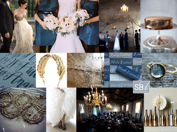
Hooray for Mondays, SouthBound Bride! And it’s no surprise I have the Olympics on my mind today. I was going to do a gold, silver and bronze board, but having just done mixed metallics last week, I thought I would focus on Olympian Blue, one of the beautiful colours from Pantone’s Fall 2012 lineup, mixed in with a bit of shiny gold, for obvious reasons. Hopefully there’ll be at least one gold to South Africa’s name by the time you read this! This blue is lovely and fresh, but it’s also quite intense, so I’ve added a light denimy blue in as well, and gone for a look that’s kind of a cross between urban and rustic, and just a bit Anthropologie. It works beautifully with the BHLDN dress top left, which I have been in love with for the last year. Another detail I absolutely adore is the calligraphed tiles for place cards (no surprise, an innovation from Martha Stewart). And for a final Olympic touch, there’s a pretty laurel-inspired gold headband. Hope you like it, and hope you’re all enjoying the games this week! (To find out more about the Pantone range and see some colour combos, check out this post.)
Colours: Olympian blue, pale blue, grey, gold
Top row (l-r): BHLDN dress {S: Alchemy Fine Events & Invitations; P: Mike Larson Photographers, Inc.}; blue bridesmaids dresses and anemone bouquets {C: Bluebird Events; P: Leo Patrone Photography}; ceremony backdrop {P: Jason Durnin}; gold cake
Row 2: Calligraphy invitation {Sycamore Street Press/Betsy Dunlap}; laurel headband; gold and white bunting; calligraphy tile place cards: topaz ring
Row 3: Olympic rings; blue shoes {C: Jenny Brown; P: Alea Lovely Photo + Video}; reception venue {P: Jason Durnin}; spraypainted bottles.


