Well, I didn’t see this one coming. After two years of warm colours – honeysuckle pink and tangerine tango orange specifically – Pantone’s just named Emerald as its colour of the year. It’s dramatic, it’s rich, it’s formal, it’s a little bit old school… and it has totally grown on me. Seriously, when I thought about it, it totally made sense. In the last year I’ve seen a couple of emerald wedding dresses, and every time it has caught my attention. Then I featured this engagement shoot, with the most gorgeous green Gucci dress. And this graphic Gucci and gold inspiration board:
Ah Emerald. You’ve been sneaking up on us the whole time.
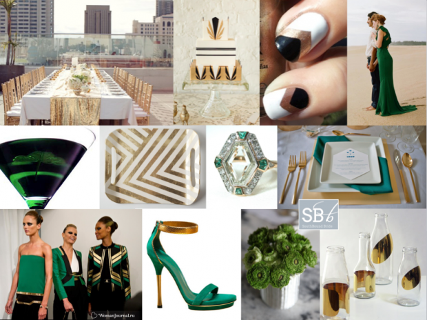
So okay, it’s the colour du jour. But how do you actually use it in a wedding? Well, you could go for the art deco-influenced graphic emerald, gold, black and white as above. But I’ve also put together a few fresh alternatives…
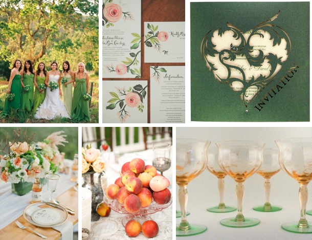
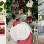
Emerald and peach (perfect for a new twist on a rustic palette):
Credits (clockwise from top left): 1- Jose Villa via Martha Stewart Weddings; 2- Binaryflaps Photography; 3- Intricate Creations; 4- TidBitz; 5- Belathee Photography via Martha Stewart Weddings; 6- Jessica Lorren Organic Photography via Every Last Detail
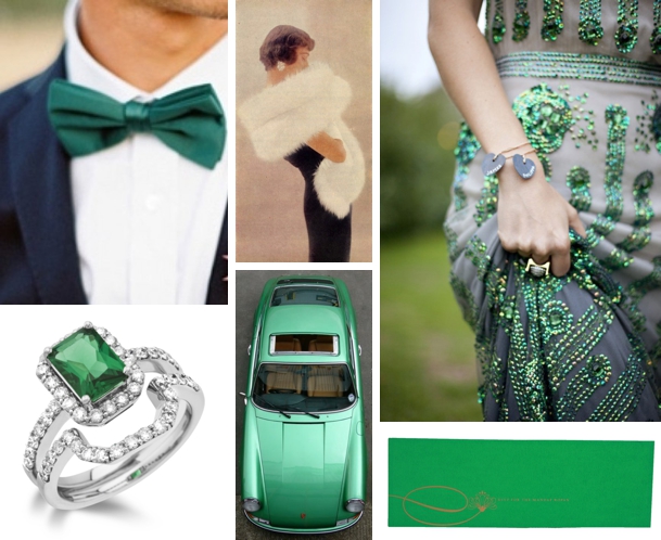
Emerald and navy (glam it up with navy and a tiny touch of sparkle):
Credits (clockwise from top left): 1- via Simply Significant; 2- Charm Magazine via Jamiee Rose; 3- Caught the Light via 100 Layer Cake; 4- Ananya Cards; 5- Pinterest; 6- Taylor & Co.
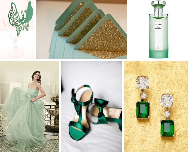
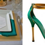
Emerald, greyed jade and gold (combined with another of Pantone’s current shades and the prettiest metallic, I love this palette!):
Credits (clockwise from top left): 1- Intricate Creations; 2- Persian Laundry; 3- Bulgari; 4- Pinterest; 5- Kate Headley via Santa Barbara Chic; 6- Karen Caldwell
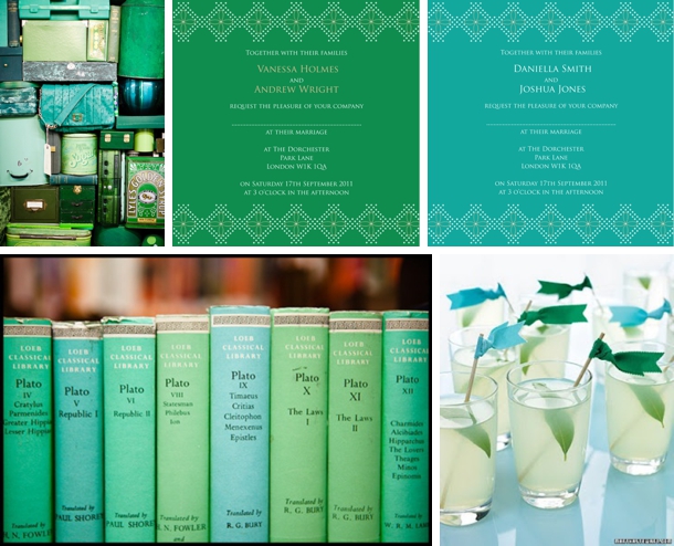
Emerald and aqua (if it’s good enough for Martha Stewart…):
Credits (clockwise from top left): 1- Pinterest; 2 & 3- Ananya Cards; 4- Martha Stewart Weddings; 5 – Jonathan Mathias
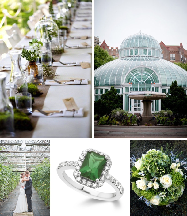
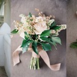
Emerald, white and beige (with a botanical twist):
Credits (clockwise from top left): 1- Erin Grace Photography via 100 Layer Cake; 2- Gulnara Studio via SMP; 3- William Clarke Flowers; 4- Taylor & Co.; 5- Jennifer Moher Photography
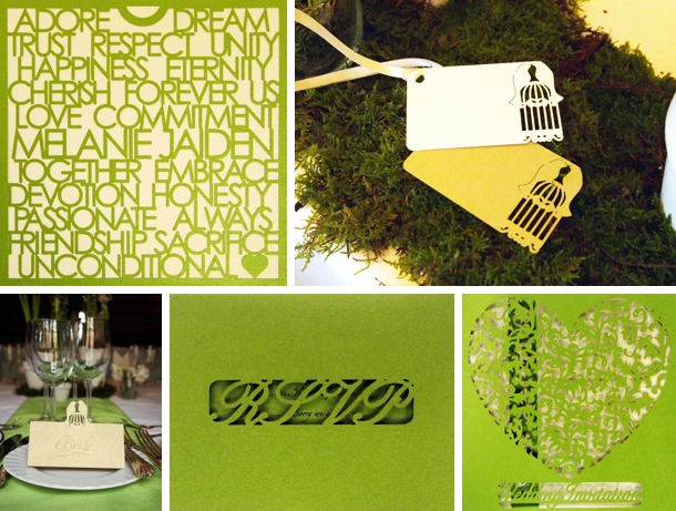
But I don’t just want you to take my word for it. To give you an industry perspective, I chatted to Kay Patel, Managing Director of Intricate Creations, a UK based company who create contemporary, bespoke laser-cut wedding stationery for the sophisticated, style-conscious couples of today. Here’s what she had to say…
Hi Kay! What’s your opinion on the new colour?
We have been waiting patiently for strong, rich and luxurious colours to be embraced. With the Tangerine Tango from 2012 and now Emerald for 2013 it is great to see transformative colours being introduced. Our clients tend to love experimenting with colour for their wedding stationery and are not scared to venture to the bolder side when it comes to striking colours, and we have already had a few orders for 2013 weddings in the emerald tones. Emerald is such as great colour, not only does it go together with what marriage symbolises – growth and unity – but by having a natural tone it can complement many other colours, which is why for us at Intricate Creations and the 170 colours we provide, we know there will be some fantastic colour combinations being chosen by our clients in 2013.
How do you think the colour should be incorporated into the wedding stationery suite?
The main ways we see Emerald being incorporated into our clients’ stationery is as follows:
- The exterior of the invitation being Emerald, but to ensure the colour is not too overpowering for concerned brides, we will be encouraging the insert to be a rich pearlescent cream.
- Emerald works exceptionally well with white and silvers for those crisp winter weddings, but also yellows and stones for warm spring and summer weddings.
- There is also the option to subtly place the colour into your stationery. Accent the bride and groom’s names within the body of the invitation wording with emerald print to remain on trend but not to overpower the stationery. We will always push to ensure the stationery makes a statement, so we would suggest complementing the printed names with co-ordinating Emerald envelopes. Just imagine them landing on your guests’ doormats… you can guarantee your invite will be opened before all the other white and brown envelopes! We like to guarantee our clients’ invitations are seen first, remembered and cherished!
Do you think couples planning their wedding should follow trends, such as this Emerald theme trend?
We believe every bride and groom is unique and they should not be forced into anything and we make this point very clear in our initial consultation. Brides will often come to our consultations armed with magazine cuttings, photos from a friend’s wedding, and ideas in a scrapbook or Pinterest board, and whilst this is fantastic for us to see their vision, we always try to get to know the couple first. We spend time finding out how they met, where they got engaged, where the wedding is being held, her likes, his likes, etc. as this all forms an image of who they are. This will then often give us a clearer indication of what is going to suit them, as brides are often swept along the wedding planning process with ideas that can be forced upon them from many external sources. As long as they genuinely love the trend that surrounds their wedding then yes, of course we believe every couple should follow their true desires and we will make those come true in their wedding stationery.
So what do you think readers? Who’s for emerald?

Comments are closed.