Inspiration Board: Pretty Preppy

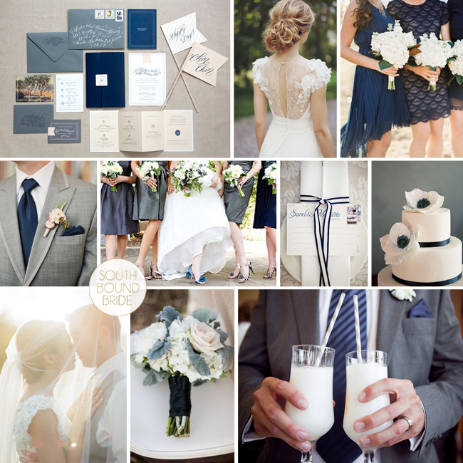
And we’re back – I couldn’t let Monday go by without some inspiration board loveliness, could I? :) Today’s combo has been my new little colour crush for a few weeks now, because seriously, how amazing do grey and navy look together? It’s so chic. I especially love the mix of a dark slate grey with a softer, bluer grey, and then sophisticated navy (plus, of course, lots of crisp white). If you like a country club chic look, this is absolutely perfect, and of course you can also inject a few softer colours like peach or coral if you like. But I actually like it just like this – it’s like a sophisticated, on-trend take on the navy and white stripes that I have been loving over the last couple of years. What do you think?

Colours: Slate grey, dove grey, navy & white

Pretty Preppy

Top row (l-r): Invitation suite {Beaux Arts Photographie}; bride {Sonya Khegay}; bridesmaids {Brett Heidebrecht}
Row 2: Grey suit {Loren Routhier}; bridesmaids {Perez Photography/The French Connection}; place setting {Lizelle Lotter}; cake {Brooke Allison Photography}
Row 3: Bride & groom {The McCartneys Photography}; bouquet {Kali Leenstra/Katy Grifiths/Flora Nova Design}; cocktails {Lizelle Lotter}.


Citrus & Slate Styled Shoot at Kelvin Grove

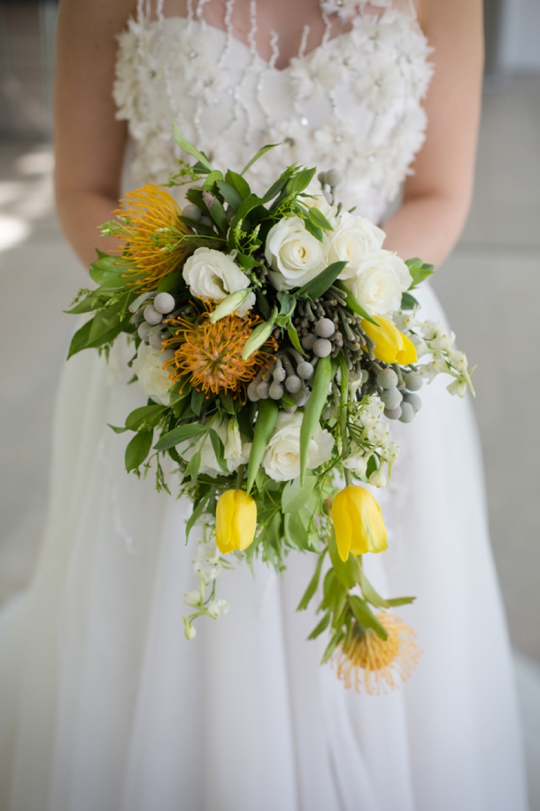
Afternoon lovelies! Very excited to share this styled shoot with you today, which comes from a very talented team of suppliers, including photographers Heathyr Huss and Nicole Rich, as well as event designer Nicola Jane Wedding & Event Specialist. The theme of the shoot was Nutopia, a romantic infusion of citrus and slate. I am always a huge fan of modern wedding styling, especially when it uses innovative colours or textures and this shoot is chock full of lovely ideas to inspire you. First of all, it is sunshine yellow, which has to be the most cheerful colour ever. With a healthy dose of citrus detailing and gorgeous flowers (including pincushion proteas, my best), parts of the look are really organic and certainly very summery. And did I mention the romance of the dresses? Wow, Elbeth Gillis gets me every time! These soft aspects contrast with some industrial elements – not scary industrial though, pretty modern industrial. As in, hanging bulbs, concrete planters (LOVE this idea), and slate grey which really makes the lemon yellow pop. The whole look is fresh and elegant and gorgeous!Read More

Inspiration Board: Coral & Chalk

Time for a last bit of inspiration before everyone runs off to get their Friday evening cocktails in hand.  And much as I love doing reader requests, this is one of my own. We’ve seen a lot of coral in the last year, but I got to thinking how perfect it would be matched up with the slate black of chalkboard and a touch of soft blush pink. It’s fresh, modern and fun, and it could work on a number of venues from a blank canvas country style (such as Kleinevalleij) to a beach wedding to a city rooftop or restaurant. It’s also perfect for a DIY kinda bride. There are, of course, lots of ways you can use chalkboard, but this particular style calls for some of the more irreverent – I love the place mat idea with drawn on knives, forks and a plate and the dessert table backdrop telling guests what everything is. Put favours in a sweet little Anthropologie jar painted in white and coral with a chalkboard label, and line the table with a ‘runner’ of single bold, bright peony blooms. LOVE. (Oh, and PS, if you want to add an extra note of colour complexity, a dash of peach is perfect here.)

Colours: Coral, blush and slate

Top row (l-r): Dotty bridesmaid {Sara Lucero}; groom with coral boutonniere {Yvonne Wong Photography}; cocktails {Abby Grace Photography/Capitol Romance}; cake pop macaroons; coral framed chalkboard
Row 2: Single bloom runner {Martha Stewart Weddings}; chalkboard style invitation; chalkboard spice jar {Anthropologie}; boutonnieres {Charmed Events Planning/Vincent Au}
Row 3: Bride with balloons {Alea Lovely}; dessert table backdrop {Elsie Larson}; chalkboard place setting