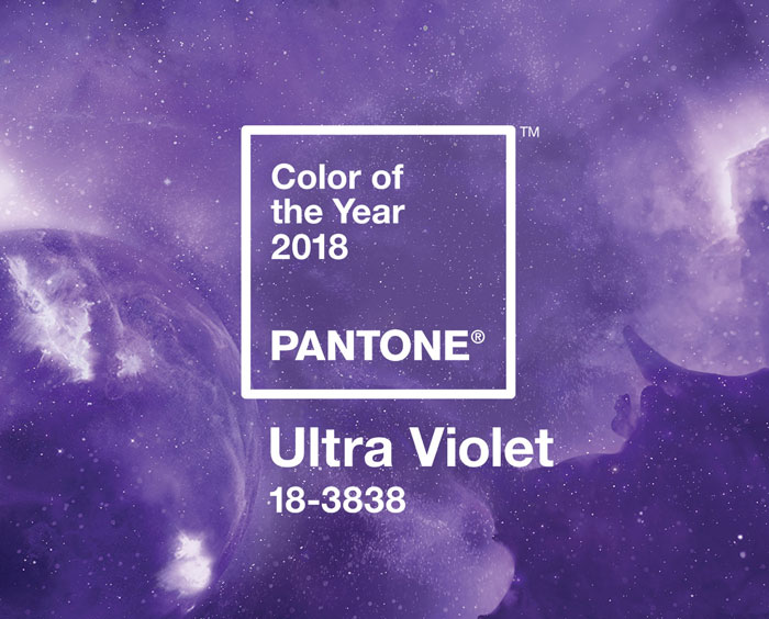
So this month, our editorial theme is ‘Cosmic Love’, and we’ll be using it to explore all things celestial wedding, but linking it at the same time to the latest development in the Pantone Color of the Year universe: Ultra Violet? Why, well, as Pantone themselves say: “Ultra Violet suggests the mysteries of the cosmos, the intrigue of what lies ahead, and the discoveries beyond where we are now… the vast and limitless night sky is symbolic of what is possible and continues to inspire the desire to pursue a world beyond our own”. I also love how Ultra Violet links to some otherworldly design elements, most notably iridescence, set to be a huge trend for 2018 (so expect to see some of that this month too, yay!). I think one of the key things about Ultra Violet is that it’s one of those colours that on its own can be… well, a little too much. It’s a great purple, but it’s still a bold colour and you don’t want to let it take over your wedding. But it combines beautifully with so many other shades: blues and greens, pinks, softer purples (maybe one of my favourite ways to use it), neutrals, pastels and berry shades alike. It lends itself to the current trend of having several colours (or tones) in your wedding palette, instead of playing mix and match. Plus, since you’ll find this shade in many flowers, I’m hoping that we’ll be seeing it in abundant florals the way Greenery did. Today we’re breaking down just a few of the options: a unicorn iridescent board suitable that is bang on trend, a softer country boho palette, a moody purple and grey number which I am loving, and a juxtaposition of purple versus bright red that really pops! Links in bold denote affiliate links. SBB may make a commission on any sales made.

