Colour Story: Placid Blue & Hemlock

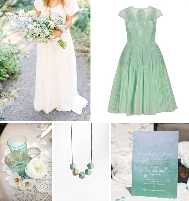
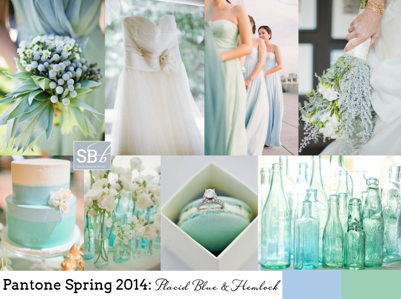
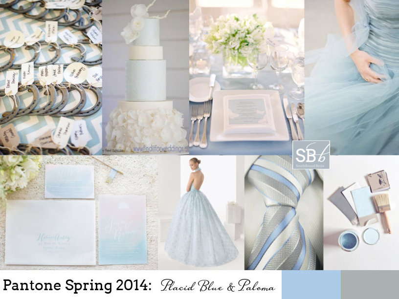
Not long ago, when I put together some inspiration boards for the new Pantone spring colour palette, I predicted that the combo of pastel green and blue would be a favourite, and that this might just be the key colour combination for 2014. Well, we won’t know for a while yet if I was right, but judging on the many Facebook likes and shares and Pinterest pins the board has had since then, I’d say I might have been on to something. So I thought there was no better pairing for a colour story! Here’s the original board:

Full credits here.

Those cool tones just meld together into perfect prettiness, don’t they? When you use two colours that are close to each other on the colour spectrum, another advantage is that you can easily create a sort of ombre effect with your colours, instead of going too mix and match. Mix your pastels with whites and neutrals – again, this gives you quite a lot of flexibility. And with blues and greens not being too girly, it’s a colour combo that your groom is sure to love too.

Read More

Inspiration Board: Portrait of a Lady

Happy Monday friends! How was your weekend? The weather has been completely mis here in Durban, although happily I was safely installed in a box for the Sharks game yesterday instead of sitting in the stands in all that rain. Hopefully the summer starts hitting South Africa a bit more soon though, because my tan is fading fast… Anyway, Monday morning means inspiration board time, and I must say, I am loving this one. A lovely dark teal (does that colour have a name?) with blush is the perfect combination of soft romance with dark jewel tones that are very much on-trend at the moment. The look is very sophisticated but pretty at the same time. What do you think?

Colours: Teal, blush and gold

Top row (l-r): Bride with statement necklace {Christine Meintjes/The Pretty Blog}; bridesmaids {Reg Campbell Wedding & Editorials/Keely Thorne Events}; shoes and bouquet {Desi Baytan Photography/Modern LA Weddings}; tablescape {Fondly Forever Photography/Yellow Bird Events}; teal groom’s suit {Fondly Forever Photography/Yellow Bird Events}
Row 2: Cake with blush flower detail; bouquet {Elisa B Photography/Southern Blooms}; car {Erin Hearts Court}; macaroon {Fondly Forever Photography/Yellow Bird Events}; flower in gold goblet {Fondly Forever Photography/Yellow Bird Events}; flower girl {Elisa B Photography}
Row 3: Bride {Fondly Forever Photography/Yellow Bird Events}; blush cocktail; pink calligraphy stationery {Ryder Evans Photography/White+White}; teal door; flowers {Fondly Forever Photography/Yellow Bird Events}.


Inspiration Board: Teal with a Kiss

Good morning my lovely friends! This is such a special week for me, I’m so excited for it to start! Because my awesome friends Abs and Phil are in town, together with their three sons, all of them my godsons. I just adore these little guys, but because they live in Australia I haven’t seen them for almost five years (apart from on Skype, not the same). So I am beyond thrilled at the idea of spending some time with them – hopefully it won’t affect the blog schedule, but if I go quiet, you’ll know why. Sometimes, you just have to let life get in the way of work ;) ANYWAY, for today, we’re getting started with another beautiful inspiration board, with a colour combo that I have a feeling will be very popular. Teal and pink are just such a pretty pair, but when you add that little gold kiss… well. Heavenly!

Colours: Teal, rose & gold

Top row (l-r): Place setting {Lisa Dolan Photography/Lauren Field Design}; bridesmaids {Brandon Chesbro/CJ’s Off the Square}; gold champagne bottles {Clary Pfeiffer Photography/Bride’s Vision}; stationery suite {Cheree Berry Paper}
Row 2: Cracker {Jennifer O‘Donnell Photography/La Fete Event Design}; glitter blue confetti; breakout lounge area {Frenzel Photographers/Joyful Weddings and Events}
Row 3: Bride; gold shoes {Ever Whim Photographs}; gold cake {Metro Custom Cakes}; table setting {Lisa Dolan Photography/Lauren Field Design}; balloon.


Inspiration Board: Huckleberry Blues

Good morning my lovelies! Hope you had a brilliant weekend! Today’s board is all about a calm, serene, cool blue and a fizzy pop of vibrant red. I must say, I love this idea. Baby blue and bright red have been a popular combination for a while, but they’re usually associated with 50s diner style weddings, or Cath Kidston chintzes. I like the idea of it for a rustic farm or vineyard wedding, with beautiful blue tables and bushels of white flowers, and then every now and again, a powerful punch of red. After all, there’s something about red, isn’t there? A hint of red heels peeping out from under a lace dress, a bright red getaway car, or a scarlet bouquet in a bridesmaid’s arms. It’s sassy, and sassy is good. What do you think?

Colours: Baby blue, white and red

Top row (l-r): Barn setting {Andi Mans Photography & Design/Blush by Brandee Gaar}; bridesmaid with red bouquet {Elizabeth Messina/Elizabeth Messina}; blue and white meringues {Jennifer Hejna Photography}; wedding dress {Jose Villa}
Row 2: Raspberries; cutlery {Alea Lovely}; bouquet {Ashley Slater Photography/Spring Sweet}; red shoes {Elizabeth Messina}; blue flowers
Row 3: Bride & groom {Laura Murray Photography/Love This Day Events}; red getaway car {Jon Duenas Photography}; place setting {Millie Holloman Photography/Salt Harbor Designs}; blue invitation {Jose Villa /Linea Carta}


Pantone Spring 2014: Placid Blue & Hemlock

Time for some more inspiration! And I must admit, I am excited to see the reaction to this one. In the last while I’ve been noticing a drift toward the pairing of pale green and blue, and even though Dazzling Blue is the lead colour for this collection, the combination of Placid Blue and Hemlock is my tip for the perfect contemporary wedding look and one I think we’ll be seeing quite a bit of in 2014. It’s such a cool, fresh combination – so chilled and so elegant, and I love how it combines with elegant country details effortlessly, including lots of organic greens and blues. Like diving into a cool pool of water at the bottom of a shady garden. Don’t you love it?

Colours: Placid Blue & Hemlock

Top row (l-r): Bridesmaid’s bouquet {Anna Kuperberg}; dress {Scott Piner Photography}; bridesmaids {Judy Pak Photography/Bella Bridesmaids}; bouquet {Scott Andrew Studio/Tracy Taylor Ward Design}
Row 2: Cake; flowers in bottles {Pobke Photography/White Room Events}; macaroon with ring; bottles.


Pantone Spring 2014: Placid Blue & Paloma

Morning, lovelies! It’s that time of the year again, when Pantone releases their spring colours. My favourite. I’m still being inspired by last years’ crop, in fact. That was, until I got a whole new ten colours to dream about. I’ll be doing a full roundup on Weds of the whole set of colours, but this week I’ll also be bringing you inspiration boards of my favourite colour combos, starting with today’s. I just love this soft blue, ‘placid blue’, especially when combined with the softest grey, ‘paloma’. So romantic! It’s also a lovely alternative if you’d been considering pastels or a blush and grey mix for your wedding, and I have a feeling we’ll be seeing a lot more of placid especially. Or just consider wearing a blue wedding dress in the shade – so unusual and gorgeous. I’ll be back with another board this afternoon, but meanwhile, what do you think?

Colours: Pantone Placid Blue & Paloma

Top row (l-r): Horseshoe escort cards {paper antler via style me pretty}; blue wedding cake with ruffles {Hey There, Cupcake!}; place setting {Jose Villa/Beth Helmstetter}; blue dress {Alicia Swedenborg}
Row 2: Watercolour invitation suite {Bubblerock/Quelque chose de Bleu}; blue wedding dress; blue and grey tie; paint samples {Lauren Bamford}.


Inspiration Board: Walk on the Ocean

Hello lovelies, now for inspiration board number 2 today. This one’s a reader request – always fun to do, as you guys come up with such a unique set of ideas that reflect your personalities and relationships. This particular board was requested by Shimoné, who together with her husband-to-be really loves the sea. Even though they’re planning an elegant garden wedding, they wanted to bring this love into their wedding, so they chose a gorgeous ocean-inspired palette of powder blue, teal, gold and white. I also took this as a starting point for some of the design details, adding a gentle watercolour/ombre element to reflect the salt water, and with sea urchins as a sweet little motif. These are sold on Etsy with little succulents inside, which makes a very cute place setting/favour and is one you could make yourself. I also like the idea of spray painting these shells gold to sit at each place setting, with or without a plant inside. The rest of the scheme is simple and classic – white flowers, especially on the huppah (the wedding will have lots of traditional Jewish elements, and this is one of my favourites), soft flowy bridesmaid dresses with statement necklaces, vintage furniture in breakout areas and gold-flecked macaroons. Simple, classic, but very lovely. Hope you like your board Shimoné!

Colours: Teal, powder blue, gold and white

Top row (l-r): Watercolour invitation; urchin favour {Kristin Rogers Photography/RobinCharlotte}; lace wedding dress {Rebekah J. Murray Photography/Atrendy Wedding}; ombre cake {Jen Huang}; urchin
Row 2: Necklace; gold pear {Sasha Gulish/Shannon Leahy Events}; ties; macaroons {Fiona Kelly Photography/Linen and Silk Weddings}; flower huppah {Heidi Ryder}
Row 3: Bridesmaid dress; hora {David Pascolla}; breakout area {Jose Villa}; table setting with vintage crockery {Love Life Images/Bradshaw Styling}


Inspiration Board: Fig & Toile

Hello lovelies, it’s time for our first inspiration board of the day. The last time I did a toile board was waaay back at the start of SBB, which I ended up turning into a gorgeous inspiration shoot (more on this soon). But now, with prints being all the rage in weddingland, toile has really come of age. And why not – it’s romantic, it’s vintage and it’s just the perfect shade of blue to set off warm pinks or peaches or corals. Too much can be… well, too much, so less is definitely more, but I couldn’t help including the gorgeously romantic toile detail dress from Claire Pettibone’s current collection. I’ve paired the toile here with fig – that rich dusky pink, and just a touch of brass. For a uniquely South African twist, I love Fabric du Sud from Carol Mills, which is all about toiles with a homegrown theme. Loving this! What do you think?

Colours: Dusky pink and blue, navy, brass and white

Top row (l-r): Claire Pettibone dress {This Modern Romance/Claire Pettibone/Gatherings by Stacie}; cake {Sonya Khegay/Latte Decor/Azale}; toile envelope liner invitations {Pyramid Atlantic/Betsy Dunlap/Katie Stoops}; blueberry cocktail
Row 2: Berry bouquet {Martha Stewart Weddings}; bridesmaids {Kellee Walsh}; figs {Lauren Kriedemann/Event & Design}
Row 3: Table setting {Souder Photography/Vintage My Wedding /Southall Eden}; brass key escort cards {Tamiz Photography/Belle Destination Weddings and Events}; Claire Pettibone dress {This Modern Romance/Claire Pettibone/Gatherings by Stacie}.

Inspiration Board: Fig & Toile


Inspiration Board: Seafoam Vineyard

Good morning friends, and what a beautiful morning it is in London. The sun is out again, the garden’s freshly mowed (thanks Olly), and there’s still the hint of woodsmoke in the air from using the outdoor stove last night (unfortunately temperatures aren’t quite summery yet). Today’s board is a reader request from Kate, who’s planning a summer wedding at Constantia Uitsig (one of my favourite venues, and somewhere I am dying to stay!). Even though it’s very much a wine country wedding, with a rustic boho vibe and an incredible view of the vineyards and Table Mountain, Kate’s chosen a palette inspired by the sea, with soft blues, greens and cream as her colours. I love this – in fact, it’s the same palette my friend Heidi chose a couple of years ago for a garden-style wedding, and it looked fantastic. Using these cool colours is sure to make everything seem fresh and natural, and it’s also easy to warm them up with tiny touches of peach or pink. Kate had some really lovely ideas that she’ll be including, and hopefully I’ve added a few more to the mix with her board. Hope you like it, Kate!

Colours: Pastel blue, green and cream

Top row (l-r): Boho bride {Rylee Hitchner/Joy Thigpen}; barrels as tables {Caroline Tran Photographer/Malibu Family Wines}; loose bouquet {Erich McVey}; blue and green glass containers with white flowers
Row 2: Bridesmaids {Judy Pak Photography}; hanging carnations; doily cutlery wraps; reception sign {Braedon Photography}; cake {Abi Q Photography/Sugar & Fluff}
Row 3: Constantia Uitsig; cork escort cards {Braedon Photography}; hydrangea bouquet {Scott Piner}; dress {Scott Piner}; groomsmen {Jenna Walker Photographers}


Colour Story: Spring Pastels

Hello lovelies, how has your Monday been so far? A couple of months ago, to highlight our new Summer Rain invitation line in collaboration with The Invitation Gallery, I put together some colour boards. It was such a popular post, that I thought I would do it again today for another colour combo that had you all pinning and repinning when it appeared in our Spring Pastels inspiration board a few months back: aqua, lavender and pink. Here’s the original board…

Full credits here.

I personally think the combination is perfect for someone who wants something girly but sophisticated – it makes me think of Laduree and rose gardens and pretty crockery, and the three colours balance each other out beautifully. So here we go… be inspired!

Read More