Happy Friday, friends! What do you have planned for this weekend? I have one of my besties in town, and we have tip top seats for the rugby on Saturday, so I am amped for that. Love me my Sharks! Anyway, before that happens, we have a day full of pastelly goodness here on the blog, starting with this sweet as candy styled couple shoot from Kaitlyn de Villiers. From pastel cocktails to delicious desserts to the most gorgeous floral crown, it indulges all of my girliest blush and mint/aqua fantasies. Hooray!Read More
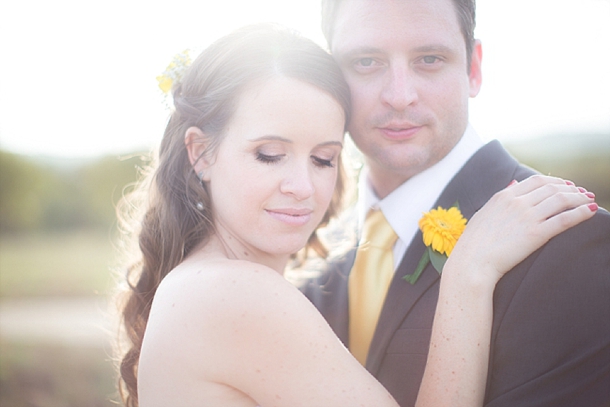
Roses are red, violets are blue, and sunflowers… well, sunflowers are the colour of happiness. They always remind me of my days at university, when us girls would often buy a single sunflower stem for a friend, or just to make our own day. They also remind me of the fields of sunflowers I’ve seen from the window of a train rolling through the Tuscan countryside. Such happy memories! Like proteas, I love how a little goes a long way (even a single bloom makes a statement), and of course their relentlessly cheerful bright yellow. It goes perfectly with the gorgeous aqua/mint chosen by Carin and Darren for their rustic chic wedding with a chilled outdoor reception by a gorgeous river landscape, and photographed beautifully by Genevieve Fundaro.Read More
Hello lovelies, how has your Monday been so far? A couple of months ago, to highlight our new Summer Rain invitation line in collaboration with The Invitation Gallery, I put together some colour boards. It was such a popular post, that I thought I would do it again today for another colour combo that had you all pinning and repinning when it appeared in our Spring Pastels inspiration board a few months back: aqua, lavender and pink. Here’s the original board…
I personally think the combination is perfect for someone who wants something girly but sophisticated – it makes me think of Laduree and rose gardens and pretty crockery, and the three colours balance each other out beautifully. So here we go… be inspired!
This afternoon I’m sharing some styled shoot inspiration, courtesy of Joanne Markland and The Mosaic Wedding Company, with a team of talented colleagues from the Nuptian Network of Associated Wedding Specialists. I love seeing industry peeps pulling together, and it’s been a real pleasure to see more styled shoots coming out of South Africa this last season – they’re such a great way to generate ideas and beautiful, inspiring, editorial imagery! This look is particularly do-able, and is the perfect look for a bride who’s having a laid back beach wedding but still wants a classic, romantic look. Simple, lush single blooms combine with natural textures like shells and white stones, with a touch of aqua blue glass from vintage bottles. There’s also a touch of fun with stripey blue straws, cute little cupcakes and the general palette of pink and aqua (which you can amp up or down depending on where on the fun/classic scale you prefer to lie). Add a swishy dress, and you’re set!Read More
Hidey ho, neighbours. How was your weekend? Mine has been absolutely chokka with work, and a separate project I have on this November which has really been taking me back in time a bit to a year I spent teaching English in Milan… really wishing I could just jump on a plane and spend some time in my second favourite country again! Anyway, we’re transporting ourselves somewhere else completely today, to tropical Colombia, where lucky reader Clara will be getting married at a restaurant venue. She’s chosen mint/aqua, coral, gold, ivory and white, and I have to say, I don’t think she could have picked a more perfect palette. It’s just the right mix of tropical, modern and romantic. My first find was the stationery set below, which I am completely in love with, and which I think completely gets across the location and the colour scheme. I also love the idea of adding in some fun tropical touches, like coral bands on the napkins and this cute enamel statement octopus ring – maybe a fun accessory for the bridesmaids, in their coral sundresses. Clara also likes shabby chic and lace, and while it’s not always easy to mix this with tropical, I’d do it using pretty tea glasses with coral roses, a fringe garland (why not include lace in this?) and a ruffly dress. The flowers are also a lovely mix between classic and tropical, and I love the bold use of a flash of gold. For the tables, I’d keep things simple – maybe using a nice print (chevron or stripes always work well) in the mint or aqua shade, with gold cutlery and glassware (or just keeping to simple white tables with beautiful stationery accents at each setting for a more sober look). Clara also asked about using flowers for the church and the restaurant and I think she has a few options, depending on the size of the party. If it’s intimate, I’d use smaller arrangements in the church placed at different heights, and then re-use these along the table (even bridesmaids’ bouquets can be placed in vases and double up as reception flowers). Or, if you’re going for big statement pieces in the church, place these standing or on stands around the reception and keep table flowers more simple. Finally, you could keep things very simple in the church – maybe forsaking flowers completely and using lots of candles, for example, and save the flowers for the reception. There are no hard and fast rules – do whatever your budget and wedding size allow. Hope you like your board, Clara, and good luck with the rest of your planning!
Good morning, friends! I hope you had a great weekend, and for those of you in SA, I know you will have been celebrating the official start of spring. I’ll try to ignore the fact that it means the end of summer for me here in the UK, and concentrate on a palette that is just perfect for a romantic spring wedding. It’s been a while since I played with lavender, and here I’ve paired it with one of last year’s hottest couples: aqua and rose. Don’t they make a lovely threesome? The purple really adds depth, and I love the little touch of vintage here as well. I’m imagining this in a garden, or at a beautiful farm, with clean white standing out against the soft colours. Dreamy.
My goodness am I excited to share this little beauty with you! I spied with my little eye, something beginning with coral and aqua on the Wedding Concepts blog last year when this shoot, which was styled and co-ordinated by the WC team, was featured in Wedding Inspirations magazine. That single pincushion protea place setting really stuck in my mind, and I was so thrilled to get hold of a copy of the magazine and devour every gorgeous pic by one of my photography faves, Annemari Ruthven. So you can imagine I was even happier when the lovely Hannes of Wedding Concepts asked if I’d like to feature it right here on SBB. Um, yes please, Hannes! The thing with styled shoots (and it’s a reason some blogs don’t always feature them) is that it’s unlikely you can replicate the whole thing on the grand scale of a wedding, unless you’re getting set to be a Real Housewife of Constantia maybe. The art of it all is to be inspired, by the mood of the shoot perhaps, by the colours (although don’t forget you can translate a look you like to a whole new palette), or by a single detail or set of details. And that’s what’s so great about this one, because it is just teeming with original and inspiring ideas. First, the colour scheme – we’ve seen it before, and both coral and aqua are huge colours right now. But this shoot shows you how to be bold AND classy in the way that colour is used. Natural textures like the pincushions and coral itself, set against the clean lines of milk glass and graphic stationery are the way to go. The table base is neutral, but through ribbons, flowers and lovely homeware items, the palette comes through. And that’s not where it ends. I love unexpected touches: the bride’s boho styling, the macaroon lollipops, the Bloody Mary bar, or DIY details like the ribbon garland or the paint dipped glass vases. It’s awesome, and I hope you enjoy poring over it just as much as I have!Read More
You know what, I’m just going to say this (even though I know one day I may totally regret it). I love involved grooms. Yes, I know it’s tempting to be all “You know what honey, I’ll just organise everything because you don’t care about what colour flowers we go for, do you? You just pay.” In fact, I know this works for a lot of grooms, as well as brides, who already feel like they need to please their moms and moms-in-law and a variable army of aunts, uncles, friends and suppliers who have big fat opinions on your big fat wedding that you simply must take on board. I used to think the best system was for the groom to just have the power of veto. But writing this blog, I’ve been surprised and delighted at how keen some of the grooms are. (Keen as sleen, as my friend Abigail would say.) Admittedly, it’s often the most creative grooms who get most involved, and today’s is one of them. He kicked things off with one of the most creative, handmade, and truly South African two-part proposals I’ve ever seen, and then he and his talented bride designed and made everything for their Simon’s Town beach wedding. And you guys, it is beautiful. So heartfelt, and with such attention to detail – my best kind of wedding basically. Plus, Lizelle Lotter has absolutely triumphed with these photos, so light and airy and romantic that I could look at them all day. So grabba cuppa, and prepare to swoon.Read More
Happy Monday, lovelies! I have so much goodness coming your way this week, it’s going to be like awesome real wedding palooza. But first, I have a very special inspiration board. This one was created especially for one of our readers, who wrote to me for some help a couple of weeks ago. She wanted a pretty, romantic look for her wedding at a beachside venue, and she wanted lots of white and aqua for her bridesmaids, but she wasn’t sure if she should introduce any other colours. Although aqua and white on their own are lovely, I always think the addition of another colour adds more dimension and gives you more options when you’re sorting out your details. There’s so much that goes with aqua – coral, lemon yellow, pretty taupe neutrals, for example – but the couple’s favourite was a mixture of aqua with rosy pink tones, inspired by the gorgeous image top left. So here’s the rest of what I came up with – light, clean and very romantic!
The key to a look like this is to base everything on a white on white palette, so that you don’t overuse the bright pink and aqua shades – you can also bring in a bit of grey or silver to help. Chantel wondered if a grey or silver damask may work for the tablecloths, and it would, but I think only if it was very subtle (as lovely as damask is, it can really dominate when used in black and white, for example). I’d suggest runners or square overlays as an alternative, and for this palette you could use pretty Cath Kidston-style prints like the pattern seen below from photographer Christine Meintjes’ gorgeous aqua and pink wedding. To bring in the aqua on the tables, I love the idea of using milk glass (or, if not actual milk glass, then glass containers spraypainted white and differing shades of aqua as in the original picture). So pretty! I also added in some beachy touches with shells and starfish, or you could get hold of some pretty white urchin shells or similar, just for a little bit of beach appeal (starfish may make a lovely motif for a romantic beachside wedding). Another place to bring aqua in is in the bride’s shoes (love these ones!) – another pretty little pop of colour alongside the bridesmaids’ dresses, without going overboard. Keep everything soft, especially the flowers (thinking peonies, roses, carnations – maybe with a few anemones for extra visual interest). I also think the ombre trend I spoke about last week works beautifully here – in invitations that have a beachy, washed out look, in pretty cake slices, and in pink flowers that graduate from deep pink to pale pink. For a final, beachy fun touch, have an ice cream bar where guests can create their own cones or sundaes at cocktail hour (or late at night). Or why not try the absolute latest trend and have classy jelly shots instead?
When you think ‘Spring’, what do you think of? A host of golden daffodils? Too right, Will Wordsworth. Daffodils are just about the most Springey flower I know, with their fresh yellow colour and buttery soft petals. I heart them big time. And I know Easter’s over, but when I started putting this yellow and aqua inspiration board together this morning, those symbols of happiness and new life kept sneaking in there. I think this would make a gorgeous theme for a Spring wedding in South African September or an Easter wedding in April, with just the prettiest flowers on the block. Hope it gives you a smile this morning if you’re back at work (I’m not! Woo!) and that whatever you got up to this long weekend you had a lovely one! :)