This month has been all about bright colours (and we’ll actually be carrying on with this through the end of the week) – it’s been the perfect way for me personally to welcome in summer! And since it’s all about the colour, I just had to go through our archives and pull together 10 palettes that use bright shades of orange, yellow, coral, blue, green and pink to show you just how gorgeous colour can be! Every one of these makes me feel super happy, and for me that’s the best reason to use bright hues on your big day – they reflect the sheer joy of the occasion and get everyone in a celebratory mood! So… which is your fave? (Links in bold denote affiliate links. SouthBound Bride may make a commission if a sale is made.)
Tag: bright colours
Coral and Aqua Styled Shoot
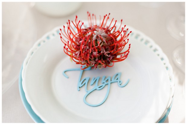
My goodness am I excited to share this little beauty with you! I spied with my little eye, something beginning with coral and aqua on the Wedding Concepts blog last year when this shoot, which was styled and co-ordinated by the WC team, was featured in Wedding Inspirations magazine. That single pincushion protea place setting really stuck in my mind, and I was so thrilled to get hold of a copy of the magazine and devour every gorgeous pic by one of my photography faves, Annemari Ruthven. So you can imagine I was even happier when the lovely Hannes of Wedding Concepts asked if I’d like to feature it right here on SBB. Um, yes please, Hannes! The thing with styled shoots (and it’s a reason some blogs don’t always feature them) is that it’s unlikely you can replicate the whole thing on the grand scale of a wedding, unless you’re getting set to be a Real Housewife of Constantia maybe. The art of it all is to be inspired, by the mood of the shoot perhaps, by the colours (although don’t forget you can translate a look you like to a whole new palette), or by a single detail or set of details. And that’s what’s so great about this one, because it is just teeming with original and inspiring ideas. First, the colour scheme – we’ve seen it before, and both coral and aqua are huge colours right now. But this shoot shows you how to be bold AND classy in the way that colour is used. Natural textures like the pincushions and coral itself, set against the clean lines of milk glass and graphic stationery are the way to go. The table base is neutral, but through ribbons, flowers and lovely homeware items, the palette comes through. And that’s not where it ends. I love unexpected touches: the bride’s boho styling, the macaroon lollipops, the Bloody Mary bar, or DIY details like the ribbon garland or the paint dipped glass vases. It’s awesome, and I hope you enjoy poring over it just as much as I have!Read More


