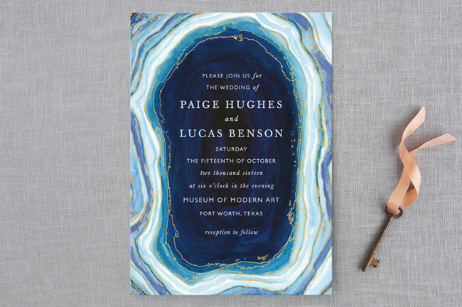
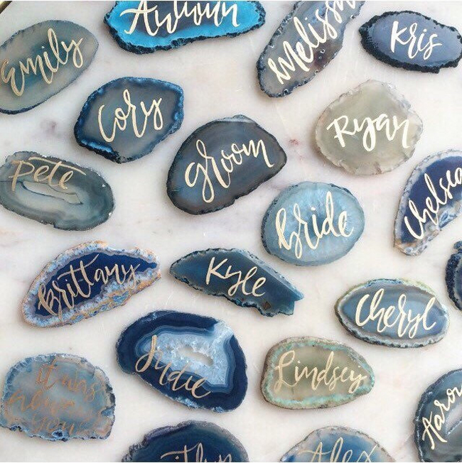
I’ve had so much fun creating blue inspiration boards this month – it really has been one of my favourite themes, and it’s reminded me how much potential there is when using blue as one of your colours. Or rather, blues, because there are so many shades and each one has something special about it. So I definitely had to do a board using blue ombre, and when I connected that with blue agate and its degrees of blue, I knew it was the perfect basis for a beautiful wedding design! Pretty, modern and elegant. (Note: This is not a sponsored post but contains affiliate links)
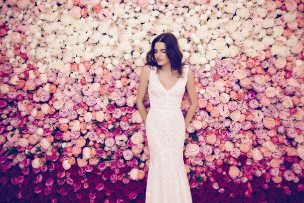
You guys, I think I have a problem. Call it FOMO, or fear of commitment, or just plain wedding dress addiction, but at the moment I feel like I have a new favourite bridal designer every week. But how can I help myself, when the most GORGEOUS gowns keep crossing my desk? And if ever a collection were worthy of obsession it’s today’s, from Hungarian designer Daalarna. The lookbook – set against a wall of bright blooms – is spot on (as is the name of the Flower Collection), because each of the dresses captures the beauty of a garden in a different way. For some, it’s through prints (oh, those prints! My fave being the one that combines ombre with floral), for some it’s through blooms of lace applique, and for others it’s with petal-soft layers of tulle. Chief designer, Anita Benes, was inspired by French impressionist Monet, and his harmonious combintion of natural elements of sky, sun, water and flowers. Like I say, GORGEOUS!Read More
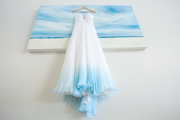
Last year I was blown away when I featured this beach wedding, which included the gorgeous ombréd Rosenworth dress pictured above (you SouthBound Brides are such trendsetters!). Again a few months ago, I featured a stunning dip-dyed wedding dress as part of this photoshoot, and it’s since become one of our most pinned images. Clearly, the ombré wedding dress is having its day, and having done a roundup of these breathtaking beauties, I am an even bigger fan than before. It’s just the perfect way to add colour to your look while still retaining the elegant white wedding dress at the top (and in many of your photos) – a stylish compromise between classic and statement looks. Have a look at these pics and tell me you’re not a convert! Links in bold denote affiliate links. The cost to you remains the same, but SBB may receive a commission for any sales made.
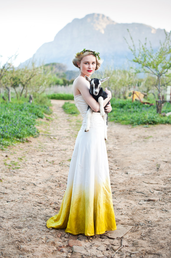
Happy Friday lovelies! I have some super sunny, summery inspiration to share with you today, an African take on sunshine yellow with (eep!) a dip-dyed Didi Couture gown. Wow. I adore everything about the styling of this shoot by Simone of Yellow Papaya – the use of geometrical and ombre elements, the relaxed farmyard vibe and the inclusion of shweshwe (which we KNOW I love!). It all makes for a wedding design that is familiar but unusual, and pretty without being overpoweringly girly. In short, super inspiring! Thanks to the awesome team behind this shoot for sharing it with us today, including fab photographer Yolande Snyders and video by The Wedding Revelation.Read More
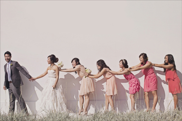
We’re heading towards the end of our series on the top bridesmaid looks for 2013, and I must say, I have loved pulling them together! I honestly don’t know how you all are choosing which one to go with, because I love them all. And today’s is no exception – as you may have figured out by now, I’m a huge fan of ombre, the French term for graduated colour – see more of this wedding look here. It also happens to work perfectly with the watercolour trend that’s making everything so pretty right now. There are lots of ways to bring ombre into your wedding, but one of my favourites is through bridesmaid dresses – it’s the perfect evolution of the mismatched look. But what IS the difference between ombre and mismatched bridesmaids? Well, the key is really in the colours, of course. With mismatched, you could pick a colour (green, for example) and let your girls buy whatever dresses they liked, as long as they’re blue. With ombre, you’ll need to be a bit more OCD about it, picking an exact shade along the same colour spectrum for each bridesmaid, starting at an intense colour and ending at a light one, spaced out according to the number of BMs you have. Sound complicated? Well, it can be – one way to make it a bit easier is to have dresses made (the same or in different styles) so you have a bit more control. Take paint samples with you when you go shopping for material or dresses – each will usually show you an ombre colour family, so they’re the perfect reference. But even if you go high street, it’s not as difficult as you might imagine, and to show you, I’ve put together three ombre looks from current high street finds. My favourite is the peach ombre look – it just works so perfectly!
Happy Monday, lovelies! I have so much goodness coming your way this week, it’s going to be like awesome real wedding palooza. But first, I have a very special inspiration board. This one was created especially for one of our readers, who wrote to me for some help a couple of weeks ago. She wanted a pretty, romantic look for her wedding at a beachside venue, and she wanted lots of white and aqua for her bridesmaids, but she wasn’t sure if she should introduce any other colours. Although aqua and white on their own are lovely, I always think the addition of another colour adds more dimension and gives you more options when you’re sorting out your details. There’s so much that goes with aqua – coral, lemon yellow, pretty taupe neutrals, for example – but the couple’s favourite was a mixture of aqua with rosy pink tones, inspired by the gorgeous image top left. So here’s the rest of what I came up with – light, clean and very romantic!
The key to a look like this is to base everything on a white on white palette, so that you don’t overuse the bright pink and aqua shades – you can also bring in a bit of grey or silver to help. Chantel wondered if a grey or silver damask may work for the tablecloths, and it would, but I think only if it was very subtle (as lovely as damask is, it can really dominate when used in black and white, for example). I’d suggest runners or square overlays as an alternative, and for this palette you could use pretty Cath Kidston-style prints like the pattern seen below from photographer Christine Meintjes’ gorgeous aqua and pink wedding. To bring in the aqua on the tables, I love the idea of using milk glass (or, if not actual milk glass, then glass containers spraypainted white and differing shades of aqua as in the original picture). So pretty! I also added in some beachy touches with shells and starfish, or you could get hold of some pretty white urchin shells or similar, just for a little bit of beach appeal (starfish may make a lovely motif for a romantic beachside wedding). Another place to bring aqua in is in the bride’s shoes (love these ones!) – another pretty little pop of colour alongside the bridesmaids’ dresses, without going overboard. Keep everything soft, especially the flowers (thinking peonies, roses, carnations – maybe with a few anemones for extra visual interest). I also think the ombre trend I spoke about last week works beautifully here – in invitations that have a beachy, washed out look, in pretty cake slices, and in pink flowers that graduate from deep pink to pale pink. For a final, beachy fun touch, have an ice cream bar where guests can create their own cones or sundaes at cocktail hour (or late at night). Or why not try the absolute latest trend and have classy jelly shots instead?