This month, we’re inspired by everything winelands (which yes, I am totally taking as an excuse to drink more wine). So I thought it might be fun to create some inspiration boards with a bit of a wine theme to them, in a totally stylish and non-cheesy way of course! Today we’re kicking things off with a rosé-coloured board – I have to say, I am LOVING the way that this peachy-coral-pink shade translates to wedding design. Add in lots of white, soft tulle, a smidgeon of grey, and a shimmer of rose gold, and you have a truly lovely palette that would be beyond perfect for an elegant vineyard wedding, no?
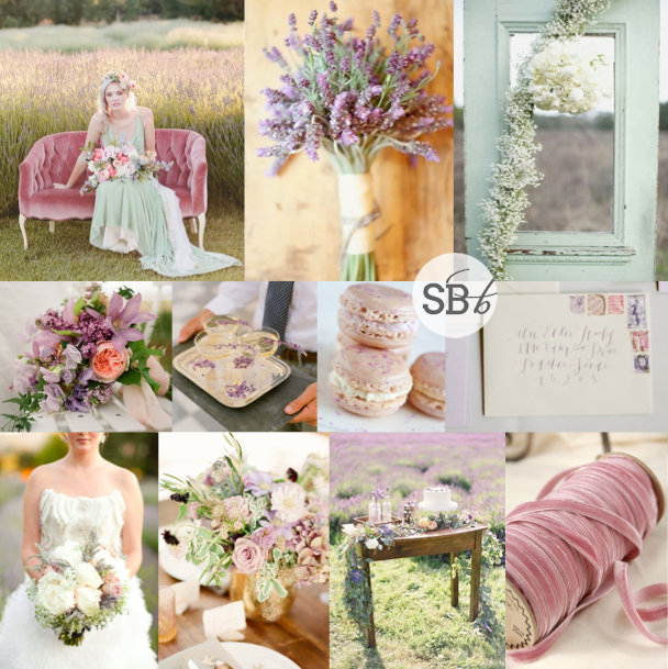
I hate the end of summer. HATE. IT. Luckily in Durban I mostly get to kid myself that it hasn’t happened yet, but this weekend I’ll be in Joburg and that means finally conceding to the chillier weather and getting my jersey on. Which will be the first time in a year and I object :( ANYWAY, so maybe it’s my nostalgia for all things summer but today’s inspiration for me is somewhere in between the warm and cold weather seasons, a muted autumnal palette that’s perfect for a late summer bride. Dusky pink mixes seamlessly with soft minty green, with a touch of lavender to complete the happy trio. Almost worth giving into autumn for, isn’t it? Oh, and PS? Velvet is SO becoming my new favourite texture! Watch this space…
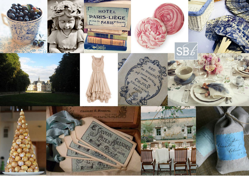
Hey lovelies! Following my feature of the Toile & Rose shoot this morning, I wanted to take another look at the Toile & Rose suite created for us by The Invitation Gallery. Canvas Stationery Boutique did a brilliant job in interpreting the inspiration board that started it all…
I might have mentioned this before, but I LOVE it! And along with the suggestions I gave earlier for recreating the French country look at your own wedding, I’ve put together some pretty toile items to inspire. Now, obviously, you are not going to use EVERYTHING toile in a wedding design – as with all prints, less is definitely more! But there are some really pretty touches, from bridesmaid gifts to fabric (with a South African twist, nogal) and even a to-die-for Claire Pettibone toile de jouy wedding dress. Dying over that one!
Good morning, friends! I hope you had a great weekend, and for those of you in SA, I know you will have been celebrating the official start of spring. I’ll try to ignore the fact that it means the end of summer for me here in the UK, and concentrate on a palette that is just perfect for a romantic spring wedding. It’s been a while since I played with lavender, and here I’ve paired it with one of last year’s hottest couples: aqua and rose. Don’t they make a lovely threesome? The purple really adds depth, and I love the little touch of vintage here as well. I’m imagining this in a garden, or at a beautiful farm, with clean white standing out against the soft colours. Dreamy.
Today’s board is another reader request – my favourite kind! Natasha emailed looking for help with her chosen palette of pewter with a rose or dusty pink. She’d had trouble finding an inspiration board using these colours that embodied the romantic elegance she was looking for from her wine farm wedding, with a touch of formality. I have to say, I LOVE these colours! Pink and grey are very hot right now, but there are many different shades of both colours to work with and pewter is absolutely gorgeous. I think the colours on their own embody the romantic (pink) combined with the more formal and elegant (pewter), which will really help to create the atmosphere Natasha wants.
There are some key foundations to the look I’ve built up here. One is the use of lots of white (since too much pewter could be a little dark), with soft, floaty textures and classic white stationery. A second is the use of calligraphy, which again adds that romantic but formal touch and ties everything else together beautifully. Use it on everything from fun fortune tellers (these make super cute orders of service or place settings) to a table of pretty escort cards to understated place settings (don’t you just love the pink ribbon?). Of course, bringing in the metallics is equally important, which I’ve done here on the wedding dress (I die for this Vera Wang, but a sparkly belt or even brooch detail on a dress would also work beautifully), in the pewter vase and in the bridesmaids’ dresses. Of course, you could just as easily go for soft pink dresses or even a combination of pink and dove grey, but I loved these formal, full-length pewter gowns. Combine with pink bouquets to get both colours across. And speaking of flowers, I adore the single oversized bloom trend and think it would be perfect for this wedding! It adds that little something quirky and different. However, if Natasha chooses to go more traditional, then roses, peonies and anemones are all possibilities, combined with other soft pink and white blooms.
Natasha also asked about favours, as she’s considering white fans for the ladies but is a bit stumped for the boys. One thing to bear in mind is that men tend to forget to take their favours home with them, so in my experience giving them something they can use on the night is ideal. I’ve suggested cigars to play into the elegant theme, but if you don’t want them all disappearing for a little while at some point, then scratchcards, alcohol minis or something edible also work well. Otherwise you could consider bottle openers (in line with the winelands setting), playing cards, or even mini hip flasks.
Hope you like your board, Natasha! And don’t forget, if you would like your own inspiration board, just drop me an email!