Inspiration Board: Forest Fantasy

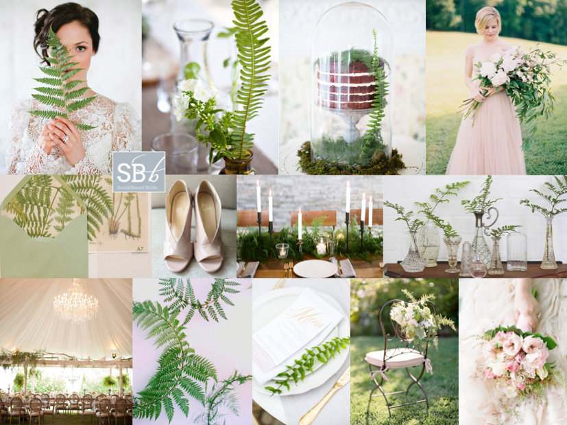
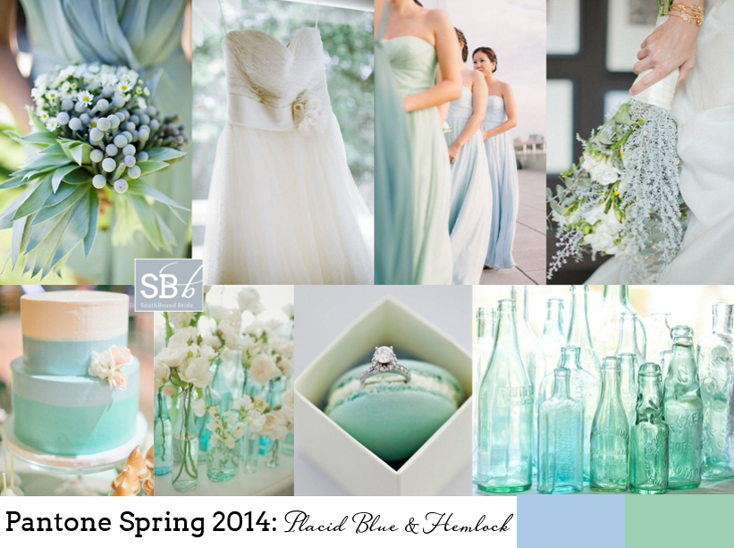
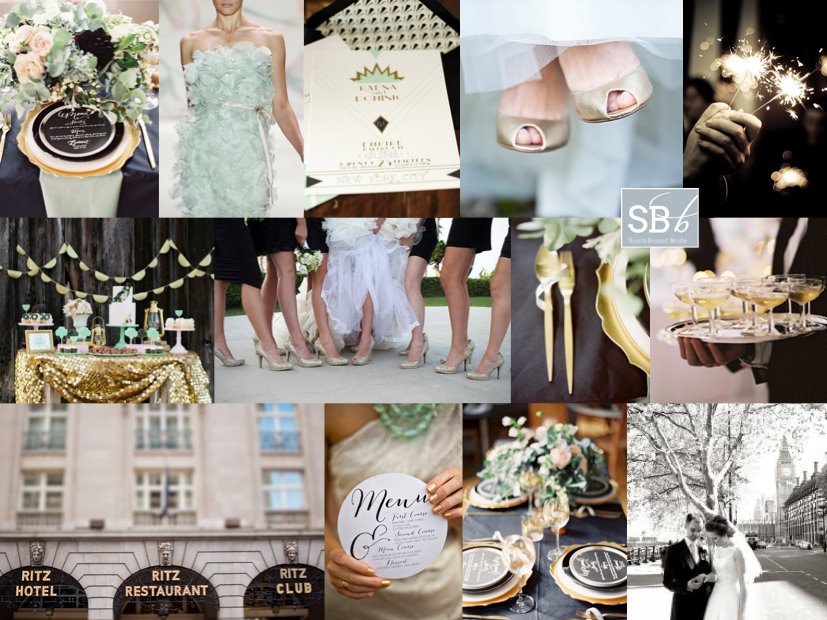
Happy Monday lovelies! It’s another week of inspiration on SouthBound Bride, and wedding planning for you all – how is it going? Are you finding everything you need here? Be sure to let me know if you have any questions or requests for features or ideas. We’re starting the week off, as we always do, with an inspiration board and this one comes straight from the enchanted forest – a theme that is very of-the-moment. We’re lucky in South Africa that we have lots of gorgeous foresty venues, and in today’s board I’ve taken a pretty straightforward (emphasis on the pretty) to the theme, with a palette of emerald and just a hint of soft blush and gold. I love the idea of woodland animals being part of the look, especially spraypainted gold (such a nifty little DIY), and handpainted in the invitation (handpainted designs being another big trend for 2014). It’s very rustic and romantic, but it also somehow has an air of formality and ‘specialness’, doesn’t it? Just perfect for a couple who loves nature.

Colours: Emerald, blush, gold

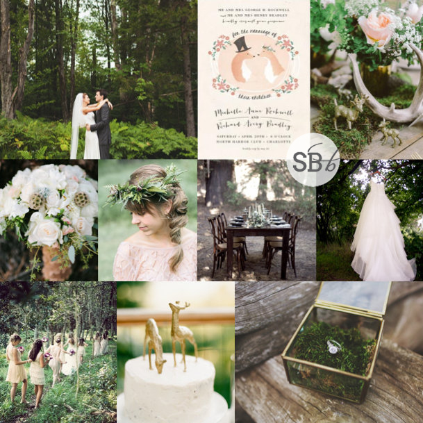
Top row (l-r): Bride & groom {Rebecca Hansen}; invitation {Lori Wemple}; table decor {Meg Van Kampen Studios/White Dress Events}
Row 2: Bouquet {Joe+Kathrina}; bride with floral garland {Brittany Mahood/Lace and Lavender}; forest table {Meghan Kay Sadler/Carly Rae Weddings}; dress in forest {Ampersand Photography}
Row 3: Bridesmaids {Alfred Lor}; cake with deer cake toppers {Mi Amore Foto}; ring in glass box {W & E Photographie/Kelly Dellinger Events}.


Inspiration Board: Botanical Blush

Monday, Monday… Never my favourite day of the week, except for one thing. We always get to start it off with a lovely inspiration board, yay! I absolutely love today’s – botanical has been a gorgeous theme that has come up in wedding design recently, and ferns are one of the florals that have been a big part of that. So I thought, what if you combined these pretty organic elements with just the softest touch of blush, for romance? I have to say, I LOVE the effect – what do you think?

Colours: Fern green, blush pink

Top row (l-r): Bride with fern {Heather Roth Photography/Simply & Forever}; fern table arrangements {Erin Grace Photography/Fieldwork Floral Operation}; cake {Heather Roth Photography/Simply & Forever}; bride in blush dress {Landon Jacob/Parkside Wedding Studio}
Row 2: Fern wedding invitation suite {Bailey and Emma of Antiquaria}; blush patent shoes {Aaron Snow Photography/Gibson Events}; table setting {Leo Patrone/Honey of Thousand Flowers}; ferns in vintage vases {Dear Heart Photographer/Function Flowers}
Row 3: Marquee {Birds of a Feather/Amorology}; fern wreaths {Leo Patrone/Honey of Thousand Flowers}; place setting {Anneli Marinovich Photography/Branco Prata -Sofia Ferreira}; chair {Jose Villa /Laurie Arons Special Events}; bouquet {Katie Stoops Photography/Events in the city}.


Colour Story: Placid Blue & Hemlock

Not long ago, when I put together some inspiration boards for the new Pantone spring colour palette, I predicted that the combo of pastel green and blue would be a favourite, and that this might just be the key colour combination for 2014. Well, we won’t know for a while yet if I was right, but judging on the many Facebook likes and shares and Pinterest pins the board has had since then, I’d say I might have been on to something. So I thought there was no better pairing for a colour story! Here’s the original board:

Full credits here.

Those cool tones just meld together into perfect prettiness, don’t they? When you use two colours that are close to each other on the colour spectrum, another advantage is that you can easily create a sort of ombre effect with your colours, instead of going too mix and match. Mix your pastels with whites and neutrals – again, this gives you quite a lot of flexibility. And with blues and greens not being too girly, it’s a colour combo that your groom is sure to love too.

Read More

Colour Story: Mint & Peach

Afternoon, friends – time for another colour story to follow up on one of your favourite inspiration boards. This colour combo was a real winner when I put it together back in February. There’s something soft and pretty but also quite zingy about the way mint and peach work together. In fact, I liked the combination so much myself that I used it for our EdWed logo. Here’s the original board:

Full credits here.

What’s more, mint and peach are the absolute perfect colour combo for a spring wedding, making them extra lovely at this time of year in South Africa. Add loads of white details – layers of tulle, crisp linens, bundles of soft white blooms, for even more beautiful country style, or keep things sleek and modern for a city celebration. There are so many possibilities.

Read More

Pantone Spring 2014: Placid Blue & Hemlock

Time for some more inspiration! And I must admit, I am excited to see the reaction to this one. In the last while I’ve been noticing a drift toward the pairing of pale green and blue, and even though Dazzling Blue is the lead colour for this collection, the combination of Placid Blue and Hemlock is my tip for the perfect contemporary wedding look and one I think we’ll be seeing quite a bit of in 2014. It’s such a cool, fresh combination – so chilled and so elegant, and I love how it combines with elegant country details effortlessly, including lots of organic greens and blues. Like diving into a cool pool of water at the bottom of a shady garden. Don’t you love it?

Colours: Placid Blue & Hemlock

Top row (l-r): Bridesmaid’s bouquet {Anna Kuperberg}; dress {Scott Piner Photography}; bridesmaids {Judy Pak Photography/Bella Bridesmaids}; bouquet {Scott Andrew Studio/Tracy Taylor Ward Design}
Row 2: Cake; flowers in bottles {Pobke Photography/White Room Events}; macaroon with ring; bottles.


Inspiration Board: Modern Romantic

Another Monday, another inspiration board, and I have to say, I am more than a little in love with this one. I’ve had a lot of requests over the last year for blush and mint weddings, and when I came across this invitation suite from Hey Look I was BLOWN AWAY by how amazing this soft, romantic colour combination works with the modern graphic black and white. With just a touch of gold, of course. It immediately got me thinking of how I often hear brides saying they want something modern but also vintage, and I think maybe this board is a little of what they mean – a contemporary feel without being too stark, and a romantic dreamy backdrop without being too fluffy. The combination sort of reminds me of Audrey Hepburn, who managed to be cutting edge stylish and incredibly classic all at the same time. Beautiful!

PS Just a little reminder for anyone who has been trying to contact me, that I am currently on leave without access to emails. I will get back to you asap!

Colours: Blush, pastel green, graphic black and white with a touch of gold

Top row (l-r): Invitation suite {Michaela Egger/Hey Look}; shoes {Harwell Photography}; striped umbrella
Row 2: Bridesmaids {Alison Mayfield Photography Studio}; boutonnieres {Simply Bloom}; vintage wedding car {Jose Villa}; tassel garland
Row 3: Striped tent; lily bouquet {Jose Villa/Mindy Weiss}; striped tie back {Landon Jacob Productions/Parkside Wedding Studio}; macaroons; cake with chevron.


Inspiration Board: Under the Tuscan Sun

Okay, this is about to be a jealous-making post. Because tomorrow, bright and early, I’ll be jetting off to Bella Toscana for three weeks in some of the most heartbreakingly beautiful scenery on earth. Picture every Tuscan vineyard you’ve ever seen in a film? Yup, exactly like that. I can’t wait! I’ll be working hard under the summer sun, but I’m actually looking forward to it – and to my ‘farmer tan’! ;) As promised, the blog will continue as if nothing has changed, but please be patient if emailing me, because I am officially off the grid. In fact, that’s something I’m almost as excited about, since for the last few years I’ve been constantly connected to some kind of electronic or social media, and it’s time to switch off and just be in the moment. So to celebrate my trip (YAY!), I’ve created a Tuscan-style inspiration board. There were a lot of ways I could have gone with this – understated olive leaf and grey, lavender and green… But one of the things I love about Tuscany is its warmth and abundance, and the fields of sunflowers I saw for the first time from a train window many years ago. These flowers are gorgeous, but they can be overpowering, so I’d just use single blooms for the bridesmaids and then in sporadic arrangements in the reception venue. Include materials such as terracotta and linen, and the straw covered bottles that traditionally hold chianti (called a fiasco, how fun is that?). Fabrics are floaty, and an open sided marquee with long tables is a must (or just set up under the trees). Tuscan olive oil is the best (believe me, I plan to eat lots of it!) and makes the perfect favour. So there you go. And here I go! See you in a month!

Colours: Sunflower yellow, olive green & Tuscan terracotta

Top row (l-r): Dress {Jose Villa Photography/Joy de Vivre Design Boutique}; wire candelabra {Leo Patrone}; floaty bridesmaid dresses {Mint Photography}; tables {Collin Hughes/Shannon Leahy Events}
Row 2: Invitation; place setting with bread {Joy Thigpen/Toast Events and Design/Jose Villa}; stamped envelope {Ruby & Willow}; olive oil favours; sunflower single bloom bouquet {Buffy Dekmar}
Row 3: Bride & groom {Josselyn Peterson/Leonora Moss}; sunflower arrangement {Olivia Griffin Photography/Walton Event Design}; wicker Chianti bottles; Tuscan landscape.


Inspiration Board: Puttin’ on the Ritz

Crunch time you guys! It’s my last week as a Londoner (for a while anyway) and I have about a ZILLION things to do before I go. But we won’t think about that. What we will think about is a bit of a tribute in loveliness to the city. There are a lot of sides to London that could inspire a wedding and many that have inspired me in other ways, but the one I have chosen today is all about glitz and glamour, as symbolised by one of the grand old ladies of the London hotel scene. The Ritz, baby. The palette is mint, gold and classic black and white (with just a teeny tiny hint of blush), the look is chic and romantic and the waiters are definitely serving champagne. So put on your finest frocks and starched collars and come join me! Of course, you don’t have to be in London to make this look work for you – all it requires is a glamorous venue, a cocktail or champagne and canape reception, and a dash of sparkle. Dashing, dahling!

Colours: Mint, gold, black, white & blush

Top row (l-r): Place setting {Ed Osborn Photography/Mimi Nicole Events}; mint dress {Monique Lhuillier}; invitation {umama on Etsy}; gold shoes {Liesl Cheney Photography/b.loved}; fireworks
Row 2: Dessert table in mint and gold {Beau & Arrow Events/Katie Neal Photo}; bridesmaids in LBDs and gold heels {Your Event by Erin/Melissa McClure Photography}; gold cutlery {Ed Osborn Photography/Mimi Nicole Events}; champagne {Belathee Photography}
Row 3: Ritz London {Elly Mac Photos}; bridesmaid with menu {Izzy Hudgins Photography/Simply Savannah Weddings & Events}; table setting {Ed Osborn Photography/Mimi Nicole Events}; bride & groom in London {Steve Poole}.


Inspiration Board: Green Gables

Good morning, brideys! How was your weekend? I’ll admit, I spent most of yesterday dying on the couch after an awesome day with my university girls – gosh, I love them, but when we get together it usually means a day of recovery! Anyway, in between feeling sorry for myself, I put together this pretty board, which was a reader request from Bonnita. I don’t know much more than her palette of peach, green and grey and while this is a combo I’ve done before, I always think that the balance of warm, sweet peach and cool, fresh green is so perfect for a wedding. Clearly Claire Pettibone thinks so too, because her gorgeous 2013 range has peach and mint accents like the back detail shown here. I’m totally in LOVE with the ceiling garlands at the reception pictured below – what a way to bring outside in for a marquee wedding especially, and I also love the handpainted feel of the invitations, with a chic envelope liner setting the tone. And I have to admit, I am coveting that ring, big time! Anyway, Bonnita, hope you like your board!

Colours: Peach, grey, mint

Top row (l-r): Table setting {Joy de Vivre Wedding Design & Coordination/Michael & Anna Costa}; dress {Elizabeth Messina}; reception decor with ceiling garland detail {Liz Banfield}; Claire Pettibone dress {Brian Leahy Photography/Claire Pettibone}
Row 2: Bouquet {Depict Photography}; peach diamond ring; invitation suite {Clark Creative}; green bridesmaid dresses {Elisabeth Millay Photography}
Row 3: Bride & groom {Depict Photography}; petal strewn aisle {Gabriel Harber Photography}; flower girl {Rebecca Arthurs Photography}; rose {Elizabeth Messina}; cake {Joy de Vivre Wedding Design & Coordination/Michael & Anna Costa}.


Inspiration Board: Seafoam Vineyard

Good morning friends, and what a beautiful morning it is in London. The sun is out again, the garden’s freshly mowed (thanks Olly), and there’s still the hint of woodsmoke in the air from using the outdoor stove last night (unfortunately temperatures aren’t quite summery yet). Today’s board is a reader request from Kate, who’s planning a summer wedding at Constantia Uitsig (one of my favourite venues, and somewhere I am dying to stay!). Even though it’s very much a wine country wedding, with a rustic boho vibe and an incredible view of the vineyards and Table Mountain, Kate’s chosen a palette inspired by the sea, with soft blues, greens and cream as her colours. I love this – in fact, it’s the same palette my friend Heidi chose a couple of years ago for a garden-style wedding, and it looked fantastic. Using these cool colours is sure to make everything seem fresh and natural, and it’s also easy to warm them up with tiny touches of peach or pink. Kate had some really lovely ideas that she’ll be including, and hopefully I’ve added a few more to the mix with her board. Hope you like it, Kate!

Colours: Pastel blue, green and cream

Top row (l-r): Boho bride {Rylee Hitchner/Joy Thigpen}; barrels as tables {Caroline Tran Photographer/Malibu Family Wines}; loose bouquet {Erich McVey}; blue and green glass containers with white flowers
Row 2: Bridesmaids {Judy Pak Photography}; hanging carnations; doily cutlery wraps; reception sign {Braedon Photography}; cake {Abi Q Photography/Sugar & Fluff}
Row 3: Constantia Uitsig; cork escort cards {Braedon Photography}; hydrangea bouquet {Scott Piner}; dress {Scott Piner}; groomsmen {Jenna Walker Photographers}