Inspiration Board: Lemon & Peach Sorbet

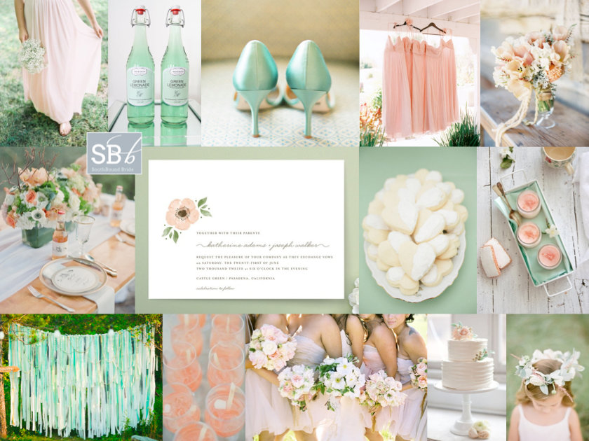
Time for some proper gorgeousness my friends. Peach has been beautiful in many ways this year, but today it is especially beautiful in the company of a soft lemony pastel yellow. It’s sweet and delicious, like a cup of cool sorbet on a summer afternoon. How amazing are the rananculus bouquets? Not to mention a bit of portrait lace back perfection on the bride. When you choose a colour scheme like this one, you don’t need to go overboard – choose a light, bright, white venue and fill it with pastel and gently ombre details and a bit of milk glass (real or imitation), and then just let the colours and the season speak for themselves. Awesomesauce.

Colours: Peach and lemon

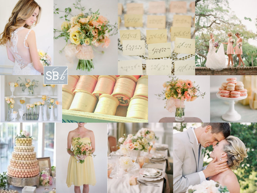
Top row (l-r): Bride in Claire Pettibone dress {Annabella Charles/Everbloom Designs}; bouquet {Elizabeth Messina/Flowerwild}; ombre place cards; bride and bridesmaids {Eric Kelly Photography}
Row 2: Flowers in milk glass {Shipra Panosian Photography/Emily Grace Design}; threads; centrepiece {Elizabeth Messina/Flowerwild}; macaroons {KT Merry/Aisle Candy}
Row 3: Ombre ball cake {Emmaline Bride}; bridesmaid {Elizabeth Messina/Flowerwild}; table setting {KT Merry/Aisle Candy}; couple {source unknown}


Inspiration Board: Teal with a Kiss

Good morning my lovely friends! This is such a special week for me, I’m so excited for it to start! Because my awesome friends Abs and Phil are in town, together with their three sons, all of them my godsons. I just adore these little guys, but because they live in Australia I haven’t seen them for almost five years (apart from on Skype, not the same). So I am beyond thrilled at the idea of spending some time with them – hopefully it won’t affect the blog schedule, but if I go quiet, you’ll know why. Sometimes, you just have to let life get in the way of work ;) ANYWAY, for today, we’re getting started with another beautiful inspiration board, with a colour combo that I have a feeling will be very popular. Teal and pink are just such a pretty pair, but when you add that little gold kiss… well. Heavenly!

Colours: Teal, rose & gold

Top row (l-r): Place setting {Lisa Dolan Photography/Lauren Field Design}; bridesmaids {Brandon Chesbro/CJ’s Off the Square}; gold champagne bottles {Clary Pfeiffer Photography/Bride’s Vision}; stationery suite {Cheree Berry Paper}
Row 2: Cracker {Jennifer O‘Donnell Photography/La Fete Event Design}; glitter blue confetti; breakout lounge area {Frenzel Photographers/Joyful Weddings and Events}
Row 3: Bride; gold shoes {Ever Whim Photographs}; gold cake {Metro Custom Cakes}; table setting {Lisa Dolan Photography/Lauren Field Design}; balloon.


Inspiration Board: Love Hearts

Pastel lovers, get ready, because today is your lucky day. I’ve really liked the ice cream pastels that have merrily floated their way into weddings in the last year or two – so pretty! Especially with mismatched pastel bridesmaids. This is a look that many brides have combined with a vintage (and sometimes rustic) look – baby’s breath bouquets, vintage books tied with lace, proteas, you know the drill. So today I wanted to reinvent the colour palette for modern romantic brides and grooms. A bit of a geometric detailing, a tiny touch of sparkle, and here you go. I think I have a new style crush :)

Colours: Mixed ice cream pastels

Top row (l-r): Love hearts; stationery set {Every Last Detail/Justin DeMutiis Photography}; wedding dress; ruffle ombre cake {Veronique Photography/Just Jack}
Row 2: Bouquet {Aaron Delesie/Kelly Oshiro Design}; place setting {Amelia Lyon/Amorology Weddings}; geometric place name holder {Indie Wed/Amanda Megan Miller Photography}; bridesmaids in pastels
Row 3: Tassel & geometric escort card display {Amelia Lyon/Amorology Weddings}; table with hanging geometric lamps {Indie Wed/Amanda Megan Miller Photography}; outdoor ceremony {Abigail K./Jade Customised Events}


Colour Story: Mint & Peach

Afternoon, friends – time for another colour story to follow up on one of your favourite inspiration boards. This colour combo was a real winner when I put it together back in February. There’s something soft and pretty but also quite zingy about the way mint and peach work together. In fact, I liked the combination so much myself that I used it for our EdWed logo. Here’s the original board:

Full credits here.

What’s more, mint and peach are the absolute perfect colour combo for a spring wedding, making them extra lovely at this time of year in South Africa. Add loads of white details – layers of tulle, crisp linens, bundles of soft white blooms, for even more beautiful country style, or keep things sleek and modern for a city celebration. There are so many possibilities.

Read More

Inspiration Board: Huckleberry Blues

Good morning my lovelies! Hope you had a brilliant weekend! Today’s board is all about a calm, serene, cool blue and a fizzy pop of vibrant red. I must say, I love this idea. Baby blue and bright red have been a popular combination for a while, but they’re usually associated with 50s diner style weddings, or Cath Kidston chintzes. I like the idea of it for a rustic farm or vineyard wedding, with beautiful blue tables and bushels of white flowers, and then every now and again, a powerful punch of red. After all, there’s something about red, isn’t there? A hint of red heels peeping out from under a lace dress, a bright red getaway car, or a scarlet bouquet in a bridesmaid’s arms. It’s sassy, and sassy is good. What do you think?

Colours: Baby blue, white and red

Top row (l-r): Barn setting {Andi Mans Photography & Design/Blush by Brandee Gaar}; bridesmaid with red bouquet {Elizabeth Messina/Elizabeth Messina}; blue and white meringues {Jennifer Hejna Photography}; wedding dress {Jose Villa}
Row 2: Raspberries; cutlery {Alea Lovely}; bouquet {Ashley Slater Photography/Spring Sweet}; red shoes {Elizabeth Messina}; blue flowers
Row 3: Bride & groom {Laura Murray Photography/Love This Day Events}; red getaway car {Jon Duenas Photography}; place setting {Millie Holloman Photography/Salt Harbor Designs}; blue invitation {Jose Villa /Linea Carta}


Pantone Spring 2014: Placid Blue & Hemlock

Time for some more inspiration! And I must admit, I am excited to see the reaction to this one. In the last while I’ve been noticing a drift toward the pairing of pale green and blue, and even though Dazzling Blue is the lead colour for this collection, the combination of Placid Blue and Hemlock is my tip for the perfect contemporary wedding look and one I think we’ll be seeing quite a bit of in 2014. It’s such a cool, fresh combination – so chilled and so elegant, and I love how it combines with elegant country details effortlessly, including lots of organic greens and blues. Like diving into a cool pool of water at the bottom of a shady garden. Don’t you love it?

Colours: Placid Blue & Hemlock

Top row (l-r): Bridesmaid’s bouquet {Anna Kuperberg}; dress {Scott Piner Photography}; bridesmaids {Judy Pak Photography/Bella Bridesmaids}; bouquet {Scott Andrew Studio/Tracy Taylor Ward Design}
Row 2: Cake; flowers in bottles {Pobke Photography/White Room Events}; macaroon with ring; bottles.


Pantone Spring 2014 Colour Report

Happy Wednesday, friends! Today we’re continuing our celebration of the new Pantone colour report with even more fresh inspiration. The great thing about these reports isn’t that anyone expects brides to slavishly follow the new colours or feel like the ones they already have are ‘out’. But it’s a chance to take a fresh look at the colours you’re using, play with new combinations if you haven’t chosen a palette yet. But best of all, it’s an insight into the colours that are coming into homeware and fashion. Why should that matter? Well, as anyone who tried to find coral bridesmaid dresses three years ago will tell you, it does. When Emerald first made an appearance last year, I’d only seen it on celebrities – this year I have been spoilt for emerald images and bridesmaid dress options – even wedding dresses. So picking one or more of these colours might make your life easier if you’re planning a wedding in the next year. So those are the practical aspects. But for today, we’re just going to enjoy the colours. I really love this year’s choices – they’re not far off what we’ve seen before, but a bit more matte or with a bit more depth, or a bit lighter. Pastel blue and green are a big trend for 2014 in my view, and Hemlock and Placid Blue are perfect for that. The neutrals are also lovely – Paloma and Sand – just with a bit of warmth for grey and taupe shades. There are two very pretty purples – Violet Tulip and Radiant Orchid. And then some fabulous brights – Cayenne (LOVE this red), Celosia Orange and a gorgeous pop of Freesia yellow. But the colour that leads the collection is Dazzling Blue, a cousin of the blues that have been showing up for a couple of years now, that has really come of age. Get ready to see a LOT more of this one. This week we’ve already seen two full boards using the Spring 2014 colours, and there’ll be even more later today and Friday, but here I thought I would do some mini boards to inspire – which is your favourite combo?Read More

Pantone Spring 2014: Freesia & Sand

How I do love a new set of colours to play with! And I must say, I think the bold, bright yellow of Pantone’s Spring 2014 collection, ‘Freesia’, may be my fave. It immediately reminded me of the bold yellow stripes that characterise a great place I went to last week in Abu Dhabi, the Monte Carlo Beach Club – everything there is kitted out (tastefully) in preppy yellow and white stripes, and it looks amazing. Paired with ‘Sand’, another of Pantone’s 2014 picks, you have the makings of a perfect beach wedding, or even of a rustic farm look. As always, be sparing with the brights, let them punch out. And punch is certainly what this colour does! Love it.

Colours: Pantone Freesia & Sand

Top row (l-r): Ring {Joielala Photographie}; stripey paper straws; invitation; dessert {Grandes Fetes/Jessica Schilling}
Row 2: Place setting {Krissy Allori Photography + Courtney Jade Photography/Double Take Event Styling}; bridesmaids in yellow stripes; billy buttons {Nineteen Eighty Five/Christine Meintjes}.


Pantone Spring 2014: Placid Blue & Paloma

Morning, lovelies! It’s that time of the year again, when Pantone releases their spring colours. My favourite. I’m still being inspired by last years’ crop, in fact. That was, until I got a whole new ten colours to dream about. I’ll be doing a full roundup on Weds of the whole set of colours, but this week I’ll also be bringing you inspiration boards of my favourite colour combos, starting with today’s. I just love this soft blue, ‘placid blue’, especially when combined with the softest grey, ‘paloma’. So romantic! It’s also a lovely alternative if you’d been considering pastels or a blush and grey mix for your wedding, and I have a feeling we’ll be seeing a lot more of placid especially. Or just consider wearing a blue wedding dress in the shade – so unusual and gorgeous. I’ll be back with another board this afternoon, but meanwhile, what do you think?

Colours: Pantone Placid Blue & Paloma

Top row (l-r): Horseshoe escort cards {paper antler via style me pretty}; blue wedding cake with ruffles {Hey There, Cupcake!}; place setting {Jose Villa/Beth Helmstetter}; blue dress {Alicia Swedenborg}
Row 2: Watercolour invitation suite {Bubblerock/Quelque chose de Bleu}; blue wedding dress; blue and grey tie; paint samples {Lauren Bamford}.


Inspiration Board: Poppy & Violet

Hello lovelies! Another week, another dose of inspiration here on SBB. This week I’m working out of Abu Dhabi while I visit one of my besties, which is so lovely, and on to South Africa on Thurs! Awesomesauce. Anyway, today we’re bringing together two strong colours that together have a lovely warmth. Poppy red is just brilliant – so bright and cheerful – but a red and white wedding can look a bit dated, depending on how you do it. But add in a punch of Pantone’s African Violet and you have the perfect contemporary combo. I love playing these colours out against a romantic rustic backdrop, as they are here – ideal for an autumn wedding, although they could also work in a modern graphic city wedding. What do you think?

Colours: Poppy red & African violet

Top row (l-r): Lilac dress {Elizabeth Messina/Joy Adaeze}; lilacs; red cocktails {Vanilla Bean Blog}; bridesmaids {Elizabeth Messina}
Row 2: Bouquet {Halberg Photographers/Kelly Oshiro Design}; door with heart lock; chocolates; table setting; calligraphy menu {Becca Borge/Sugar(ed) Event Design and Planning}
Row 3: Bride in field of poppies {Easy Dreamer Photography/Romancing the Stone Styling}; lilac and red stationery; poppy bouquet.

Inspiration Board: Poppy & Violet | SouthBound Bride