Inspiration Board: Green Gables

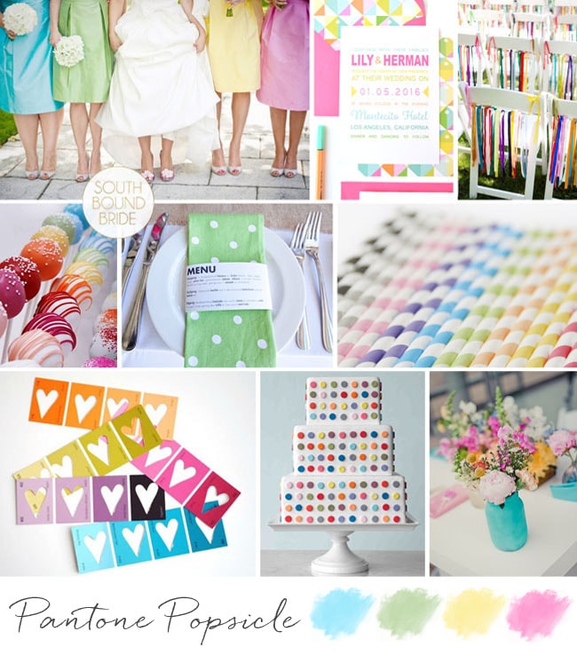
Good morning, brideys! How was your weekend? I’ll admit, I spent most of yesterday dying on the couch after an awesome day with my university girls – gosh, I love them, but when we get together it usually means a day of recovery! Anyway, in between feeling sorry for myself, I put together this pretty board, which was a reader request from Bonnita. I don’t know much more than her palette of peach, green and grey and while this is a combo I’ve done before, I always think that the balance of warm, sweet peach and cool, fresh green is so perfect for a wedding. Clearly Claire Pettibone thinks so too, because her gorgeous 2013 range has peach and mint accents like the back detail shown here. I’m totally in LOVE with the ceiling garlands at the reception pictured below – what a way to bring outside in for a marquee wedding especially, and I also love the handpainted feel of the invitations, with a chic envelope liner setting the tone. And I have to admit, I am coveting that ring, big time! Anyway, Bonnita, hope you like your board!

Colours: Peach, grey, mint

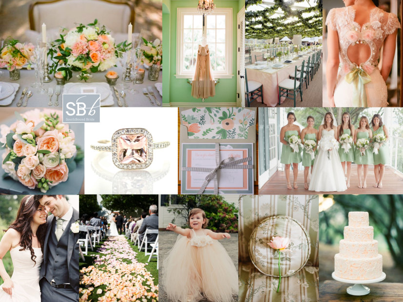
Top row (l-r): Table setting {Joy de Vivre Wedding Design & Coordination/Michael & Anna Costa}; dress {Elizabeth Messina}; reception decor with ceiling garland detail {Liz Banfield}; Claire Pettibone dress {Brian Leahy Photography/Claire Pettibone}
Row 2: Bouquet {Depict Photography}; peach diamond ring; invitation suite {Clark Creative}; green bridesmaid dresses {Elisabeth Millay Photography}
Row 3: Bride & groom {Depict Photography}; petal strewn aisle {Gabriel Harber Photography}; flower girl {Rebecca Arthurs Photography}; rose {Elizabeth Messina}; cake {Joy de Vivre Wedding Design & Coordination/Michael & Anna Costa}.


Inspiration Board: Seafoam Vineyard

Good morning friends, and what a beautiful morning it is in London. The sun is out again, the garden’s freshly mowed (thanks Olly), and there’s still the hint of woodsmoke in the air from using the outdoor stove last night (unfortunately temperatures aren’t quite summery yet). Today’s board is a reader request from Kate, who’s planning a summer wedding at Constantia Uitsig (one of my favourite venues, and somewhere I am dying to stay!). Even though it’s very much a wine country wedding, with a rustic boho vibe and an incredible view of the vineyards and Table Mountain, Kate’s chosen a palette inspired by the sea, with soft blues, greens and cream as her colours. I love this – in fact, it’s the same palette my friend Heidi chose a couple of years ago for a garden-style wedding, and it looked fantastic. Using these cool colours is sure to make everything seem fresh and natural, and it’s also easy to warm them up with tiny touches of peach or pink. Kate had some really lovely ideas that she’ll be including, and hopefully I’ve added a few more to the mix with her board. Hope you like it, Kate!

Colours: Pastel blue, green and cream

Top row (l-r): Boho bride {Rylee Hitchner/Joy Thigpen}; barrels as tables {Caroline Tran Photographer/Malibu Family Wines}; loose bouquet {Erich McVey}; blue and green glass containers with white flowers
Row 2: Bridesmaids {Judy Pak Photography}; hanging carnations; doily cutlery wraps; reception sign {Braedon Photography}; cake {Abi Q Photography/Sugar & Fluff}
Row 3: Constantia Uitsig; cork escort cards {Braedon Photography}; hydrangea bouquet {Scott Piner}; dress {Scott Piner}; groomsmen {Jenna Walker Photographers}


Colour Story: Spring Pastels

Hello lovelies, how has your Monday been so far? A couple of months ago, to highlight our new Summer Rain invitation line in collaboration with The Invitation Gallery, I put together some colour boards. It was such a popular post, that I thought I would do it again today for another colour combo that had you all pinning and repinning when it appeared in our Spring Pastels inspiration board a few months back: aqua, lavender and pink. Here’s the original board…

Full credits here.

I personally think the combination is perfect for someone who wants something girly but sophisticated – it makes me think of Laduree and rose gardens and pretty crockery, and the three colours balance each other out beautifully. So here we go… be inspired!

Read More

Inspiration Board: Copper & Ostrich Egg

Monday means inspiration board time, and today I’ve decided to do one of my own. I wanted to create a look that was truly South African, but at the same time contemporary, elegant and understated. Neutrals were the way to go, and I love the ostrich shell offwhite combined with black and sage, with copper metallics as a trendy little twist. Another current trend that works well here is the fashion for prints, here using the gorgeous Skinny LaMinx range with their gorgeous pincushion proteas (an ideal complement to the white king proteas in the bouquet and table arrangement pictured here). Add neutral bridesmaids dresses, copper foil stamped stationery and some other shiny copper touches, and you have the perfect fusion of classic black and white, down-to-earth South African-ness and fresh 2013 style. So usable – what do you think?

Colours: Black, ecru, sage and copper

Top row (l-r): Bouquet {I Heart Weddings/flower talk}; copper shoes {Anthropologie}; protea under bell jar {Just Jack/Cari Eksteen}; table setting {Skinny laMinx}; marquee setting {Kym Ventola Photography/Some Like It Classic}
Row 2: Neutral bridesmaids {Kym Ventola Photography/Some Like It Classic}; succulent in copper vase {Kym Ventola Photography/Some Like It Classic}; pincushion protea wall art; copper foil stamped invitation {Jolie Jolie}
Row 3: Bride & groom {rylee hitchner/abany bauer}; print napkin {Skinny laMinx}; copper wrapped boutonniere {Wedding Artists Collective/Gloria Wong Design}; hanging copper tins {Dave Lapham/Laura Helm at Ashton Events}; cake on copper cake stand {A Fabulous Fete on Etsy}.


Inspiration Board: Urban Alice

Hello lovelies! I am rushing around backstage, getting the last bits ready for our Editorial Wedding workshop… tomorrow! Eek! Anyway, I had just enough time to put together an inspiration board – and this was such a cool reader request! Kayla wrote to tell me about her summer wedding at The Cheney Place, which is an absolutely stunning venue with face brick walls and an elegantly urban loft sort of vibe. She and her fiance want candles and string lights everywhere, a wedding that is casual, romantic and fun. They also want a bit of an Alice in Wonderland theme going on. I have to say, I absolutely LOVED this whole idea (using a palette of navy, cerulean blue and white, although you could add in a rose or blush shade for extra colour). Candles and hanging lights (love the bulbs!) are so magical, and work beautifully against brick. Keep bridesmaids chic in navy and flowers soft, but with a bit of an unexpected edge like the spiky accents to the bouquet below. Alice is a great theme, but can be completely overdone – you can keep the motif fun and classy with stationery details (love these character card place settings with the original artwork so much!), a few clocks and keys and then some slightly mad touches, like the hanging teacup installation or the teacup glasses (how cute are these?). You just need enough mad hatter to give your guests the idea that this is a fun, slightly avant-garde celebration, and then let them take it from there! Have a great wedding Kayla – can’t wait to see it and hope you like your board!

Colours: Navy, cerulean, white

Top row (l-r): Urban candlelight setting; Alice in Wonderland place card {Carmen and Ingo}; navy bridesmaid dress {Kristin Vining/Weddings in the Bahamas}; blue ruffle cake {Adrienne Page/Tara Guérard Soirée/Val Cakes}
Row 2: Key escort cards; table setting {Carmen and Ingo}; drinks {Liga Photography}; clocks {Braedon Photography/Tricia Fountaine}
Row 3: Table with lights {Krista Mason/Chic Celebrations}; bride with clock {Alyssa Marie Photography}; bouquet {Krista Mason/Chic Celebrations}; Alice in Wonderland place card {Carmen and Ingo}; teacup glasses; hanging teacups.


Save

Inspiration Board: Elgin Spring

I have an extra special inspiration board today, as it’s for my beautiful cousin Caitlin, who’s currently planning her wedding. Caty grew up on an apple, pear and now wine farm in Elgin – one of the most beautiful places ever – and that’s where she and her fiance will be having their late spring wedding this year. It’s going to be gorgeous, and I love Caty’s idea of using a soft, dreamy palette of whites, creams, grey and pale blush pink with lush blooms and some rustic textures that pay tribute to the farm with wine barrels and apple crates. I think when you go for this sort of look, the best thing is to keep it simple but do the basics well – gorgeous flowers are the biggest building block, along with soft hair, flowy bridesmaids’ dresses (in grey, white or blush will work). I’d mix up the bouquets to include a variety of blooms including silver brunia, but also blushing bride proteas (a big floral crush of mine at the moment!). Use rustic shutters (to hold escort cards?), calligraphed signs and printed calligraphy napkin menus, and apple cocktails for after the ceremony (also love these painted white apples as place or escort cards, or just for fun). I’ve also included a little nod to Caty’s rowing talents with an oar guest book (although another sweet idea is to use paddles as signposts). It all adds up to a classic but contemporary look that is super romantic.

Colours: White, cream, blush and grey

Top row (l-r): Bouquet with blushing brides {Florali}; printed calligraphy napkin {Rylee Hitchner Photography/Jessica Sloane Event Styling & Design}; oar guest book {Alea Lovely}; bride and groom {Marta Locklear Photography/Diamond Events}
Row 2: Bridesmaids {Polly Alexandre Photography}; crate with olive leaf details and table number {Punam Bean Photography}; bride and flowergirl {Hristina Piltz}
Row 3: Ceremony with wine barrel entrance {Jose Villa}; wine barrel and shutter escort cards {Laura Gordon Photography/Tyler Flood}; ceremony sign {Jose Villa/Laurie Arons Special Events}; flowers and silver vase {Gia Canali Photography/Delicate Details}.

Rustic Romantic Inspiration Board


Inspiration Board: Botanical Brights

Happy Saturday, lovelies! Here’s our last inspiration board for the week, and while the rest have been reader requests, this one’s just for me :) One of my biggest sources of inspiration is the amazing online magazine Magnolia Rouge, and in the last issue, one of my favourites was a gorgeous bouquet recipe photographed by Annabella Charles. I absolutely loved the mix of cool green, soft pinks and purples and a pop of bright fuschia, as well as the botanical feel of the bouquet and the feature. Botanicals are a big design trend in weddings this year (more on that soon) but while most botanical looks feature muted colours, I was inspired to create a board that incorporated both the delicate botanical look and that beautiful dash of bright colour. I love it – hope you do too!

Colours: Green, purple and fuschia

Top (l-r): Flowers and calligraphed envelopes {Annabella Charles/Haute Horticulture/Kristin Wolter}; bridesmaids {Sarah Hasstedt/Pink Champagne Events}; dress {Eric Kelley Photography/Beehive Events}
Row 2: Pie table {Kellan Studios}; leaf place cards {Annabella Charles/Haute Horticulture/Kristin Wolter}
Row 3: Table setting {Odalys Mendez Photography/Virtu Floral and Event Design/The Funky Shack/Southern Flair}; bouquet {Alea Lovely Photo/The Bridal Tree}; Figs in bowl {Annabella Charles/Haute Horticulture/Kristin Wolter}

Title of Recipe Goes Here


Inspiration Board: Pantone Popsicle

It’s been a colourful day on SBB! Here’s the latest in our week of inspiration boards, and this one was requested by bride-to-be Rita. She and her fiance are getting married in May, and are planning a modern eclectic wedding with a touch of elegance. They want white as the base colour, and then with pops of colour everywhere for their garden ceremony and reception. I personally love this look – even though it’s very colourful, the modern white base keeps it clean and stylish (much like the gorgeous styled shoot we featured earlier today). I love the idea of printed napkins (adding an extra layer of texture), coloured straws, ribbons on the chairs and a multitude of coloured lanterns. Just one word of caution – keep one part of every element plain to make those colours pop and not start looking too chaotic. For example, the bridesmaids below in their rainbow dresses with white bouquets (or change that for crisp white dresses and colourful bouquets), the white band against the coloured napkin, or the painted vases full of colourful blooms on a white runner. And how cute is that cake? Hope you like your board Rita!

Colours: Bright multicolour pastels

Top row (l-r): Bride and bridesmaids {onelove photography}; wedding invitation {Gubba Gumma}; chairs with ribbons {Elizabeth Anne Weddings/Laura Ivanova Photography}
Row 2: Colourful cake pops; polka dot napkin {Yvette Gilbert}; rainbow paper straws {Peach Blossom}
Row 3: Colour chips; colour dot cake {Martha Stewart}; painted mason jars {Jeanine Groenewald/Leipzig}.

Pantone Popsicle Inspiration Board | SouthBound Bride

Inspiration Board: Ocean Lavender

Time for another inspiration board? How are you guys enjoying having a daily one? Okay, there’s no way I could do this every week, but with so many requests coming in, it’s meant catching up a little, which means I get to make more of you happy. Win. Anyway, so today’s request comes all the way from Holland and I absolutely LOVE the colours bride Annet has chosen – lavender and blue. Because they’re complementary, they work perfectly in synch, but they’re also an unusual choice for a beach wedding (how’s this for romance – Annet and her husband are getting married at a castle they have to reach by boat, and then having dinner and dancing at a restaurant on the beach). I love this idea of bringing the country to the sea, and as well as incorporating natural textures like glass, I’d use fresh potted herbs as much as possible in the table centrepieces and lavender itself for the bouquet. The end result is soft and super stylish. Hope you love your board Annet!

Colours: Lavender and dusky blue

Top row (l-r): Bouquet {Lauren Kinsey Fine Art Photography/Lauren Kinsey Fine Art Photography + Shannon Reeves Events + Angela Haley of Hemstitch Vintage Rentals}; bottle {Krista Fox Photography/Fabulous Occasions}; bridesmaids {Images by Berit, Inc./6 Degrees of Celebration}, envelope with white wax seal
Row 2: Braided hairstyle; lavender confetti {Simply Bloom Photography}; tables {Claudia Rose Carter}; flowergirls {Olivia Leigh/Estera Events}
Row 3: Beach glass {Best Photography/Jenn Aquilia Events}; lavender pot {KT Merry/Sara Jean Events}; cake {Best Photography/Jenn Aquilia Events}; message in a bottle {Mike Larson Photographers, Inc./NLC Productions}; couple dancing {Millie Holloman Photography/Salt Harbor Designs}.


Inspiration Board: Bon Voyage

Well, I promised you folks a week of inspiration, and that’s exactly what we’re delivering! After this morning’s colourful wedding, this afternoon we’re concentrating on just the one colour – the only colour this year dahling, Pantone’s 2013 colour of the year, emerald green. Reader Heather wrote to ask for an emerald board for her spring wedding in New Orleans. As it’s a destination, Heather and her fiance plan to incorporate maps and a travel motif, but they want to keep things simple and elegant. So I’ve kept travel details to a minimum, with a map guest book and other subtle touches – a little globe, postcard-style escort card tags, antique map boutonnieres for the guys and super sweet vintagey favour bags. Combined with lace and the deep emerald shade, it creates the sort of vintage feel Heather wanted, and has a nod to travel without feeling themey. Flowers are kept simple white with prominent foliage, as are the boutonnieres, and the bridesmaids wear emerald dresses with emerald shoes for the bride. For the tables, a lace runner is perfectly pretty, with a variety of small arrangements in different vases. It works, doesn’t it? Yay for emerald. Hope you like your board, Heather!

PS Photographers, if you really want to be inspired, come back in an hour when I’ll be giving you a sneak peek of what’s to come on our EdWed shoot! It’s GOOD. :)

Colours: Emerald and ivory

Top row (l-r): Mini globe on books {Blush Bridal Consultation Group/Lauren Brooks Photography}; thistle boutonnieres {Jose Villa/JL Designs}; green shoes {Dally Street Images}; map guest book {Snap Weddings}; bouquet {Anne Robert Photography/Petals & Hedges}
Row 2: Postcard escort tags {Tracie Howe Photography/Blush Celebrations}; bridesmaid dresses; cufflinks {Not on the High Street}; groomsmen {Shannen Natasha Photography}
Row 3: Bride in lace wedding dress {Tracie Howe Photography/Blush Celebrations}; favour bags with vintage aeroplane {Sarah Layne Photography/Your Perfect Bridesmaid}; table setting {Sarah Layne Photography/Your Perfect Bridesmaid}; couple with map {Celeste Duran}.