Inspiration Board: Mint & Peach

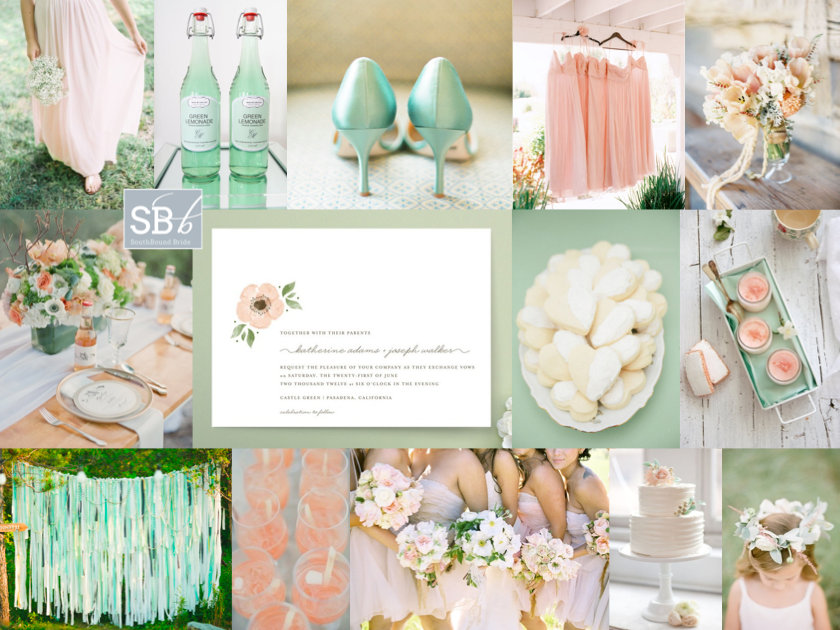
It’s inspiration board day, and I have a little feeling you guys are going to looooove this one. First off, mint and peach are pretty much a combination made in colour palette heaven, and they just happen to be what I think will turn out to be the colours of the year. Peach brings warmth (but gentle, like) and mint brings cool with a hint of sweetness, like a sip of ice-cold lemonade on a sunny day. Reader Tam wrote in to tell me about her wedding using these colours, and she used words like ‘relaxed’, ‘romantic’, ‘elegant’ and ‘less is more’. With beautifully rustic Rockhaven as her summer venue, I immediately pictured a wedding that was soft and flowey (for want of a better word!) – very much Beth Helmsetter/Style Me Pretty/Jose Villa. Flowers are important, and I adore both the bouquet and the table arrangement on this board (notice how apart from the lemonade, the flowers do most of the work on this table – gorgeous cutlery, crockery and other details become a bonus rather than the main event). Bridesmaids wear long, loose dresses in peach, with a garland for the flower girls (who I’d put in simple white cotton dresses and leave barefoot). Guests are served cool cocktails and iced biscuits, before having their photos taken in front of a pretty mint ribbon backdrop in the gardens during cocktail hour. For the stationery, I’d definitely make use of the current trend for hand-painted watercolour – less is definitely more in this stunning suite. The concepts are simple, the execution is perfect, and it all adds up to a shedload of pretty. Hope you like your board, Tam!

Colours: Mint, peach and white

Top row (l-r): Barefoot bridesmaid {Clary Photo}; mint lemonade {Bryllupsglimt}; mint shoes {Lane Dittoe}; peach bridesmaids’ dresses {Leo Patrone Photography}; peach bouquet {Jill La Fleur/Flower Wild}
Row 2: Table setting {Jessica Lorren Organic Photography}; peach watercolour invitation {Minted}; sugar cookies {Paige + Blake Green}; rose biscuits & rose yoghurt {Food & Cook}
Row 3: Mint ribbon backdrop {J.R. Clubb/Ryan Farr}; peach cocktail {onelove photography/Stephanie Grace Designs}; bridesmaids {Joy Thigpen/Jose Villa}; cake {KT Merry/Nine Cakes}; flower girl {KT Merry Photography}.

 

Inspiration Board: Meet Me in Buenos Aires

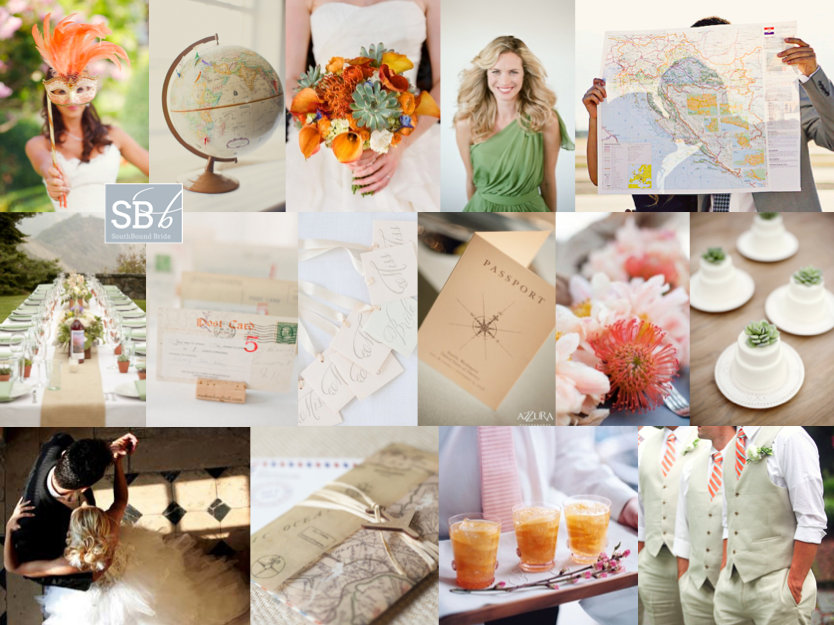
Good morning, lovelies! I hope you had a fantastic weekend. I’m back from Abu Dhabi, feeling chilled out and even a little tanned, and ready for the week ahead. I’m still catching up from my jetsetting, and getting used to being four hours back again. But that aside, travel is just my best thing, and appropriately, today’s inspiration board is all about travel! Today we have another reader request, from German reader Esther. Now how’s this for an international tale of love – Esther and her Swiss fiance met in Buenos Aires (how ironic, when their home countries are so close together!) and they’ve decided to get married in Cape Town, which I obviously think is the best idea ever. Esther loves a bit of old fashioned elegance, and she wants to bring both Brazil and Africa into their design. She adores succulents (and succulent green) and would like to accent this with orange from pincushion proteas as a tribute to South Africa. Love this! I’d work with a neutral white backdrop, with bridesmaids in soft green and bold bouquets (but otherwise keeping the orange fairly soft). I’d also incorporate the elegant vintage with a travel theme, including maps, a globe ‘guest book’ and postcard escort cards. There are some really lovely Argentine traditions Esther can include – first off, the cake pull (where ribbons are baked into the cake, one with a ring attached, and all the single women pull them out in order to find out who will be married next), cocktails (although I’ve borrowed the pictured peach caipirinhas from neighbouring Brazil), a tango first dance and carnival carioca (where, late at night, guests don hats and props and have their own little carnival on the dancefloor – a perfect double use for your photobooth props!). It adds up to a sophisticated personal tribute to the couple’s history, rather than a theme party. Hope you like your board, Esther, and welcome to our beautiful country!

Colours: White, soft green, orange

Top row (l-r): Bride with carnival mask {Marisa Holmes/Wedding Italy}; globe {Rebecca Arthurs Photography}; pincushion and succulent bouquet {Q Weddings/Statue of Design}; green bridesmaid dress {Elizabeth Messina}; couple with map {Courtney Brooke}
Row 2: Table setting {Allyson Magda Photography/Glow Event Design}; postcard escort cards {KT Merry}; cake pulls {Nancy Ray/Kickstand Events/Weddings Etc. }; vintage passport invitation {Azzura Photography}; pincushion proteas {KT Merry/David Fittin/Parrish Designs}; individual cakes with succulents {Christa Elyce Photography/Ellanesque Weddings/Sugary + Chic Boutique}
Row 3: Tango {source unknown}; stationery with map; peach caipirinha {Simon Bevan}; groomsmen with orange ties {Esther Louise Photography}.


Inspiration Board: Emerald Aisle

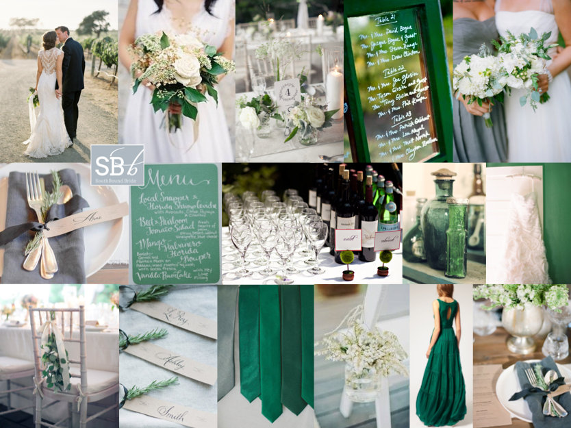
Happy Monday lovelies! As you read this, I’ll be arriving in sunny Abu Dhabi – how exciting! It’s been ages since I travelled anywhere (or saw the sun!) and I can’t wait. So forgive me if I’m not on email/Facebook much this week – although the blog will continue as usual, starting with this lovely inspiration board for a lovely reader who has chosen emerald and grey as her wedding colours. I’m so excited to see you guys embracing the colour of the year! I’ve been seeing everything from emerald and aqua to emerald and gold all over the place this fortnight, but not so many grey pairings. Since I didn’t know anything else about the wedding design, I thought it would be good to show how you don’t always need to use blocks of what is in fact a very strong colour in order to use it. For this palette, you’ll find emerald in some of the stationery, in the frame of a window used for table names, and in the groomsmen’s ties, but all the rest of the emerald comes from more organic sources like glass and foliage. A touch of rosemary on a pretty grey napkin, a bit of greenery at the back of a chair, a beautiful bouquet. Everything else is white and grey, and I think it looks so elegant, don’t you? If you’d like to make a statement, I love the idea of the bride putting on a second, emerald dress later at the reception, but actually I think this is quite a simple look to get right. Although my love for calligraphy is clearly going strong! Hope you like it friends! Will any of you be using 2013’s colour of the year in your palette? (If you’d like more emerald ideas, click here.)

Colours: Emerald & grey

Top row (l-r): Bride and groom {Jose Villa}; bouquet {}; table setting {Isabelle Selby Photography/Exquisite Affairs Productions}; table names on window frame; bride and bridesmaid {Ali Harper Photography/Consultants Unlimited}
Row 2: Place setting with rosemary {Lyndsey Hamilton/Elisabeth Millay}; calligraphy menu; drinks table {Robert and Kathleen Photographers}; green bottles; wedding dress {Kurt Boomer}
Row 3: Chair decoration {Isabelle Selby Photography/Exquisite Affairs Productions}; rosemary name tags {Lyndsey Hamilton/Elisabeth Millay}; green ties {source unknown}; chair with decoration {Samm Blake}; emerald evening gown; place setting {Lyndsey Hamilton/Elisabeth Millay}.


Inspiration Board: Spain Meets South

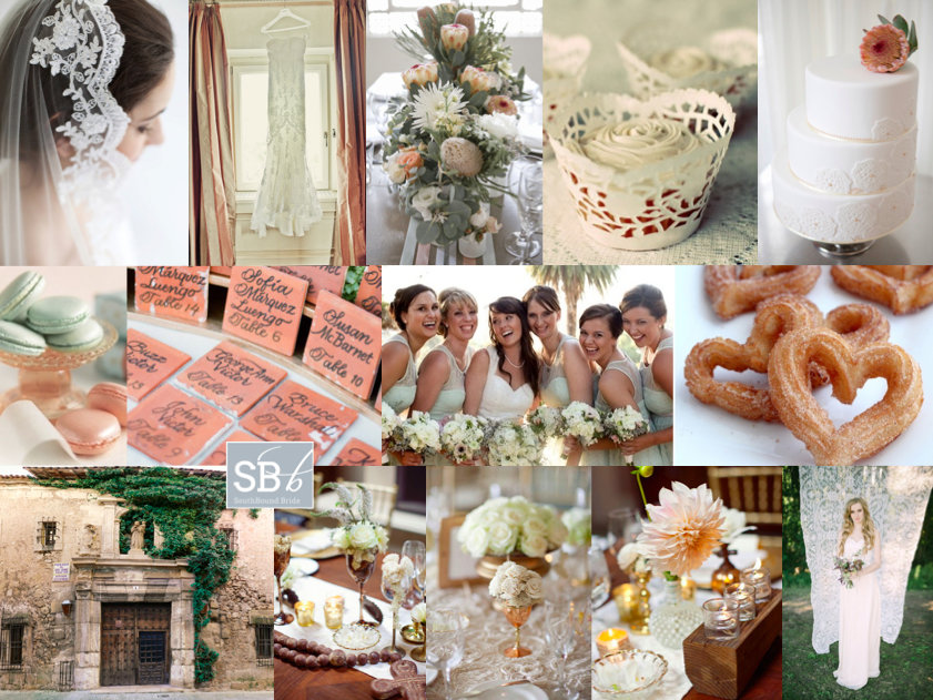
Hello lovelies, I have an extra inspiration board for you today. This one is a request from reader Simone, who’s originally from SA but now lives in Melbourne with her Spanish fiance. So international! The wedding will take place in a beautiful town in central Spain, set on a hilltop with winding streets and castle ruins. What an impossibly romantic location! Being proudly South African, Simone wants to include South African elements, including King Proteas and aloes. Because the venue hadn’t been finalised when she wrote to me, Simone wasn’t sure of much of the design, but she’d picked coral and mint as her colours. I think this is a great choice – not just because they’re on trend, but the soft pink and warm pink will work well in a variety of settings (and, of course, with the proteas). I’d combine them with copper or brass vessels for a lovely Spanish colonial feel on the tables. Another Spanish touch I would make a lot of is lace – this makes a great motif, and doesn’t need to look Victorian vintage. For example, use just a touch in soft mint bridesmaid dresses, in the form of doily cupcake cases and even as a photobooth backdrop! My favourite lace detail is the cake – especially with that protea on top! It’s the perfect Spanish/South African combination. I also thought the tiles as table numbers were a charming touch. Simone is considering serving macaroons (great for the colour) but I love the idea of a late night serving of hot chocolate with churros and koeksusters. In fact, menu is a wonderful way to pay tribute to your home country, just as Princess Charlene did for her Monaco wedding. Another idea from that wedding is to include South African music in your service. Hope you like your board Simone – can’t wait to see your wedding!

Colours: Coral and mint

Top row (l-r): Mantilla; lace dress {Jimena Roquero}; protea centrepiece {Jennifer Sando/White Room Events}; doily cupcake case; cake with protea topper and lace detailing {Jennifer Sando/White Room Events}
Row 2: Macaroons; tile escort cards {KT Merry}; mint lace bridesmaid dresses {Melissa McClure Photography}; churro hearts
Row 3: Spanish doorway; table decor (3 images) {Joielala/Canvas & Canopy Events}; lace photobooth/ceremony backdrop {NGG Studios/Imbue Weddings}.


Inspiration Board: Lovelier Than Lilacs

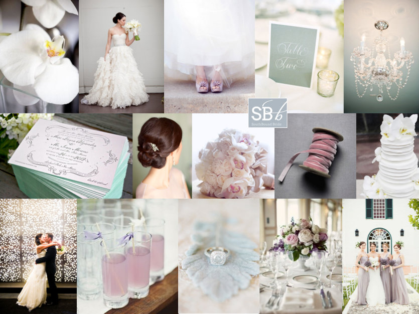
It’s Monday, and Mondays mean one thing here on SBB, and that’s inspiration boards. Yay! So to kick off the week, I have a reader’s request that I’ve been looking forward to getting to. Georgie sent me a request before Christmas for her Johannesburg wedding – she said that with so many themed weddings around, she and her fiance wanted to bring their focus back to what was traditional, classic and elegant. Their venue in Parktown has a gorgeous view of the city, so they’d like that to be central, and will include lots of ambient light in the form of candles and fairy lights. Their palette is clean white with dove grey, lilac and celadon (a green very much like Pantone’s current Greyed Jade). Georgie had just one more request, and that was to include orchids, since they will remind them of India and Singapore – two places that are meaningful to the couple. So that was the brief, and that’s what we’ve got. No themes, no motifs, no gimmicks – just classical elements and a gorgeous set of colours. As with all weddings where white forms a big part of the canvas, texture is important, so I’ve included lots of it – feathery tulle in the bride’s dress, crisp linens on the tables, even a little touch of velvet ribbon, which I really like (especially since this is an autumn wedding). The orchids are there – nice, simple and soft, but I think roses on the table are a classically romantic statement so I’d probably stick to orchids in bouquets and in other special places like on the cake. Chandeliers and a twinkle light curtain add a festive touch, and I’d bring in the colour accents in soft ways – bridesmaid’s dresses, shoes and (my best) invitations with a subtle touch of celadon on the edges. Add a pretty hairpiece, updos for the bridal party, a touch of calligraphy and signature cocktails for while guests enjoy that magnificent view. Et voila. A return to elegance. Hope you like your board, Georgie!

Colours: White, lilac, dove grey & celadon

Top row (l-r): Orchid {Anouschka Rokebrand}; bride {Beth Helmstetter/Samuel Lippke Studios}; pale lilac shoes {SH Weddings/Hanle Productions}; calligraphy table number {Jose Villa}; chandelier {Tea Olive Photography}
Row 2: Invitations with celadon edging {Lucky Luxe Couture Correspondence}; elegant updo {Easton Events/Patricia Lyons Photography}; orchid and rose bouquet; lilac velvet ribbon; cake with white orchids {Jenna Walker Photographers/Creative Weddings}
Row 3: Bride and groom with fairy light curtain {Cory Ryan Photography/CLINK }; lilac cocktail with ribbon tags {Samm Blake}; diamond ring {KT Merry}; table setting {Kate Preftakes Photography}; lilac bridesmaid dresses {Samm Blake}.


Inspiration Board: Carnevale

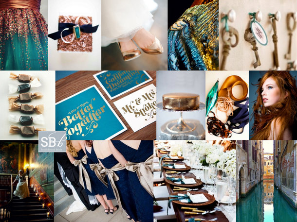
Good morning friends? How were your weekends? I had a really good one, doing more January planning and organising as well as catching up with Louise from b.loved and chatting about our big blog and business plans for 2013 – all very exciting! You’ll also get to kuier with her a bit later this week. But for now, it’s time for our Monday inspiration board. I wanted to start the year with something bold and new, and after telling you that copper was one of the year’s hot colours, I just had to get stuck in. I’ve decided to combine it with both teal and navy, and it’s rich, opulent and exciting – maybe even slightly mysterious. It reminded me a little of Venice (hence the name). I’d just love to see this one come to life!

Colours: Navy, teal and copper

Top row (l-r): Copper and teal dress; glitter giftwrap {Grey Likes Weddings/T&H Photography}; copper shoes {Desiree Dawn Events/Shea Christine}; sparkly top {Fiona Kelly/b.loved Weddings}; keys {Your Las Vegas Wedding Concierge/Chelsea Nicole}
Row 2: Sweets; teal stationery suite {Sean Flanigan/Lilia DeGregory}; copper cake {Missy Photography/Merci New York}; ribbons {Grey Likes Weddings/T&H Photography}; gorgeous redhead bride
Row 3: Opulent bride {Fiona Kelly/b.loved Weddings}; navy bridesmaids; table settings; Venice.


Pantone’s Colour of the Year 2013: Emerald

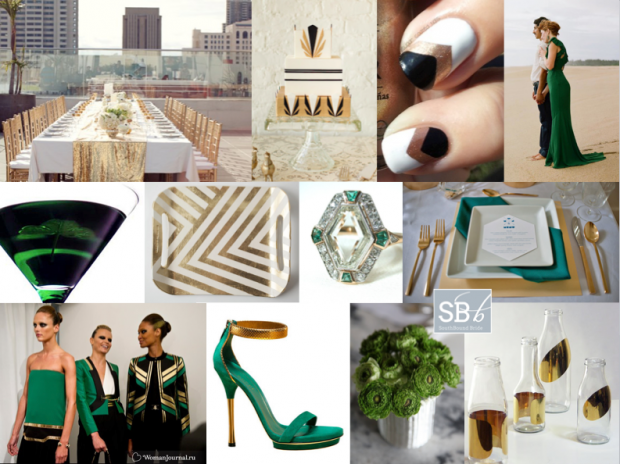
Well, I didn’t see this one coming. After two years of warm colours – honeysuckle pink and tangerine tango orange specifically – Pantone’s just named Emerald as its colour of the year. It’s dramatic, it’s rich, it’s formal, it’s a little bit old school… and it has totally grown on me. Seriously, when I thought about it, it totally made sense. In the last year I’ve seen a couple of emerald wedding dresses, and every time it has caught my attention. Then I featured this engagement shoot, with the most gorgeous green Gucci dress. And this graphic Gucci and gold inspiration board:

Read More

Inspiration Board: Navy & Chalkboard

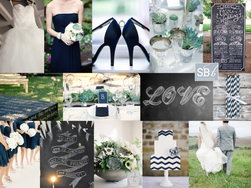
Hello friends! I’m rounding up this afternoon with a reader request board – you’ll be seeing a lot of these in the next few weeks as I am trying to finish all of them off from this year as I know there’ll be lots of new requests for 2013! I do try to do all of them, but it’s getting tough to keep up with demand, so do bear with me :) Anyway, this one is for the lovely Stacy, who’s getting married at Shalwyn in Natal next summer. She and her fiance chose the venue because of the relaxed feel and open fields, so they’re looking to reflect this with an elegantly rustic wedding in shades of navy, grey and white. LOVE. And I love even more that Stacy loves chalkboard and succulents. They go together just beautifully, and with a cool palette, you have that combination of elegance and rusticity (is that a word? no? should be.). Chalkboard can be quite beautiful, especially when combine with calligraphy, but my favourite detail here is the altar platform decorated with chalkboard paint and words of love. Hope you like your board, Stacy – enjoy your planning!

Colours: navy, light grey, white

Top row (l-r): Wedding dress {Elizabeth Scott Photography}; bridesmaid with succulent bouquet {Kate Harrison/Downey Street Events/Eventscapes}; navy shoes {Visions by Heather}; silver tipped glasses {Fiona Kelly/Helen Carter Weddings}; chalkboard programme
Row 2: Chalkboard ceremony platform {Sybrand Cillié/Aleit Wedding Coordination}; succulent and burlap decor {Kate Harrison Photography/Off the Beaten Path Weddings}; LOVE chalkboard {Tanamachi Studio}; striped navy paper straws
Row 3: Navy bridesmaids {Jen Huang Photography}; chalkboard; centrepiece {Eric Kelley/Lora Kelley and Mallory Joyce}; chevron cake with succulent accent {Sweet & Saucy}; Shalwyn couple {Brightgirl Photography}.


Inspiration Board: Cape of Storms

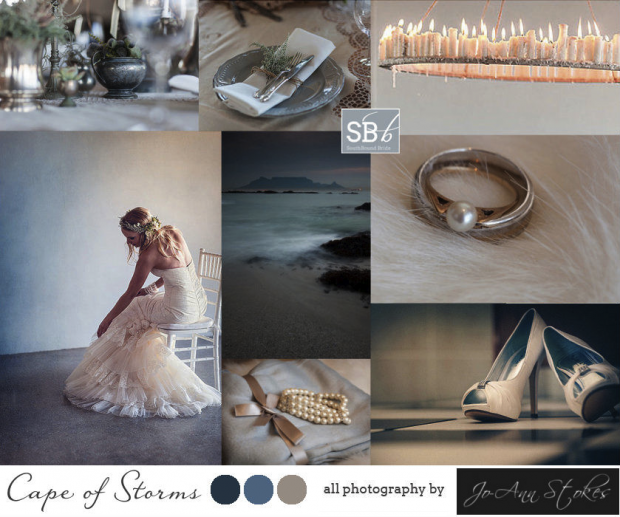
Good morning friends! I have another very special inspiration board to share today – this time we’re featuring the photographs of photographer Jo-Ann Stokes. Going through a photographer’s portfolio to put a board together is so interesting, as it really allows me to get a sense of their style, and I love the way Jo-Ann uses shadows and light to create atmospheric pics that are a little bit fashion and a little bit cinematic. I couldn’t help but be drawn to some of the moody blue images, as they remind me of the changeable weather in the Cape, and all of that natural beauty. So that’s where we went with the board. I think this is such a good look for a local wedding – soft naturals, a whole range of shades from grey to blue, and again that interplay between shadows and light. I love it, and I hope you will too! Head over to Jo-Ann’s blog to see examples of her lovely work, and remember that she’s taking bookings for your big day!


Contact Jo-Ann Stokes:
Email: jo-ann@joannstokes.com
Phone: +27 (0)82 650 9238
Website: www.joannstokes.com
Facebook: www.facebook.com/pages/Photography-by-Jo-Ann-Stokes


Inspiration Board: Dolce Vita

Good morning friends! Today we have something a little different for our inspiration board. It’s no news to you that I’m a fan of Cape Town photographer Cheryl McEwan‘s work as we’ve been working together for some time, but I’m delighted to feature her as one of our Days of December sponsors. Since an image is worth a thousand words, I’ve trawled through Cheryl’s archive (the happiest of tasks, with her dreamy style and attention to detail) to come up with a brand new SBB inspiration board. Cheryl’s a keen traveller (in fact, her husband Sven proposed to her in the middle of their world travel adventure!) so although she is based in South Africa for much of the year, I wanted to pay tribute to that love of travel in my choice of theme. And I personally find nothing more inspiring than a little trip to Italy. I took the palette for this board from Cheryl’s pic from the Cinque Terre, the muted mishmash of Mediterranean colour, sun bleached walls and intricate detailing that immediately sets a warm, summery tone for a wedding. Use heavy urns and candelabras, with platters of fruit instead of flowers on the tables, and of course plenty of wine! This makes me think of long Sunday afternoons and long tables, family, friends, laughter. All those things that make an Italian feast, a sweet life, and a beautiful wedding. Head over to Cheryl’s blog to see more of her gorgeous photography, including weddings, couple shoots and some personal travel gems.

Contact Cheryl McEwan:
Email: info@cherylmcewan.co.za
Website: www.cherylmcewan.co.za
Facebook: https://www.facebook.com/cherylmcewanphotography
Twitter: @CherylMcEwan_

SBB ♥ Cheryl McEwan Photography, a featured member of our Directory