As we come to the end of our spring pastel month, it’s time to introduce you to the last three shades in Pantone’s Spring 2016 lineup. Today we have two beautiful brights and a soft neutral, that goes with pretty much everything else in the palette. Let’s have a looky shall we?
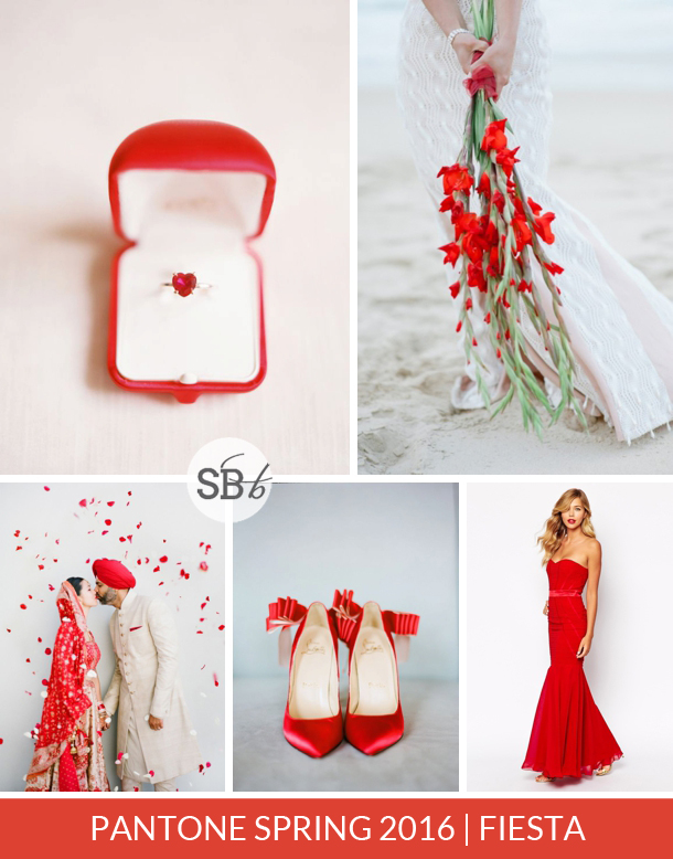
First on the menu is a gorgeous, vibrant red which is called, appropriately, Fiesta. This fiery bright is in contrast to the wine reds that have dominated recently and works brilliantly with the vibrant natural reds of cherries, strawberries and bold red blooms.
Top row (l-r): Ring {Polly Alexandre/London Bride}; bouquet {DNA Photograpers}
Row 2: Bride & groom {Heather Waraksa/AaB Creates}; red shoes {Nadia Hung Photography}; red bridesmaid dress
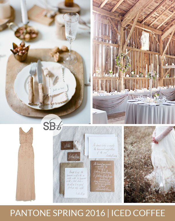
Top row (l-r): Place setting {He is Visual/Carla van Heerden}; barn wedding {Glass Jar Photography/Village Vines Florists}
Row 2: Taupe bridesmaid dress; invitation suite {Jen Huang/Pearl & Godiva/Maybelle Imasa}; bride in field {Simply Jessie Photography/Jayne Weddings and Events}
Next up is a beautiful soft taupe which reminds me of our month of natural // beauty a while back. This is the perfect base for either a simple, rustic celebration with plenty of wood and white, or as a neutral complement to a bright or pastel shade.
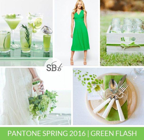
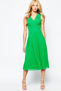
Top row (l-r): Green cocktails {Jim Franco}; green bridesmaid dress; bottles in crate {Kate Grewal/Alison Millar}
Row 2: Green bouquet {Gerald Carvalho Photography/Grant Avenue Florist}; place setting {Anneli Marinovich/b.loved}
The final colour in the report just says spring to me all over. It’s the bright, cool green of a fresh Granny Smith – a reference to nature, but bold enough to really make an impact in any setting.

Click on any of the product images to shop. For the most recent bridesmaid dress finds, check in with our Bridesmaid Boutique Pinterest Board
NOTE: This post includes affiliate links

