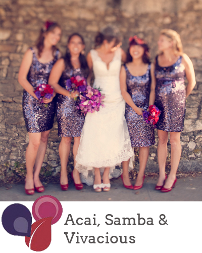
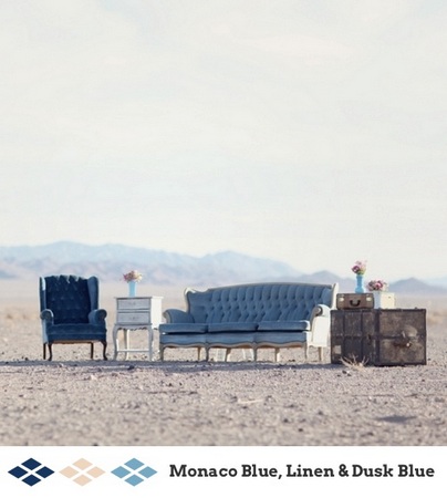
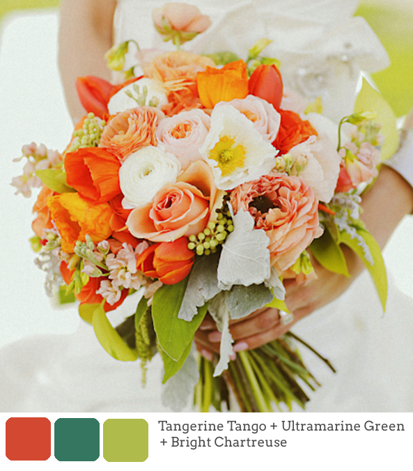
Goodness, but time is rushing by! It seems like just yesterday that the Pantone Spring 2013 colour report came out, and I’ve had so much fun working with the colours this year, including colour of the year, Emerald. But with the days finally starting to get longer on this side of the world comes the Fall report, and as before, the colours are bolder and brighter and perfect for a statement look. This time around they all really remind me of Morocco, and what I’m really looking forward to doing is pairing them with soft neutrals as well as each other, as they are here. So how might you go about using them? As usual, I’ve put together a selection of mini-boards to give you some ideas! Which is your fave?
Tag: colours
Pantone Spring 2013 Colour Report
It’s my favourite time of year again – Pantone have just released their latest spring fashion palette, and man, is it a good one! I absolutely love every one of these pretty, preppy colours, from punchy Poppy Red or Lemon Zest to cool Monaco Blue (best name ever) and Linen, which pretty much go with everything. Greyed Jade and African Violet are lovely soft versions of purple and green, and Tender Shoots and Nectarine offer chilled out alternatives to chartreuse and coral. I also love emerald and dusky blue – lovely, cool colours you just want to dive on into. There are SO many combinations of these colours that would look amazing at a wedding, but I’ve put together a few mini palettes to get you started. Which is your favourite?
Pantone Fall 2012 Colour Report
This isn’t quite breaking news, but while I was on hiatus, Pantone released their latest set of colours for autumn 2012, and I wanted to share them with you, as well as a few mini-boards showing how you might combine them into fresh takes on old colour palettes. Tangerine Tango (Pantone’s colour of the year) is still going strong (and I actually prefer these colour pairings for TT than those from spring), but for the less adventurous there are some softer colours as well as some bolds that pack a punch. Chatreuse, for example, can be used sparingly but to great effect. I suspect that of all of them, Rhapsody is the one we’ll see in more weddings this season, but I think (with the Olympics just weeks off now) that Olympian Blue must be my favourite. Which is yours?


