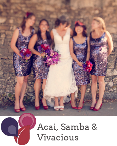
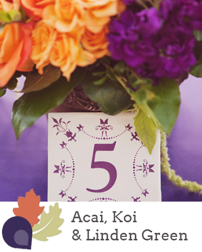
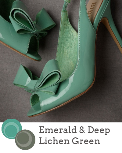
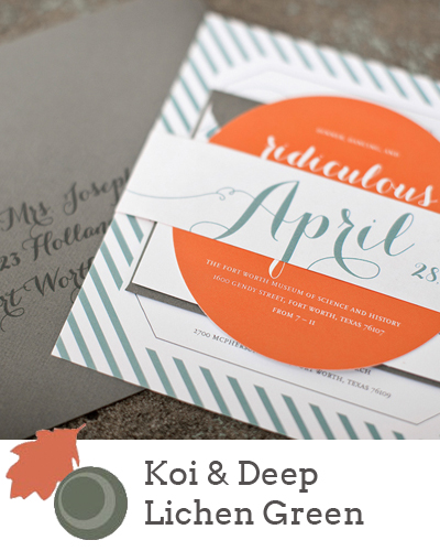
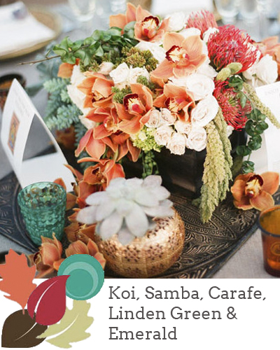
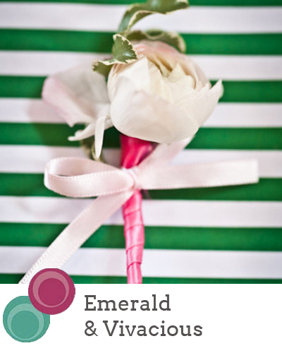
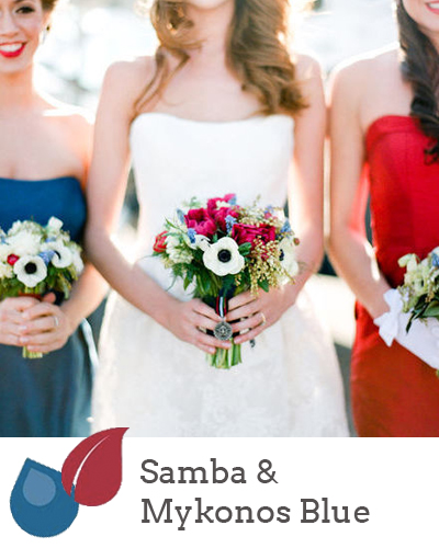
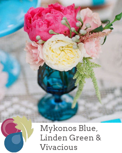
Goodness, but time is rushing by! It seems like just yesterday that the Pantone Spring 2013 colour report came out, and I’ve had so much fun working with the colours this year, including colour of the year, Emerald. But with the days finally starting to get longer on this side of the world comes the Fall report, and as before, the colours are bolder and brighter and perfect for a statement look. This time around they all really remind me of Morocco, and what I’m really looking forward to doing is pairing them with soft neutrals as well as each other, as they are here. So how might you go about using them? As usual, I’ve put together a selection of mini-boards to give you some ideas! Which is your fave?
Source: Ever Whim Photographs
Source: Stephanie Williams Photography
Source: BHLDN via A Crimson Kiss
Source: Atheneum Creative via Oh So Beautiful Paper
Source: Oh, How Charming/Braedon Photography via Green Wedding Shoes
Source: Event Styling by Shawna Marie/Katie Cassidy Photography, via Style Me Pretty
Source: Scheme Events/Laura Ivanova Photography via Style Me Pretty
Source: Picotte Weddings, Inc. /Events by Heather Ham via Style Me Pretty


Comments are closed.