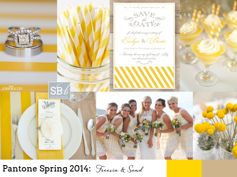
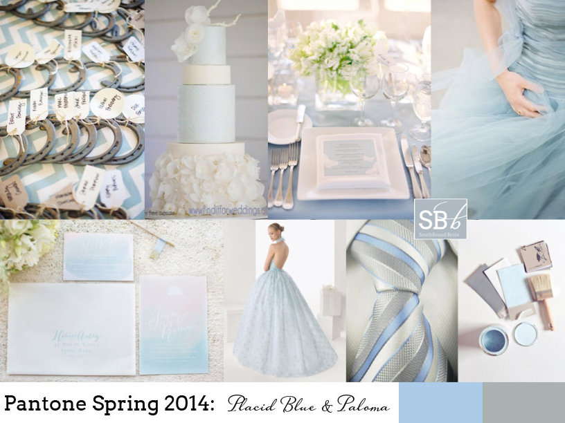
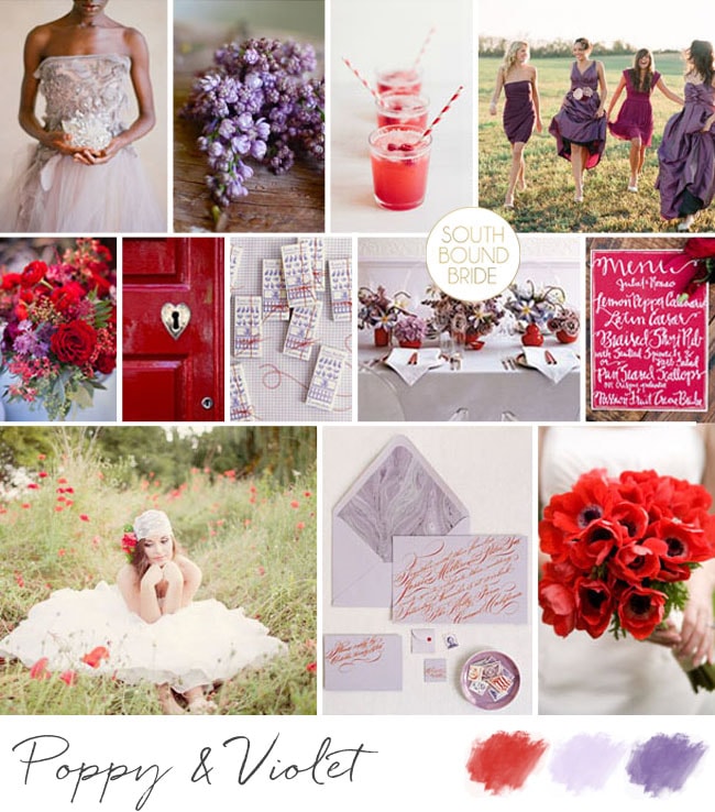
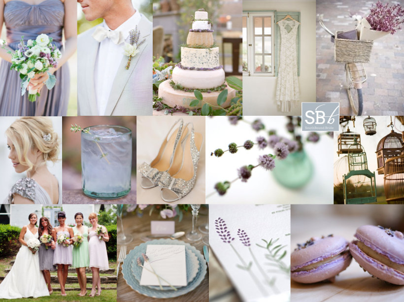
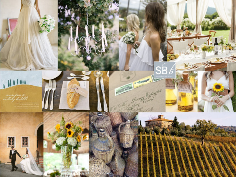
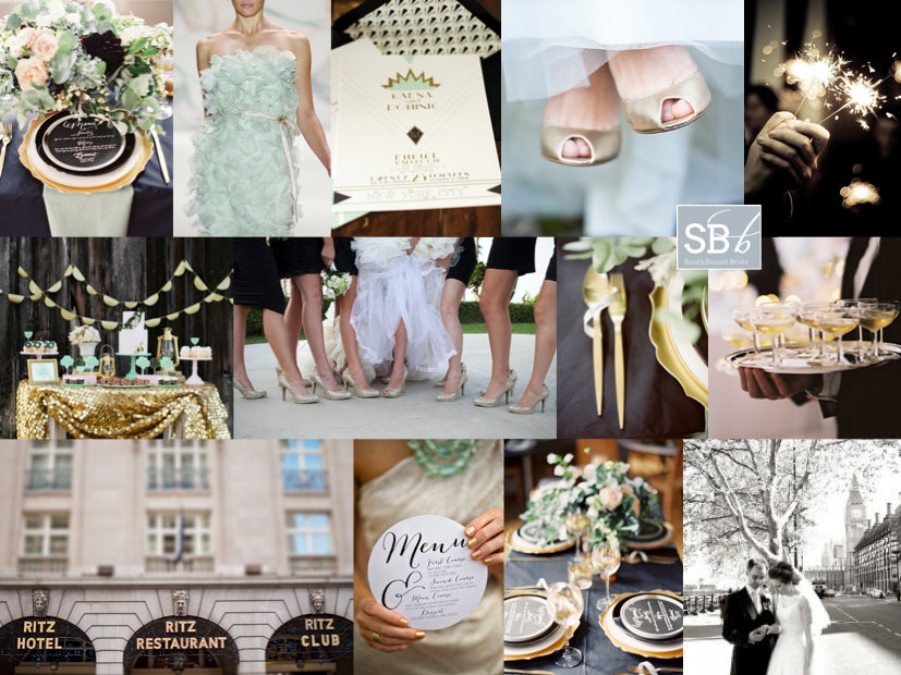
Happy Wednesday, friends! Today we’re continuing our celebration of the new Pantone colour report with even more fresh inspiration. The great thing about these reports isn’t that anyone expects brides to slavishly follow the new colours or feel like the ones they already have are ‘out’. But it’s a chance to take a fresh look at the colours you’re using, play with new combinations if you haven’t chosen a palette yet. But best of all, it’s an insight into the colours that are coming into homeware and fashion. Why should that matter? Well, as anyone who tried to find coral bridesmaid dresses three years ago will tell you, it does. When Emerald first made an appearance last year, I’d only seen it on celebrities – this year I have been spoilt for emerald images and bridesmaid dress options – even wedding dresses. So picking one or more of these colours might make your life easier if you’re planning a wedding in the next year. So those are the practical aspects. But for today, we’re just going to enjoy the colours. I really love this year’s choices – they’re not far off what we’ve seen before, but a bit more matte or with a bit more depth, or a bit lighter. Pastel blue and green are a big trend for 2014 in my view, and Hemlock and Placid Blue are perfect for that. The neutrals are also lovely – Paloma and Sand – just with a bit of warmth for grey and taupe shades. There are two very pretty purples – Violet Tulip and Radiant Orchid. And then some fabulous brights – Cayenne (LOVE this red), Celosia Orange and a gorgeous pop of Freesia yellow. But the colour that leads the collection is Dazzling Blue, a cousin of the blues that have been showing up for a couple of years now, that has really come of age. Get ready to see a LOT more of this one. This week we’ve already seen two full boards using the Spring 2014 colours, and there’ll be even more later today and Friday, but here I thought I would do some mini boards to inspire – which is your favourite combo?Read More
Tag: Inspiration Boards
Pantone Spring 2014: Freesia & Sand
How I do love a new set of colours to play with! And I must say, I think the bold, bright yellow of Pantone’s Spring 2014 collection, ‘Freesia’, may be my fave. It immediately reminded me of the bold yellow stripes that characterise a great place I went to last week in Abu Dhabi, the Monte Carlo Beach Club – everything there is kitted out (tastefully) in preppy yellow and white stripes, and it looks amazing. Paired with ‘Sand’, another of Pantone’s 2014 picks, you have the makings of a perfect beach wedding, or even of a rustic farm look. As always, be sparing with the brights, let them punch out. And punch is certainly what this colour does! Love it.
Colours: Pantone Freesia & Sand
Top row (l-r): Ring {Joielala Photographie}; stripey paper straws; invitation; dessert {Grandes Fetes/Jessica Schilling}
Row 2: Place setting {Krissy Allori Photography + Courtney Jade Photography/Double Take Event Styling}; bridesmaids in yellow stripes; billy buttons {Nineteen Eighty Five/Christine Meintjes}.
Pantone Spring 2014: Placid Blue & Paloma
Morning, lovelies! It’s that time of the year again, when Pantone releases their spring colours. My favourite. I’m still being inspired by last years’ crop, in fact. That was, until I got a whole new ten colours to dream about. I’ll be doing a full roundup on Weds of the whole set of colours, but this week I’ll also be bringing you inspiration boards of my favourite colour combos, starting with today’s. I just love this soft blue, ‘placid blue’, especially when combined with the softest grey, ‘paloma’. So romantic! It’s also a lovely alternative if you’d been considering pastels or a blush and grey mix for your wedding, and I have a feeling we’ll be seeing a lot more of placid especially. Or just consider wearing a blue wedding dress in the shade – so unusual and gorgeous. I’ll be back with another board this afternoon, but meanwhile, what do you think?
Colours: Pantone Placid Blue & Paloma
Top row (l-r): Horseshoe escort cards {paper antler via style me pretty}; blue wedding cake with ruffles {Hey There, Cupcake!}; place setting {Jose Villa/Beth Helmstetter}; blue dress {Alicia Swedenborg}
Row 2: Watercolour invitation suite {Bubblerock/Quelque chose de Bleu}; blue wedding dress; blue and grey tie; paint samples {Lauren Bamford}.
Inspiration Board: Poppy & Violet
Hello lovelies! Another week, another dose of inspiration here on SBB. This week I’m working out of Abu Dhabi while I visit one of my besties, which is so lovely, and on to South Africa on Thurs! Awesomesauce. Anyway, today we’re bringing together two strong colours that together have a lovely warmth. Poppy red is just brilliant – so bright and cheerful – but a red and white wedding can look a bit dated, depending on how you do it. But add in a punch of Pantone’s African Violet and you have the perfect contemporary combo. I love playing these colours out against a romantic rustic backdrop, as they are here – ideal for an autumn wedding, although they could also work in a modern graphic city wedding. What do you think?
Colours: Poppy red & African violet
Top row (l-r): Lilac dress {Elizabeth Messina/Joy Adaeze}; lilacs; red cocktails {Vanilla Bean Blog}; bridesmaids {Elizabeth Messina}
Row 2: Bouquet {Halberg Photographers/Kelly Oshiro Design}; door with heart lock; chocolates; table setting; calligraphy menu {Becca Borge/Sugar(ed) Event Design and Planning}
Row 3: Bride in field of poppies {Easy Dreamer Photography/Romancing the Stone Styling}; lilac and red stationery; poppy bouquet.
Inspiration Board: Mint & Lilac
There’s just something about purple palettes that I love, don’t you think? They really are just so pretty. And today’s is no exception. Lilac, lavender and mint make a great combination on their own, but when you add a bit of grey and a touch of silver sparkle, as well as a little dash of vintage, it’s just made for a wedding day. The cheese cake you may recognise from our roundup last week – I absolutely adore this one – but I also love the jumble of hanging bird cages, the mix and match bridesmaids, and the bride’s hair and gorgeous grey dress. I can just imagine how this would look in real life. The other great thing about this palette is that it’s so versatile – I could imagine this for spring, summer… and with a few tiny tweaks, autumn and winter too. What do you think?
Colour: Mint, lavender, lilac, grey & silver
Top row (l-r): Bridesmaid bouquet {Elisa B Photography/Amore Events by Cody/Sugar Magnolias}; lavender boutonniere {KT Merry/Sara Jean Events}; cheese wedding cake {Aaron Delesie/Laura Gresham Events/}; lace dress {Oh, How Charming/Braedon Photography}; bicycle
Row 2: Bride in grey dress {Joielala Photographie}; cocktail {Tim Halberg}; silver glitter shoes {Paperwhites Photography}; flowers in vase; hanging birdcages
Row 3: Bride & bridesmaids {Pam Cooley Photography}; place setting {Elisa B.}; lavender letterpress {Satsuma Press}; macaroons.
Inspiration Board: Modern Romantic
Another Monday, another inspiration board, and I have to say, I am more than a little in love with this one. I’ve had a lot of requests over the last year for blush and mint weddings, and when I came across this invitation suite from Hey Look I was BLOWN AWAY by how amazing this soft, romantic colour combination works with the modern graphic black and white. With just a touch of gold, of course. It immediately got me thinking of how I often hear brides saying they want something modern but also vintage, and I think maybe this board is a little of what they mean – a contemporary feel without being too stark, and a romantic dreamy backdrop without being too fluffy. The combination sort of reminds me of Audrey Hepburn, who managed to be cutting edge stylish and incredibly classic all at the same time. Beautiful!
PS Just a little reminder for anyone who has been trying to contact me, that I am currently on leave without access to emails. I will get back to you asap!
Colours: Blush, pastel green, graphic black and white with a touch of gold
Top row (l-r): Invitation suite {Michaela Egger/Hey Look}; shoes {Harwell Photography}; striped umbrella
Row 2: Bridesmaids {Alison Mayfield Photography Studio}; boutonnieres {Simply Bloom}; vintage wedding car {Jose Villa}; tassel garland
Row 3: Striped tent; lily bouquet {Jose Villa/Mindy Weiss}; striped tie back {Landon Jacob Productions/Parkside Wedding Studio}; macaroons; cake with chevron.
Inspiration Board: Lazy Hazy Days
Some weddings are all tradition and formality and classic palettes. Invitations are engraved, etiquette is followed. They’re lovely, of course. But the other kind of wedding I love is when a couple takes their cue from their favourite kind of party: a brunch, a dinner party, a picnic, a festival even. Or, in the case of this board, a summer garden party. Sundresses for the ladies, lemonade, alcoholic popsicles, ribbon wands. Red, pink and orange were a popular colour combo a few years ago, but they’re updated here with melon, pink and a punch of yellow – and how gorgeous is that bright citrusy table and bouquet? This would be such a fun wedding to host and attend, and is perfect for a couple who would like to keep things more lighthearted with their palette.
Colours: Orange, yellow, pink
Top row (l-r): Bridesmaids in sundresses {KT Merry/David Arthur Fittin/Lucia Paul Design}; lemonades {KT Merry/David Arthur Fittin/Lucia Paul Design}; bouquet {Cliff Brunk/A Bride’s Best Friend}
Row 2: Parfaits; cake {Anne Robert Photography/Dana FitzGerald/Blackbird Bakery}; billy buttons {Andrea Dozier}
Row 3: Table arrangements {Laura Jane Petelko/Cynthia Martyn Events Inc.}; popsicles in wine; ribbon wands {Cameron + Kelly Studios/Sedona Bride}
Inspiration Board: Gingerbread Biscuit
Hello lovelies! Well, as you read this, I’ll be far away in Tuscany, enjoying some fantastic summer sun. But to make sure my readers in South Africa don’t feel TOO jealous, it being mid-winter and all, I’ve put together this toasty winter board. Gingerbread is, of course, something that we often associate with Christmas, but in the Southern hemisphere it’s much more appropriate for the middle of the year, and it’s the warm copper tones of this biscuit that have inspired today’s board. I think ‘brown’ (or rather, earth toned, as I like to think of them) weddings can get a bad rap – after all, if you use natural textures like wood and dark glass and set it against lush white flowers, pretty detailing and other classic whites, then there’s no reason why it has to be dark and drab at all. Treat your guests to a coffee station (how much do I love these custom calligraphy coffee mug holders?), and warm their fingers and toes at an open fire. There’s a pretty touch of vintage here, but it’s all understated and perfect for the season. What do you think? Would you consider having a winter wedding?
Colours: Mocha, cappuccino, white
Top row (l-r): Bride {Elizabeth Messina}; gingerbread cookies; bouquet {Elizabeth Messina/Mindy Rice}; coffee station
Row 2: Cake table {Ashley Rose}; invitation; brown bottles; gingerbread heart cookies; vintage post card guest book alternative {Oh Darling Photography}
Row 3: Holy matrimony sign; calligraphy cup holder {Oh, How Charming!/Mindy Rice Floral and Event Design/Paperfinger/Aaron Delesie}; escort cards {Carrie Patterson Photography}; white flowers {Polly Alexandre Photography}; Dress with brown overlay {Studio Bella}.
Inspiration Board: Under the Tuscan Sun
Okay, this is about to be a jealous-making post. Because tomorrow, bright and early, I’ll be jetting off to Bella Toscana for three weeks in some of the most heartbreakingly beautiful scenery on earth. Picture every Tuscan vineyard you’ve ever seen in a film? Yup, exactly like that. I can’t wait! I’ll be working hard under the summer sun, but I’m actually looking forward to it – and to my ‘farmer tan’! ;) As promised, the blog will continue as if nothing has changed, but please be patient if emailing me, because I am officially off the grid. In fact, that’s something I’m almost as excited about, since for the last few years I’ve been constantly connected to some kind of electronic or social media, and it’s time to switch off and just be in the moment. So to celebrate my trip (YAY!), I’ve created a Tuscan-style inspiration board. There were a lot of ways I could have gone with this – understated olive leaf and grey, lavender and green… But one of the things I love about Tuscany is its warmth and abundance, and the fields of sunflowers I saw for the first time from a train window many years ago. These flowers are gorgeous, but they can be overpowering, so I’d just use single blooms for the bridesmaids and then in sporadic arrangements in the reception venue. Include materials such as terracotta and linen, and the straw covered bottles that traditionally hold chianti (called a fiasco, how fun is that?). Fabrics are floaty, and an open sided marquee with long tables is a must (or just set up under the trees). Tuscan olive oil is the best (believe me, I plan to eat lots of it!) and makes the perfect favour. So there you go. And here I go! See you in a month!
Colours: Sunflower yellow, olive green & Tuscan terracotta
Top row (l-r): Dress {Jose Villa Photography/Joy de Vivre Design Boutique}; wire candelabra {Leo Patrone}; floaty bridesmaid dresses {Mint Photography}; tables {Collin Hughes/Shannon Leahy Events}
Row 2: Invitation; place setting with bread {Joy Thigpen/Toast Events and Design/Jose Villa}; stamped envelope {Ruby & Willow}; olive oil favours; sunflower single bloom bouquet {Buffy Dekmar}
Row 3: Bride & groom {Josselyn Peterson/Leonora Moss}; sunflower arrangement {Olivia Griffin Photography/Walton Event Design}; wicker Chianti bottles; Tuscan landscape.
Inspiration Board: Puttin’ on the Ritz
Crunch time you guys! It’s my last week as a Londoner (for a while anyway) and I have about a ZILLION things to do before I go. But we won’t think about that. What we will think about is a bit of a tribute in loveliness to the city. There are a lot of sides to London that could inspire a wedding and many that have inspired me in other ways, but the one I have chosen today is all about glitz and glamour, as symbolised by one of the grand old ladies of the London hotel scene. The Ritz, baby. The palette is mint, gold and classic black and white (with just a teeny tiny hint of blush), the look is chic and romantic and the waiters are definitely serving champagne. So put on your finest frocks and starched collars and come join me! Of course, you don’t have to be in London to make this look work for you – all it requires is a glamorous venue, a cocktail or champagne and canape reception, and a dash of sparkle. Dashing, dahling!
Colours: Mint, gold, black, white & blush
Top row (l-r): Place setting {Ed Osborn Photography/Mimi Nicole Events}; mint dress {Monique Lhuillier}; invitation {umama on Etsy}; gold shoes {Liesl Cheney Photography/b.loved}; fireworks
Row 2: Dessert table in mint and gold {Beau & Arrow Events/Katie Neal Photo}; bridesmaids in LBDs and gold heels {Your Event by Erin/Melissa McClure Photography}; gold cutlery {Ed Osborn Photography/Mimi Nicole Events}; champagne {Belathee Photography}
Row 3: Ritz London {Elly Mac Photos}; bridesmaid with menu {Izzy Hudgins Photography/Simply Savannah Weddings & Events}; table setting {Ed Osborn Photography/Mimi Nicole Events}; bride & groom in London {Steve Poole}.