Inspiration Board: Midsummer Night’s Dream

I read a lot of wedding blogs, but one that consistently inspires is the fab Magnolia Rouge – I never fail to be inspired by what Kate features! This week one of the pics she posted from a shoot by the fabulously talented Annabella Charles caught my eye, and I was immediately carried away with the idea of a beautiful Midsummer Night’s Dream garden party theme – a delicious twist on the soft pink, green and gold colour scheme that I know so many of you are in love with at the moment. Delicate climbing vines (how pretty is this table?), lush blooms, curly calligraphy, a mossy bed for the rings, a touch of glitz and a night dancing under the stars. It’s elegant, but soft and romantic and even a little bit playful – the perfect combination!

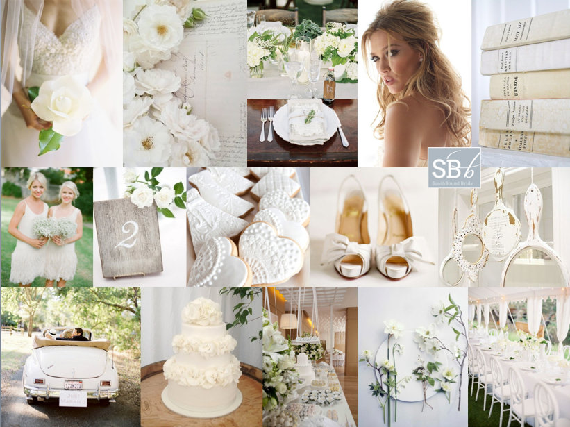
Colours: White, sage green, blush pink and gold

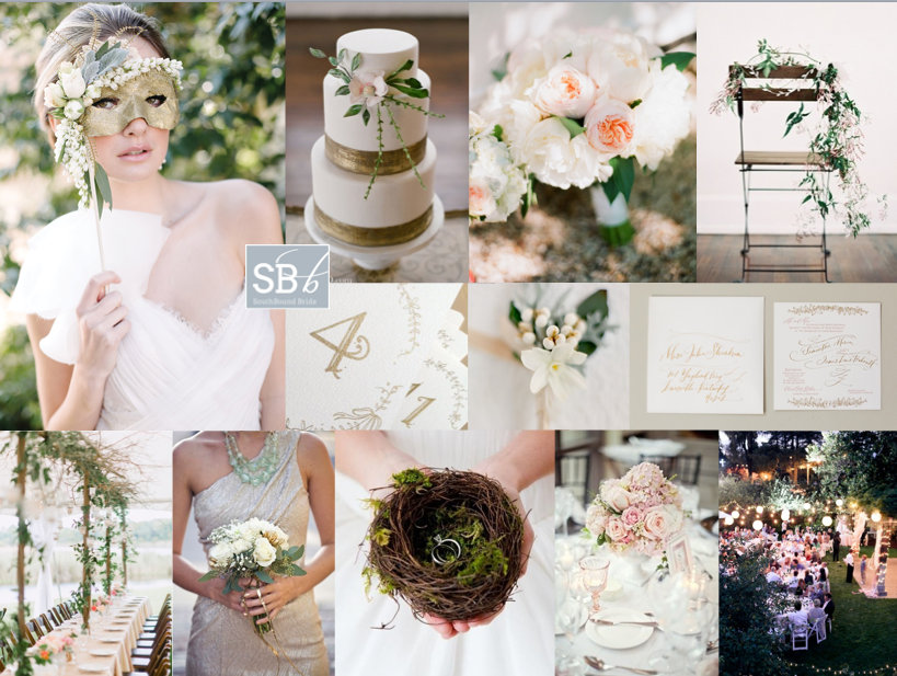
Top row (l-r): Bride with mask {Annabella Charles/Haute Horticulture}; cake {Odalys Mendez Photography/Sweet Sensations}; peony bouquet {Katie Stoops Photography/Pat’s Flowers}; chair {Odalys Mendez/Ginny Au}
Row 2: Calligraphy table numbers { on Etsy}; boutonniere; invitation {Paperfinger}
Row 3: Table with trellis {Pasha Belman Photography/Stunning & Brilliant Events}; gold bridesmaid dress {Izzy Hudgins Photography/Simply Savannah Weddings & Events}; nest ring pillow {Acanthus Floral}; table setting {Megan Thiele Studios}; outdoor reception {Edyta Szyszlo/lovely little details}


Inspiration Board: Blanc de Blanc

Happy Monday SouthBound Brides! And happy first day of the month. Eeks, how did it get to be the second half of the year already? Anyway, for today’s inspiration colour scheme we have… no colour scheme. I’ve gone back to basics, because as much as punches of colour are fabulous, I still love a white on white wedding. Especially when you add some soft, country touches with just a whisper of rustic-ey vintage. Lush garden blooms, a beautiful open-sided marquee, and textured detailing like a ruffly cake and lace-iced biscuits. My favourite idea? Why not hang distressed white-painted mirrors in a row with table assignments written on them?

Colours: White

Top row (l-r): Single bloom bouquet {Jose Villa}; flowers and letter; table setting {Beth Helmstetter Events/Steve Steinhardt}; half up hairstyle; white books
Row 2: White bridesmaids dresses {Jemma Keech Photography}; table number {Kristen Wood/Denise Addesso}; iced biscuits {Kiss Me Kate/Studio 76 Artist Group}; white shoes {Jose Villa}; hanging mirrors
Row 3: White wedding car {Jose Villa/Rosemary Special Events}; cake with ruffles; dessert table; white flowers; open-sided marquee {Jose Villa/Rosemary Special Events}.


Inspiration Board: Sunny Afternoon

Hey friends! It’s been a little while since I did an inspiration board request, but today we have a gorgeous yellow board for reader Cheri. She’s planning a barn wedding (LOVE barn weddings!) at a rosemary farm, with the ceremony in a flower maze – how pretty is that? They’d like a relaxed, old farmhouse feel, with a palette of yellow, grey and white reflected in the flower combination of succulents, billy balls and baby’s breath. They’re also planning to use old jam jars and wine bottles, which I think is a great idea. I absolutely love yellow as a wedding colour, because it’s so happy and sunny and bright – it immediately sets the tone for smiles all day long. Succulents and billy balls make an awesome combination – isn’t this bouquet lovely, and that cake! – and I like the idea of recycled glass throughout. I’m especially a fan of painted wine bottles used as vases – they work beautifully here, don’t they? I’d add succulents in small wooden crates to the table decor as well. Although Cheri plans to use baby’s breath (which is lovely), I’m also a big fan of little daisies for this wedding theme – look how pretty the bridesmaid bouquet is below. And I also like the idea of a very, very subtle yellow gingham motif, perhaps for preserve favour tops and on the groom’s pocket handkerchief. Finally, you can really make the ceremony area pop with ribbon aisles, like the one above – they really add that carnival feeling. Hope you like your board, Cheri!

Colours: Yellow, white and grey

Top row (l-r): Ceremony area {Love Me Do Photography}; cake with billy balls; bouquet with succulents and billy balls {This Modern Romance/Honey and Poppies}
Row 2: Wool wrapped table number {Daffodil Waves}; invitation; rings with billy balls {Cameron Ingalls}; gingham jar top; gingham groom’s pocket {Johnny Miller}
Row 3: Billy balls on chair {This Modern Romance/Honey and Poppies}; daisy bouquet {This Modern Romance/Honey and Poppies}; grey and white wine bottles {white rabbit studios}; mason jars with striped straws {Callie V Photography}; bride and groom {Ryan Ray/Lavender Joy Weddings}


Inspiration Board: Blossom & Berry

Happy Monday, folks – here’s to a super-productive week! Today we have a pretty, rustic red and white board, that would be just perfect for an autumn wedding. There’s a little touch of French bistro, and textures of wood, kraft, burlap and berry. So pretty! Red and white is a combo that I often see in real weddings, but it’s often used either in a more modern way or as a stark accent against a classic white wedding. But here it’s a gorgeous alternative to the pretty pastels or muted neutrals that you usually see for a rustic wedding. Lovely, isn’t it? Don’t be afraid to play with your ideas on colour a bit when planning your wedding – just because you have chosen a specific style doesn’t mean that you have to use the same palette as many others before you. Often just this little twist can make a look really fresh and interesting. My favourite touches here are the mannequin escort cards, the tin dessert menu, the gorgeous burlap runner with table number and the bridesmaids’ mismatched shoes. Which do you like best?

Colours: Red, white, green and mocha

Top row (l-r): Bride in blossoms {Tec Petaja/Joy Thigpen}; berry desserts {Danielle Capito}; wooden gate {Tec Petaja/Joy Thigpen}; table with burlap runner {Nikki Meyer Photography/Kraak}; bicycles
Row 2: Bridesmaids with red shoes {Emily Johnston Anderson}; mannequin escort cards {m three studio}; strawberry cocktail; outdoor ceremony {Caroline Tran Photographer/Kelly Oshiro Design}

Row 3: Table with red flower arrangement {Flowerwild/Jose Villa}; groom in braces {Zara Zoo Photography}; farm inspiration suite; bouquet with strawberry {Nikki Meyer Photography/Kraak}; book ring shot.


Inspiration Board: Love Shines Bright

Morning, lovelies! How was your weekend? I am still playing catchup with admin – sometimes it seems never-ending, doesn’t it? But I’m here with an inspiration board to literally brighten your morning. Okes, this might be one of my favourite colour combos ever. When neon brights started making their way into weddings, I was first a little horrified, then intrigued. I decided I liked them, but in a sort of graphic, modern way. But I’ve also been quietly intrigued as to how you could use them in a pretty, soft way as well, one that would suit more brides. And this is pretty much it. A palette of soft grey, coral and then a pop of lumo yellow. Sounds insane, but the brights really bring out the other colours and I just adore the end result! What do you think?

Colours: Mushroom, peach, coral and neon yellow

Top row (l-r): Bouquet {Shoot This Not That}; bridesmaids {Kate Harrison Photography/Enjoy Events Co. Inc.}; neon table number {Shoot This Not That}
Row 2: Coral shoes {Laura Murray Photography/Holly Gerard}; cutlery bundle {Shoot This Not That}; coral table decor {Elizabeth Scott Photography/Sweet November Events}
Row 3: Neon necklace {Imbue Weddings/Byron Loves Fawn}; flowers; menu with neon string {Kate Harrison Photography/Enjoy Events Co. Inc.}


Neon Rustic Wedding Inspiration | SouthBound Bride

Inspiration Board: Walk on the Ocean

Hello lovelies, now for inspiration board number 2 today. This one’s a reader request – always fun to do, as you guys come up with such a unique set of ideas that reflect your personalities and relationships. This particular board was requested by Shimoné, who together with her husband-to-be really loves the sea. Even though they’re planning an elegant garden wedding, they wanted to bring this love into their wedding, so they chose a gorgeous ocean-inspired palette of powder blue, teal, gold and white. I also took this as a starting point for some of the design details, adding a gentle watercolour/ombre element to reflect the salt water, and with sea urchins as a sweet little motif. These are sold on Etsy with little succulents inside, which makes a very cute place setting/favour and is one you could make yourself. I also like the idea of spray painting these shells gold to sit at each place setting, with or without a plant inside. The rest of the scheme is simple and classic – white flowers, especially on the huppah (the wedding will have lots of traditional Jewish elements, and this is one of my favourites), soft flowy bridesmaid dresses with statement necklaces, vintage furniture in breakout areas and gold-flecked macaroons. Simple, classic, but very lovely. Hope you like your board Shimoné!

Colours: Teal, powder blue, gold and white

Top row (l-r): Watercolour invitation; urchin favour {Kristin Rogers Photography/RobinCharlotte}; lace wedding dress {Rebekah J. Murray Photography/Atrendy Wedding}; ombre cake {Jen Huang}; urchin
Row 2: Necklace; gold pear {Sasha Gulish/Shannon Leahy Events}; ties; macaroons {Fiona Kelly Photography/Linen and Silk Weddings}; flower huppah {Heidi Ryder}
Row 3: Bridesmaid dress; hora {David Pascolla}; breakout area {Jose Villa}; table setting with vintage crockery {Love Life Images/Bradshaw Styling}


Inspiration Board: Fig & Toile

Hello lovelies, it’s time for our first inspiration board of the day. The last time I did a toile board was waaay back at the start of SBB, which I ended up turning into a gorgeous inspiration shoot (more on this soon). But now, with prints being all the rage in weddingland, toile has really come of age. And why not – it’s romantic, it’s vintage and it’s just the perfect shade of blue to set off warm pinks or peaches or corals. Too much can be… well, too much, so less is definitely more, but I couldn’t help including the gorgeously romantic toile detail dress from Claire Pettibone’s current collection. I’ve paired the toile here with fig – that rich dusky pink, and just a touch of brass. For a uniquely South African twist, I love Fabric du Sud from Carol Mills, which is all about toiles with a homegrown theme. Loving this! What do you think?

Colours: Dusky pink and blue, navy, brass and white

Top row (l-r): Claire Pettibone dress {This Modern Romance/Claire Pettibone/Gatherings by Stacie}; cake {Sonya Khegay/Latte Decor/Azale}; toile envelope liner invitations {Pyramid Atlantic/Betsy Dunlap/Katie Stoops}; blueberry cocktail
Row 2: Berry bouquet {Martha Stewart Weddings}; bridesmaids {Kellee Walsh}; figs {Lauren Kriedemann/Event & Design}
Row 3: Table setting {Souder Photography/Vintage My Wedding /Southall Eden}; brass key escort cards {Tamiz Photography/Belle Destination Weddings and Events}; Claire Pettibone dress {This Modern Romance/Claire Pettibone/Gatherings by Stacie}.

Inspiration Board: Fig & Toile


Inspiration Board: Olive & Stripe

Happy Monday friends! There’s been a lot going on here at SBB headquarters, which I may or may not get around to sharing with you all. But it’s a new week, and that always means a fresh start and fresh inspiration. Today’s is one that sort of just came together, but I think if I had married, this might be what my wedding could have looked like. I love everything Italian (especially since I have been doing some writing jobs that are making me long to spend some time there again!) but while a rustic Tuscan farmhouse look is fab, I also love the idea of updating it a bit with a bit of a chic modern, black and white, Kate Spade look – the perfect combination of Mediterranean and contemporary graphic. Do you love it as much as I do?

Colours: Black, white and green

Top row (l-r): Place setting {Viera Photographics/The Stylish Soiree}; bridesmaids in black dresses {Ladybug Photography}; heels {Lacie Hansen}; olive leaf bouquet {M&J Photography/Weddings In Italy}
Row 2: Dress with sash {SimplyBloom Photography}; olive grove {Jose Villa}; striped straws {Caplan Miller}; groom {Judy Pak/Dreamlite Photography}
Row 3: Couple {Lacie Hansen}; wine bottle table numbers; olive leaf heart {Camille Soulayrol}; outdoor table {Kaella Lynn Events/Nirav Photography}; bride and groom in Positano {Forever Photography}.


Inspiration Board: Green Gables

Good morning, brideys! How was your weekend? I’ll admit, I spent most of yesterday dying on the couch after an awesome day with my university girls – gosh, I love them, but when we get together it usually means a day of recovery! Anyway, in between feeling sorry for myself, I put together this pretty board, which was a reader request from Bonnita. I don’t know much more than her palette of peach, green and grey and while this is a combo I’ve done before, I always think that the balance of warm, sweet peach and cool, fresh green is so perfect for a wedding. Clearly Claire Pettibone thinks so too, because her gorgeous 2013 range has peach and mint accents like the back detail shown here. I’m totally in LOVE with the ceiling garlands at the reception pictured below – what a way to bring outside in for a marquee wedding especially, and I also love the handpainted feel of the invitations, with a chic envelope liner setting the tone. And I have to admit, I am coveting that ring, big time! Anyway, Bonnita, hope you like your board!

Colours: Peach, grey, mint

Top row (l-r): Table setting {Joy de Vivre Wedding Design & Coordination/Michael & Anna Costa}; dress {Elizabeth Messina}; reception decor with ceiling garland detail {Liz Banfield}; Claire Pettibone dress {Brian Leahy Photography/Claire Pettibone}
Row 2: Bouquet {Depict Photography}; peach diamond ring; invitation suite {Clark Creative}; green bridesmaid dresses {Elisabeth Millay Photography}
Row 3: Bride & groom {Depict Photography}; petal strewn aisle {Gabriel Harber Photography}; flower girl {Rebecca Arthurs Photography}; rose {Elizabeth Messina}; cake {Joy de Vivre Wedding Design & Coordination/Michael & Anna Costa}.


Inspiration Board: Seafoam Vineyard

Good morning friends, and what a beautiful morning it is in London. The sun is out again, the garden’s freshly mowed (thanks Olly), and there’s still the hint of woodsmoke in the air from using the outdoor stove last night (unfortunately temperatures aren’t quite summery yet). Today’s board is a reader request from Kate, who’s planning a summer wedding at Constantia Uitsig (one of my favourite venues, and somewhere I am dying to stay!). Even though it’s very much a wine country wedding, with a rustic boho vibe and an incredible view of the vineyards and Table Mountain, Kate’s chosen a palette inspired by the sea, with soft blues, greens and cream as her colours. I love this – in fact, it’s the same palette my friend Heidi chose a couple of years ago for a garden-style wedding, and it looked fantastic. Using these cool colours is sure to make everything seem fresh and natural, and it’s also easy to warm them up with tiny touches of peach or pink. Kate had some really lovely ideas that she’ll be including, and hopefully I’ve added a few more to the mix with her board. Hope you like it, Kate!

Colours: Pastel blue, green and cream

Top row (l-r): Boho bride {Rylee Hitchner/Joy Thigpen}; barrels as tables {Caroline Tran Photographer/Malibu Family Wines}; loose bouquet {Erich McVey}; blue and green glass containers with white flowers
Row 2: Bridesmaids {Judy Pak Photography}; hanging carnations; doily cutlery wraps; reception sign {Braedon Photography}; cake {Abi Q Photography/Sugar & Fluff}
Row 3: Constantia Uitsig; cork escort cards {Braedon Photography}; hydrangea bouquet {Scott Piner}; dress {Scott Piner}; groomsmen {Jenna Walker Photographers}