Inspiration Board: Copper, Orchid & Navy

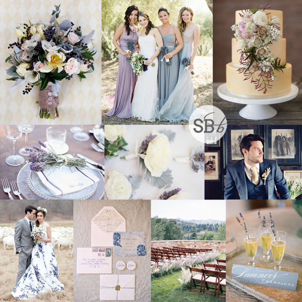
It’s hard to believe this year is already winding down (where did you gooooo, 2014?) and that it’s almost time for a new Colour of the Year to steal the Pantone crown. I’ll be sorry to see this year’s favourite, Radiant Orchid go – although of course, it won’t go at all, just take a step back in the colour inspiration stakes. But I really liked how this pinky purple played so well with others – it really made for some unusual and gorgeous combinations. Today I’m mixing a soft orchid with one of my absolute fave metallics, copper, with a bit of grey and slate and a hint of navy thrown in. I think the combination is amazing! I especially love how the copper gleams next to the other shades, and how the navy adds that extra little bit of depth. Somebody choose this for their wedding, pretty please? ;)

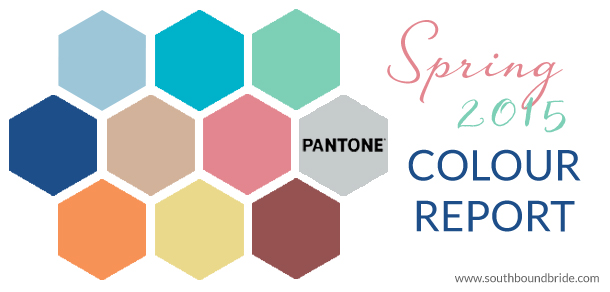
Colours: Lilac, light grey, slate grey, copper & navy

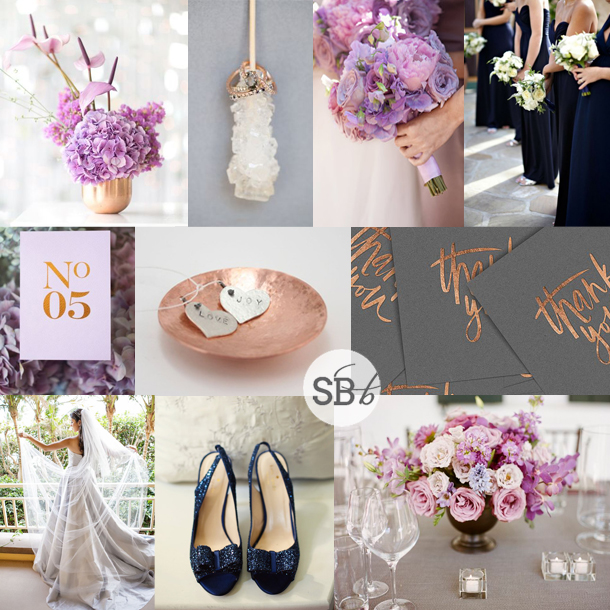
Top row (l-r): Centrepiece in copper vase {Catherine Mac Photography/Fleur Le Cordeur}; rock sugar with rings {MLKL Photography}; bouquet {Aaron Delesie/Nisie’s Enchanted Florist}; navy bridesmaid dresses {Miki and Sonja Photography/XOXO BRIDE}
Row 2: Table number {Catherine Mac Photography/Fleur Le Cordeur/Seven Swans}; copper dish; copper & grey thank you cards {cocorrina}
Row 3: Bride in grey dress {Petronella Photography/Ashley Gerrity Photography/Aribella Events}; navy wedding shoes {Erik Maziarz for Carla Ten Eyck}; centrepiece {A Bryan Photo/Gathering Floral + Event Design/Kristin Newman Designs}


Inspiration Board: Just Dotty

Morning lovelies! I’m going to keep this brief since, after a fab weekend in Joburg spending time with dear friends, I am in bed with a bug, feeling very poorly and sorry for myself. Bah. Anyway, today’s board is a far cry from my mood fortunately – it’s all about bright yellow and pink colours, set off against a sweetly sophisticated polka dot motif. So much cuteness. I love the way that the print adds a note of fun, but at the same time, the monochrome element keeps things modern and chic. Hope you like it!

Top row (l-r): Groom with dotty tie {Allison Cox}; invitation {Wedding Paper Divas}; bridesmaid polka dot dress {Amy Majors Photography}
Row 2: Swiss dot wedding dress {The Natural Wedding Company}; lollies; centrepiece {Springs Floral/Mirelle Carmichael}; pink lemonade {Wings of Glory Photography}
Row 3: Bouquet {Gracie Blue Photography/carolynA Events/Holly Bryan Floral and Botanical Design}; pink and yellow balloons {Poppy Talk}; cake with dots {Erica O’Brien}

Just Dotty Wedding Inspiration Board | SouthBound Bride


Save

Inspiration Board: Golden Leaves

Good lord, how is it Monday again already? And how is it NOVEMBER? There’s only one way to deal with my standard end-of-year panic that time has almost slipped by me today, and that’s with some wedding pretty. I must say, I am loving today’s combination. Partly because I’m a sucker for leaves and garlands, but also because I think that gold, kraft paper and mint make such a sweet mix I’m amazed I haven’t stumbled upon it before. Leaves make an elegant motif in this design, showing up everywhere from stationery to cake to shoes, and it’s a subtle but effective way of tying everything together. Add a mint suit for the groom, and I’m in style heaven.

Colours: Mint, kraft paper beige, gold

Top row (l-r): Wedding invitations {Minted}; leaf hair garland {Aya Jewellery}; dress {Shell de Mar}; cake {Alante Photography/Honey Crumb Cake Studio}
Row 2: Gold shoes; bridesmaids {Bryce Covey Photography/Adrianna Papell}; gold bunting {Toast}
Row 3: Kraft chair sign {Hunter Photographic/Baci Designer}; mint suit; gold stripe straws {Thatch & Thistle Co.}; tablescape with candle {Amanda K Photography}


Inspiration Board: Chic Antique

Happy Monday lovelies! Before I dive into today’s board, I just wanted to wish the lovely Louise of b.loved a HUGE congrats on her new site and brand – be sure to head over and check it out!
You know, it’s not so long since the vintage trend swept wedding world, but since then things have come a long way as brides and grooms try to find new ways to introduce antique elements and still keep their decor personal and unique. One way to do this is through colour – the first wave of vintage often fell back on neutral palettes, but I think today’s pastel combo has a lovely Victorian feel. I also love how the navy blue sort of anchors the softer colours, and introduces a more grown up aspect. Add a completely swoony old world invitation suite and a chic, one-of-a-kind print wedding dress, and you have the perfect ingredients for a chic antique wedding day!

Colours: Navy, lavender, blush, lemon & baby blue

Top row (l-r): Bouquet {Millie Holloman}; bridesmaids {Jose Villa Photography/MAP Events}; cake {Nikole Ramsay Photography/Victoria Keith Cakes}
Row 2: Place setting with lavender {Sugokuii Weddings Capri/Simply Bloom Photography}; boutonnieres {Erich McVey Photography/Kelly Kaufman}; groom
Row 3: Print wedding gown; invitation suite {Elisa Bricker/Mimi Nicole Events/Brown Linen}; ceremony area {Leo Patrone/Honey of a Thousand Flowers}; lavender champagne {Jen Fariello/Easton Events}


15 Gorgeous Pink Colour Schemes for your Wedding

Good morning, friends! With October being Breast Cancer Awareness Month, we’ve decided to THINK PINK this week, with one pink-focused post on the blog every day. I know what an eternal favourite this colour is with my brides, so there’ll be lots to inspire! Today we’re starting with a roundup of 15 absolutely gorgeous colour combinations featuring shades of pink from blush to brash. Click on any of the pictures below and you’ll be taken to a full inspiration board featuring this colour combo!

Image credits (top to bottom, left to right): 1- Lane Dittoe via Style Me Pretty | 2- via Martha Stewart Weddings | 3- Ling Photography via The Knot | 4- Beaux Arts Photographie/Kelly Oshiro via Loverly | 5- Erin Kate/Soil & Stem via Snippet & Ink | 6- AveryHouse/Ryan Alexander Events via Elizabeth Anne Designs | 7- Emily Steffen Photography/At your Service Weddings via Wedding Chicks | 8- Graze Wedding Catering | 9- Cheree Berry Paper via Martha Stewart Weddings | 10- Every Last Detail/MMD Events/Tina Bass Photography via Wedding Chicks | 11- Citrus & Orange | 12- Jose Villa/Beth Helmstetter via Style Me Pretty | 13- Michaela Egger/Hey Look | 14- Elisa B Photography/Southern Blooms via Style Me Pretty | 15- White Linen Photographers/Flowers by Antonella via Style Me Pretty


Inspiration Board: Bright Sunshiney Day

For the last couple of weeks, we’ve been exploring Pantone’s Spring 2015 palette, and today we have another lovely combination, bringing together pastel blue and yellow with a pretty sea green shade. I love how the combination of the blue and green adds depth, and then the yellow is a bright pop of action against these serene shades – perfect for a summer wedding in my opinion. It’s also a fresh alternative to the yellow and grey colour scheme that is still so popular, as it has the same mix of cool and bright.

Colours: Pantone Aquamarine, Lucite Green & Custard

Top row (l-r): Lace & seafoam tulle dress {Jodi Miller}; centrepiece {}; bridesmaids {Segerius-Bruce/Tiffany Grant-Riley}; sweets
Row 2: Bride & groom {Clary Photo}; shoes with bow; lemons {Meadowbrook Farm}
Row 3: Lemonade {Caroline Joy Photography/Sweet Sunday Events}; place setting {Jen Huang}; cake on yellow stand {Stephanie Williams Photography/Sweet and Saucy/JL Designs}; church {Bree Madden}.

Aqua and Yellow Summer Wedding Inspiration


Save

Inspiration Board: Summer Toile

Morning loves! It’s inspiration board Monday, and as promised, I have another board mixing and matching the colours from Pantone’s Spring 2015 palette. Recently I have been loving pinks and blues together, and this is such a fresh way of doing it – a bright blue a few shades up from navy, a sweet rosy pink and another, softer, blue (as well as a few softer shades of pink and lots of white). Pair with a touch of toile and some ripe blueberries, and you have the perfect summer wedding style.

Colours: Pantone Aquamarine, Classic Blue & Strawberry Ice and pastel pink

Top row (l-r): Place setting {Cheryl McEwan/SouthBound Bride}; bride with veil {Erich Mcvey}; bouquet {Jessica Burke Photography}
Row 2: Bridesmaid with bouquet {Luna Photo/Alchemy Fine Events/Krista Jon}; toile envelope liner {Katie Stoops/Pyramid Atlantic}; blueberry garland {Love Life Studios}
Row 3: Blueberry cocktail {Graze}; cake with blueberries {Karenanna Cakes/Anneli Marinovich/b.loved}; bride with flower {This Modern Romance/Gatherings by Stacie}; bridesmaids {Lane Dittoe Photographer}


Inspiration Board: Something Blue

Welcome back, lovelies! I hope you’re ready for a gorgeous new week. I’ll be spending the first few days of it away from my computer for once, enjoying some relaxing mom and daughter spa time in the Drakensberg. As I write this, I can’t wait – feel free to be made jealous by following me on Instagram. Anyway, in the meantime I’m turning back to the Pantone Spring 2015 colours I introduced last week, with the first of a few full inspiration boards that include these gorgeous shades. Today I’ve combined two of the spring blues – Classic Blue and Aquamarine – with the warm neutral, Toasted Almond. It’s a pretty, preppy mix, and absolutely perfect for a fresh, modern wedding.

Colours: Pantone Classic Blue, Aquamarine & Toasted Almond

Pantone Spring 2015 inspiration board

Top row (l-r): Bride & groom {Alea Lovely}; programme with blue ribbon {Laura Gordon Photography/Shine Wedding Invitations}; chair {Lane Dittoe, Fine Art Wedding Photography/Twine Events}; blue shoes {Kina Wicks Photography}
Row 2: Blue china {Taylor & Porter Photographs}; groom in tan suit {Lisa Berry Photography + Carla Ten Eyck/Jubilee Events}; cake with blue flower {Lane Dittoe, Fine Art Wedding Photography/Twine Events}
Row 3: Bouquet {Anastasiya Belik/PEONY Art Decoration Studio}; table numbers; blue ceremony chairs {Hazelnut Photography/Les Belles Affaires}; bridesmaid dress with bow {Blue Rose Photography/Simply by Tamara Nicole}


Pantone Spring 2015

One of my favourite times of year in the wedding industry is now, because after New York fashion week and ahead of the bridal shows, all the new collections start coming out (one day I WILL make it to New York to take up my invitations there!). And it’s also when Pantone announces their Spring palette for the following Spring – while the autumn colours are gorgeous, the Spring ones are always just a little bit more wedding-worthy, and it’s lovely to see and dream how things will be looking next year. So today I’m sharing the ten new shades, as well as mini-palettes to give you some ideas on how to combine them. In the coming weeks, I’ll be creating some brand new full inspiration boards in these colours – can’t wait to play and have some fun!Read More

Inspiration Board: Sangria

Happy Monday, lovelies! Next week I’ll be bringing you news of the brand new Spring 2015 colours from Pantone, but first I wanted to give a little love to my favourite of the Fall 2014 colours. Sangria is the sort of plummy magenta that’s the perfect compromise between classic burgundy and on-trend berry shades. I absolutely love it. All kinds of mixes would work, but for today’s board, I’ve just decided to infuse this fab colour on its own into a bold and beautiful country inspiration board. It works beautifully for cold weather, but just add a soft pink and you’ll be set for spring too.

Colours: Pantone Sangria

Top row (l-r): Magenta dress {Pearl & Godiva/Corbin Gurkin/Maria Lluisa Rabell}; bouquet {Jesse Leake Photography/Brown Paper Design}; fig cake table {Landon Jacob Photography/Spencer Special Events}
Row 2: Stationery suite {KT Merry Photography/Three Little Words}; bride with flower crown {Blush Photography/Tinge}; dress & bouquet {Maree Wilkinson Photography/New Bohemian}
Row 3: Place setting {Brushfire Photography}; bride {Erich McVey}; bride with flower {Michelle Boyd Photography/Sweet Sunday Events }.