Inspiration Board: Walk on the Ocean

Hello lovelies, now for inspiration board number 2 today. This one’s a reader request – always fun to do, as you guys come up with such a unique set of ideas that reflect your personalities and relationships. This particular board was requested by Shimoné, who together with her husband-to-be really loves the sea. Even though they’re planning an elegant garden wedding, they wanted to bring this love into their wedding, so they chose a gorgeous ocean-inspired palette of powder blue, teal, gold and white. I also took this as a starting point for some of the design details, adding a gentle watercolour/ombre element to reflect the salt water, and with sea urchins as a sweet little motif. These are sold on Etsy with little succulents inside, which makes a very cute place setting/favour and is one you could make yourself. I also like the idea of spray painting these shells gold to sit at each place setting, with or without a plant inside. The rest of the scheme is simple and classic – white flowers, especially on the huppah (the wedding will have lots of traditional Jewish elements, and this is one of my favourites), soft flowy bridesmaid dresses with statement necklaces, vintage furniture in breakout areas and gold-flecked macaroons. Simple, classic, but very lovely. Hope you like your board Shimoné!

Colours: Teal, powder blue, gold and white

Top row (l-r): Watercolour invitation; urchin favour {Kristin Rogers Photography/RobinCharlotte}; lace wedding dress {Rebekah J. Murray Photography/Atrendy Wedding}; ombre cake {Jen Huang}; urchin
Row 2: Necklace; gold pear {Sasha Gulish/Shannon Leahy Events}; ties; macaroons {Fiona Kelly Photography/Linen and Silk Weddings}; flower huppah {Heidi Ryder}
Row 3: Bridesmaid dress; hora {David Pascolla}; breakout area {Jose Villa}; table setting with vintage crockery {Love Life Images/Bradshaw Styling}


Inspiration Board: Green Gables

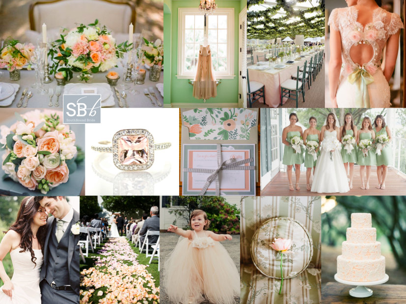
Good morning, brideys! How was your weekend? I’ll admit, I spent most of yesterday dying on the couch after an awesome day with my university girls – gosh, I love them, but when we get together it usually means a day of recovery! Anyway, in between feeling sorry for myself, I put together this pretty board, which was a reader request from Bonnita. I don’t know much more than her palette of peach, green and grey and while this is a combo I’ve done before, I always think that the balance of warm, sweet peach and cool, fresh green is so perfect for a wedding. Clearly Claire Pettibone thinks so too, because her gorgeous 2013 range has peach and mint accents like the back detail shown here. I’m totally in LOVE with the ceiling garlands at the reception pictured below – what a way to bring outside in for a marquee wedding especially, and I also love the handpainted feel of the invitations, with a chic envelope liner setting the tone. And I have to admit, I am coveting that ring, big time! Anyway, Bonnita, hope you like your board!

Colours: Peach, grey, mint

Top row (l-r): Table setting {Joy de Vivre Wedding Design & Coordination/Michael & Anna Costa}; dress {Elizabeth Messina}; reception decor with ceiling garland detail {Liz Banfield}; Claire Pettibone dress {Brian Leahy Photography/Claire Pettibone}
Row 2: Bouquet {Depict Photography}; peach diamond ring; invitation suite {Clark Creative}; green bridesmaid dresses {Elisabeth Millay Photography}
Row 3: Bride & groom {Depict Photography}; petal strewn aisle {Gabriel Harber Photography}; flower girl {Rebecca Arthurs Photography}; rose {Elizabeth Messina}; cake {Joy de Vivre Wedding Design & Coordination/Michael & Anna Costa}.


Inspiration Board: Seafoam Vineyard

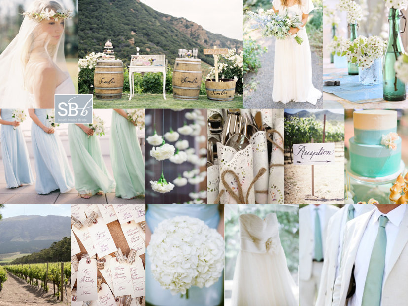
Good morning friends, and what a beautiful morning it is in London. The sun is out again, the garden’s freshly mowed (thanks Olly), and there’s still the hint of woodsmoke in the air from using the outdoor stove last night (unfortunately temperatures aren’t quite summery yet). Today’s board is a reader request from Kate, who’s planning a summer wedding at Constantia Uitsig (one of my favourite venues, and somewhere I am dying to stay!). Even though it’s very much a wine country wedding, with a rustic boho vibe and an incredible view of the vineyards and Table Mountain, Kate’s chosen a palette inspired by the sea, with soft blues, greens and cream as her colours. I love this – in fact, it’s the same palette my friend Heidi chose a couple of years ago for a garden-style wedding, and it looked fantastic. Using these cool colours is sure to make everything seem fresh and natural, and it’s also easy to warm them up with tiny touches of peach or pink. Kate had some really lovely ideas that she’ll be including, and hopefully I’ve added a few more to the mix with her board. Hope you like it, Kate!

Colours: Pastel blue, green and cream

Top row (l-r): Boho bride {Rylee Hitchner/Joy Thigpen}; barrels as tables {Caroline Tran Photographer/Malibu Family Wines}; loose bouquet {Erich McVey}; blue and green glass containers with white flowers
Row 2: Bridesmaids {Judy Pak Photography}; hanging carnations; doily cutlery wraps; reception sign {Braedon Photography}; cake {Abi Q Photography/Sugar & Fluff}
Row 3: Constantia Uitsig; cork escort cards {Braedon Photography}; hydrangea bouquet {Scott Piner}; dress {Scott Piner}; groomsmen {Jenna Walker Photographers}


Inspiration Board: Urban Alice

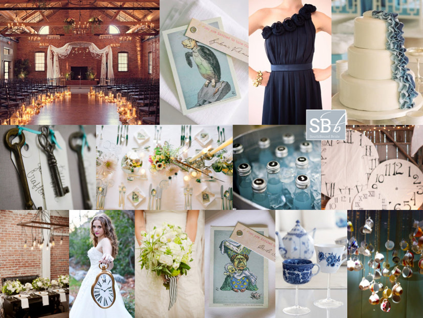
Hello lovelies! I am rushing around backstage, getting the last bits ready for our Editorial Wedding workshop… tomorrow! Eek! Anyway, I had just enough time to put together an inspiration board – and this was such a cool reader request! Kayla wrote to tell me about her summer wedding at The Cheney Place, which is an absolutely stunning venue with face brick walls and an elegantly urban loft sort of vibe. She and her fiance want candles and string lights everywhere, a wedding that is casual, romantic and fun. They also want a bit of an Alice in Wonderland theme going on. I have to say, I absolutely LOVED this whole idea (using a palette of navy, cerulean blue and white, although you could add in a rose or blush shade for extra colour). Candles and hanging lights (love the bulbs!) are so magical, and work beautifully against brick. Keep bridesmaids chic in navy and flowers soft, but with a bit of an unexpected edge like the spiky accents to the bouquet below. Alice is a great theme, but can be completely overdone – you can keep the motif fun and classy with stationery details (love these character card place settings with the original artwork so much!), a few clocks and keys and then some slightly mad touches, like the hanging teacup installation or the teacup glasses (how cute are these?). You just need enough mad hatter to give your guests the idea that this is a fun, slightly avant-garde celebration, and then let them take it from there! Have a great wedding Kayla – can’t wait to see it and hope you like your board!

Colours: Navy, cerulean, white

Top row (l-r): Urban candlelight setting; Alice in Wonderland place card {Carmen and Ingo}; navy bridesmaid dress {Kristin Vining/Weddings in the Bahamas}; blue ruffle cake {Adrienne Page/Tara Guérard Soirée/Val Cakes}
Row 2: Key escort cards; table setting {Carmen and Ingo}; drinks {Liga Photography}; clocks {Braedon Photography/Tricia Fountaine}
Row 3: Table with lights {Krista Mason/Chic Celebrations}; bride with clock {Alyssa Marie Photography}; bouquet {Krista Mason/Chic Celebrations}; Alice in Wonderland place card {Carmen and Ingo}; teacup glasses; hanging teacups.


Save

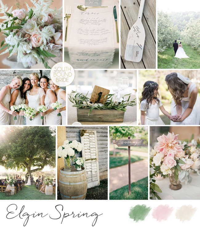
Inspiration Board: Elgin Spring

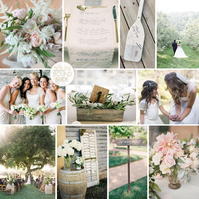
I have an extra special inspiration board today, as it’s for my beautiful cousin Caitlin, who’s currently planning her wedding. Caty grew up on an apple, pear and now wine farm in Elgin – one of the most beautiful places ever – and that’s where she and her fiance will be having their late spring wedding this year. It’s going to be gorgeous, and I love Caty’s idea of using a soft, dreamy palette of whites, creams, grey and pale blush pink with lush blooms and some rustic textures that pay tribute to the farm with wine barrels and apple crates. I think when you go for this sort of look, the best thing is to keep it simple but do the basics well – gorgeous flowers are the biggest building block, along with soft hair, flowy bridesmaids’ dresses (in grey, white or blush will work). I’d mix up the bouquets to include a variety of blooms including silver brunia, but also blushing bride proteas (a big floral crush of mine at the moment!). Use rustic shutters (to hold escort cards?), calligraphed signs and printed calligraphy napkin menus, and apple cocktails for after the ceremony (also love these painted white apples as place or escort cards, or just for fun). I’ve also included a little nod to Caty’s rowing talents with an oar guest book (although another sweet idea is to use paddles as signposts). It all adds up to a classic but contemporary look that is super romantic.

Colours: White, cream, blush and grey

Top row (l-r): Bouquet with blushing brides {Florali}; printed calligraphy napkin {Rylee Hitchner Photography/Jessica Sloane Event Styling & Design}; oar guest book {Alea Lovely}; bride and groom {Marta Locklear Photography/Diamond Events}
Row 2: Bridesmaids {Polly Alexandre Photography}; crate with olive leaf details and table number {Punam Bean Photography}; bride and flowergirl {Hristina Piltz}
Row 3: Ceremony with wine barrel entrance {Jose Villa}; wine barrel and shutter escort cards {Laura Gordon Photography/Tyler Flood}; ceremony sign {Jose Villa/Laurie Arons Special Events}; flowers and silver vase {Gia Canali Photography/Delicate Details}.

Rustic Romantic Inspiration Board


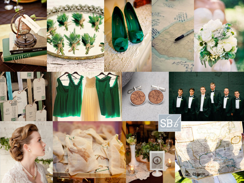
Inspiration Board: Bon Voyage

Well, I promised you folks a week of inspiration, and that’s exactly what we’re delivering! After this morning’s colourful wedding, this afternoon we’re concentrating on just the one colour – the only colour this year dahling, Pantone’s 2013 colour of the year, emerald green. Reader Heather wrote to ask for an emerald board for her spring wedding in New Orleans. As it’s a destination, Heather and her fiance plan to incorporate maps and a travel motif, but they want to keep things simple and elegant. So I’ve kept travel details to a minimum, with a map guest book and other subtle touches – a little globe, postcard-style escort card tags, antique map boutonnieres for the guys and super sweet vintagey favour bags. Combined with lace and the deep emerald shade, it creates the sort of vintage feel Heather wanted, and has a nod to travel without feeling themey. Flowers are kept simple white with prominent foliage, as are the boutonnieres, and the bridesmaids wear emerald dresses with emerald shoes for the bride. For the tables, a lace runner is perfectly pretty, with a variety of small arrangements in different vases. It works, doesn’t it? Yay for emerald. Hope you like your board, Heather!

PS Photographers, if you really want to be inspired, come back in an hour when I’ll be giving you a sneak peek of what’s to come on our EdWed shoot! It’s GOOD. :)

Colours: Emerald and ivory

Top row (l-r): Mini globe on books {Blush Bridal Consultation Group/Lauren Brooks Photography}; thistle boutonnieres {Jose Villa/JL Designs}; green shoes {Dally Street Images}; map guest book {Snap Weddings}; bouquet {Anne Robert Photography/Petals & Hedges}
Row 2: Postcard escort tags {Tracie Howe Photography/Blush Celebrations}; bridesmaid dresses; cufflinks {Not on the High Street}; groomsmen {Shannen Natasha Photography}
Row 3: Bride in lace wedding dress {Tracie Howe Photography/Blush Celebrations}; favour bags with vintage aeroplane {Sarah Layne Photography/Your Perfect Bridesmaid}; table setting {Sarah Layne Photography/Your Perfect Bridesmaid}; couple with map {Celeste Duran}.


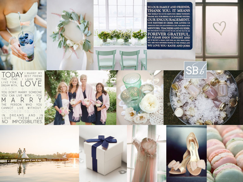
Inspiration Board: The Lake House

Good morning, friends! Who’s ready for an inspiration-filled week? Well, I hope you are, because this week we have not one but FIVE reader requested inspiration boards to share with you. That’s a different board every day, and five different looks to fall in love with. And that’s alongside our usual raft of loveliness, so get ready to get in trouble with your IT department for stopping by SBB at least twice a day! ;) (Of course, if that’s a problem, you can always subscribe via email.) So let’s get started! Today’s board is for reader Ashley, who’s planning an autumn wedding at a lake house in Minnesota. How romantic does that sound? And romantic is the right word for the palette she’s chosen (LOVE): navy, mint and blush. Most autumn palettes are warm, but this combination of cool shades makes me think of those first chilly mornings by the water (how I miss my river runs!). Ashley’s theme for her wedding is ‘happy, love, best friends’ and she wants a mix of classic, vintage and casual comfy. I think we’ve struck the right balance here and I love the typographic elements – the invitation using the ‘today I marry my best friend’ quote and the thank you card at each guest place. The final result is soft but a little preppy, and very very pretty. Hope you like your board, Ashley!

Colours: Navy, mint & blush

Top row (l-r): Cocktail with blueberries {Chrisman Studios}; flower garland {KT Merry Photography/Beauty in the Making}; table with mint chairs {Martha Stewart}; thank you card; window with heart {Elizabeth Messina}
Row 2: ‘Today I marry my best friend’ invitation; bridesmaids with blush wraps {Emily Steffen Photography}; mint and clear vases {Laura Ashbrook Photography/Floral Occasions}; lemonade in mason jars {Ulmer Studios}
Row 3: Bride and groom on pier {Caroline + Ben Photography}; wrapped box; pink dress {Elizabeth Messina}; pink shoes; macaroons.


Inspiration Board: Antique Teal & Rose

Good morning, lovelies! I have two gorgeous inspiration boards to share with you today, both requests from you, our SBB readers. The first is all about the soft vintage palette of dusty pink and teal, and is just for Janel, who is planning a summer wedding at a wine farm. She told me she loves girly things, like lace, flowers and ribbon, and wanted to incorporate these. I can’t think of a prettier, girlier motif than a bit of lace, hanging from the trees in embroidery hoops, draped along the table as a runner. Use vintage objects to create an antique shop feel (just like this couple did so successfully), and the softest pink flowers (in LOVE with this bouquet!), bridesmaids’ dresses and shoes for the bride. I also love the romantic teal touches – paper pom poms, glass jars, and gorgeous painted chairs (if only Anthro did hiring!). Hope you like your board, Janel!

Colours: Soft dusky pink, teal & white

Top row (l-r): Bride {Paul Johnson}; bouquet; lace embroidery hoops {White Rabbit Studio}; lace table runner {Sean Money + Elizabeth Fay/Tiger Lily Weddings}
Row 2: Pink shoes {Marie Labbancz}; wrought iron chair {Anthropologie}; paper pom poms; antique shoe stretch {Maryke Harper Photography}
Row 3: Suitcase & books; pink champagne cocktails {Jose Villa Photography}; pink bridesmaids dresses {Alexis Diack}; vintage teal and rose table setup {Events by Heather Ham/Picotte Weddings}.


Inspiration Board: Nautical Rustic

Good morning, lovelies! It’s a new day, a new week: what will you accomplish? I’m feeling super fired up myself, as this week we’re launching a little project that’s been developing off-camera for quite some time, and I can’t wait to share it with you! So look out for an announcement (especially my lovely photographer friends and followers!). Anyway, let’s move on to today’s wedding inspiration, which is a request from reader Natassja. She’s chosen nautical rustic as her theme, and I absolutely fell in love with the concept! Natassja is getting married at Swartvlei beach, and she’s using a classic nautical palette of blue, red and off white. The great thing about nautical style is that there are lots of rustic textures, and texture is what rustic styling is all about. Think lots of rope, net and real boating ephemera. I love the idea of the rope table numbers especially, and the rope wrapped vases (both easy and effective DIY projects). Use the same big textures as statement pieces at the ceremony, or knot a rope curtain at your makeshift altar. Keep stationery crisp, or incorporate the gorgeous watercolour motif that’s so popular at the moment. I especially like the semaphore motif, which has the couple’s monogram spelled out with flags! And just because we’re going nautical doesn’t mean I couldn’t include this year’s rustic wedding must-have: the naked cake! How gorgeous (and delicious!) is this red velvet creation? I absolutely love this look – hope you do too, Natassja!

Colours: Navy, cherry red, off-white, taupe

Top row (l-r): Rope heart {Rachel Peters Photography/Kiss The Bride}; red velvet naked cake {Michelle March/Unearthed Vintage}; cake toppers {Jaco le Roux}; rope table number {}; origami boat {Purple Tree Wedding Photography/Affairy Event}
Row 2: Invitation {Swiss Cottage Designs/Love* Jenna Calligraphy}; ceremony area {Erin hearts Court/Five Star Weddings and Events}; rope vases {Bayside Bride}; bridesmaid with yay sign {Captured Photography by Jenny/My Event Boutique }
Row 3: Ship’s netting decoration {Fox Fotography/Dairing Events}; red anemone bouquet {Michelle March/Unearthed Vintage}; semaphore invitation {}; bride and groom with ship wheel {Troy and Aimee Grover}.


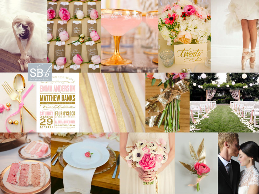
Inspiration Board: Sugarplum Fairy

Hello lovely friends – hope you all had a fabulous weekend. London was COLD, so I spent it wrapped up warm inside! Last Thursday I indulged myself in all things Sparkle & Blush, but today I’m moving on to a whole new pink and glitter inspiration board obsession. This one was created especially for reader Marielen, who is planning a spring wedding in Canada. She’s a fan of everything ballerina, and wanted something classic, modern and romantic, as well as warm and inviting, in pinks and golds. Well, pink and gold is one of my absolute favourite combos, and Marielen could just go for basic ballerina blush, pairing it with gold glitter (which is itself a lovely combo), but I really love the addition of a hot pink (this is also a great colour combo if you’re going to use graphic black and white as a base). It just adds that extra bit of warmth and brings the look bang up to date. Adding a bit of ballerina style is no problem – there are many gorgeous ballet-inspired dresses around at the moment, and I do love a bride in ballet slippers. Make sure bride (and maids) are in chic buns, and accessories with lots of tulle and ruffles and ribbon – both in the bridal party and at the reception. I love the use of roses here – they really are a classic – and especially the sweet escort cards and also a little rose bud at each place setting. Another lovely touch is the glittery ribbon for the bouquet. And speaking of ribbon, an idea I really love (that is a subtle but very pretty reference to the ballet stage) is to have a ribbon curtain for the aisle – how gorgeous does it look? It’s something you could do inside (against a blank wall) or out as pictured here, and will really make an impact! If possible, you can also re-use the curtain (now ungathered) behind the main table at the reception. I must say, I really love this look – hope you do too, Marielen!

Colours: Blush pink, candy pink, hot pink, gold glitter

Top row (l-r): Ballerina {Asian Bees}; rose escort cards {A Bryan Photo/Calder Clark Designs}; blush cocktails {Insight Creative/Carbine Avenue}; centrepiece {A Bryan Photo/Calder Clark Designs}; ballet shoes {Yan Photo/Honey of a Thousand Flowers}
Row 2: Gold cutlery; pink and gold invitation {Fine & Dandy Paperie}; pink and gold ribbons {Insight Creative/Carbine Avenue}; sparkly bouquet tie {Confetti Pop }; aisle {Edyta Szyszlo/lovely little details}
Row 3: Pink ombre cake {Edyta Szyszlo/lovely little details}; place setting with rosebud {Q Weddings/Suzanne Court Catering & Events}; bouquet {nbarrett photography/Lavender Joy Weddings}; pink flower boutonniere {Confetti Pop}; bride and groom {Rebekah Westover Photography/Attention 2 Detail Events}.