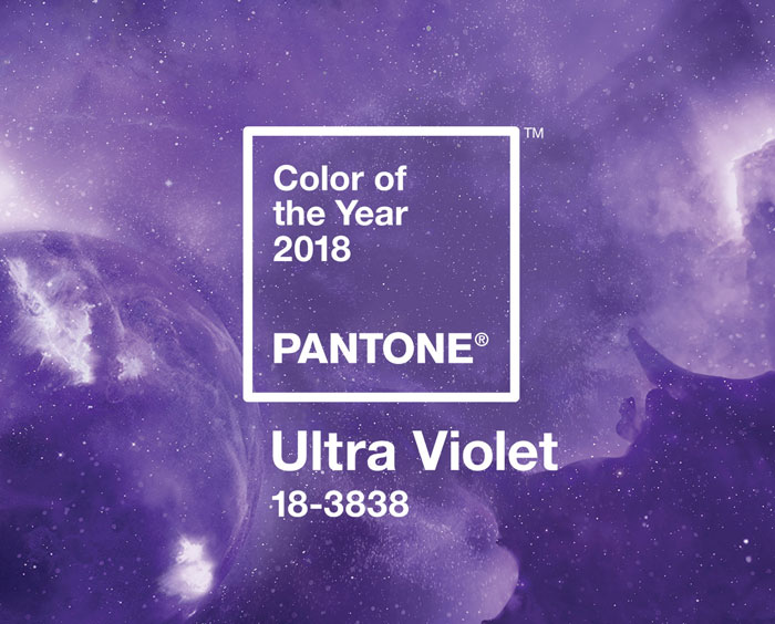
So this month, our editorial theme is ‘Cosmic Love’, and we’ll be using it to explore all things celestial wedding, but linking it at the same time to the latest development in the Pantone Color of the Year universe: Ultra Violet? Why, well, as Pantone themselves say: “Ultra Violet suggests the mysteries of the cosmos, the intrigue of what lies ahead, and the discoveries beyond where we are now… the vast and limitless night sky is symbolic of what is possible and continues to inspire the desire to pursue a world beyond our own”. I also love how Ultra Violet links to some otherworldly design elements, most notably iridescence, set to be a huge trend for 2018 (so expect to see some of that this month too, yay!). I think one of the key things about Ultra Violet is that it’s one of those colours that on its own can be… well, a little too much. It’s a great purple, but it’s still a bold colour and you don’t want to let it take over your wedding. But it combines beautifully with so many other shades: blues and greens, pinks, softer purples (maybe one of my favourite ways to use it), neutrals, pastels and berry shades alike. It lends itself to the current trend of having several colours (or tones) in your wedding palette, instead of playing mix and match. Plus, since you’ll find this shade in many flowers, I’m hoping that we’ll be seeing it in abundant florals the way Greenery did. Today we’re breaking down just a few of the options: a unicorn iridescent board suitable that is bang on trend, a softer country boho palette, a moody purple and grey number which I am loving, and a juxtaposition of purple versus bright red that really pops! Links in bold denote affiliate links. SBB may make a commission on any sales made.
Category: Purple
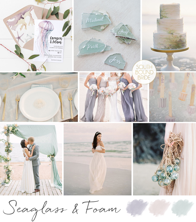
Inspiration Board: Seaglass & Foam
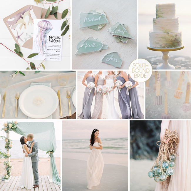
When it comes to beach weddings, some colour schemes pop up over and over again – usually variations on the ocean colours of blue and green. Nothing wrong with that – I’m always a big fan of everything in the blue-grey spectrum! But you don’t need to limit yourself if you’re yearning for a coastal celebration but attracted to some of the other colours of the rainbow. Today I thought I would bring together a soft seaglass green with pale lavender and a touch of peachy blush, and I have to tell you, I love it! What do you think? This post includes affiliate links (in bold); SBB may receive a commission on any sales but the cost to you remains the same.
Top row (l-r): Jellyfish invitation (Love Me Do Design) | Seaglass escorts (Keith Morrison) | Cake (Brett Heidebrecht/kneadtomake)
Row 2: Place setting (Erich McVey/Ginny Au) | Bridesmaids in purple (Kelly Kollar Photography) | Popsicles (Eric Kelley Photography)
Row 3: Ceremony (Anastasiya Belik) | Bride on beach (Hairpiece: Romantic Art Life/Dress: Jillian Fellers) | Glass float ‘bouquet’ (Maria Lamb Photography/Emily Riggs Bridal)
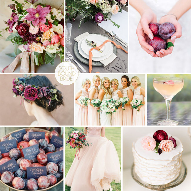
Inspiration Board: Each Peach Pear Plum
Time for some colour inspiration, lovelies! I’ve said it before, my favourite thing about using fruit and veg (since farm fresh decor is what we’re talking about this month) is the purity of natural colour, which is just never quite the same in synthetic form. So when it came to designing a board in the colour plum, I knew I wanted to follow the natural variation of actual plums instead of just the deep paint shade – a mix of Marsala or burgundy red moving right into rich purple. And to keep things bright and romantic, I’ve combined it with peach and white. I’m pretty much in love with the result – how about you?
Colours: Plum, burgundy, peach & white
Top row (l-r): Bouquet (Twig & Twine/Adelphi Productions/Christina McNeill); place setting (Hudson Nichols Photography/Bottle Pop Party Co./Fresh Designs Florist); plums (Claire Thomson)
Row 2: Flower crown (Heather Hawkins Photography/Bows And Arrows/Makeup Santa Fe); peach bridesmaids (Belle and Beau); peach cocktail
Row 3: Plum escort cards (Adam Barnes); peach wedding dress (Sara Hasstedt/A Vintage Affair Events & Rentals/Violet Floral Design); ruffle cake (Kina Wicks)
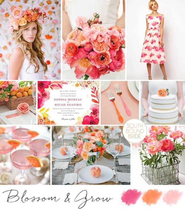
Inspiration Board: Blossom & Grow
Sometimes I go through a phase where I do a bunch of more subtle and sedate inspiration boards, and I absolutely love working gentle or neutral tones and elegant, grown-up combinations. And then some days I just want to go mad and play with some colour. That’s today, and I have to tell you, I am loving the result. That’s the thing about using bold colour in your wedding- it adds a feeling of fun and happiness to the day, and there’s no reason why there has to be a trade-off in sophistication. Take today’s flower-filled inspiration board – big, bold punches of orange and fuschia and peach, with an underlying white to offset all of that colour. Modern, beautiful, and inspiring.
Colours: Peach, orange, fuschia

Top row (l-r): Bride in flower crown {Ali Harper Photography/Amy Osaba}; bouquet {Stylish & Hip Weddings/Shiramisu/The Green Vase}; floral print bridesmaid dress
Row 2: Tablescape {Rebecca Wood Photography/Cynthia Martyn Events Inc./Stemz}; floral invitation {Wedding Paper Divas}; paint dipped cutlery {KT Merry/David Arthur Fittin/Lucia Paul Design}; cake {JoPhoto}
Row 3: Cocktails {Christy Tyler Photography/Reenie Rose}; table with peaches {Justin DeMutiis Photography/Jade Lee Events}; flowers in wire basket {Rebecca Wood Photography/Cynthia Martyn Events Inc./Stemz}
Inspiration Board: Pumpkin & Lavender
Happy Monday friends! As part of our month of autumn awesome, over the next few weeks we’ll be focusing our colour inspiration on Pantone’s Fall 2015 palette (be sure to check in this afternoon, when we’ll be introducing all the colours and pairing them up with gorgeous bridesmaid dresses). Today we’re starting with a combination of mustardy yellow and bright violet shades – absolutely perfect for a warm but very pretty autumn wedding. Add touches of soft purple and pumpkin shell orange to round it out, and you have a beautiful seasonal look.
Colours: Pantone Amethyst Orchid, Pantone Oak Buff, heather & orange
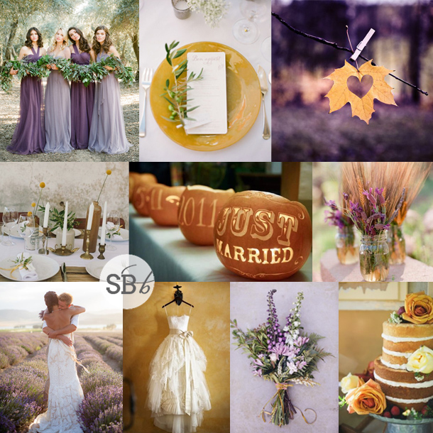
Top row (l-r): Bridesmaids {Stephanie Williams/Jenny Yoo}; place setting {KT Merry Photography/Clara Tuma Photography}; leaf
Row 2: Tablescape {Love Made Visible/De Liefde}; carved pumpkins {Laughter & Light}; mason jar centrepieces {Beaux Arts Photographie}
Row 3: Bride & groom {Amy Lashelle/Scenemakers}; wedding dress {Catherine Hall Studios/Holliday Weddings/Vera Wang}; bouquet {Anna Kidman/Mildred & Co + Lu Diamond Flowers}; naked cake {Paige Reaux Photography}
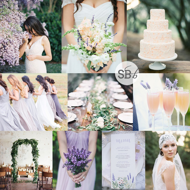
Inspiration Board: Lavender, Peach & Emerald
Goodness but I love this colour combo! Seriously, isn’t it beautiful and fresh? The deep cool of emerald green (adding a touch of formality), softly feminine purple and lavender, and sweet peach, along with cool white. Purple-loving brides take note, because this would be absolutely gorgeous for a range of weddings. As always, I love colours brought out through natural elements, so include lots of emerald foliage in your decor – you could even have green garlands only on your tables. Dress your girls in flowing lavender gowns, and serve peachy bellinis with lavender decorations. Then just add a few more whimsical touches – a floral arch or chandelier for your ceremony, illustrated stationery, a lacy cake. Perfect!
Colours: Lavender, purple, peach, white & emerald green
Top row (l-r): Bride {Brett Heidebrecht}; bouquet {Justen Clay Photography}; peach lace cake {Michael & Anna Costa/Joy de Vivre Wedding Design & Coordination/Sweet & Saucy Shop}
Row 2: Bridesmaids {Reverie Supply/For Her and For Him}; tablescape {Rylee Hitchner/Cloth of Gold/Ginny Au/Amy Osaba}; peach cocktails {Simply Bloom Photography, LLC/La Fleur Weddings}
Row 3: Foliage arch {Mint Photography/Pink Parasol Designs and Coordinating/Bristol Lane Florals}; posey bouquet {E. Ribant photography}; menu {Joy Michelle Photography/Anchor Point Press}; bride in juliet cap veil
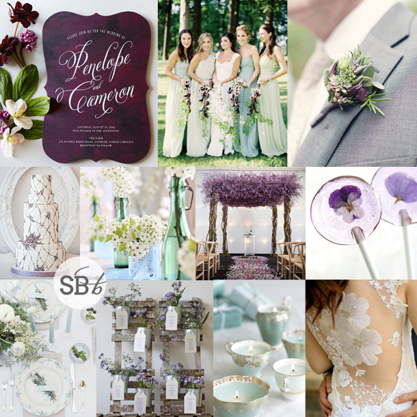
Inspiration Board: Pansy & Pastel
Hello friends! We’re entering the final stretch of the year now, and I don’t know about you, but my head is all over Christmas and new year. Starting next week, we’ll be looking back at our favourite parts of the year here on SBB, but first, we still have some more fresh inspiration to send your way. And first up is this pretty inspiration board, which mixes a strong pansy purple with soft pastel greens and blues. I think it’s so pretty, don’t you? And absolutely lovely for a summer wedding, allowing you to bring in the bright berry shades that are so popular at the moment, balanced with the softer summer hues. Gorgeousness.
Colours: Purple, mint & pastel blue
Top row (l-r): Invitation {Wedding Paper Divas}; bridesmaid dresses {Jose Villa/Style Me Pretty Weddings}; boutonniere {Caro Hutchings Photography/Scarlet & Violet
}
Row 2: Cake {SpectacularSpectacular/Ikonica/Bobbette & Belle}; blue and green glass containers with white flowers; lavender arch {SpectacularSpectacular/Ikonica/Todd Kjargaard}; pansy lollipops {SprinkleBakes}
Row 3: Table setting {Cassidy Carson/12th Table/Kelly Lenard}; table plan {The Wedding of My Dreams}; candles in teacups {Georgica Pond}; portrait back wedding dress {Pepper Nix Photography/Claire Pettibone}.
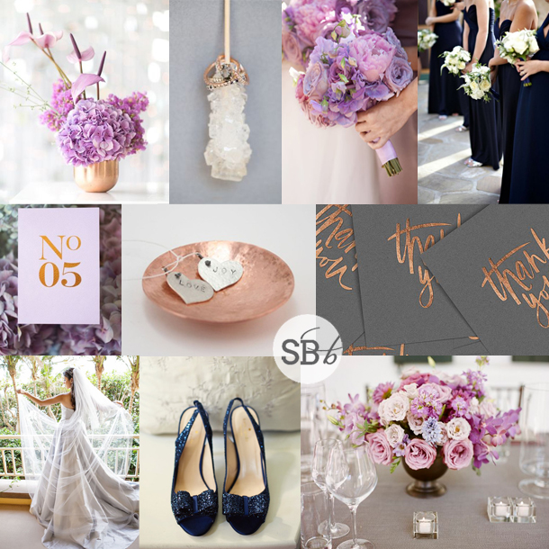
Inspiration Board: Copper, Orchid & Navy
It’s hard to believe this year is already winding down (where did you gooooo, 2014?) and that it’s almost time for a new Colour of the Year to steal the Pantone crown. I’ll be sorry to see this year’s favourite, Radiant Orchid go – although of course, it won’t go at all, just take a step back in the colour inspiration stakes. But I really liked how this pinky purple played so well with others – it really made for some unusual and gorgeous combinations. Today I’m mixing a soft orchid with one of my absolute fave metallics, copper, with a bit of grey and slate and a hint of navy thrown in. I think the combination is amazing! I especially love how the copper gleams next to the other shades, and how the navy adds that extra little bit of depth. Somebody choose this for their wedding, pretty please? ;)
Colours: Lilac, light grey, slate grey, copper & navy
Top row (l-r): Centrepiece in copper vase {Catherine Mac Photography/Fleur Le Cordeur}; rock sugar with rings {MLKL Photography}; bouquet {Aaron Delesie/Nisie’s Enchanted Florist}; navy bridesmaid dresses {Miki and Sonja Photography/XOXO BRIDE}
Row 2: Table number {Catherine Mac Photography/Fleur Le Cordeur/Seven Swans}; copper dish; copper & grey thank you cards {cocorrina}
Row 3: Bride in grey dress {Petronella Photography/Ashley Gerrity Photography/Aribella Events}; navy wedding shoes {Erik Maziarz for Carla Ten Eyck}; centrepiece {A Bryan Photo/Gathering Floral + Event Design/Kristin Newman Designs}
Inspiration Board: Chic Antique
Happy Monday lovelies! Before I dive into today’s board, I just wanted to wish the lovely Louise of b.loved a HUGE congrats on her new site and brand – be sure to head over and check it out!
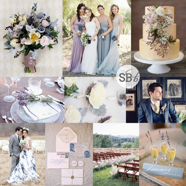
You know, it’s not so long since the vintage trend swept wedding world, but since then things have come a long way as brides and grooms try to find new ways to introduce antique elements and still keep their decor personal and unique. One way to do this is through colour – the first wave of vintage often fell back on neutral palettes, but I think today’s pastel combo has a lovely Victorian feel. I also love how the navy blue sort of anchors the softer colours, and introduces a more grown up aspect. Add a completely swoony old world invitation suite and a chic, one-of-a-kind print wedding dress, and you have the perfect ingredients for a chic antique wedding day!
Colours: Navy, lavender, blush, lemon & baby blue
Top row (l-r): Bouquet {Millie Holloman}; bridesmaids {Jose Villa Photography/MAP Events}; cake {Nikole Ramsay Photography/Victoria Keith Cakes}
Row 2: Place setting with lavender {Sugokuii Weddings Capri/Simply Bloom Photography}; boutonnieres {Erich McVey Photography/Kelly Kaufman}; groom
Row 3: Print wedding gown; invitation suite {Elisa Bricker/Mimi Nicole Events/Brown Linen}; ceremony area {Leo Patrone/Honey of a Thousand Flowers}; lavender champagne {Jen Fariello/Easton Events}
Inspiration Board: Sangria
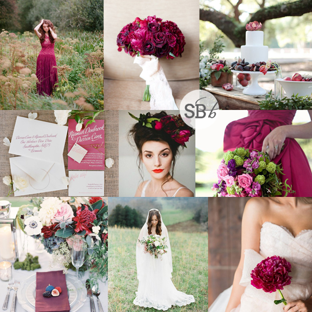
Happy Monday, lovelies! Next week I’ll be bringing you news of the brand new Spring 2015 colours from Pantone, but first I wanted to give a little love to my favourite of the Fall 2014 colours. Sangria is the sort of plummy magenta that’s the perfect compromise between classic burgundy and on-trend berry shades. I absolutely love it. All kinds of mixes would work, but for today’s board, I’ve just decided to infuse this fab colour on its own into a bold and beautiful country inspiration board. It works beautifully for cold weather, but just add a soft pink and you’ll be set for spring too.
Colours: Pantone Sangria
Top row (l-r): Magenta dress {Pearl & Godiva/Corbin Gurkin/Maria Lluisa Rabell}; bouquet {Jesse Leake Photography/Brown Paper Design}; fig cake table {Landon Jacob Photography/Spencer Special Events}
Row 2: Stationery suite {KT Merry Photography/Three Little Words}; bride with flower crown {Blush Photography/Tinge}; dress & bouquet {Maree Wilkinson Photography/New Bohemian}
Row 3: Place setting {Brushfire Photography}; bride {Erich McVey}; bride with flower {Michelle Boyd Photography/Sweet Sunday Events }.

