Inspiration Board: Elegant Pewter

Hello lovelies! I’m back from my holiday, feeling refreshed and tanned and enjoying a last little day off for the bank holiday today. Greece was spectacular, and apart from having tonsilitis for a few days, I had the best time. And the food! Oh my word. I’ve eaten enough fresh fish, feta and calamari to feed a small Greek army. Not to mention the spectacular sunsets… Sigh. Back to reality. Of course, when reality is getting to make pretty inspiration boards for Cap Classique brides, then reality aint so bad! As you know, I just love when readers get in touch to ask for their very own inspiration boards, and today’s was created especially for Elana, who has chosen pewter and white as her colours. Elana is getting married at Dieu Donne, a stunning Franschhoek venue that is all light and glass and views and facebrick, and she wanted to create a look that was classic and elegant. Think all white flowers (with touches of fynbos), long silvery bridesmaids’ dresses, mirrors and chandeliers, with macaroons as favours. I don’t know what Elana’s planning for her dress, but I love the idea of including a brooch detail either on the dress or shoes, and picking this up with the cake later on – a subtle way of pulling everything together. But the idea that really made me excited was including suspended blossoms either above the tables or as a backdrop in a key part of the space like the dancefloor or dessert table. This is a hot trend at the moment, and it’s just the kind of quirky, memorable detail that can set the decor apart. The overall effect is beautiful and timeless. Hope you like your board, Elana!

If you’d like to request your own inspiration board, email me at capclassique {@} yahoo {dot} co {dot} uk.

Colours: Pewter & white

Top row (l-r): Rose and fynbos bouquet; bride & groom (Bowersock Photography); Badgley Mischka shoes (Amy Wellenkamp Photographers); champagne flutes (Natalie Spencer); fynbos confetti (Nikki Meyer)
Row 2: Chandelier detail at Dieu Donne (Roxy Laker); suspended blooms; ornate mirror table plan (Shoot Lifestyle); grey and white macaroons (Taylor Jackson Photography)
Row 3: View at Dieu Donne (Lizelle Lotter); hanging flowers; centrepiece (Amy Wellenkamp Photographers); bridesmaids in pewter dresses (Shoot Lifestyle); cake with brooch and ribbon detail.

Inspiration Board {1 Theme 3 Ways}: Chic Safari

Happy Monday folks! We have one of my favourite features on Cap Classique this week – 1 Theme 3 Ways, where I bring you three inspiration boards around a particular theme or motif, all with very different looks. Safari style isn’t something we always associate with the Cape, since there are such spectacular bush venues around the rest of the country, but I’ve had many requests recently for safari style (more about venues later this week). In fact, one of this week’s boards was designed specifically for a reader who is considering vintage safari as her theme. But today I thought I would start with a more modern palette – one that is bang on trend in fact: green, grey, black and white. I know lots of you want to avoid the very obvious animal motifs, but I think a touch of zebra works perfectly here – just be sparing and use it wisely. I love the combination of pale green and grey bridesmaid dresses and a delicate white and green bouquet with a touch of brunia, and then bolder graphic touches like the zebra stationery and the black and white striped rosette. And this being 2011, we can’t not have a bit of sparkle – how gorgeous is this bride’s bolero? This look is ideal for a couple who want an elegant modern wedding that still has a touch of the bushveld about it, or who want to reflect elements of a game lodge setting without going overboard, and it’s very easy to achieve. I love it – what do you think?

Colours: Green, grey, black and white

Top row (l-r): Bride with sparkly bolero (onelove photography); green and grey bridesmaids’ dresses (13:13 Photography); hanging lanterns (Cari Photography); lamp with rosette (Cari Photography)
Row 2: Zebras; bouquet with roses and brunia; I Married Adventure (onelove photography); rings with stamp (Laura Ashbrook Photography)
Row 3: Bride & groom (Zara Zoo); zebra stationery suite (Paper Moss/Laura Ashbrook Photography); outdoor reception (Shanna Jones).

Inspiration Board: Par Avion

Happy Monday, everyone! Wow, it has been an exhausting weekend for me – I finally did the big move, so it has been non-stop packing and unpacking, etc. What a schlep. But I’m so excited about my new place, and can’t wait to get decorating! One of the best parts is that I have an en suite bathroom again, so get to pull out of storage a fab little gadget I have – it’s a bath rack/caddy that stretches over the bath and instead of having place for soap, has a rack for a book, and a holder for a glass of wine. Actually, it also has place for a candle, but I figured paper… alcohol… flame… maybe not the best idea! Anyway, I can’t wait to make use of it again, and with all my sore muscles from carrying boxes and a day of cleaning today, I’m sure I will soon! ANYWAY, on to today’s board, which is inspired by a different kind of moving: travel! As you may have picked up, I adore air mail stripes, and I like the idea of combining them with a soft vintage palette and fun travel, aeroplane and postage-inspired details.  It brings together the idea of love letters, and far flung places, and the old world romance of the aeroplane. This would be perfect for a couple who have done long distance, or just for one who love to (or long to!) see the world. Favourite real wedding detail? The ‘departure planes’, which were thrown at the bride and groom as they made their exit instead of confetti. Cute, huh?

Colours: Peach and soft neutrals

Top row (l-r): Bride with bouquet (Tying.the.Knot Wedding Coordination); bouquet (Ella Jae Weddings); dresses (Jose Villa); globe (Rock Paper Scissors Events/Ohana Photographers); vintage suitcases with framed escort card display (Kate Foley Designs/Catie Ronquillo Photography)
Row 2: Airmail invitation; aeroplane biscuits; air mail stamp; DIY toy glider save the dates
Row 3: Departure planes (Nine Photography); vintage plates; boutonniere (Josephine Sicad); airmail escort cards on map (Kate Foley Designs/Catie Ronquillo Photography); cake with stamp garland.

**Like this idea? Click here for more travel-inspired wedding details.**

Inspiration Board: Pewter & Rose

Today’s board is another reader request – my favourite kind! Natasha emailed looking for help with her chosen palette of pewter with a rose or dusty pink. She’d had trouble finding an inspiration board using these colours that embodied the romantic elegance she was looking for from her wine farm wedding, with a touch of formality. I have to say, I LOVE these colours! Pink and grey are very hot right now, but there are many different shades of both colours to work with and pewter is absolutely gorgeous. I think the colours on their own embody the romantic (pink) combined with the more formal and elegant (pewter), which will really help to create the atmosphere Natasha wants.

There are some key foundations to the look I’ve built up here. One is the use of lots of white (since too much pewter could be a little dark), with soft, floaty textures and classic white stationery. A second is the use of calligraphy, which again adds that romantic but formal touch and ties everything else together beautifully. Use it on everything from fun fortune tellers (these make super cute orders of service or place settings) to a table of pretty escort cards to understated place settings (don’t you just love the pink ribbon?). Of course, bringing in the metallics is equally important, which I’ve done here on the wedding dress (I die for this Vera Wang, but a sparkly belt or even brooch detail on a dress would also work beautifully), in the pewter vase and in the bridesmaids’ dresses. Of course, you could just as easily go for soft pink dresses or even a combination of pink and dove grey, but I loved these formal, full-length pewter gowns. Combine with pink bouquets to get both colours across. And speaking of flowers, I adore the single oversized bloom trend and think it would be perfect for this wedding! It adds that little something quirky and different. However, if Natasha chooses to go more traditional, then roses, peonies and anemones are all possibilities, combined with other soft pink and white blooms.

Natasha also asked about favours, as she’s considering white fans for the ladies but is a bit stumped for the boys. One thing to bear in mind is that men tend to forget to take their favours home with them, so in my experience giving them something they can use on the night is ideal. I’ve suggested cigars to play into the elegant theme, but if you don’t want them all disappearing for a little while at some point, then scratchcards, alcohol minis or something edible also work well. Otherwise you could consider bottle openers (in line with the winelands setting), playing cards, or even mini hip flasks.

Hope you like your board, Natasha! And don’t forget, if you would like your own inspiration board, just drop me an email!

Colours: Dusky pink, white and pewter

Top row (l-r): Invitation; Vera Wang Dorothy dress via The Knotty Bride; cigar favour (Joanne Markland); getaway car (Jose Villa)
Row 2: Pewter jug; bridesmaids’ dresses (Kristin Vining); ribbon place setting (Nastassja Harvey); fortune teller; rose shoes
Row 3: Outdoor vineyard ceremony (Jose Villa); calligraphy escort cards; large single bloom bouquet (Imago Vita Photography); fan favour (Brett Buchanan); pink and pewter cushions (Jeremy Harwell).

Inspiration Board: Snow White

I’ve been wanting to do this inspiration board ever since I saw the winning dessert table design in the European Sweet Table Contest by Belle Amour. Debs took a vintage fairytale approach, and with that forest wallpaper and the blood red, snow white and black as ebony colour scheme, it was simply stunning. I thought it would be a great starting point for a winter wedding. Obviously you want to avoid Disney cheese, but you can take design elements straight from the story – dozens of mirrors lining the walls, red apples at every place setting – just try to avoid the temptation to dress your seven bridesmaids up as dwarves! ;) Colette Dinnigan currently has a Snow White bridal collection, and this pretty dress has the perfect mix of drama and whimsy. Pile on the red lipstick, and you’re sure to be fairest of them all!

Colours: Red, white, black, grey.

Top row (l-r): Snow White dessert table; wedding dress; bride with ornate hairband
Row 2: Red shoes picture by Elizabeth Messina; ‘fairest of them all’ ring; red apple place setting; glass ring box; invitation
Row 3: Red apple picture by Love Made Visible; mirrors; baby’s breath; cranberry red bridesmaid’s dress.


Inspiration Board: Coral & Grey

Happy Monday! We’ll soon be featuring a stunning wedding in Simonstown, and looking at the pics got me to thinking about vintage naval prints and nautical weddings. Although navy and red is the most obvious colour combination for this theme, I love the subtler beachy beauty of coral and grey, which also happen to be two colours that are bang on trend right now. Then I remembered these gorgeous invitations from Ruby & Willow and I knew I had to do a board. I think the final result is classy and just a little rustic – perfect for a venue by the sea.

Colours: Coral, grey, charcoal and white

Top row (l-r): Bride & groom; Anthropologie whale ornament; coral invitations
Row 2: Coral cufflinks; heart pin boutonniere; ship’s wheel; succelent with rings; coral earrings
Row 3: Shell necklace; vintage naval print; coral peonies.

Inspiration Board: Citrus Martini

This week we’re featuring three citrus-themed inspiration boards inspired by Cape venues to show how a single theme can be interpreted in a number of different ways. Which one is your favourite?

**************************************************************

Today’s board is something completely different from the rustic vintage vibe we featured yesterday. It’s all about funky, modern design, using bright orange and yellow, and playful citrusey details. I adore the ceiling-high table arrangements and stationery (which both come from this amazing concept shoot), and the way grey makes the brighter colours pop. Not to mention the use of actual oranges in the bride and bridesmaids’ bouquets – so fun! And what’s a sophisticated orange and lemon-themed soiree without a signature martini? The perfect Cape venue space for this light, contemporary design is The Conservatory in Franschoek, with its huge glass panels and mod grey accents – ideal for a lunchtime wedding where your guests can really appreciate the views. For more on The Conservatory see our venue spotlight, and for more chic modern options, have a look at the Amazing Spaces website.

Colours: Bright orange, yellow and slate grey

Top row (l-r): The Conservatory ; table with branch arrangement; martinis; bride & groom
Row 2: Bridesmaids; ribbon wands; ring; The Conservatory
Row 3: Naartjie name tag; place setting; invitation; tulip bouquet.

If you’d like to see more lovely examples of fruit as part of wedding design, have a look at our feature here.

Note: None of the posts in this series have been sponsored by the featured venues, including The Conservatory.

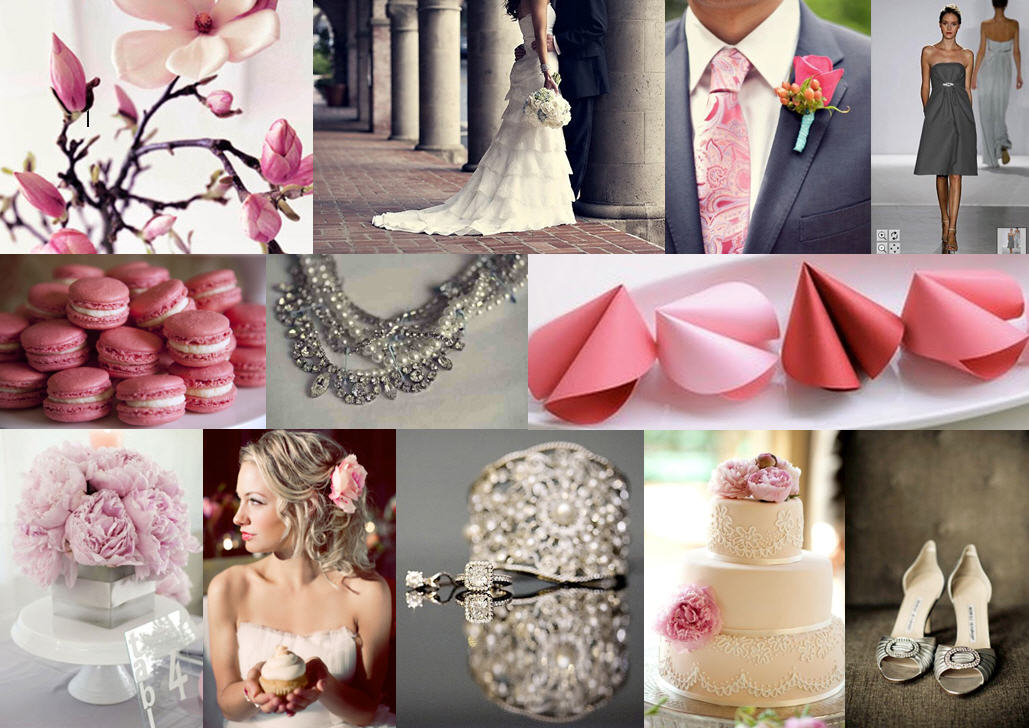
Inspiration Board: Shades of Pink & Grey

When I saw this fabulous post by Lana from lanalou style, I knew I would have to do a wedding inspiration board based on her idea of shades of pink and grey. I love the flexibility of using a range of different shades of a colour, and pink and grey look amazing (and very fresh) together. Add a bit of sparkle and hey presto, you have a modern, pretty and sophisticated palette.

Colours: Pink and grey

Top row (l-r): Flowers; bride & groom; groom’s tie and boutonniere; bridesmaid’s dress
Row 2: Macaroons; necklace; fortune cookies
Row 3: Peonies; bride with cupcake; diamonds; cake; shoes.

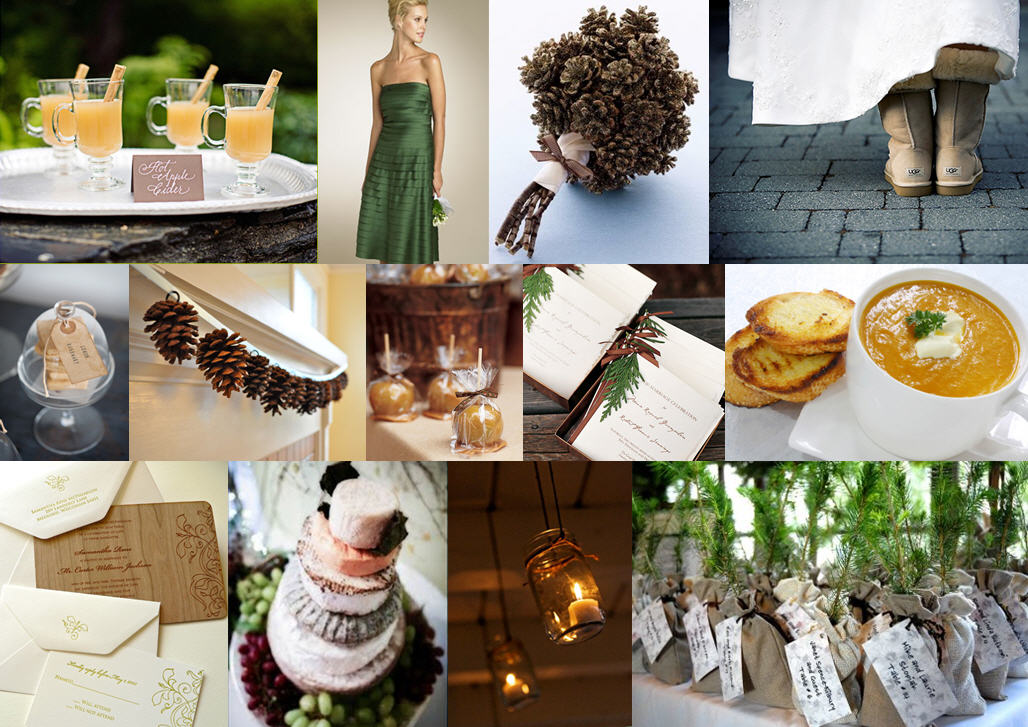
Inspiration Board: Pine & Cider

Brrr! For all of you South Africans waking up to a chilly winter morning, here’s a little bit of inspiration to warm you up. Summer weddings are glorious, but I adore winter ones too – what an opportunity to make the most of all those lovely cold comforts: open fires, hot cider, butternut soup… I just love this woodsy combination of forest green and brown, and pinecones make a lovely motif for stationery, etc. And isn’t the pinecone bouquet is just gorgeous? I love the garland as well.

Colours: Forest green and chocolate brown, with touches of mocha and yellow

Top row (l-r): Cider; bridesmaid dress; pinecone bouquet; Uggs bride
Row 2: Lemon cookies; pinecone garland; caramel apples; programmes; butternut soup
Row 3: Wood invitations; cheese cake; mason jar candles; sapling favours.

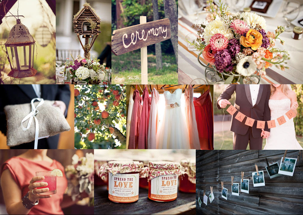
Inspiration Board: Rustic Peach & Apricot

Don’t you just adore farm weddings? Rustic details are always so charming, and give your celebration such a relaxed vibe. If you’re not lucky enough to have use of a private farm, today’s inspiration board would also be perfect for a venue like Rockhaven Farm or Beloftebos. The warm autumny colour palette, ranging from peach through apricot, pinks and purple was inspired by this beautiful wedding, but I think combines beautifully with rustic touches like the lamp, birdhouse and wooden ceremony sign. You could use burlap for the table cloths or runners, and I just love the ‘spread the love’ konfyt favours!

Colours: peach, apricot, pink, purple, white

Top row (l-r): Photo of lantern by The Nichols via Style Me Pretty; photo of birdhouse by Caroline Ghetes via Style Me Pretty; photo of ceremony sign via Green Wedding Shoes; photo of flowers by Caroline Ghetes via Style Me Pretty
Row 2: Photo of burlap ring pillow via Southern Weddings; peach tree photo by David Tsay via Snippet & Ink; photo of dresses via Style Me Pretty; photo of couple by Kristin Banta via Style Me Pretty
Row 3: Photo of signature cocktail by The Nichols via Style Me Pretty; photo of jam favours via Once Wed; photo of family picture wall via Style Me Pretty.