Inspiration Board: Coral & Glam

Tangerine may have been Pantone’s 2013 colour of the year, but if there’s a breakout shade for weddings this season, it’s coral. And boy, am I ever glad! Coral is such a warm shade, and so versatile – I can’t believe how many colours it works with beautifully! It’s also lovely reader Carrie’s favourite colour, so of course she’s chosen it for her summer wedding. And Carrie must be a girl after my own heart, because she also loves a bit of sparkle, and wants to put her bridesmaids in mismatched glittery dresses – how pretty is that? There are some lovely coral or blush and sequin dresses available at the moment, but for this board I’ve gone for one of my absolute favourite bridesmaid combos of recent times – these copper skirt and top sequin and lace mismatches are just amazing and they look so good with the coral and white bouquets! Add in beautiful copper heart Vivienne Westwood shoes, and some good as gold accents and you have the perfect amount of metallic. A good tip with coral is to use it in a sort of ombre way, with everything from a pale blush to the most powerful orange version of the colour, just the way that it is in this adorable stationery suite. Add a few special touches – homemade lemonade, a ruffly chair back, sparkly mason jars, and you have everything you need for coral and glam wedding wonderful. Hope you like your board, Carrie!

Colours: Coral, blush, white, copper & gold

Top row (l-r): Bridesmaids {P: Jarvie Digital Photography}; table layout {S: Envision Wedding Studio; P: AC Ellis Inc.}; pink lemonade {P: White Loft Studio}; blush ruffle chair back {S: Envision Wedding Studio; P: AC Ellis Inc.}
Row 2: Coral & gold stationery suite {P: Jean-Pierre Gary and Kiera Ormut-Fleishman}; coral macaroons; Vivienne Westwood shoes; fireplace ceremony {P: Justin Demutiis Photography; S: Olivier Events}
Row 3: Sparkle mason jars; lace sheath dress with keyhole back {P: Paul Johnson}; cake {Elizabeth Messina}; single bloom centrepiece {Martha Stewart}.


Inspiration Board: Olympian Blue

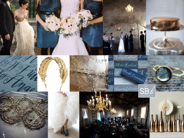
Hooray for Mondays, SouthBound Bride! And it’s no surprise I have the Olympics on my mind today. I was going to do a gold, silver and bronze board, but having just done mixed metallics last week, I thought I would focus on Olympian Blue, one of the beautiful colours from Pantone’s Fall 2012 lineup, mixed in with a bit of shiny gold, for obvious reasons. Hopefully there’ll be at least one gold to South Africa’s name by the time you read this! This blue is lovely and fresh, but it’s also quite intense, so I’ve added a light denimy blue in as well, and gone for a look that’s kind of a cross between urban and rustic, and just a bit Anthropologie. It works beautifully with the BHLDN dress top left, which I have been in love with for the last year. Another detail I absolutely adore is the calligraphed tiles for place cards (no surprise, an innovation from Martha Stewart). And for a final Olympic touch, there’s a pretty laurel-inspired gold headband. Hope you like it, and hope you’re all enjoying the games this week! (To find out more about the Pantone range and see some colour combos, check out this post.)

Colours: Olympian blue, pale blue, grey, gold

Top row (l-r): BHLDN dress {S: Alchemy Fine Events & Invitations; P: Mike Larson Photographers, Inc.}; blue bridesmaids dresses and anemone bouquets {C: Bluebird Events; P: Leo Patrone Photography}; ceremony backdrop {P: Jason Durnin}; gold cake
Row 2: Calligraphy invitation {Sycamore Street Press/Betsy Dunlap}; laurel headband; gold and white bunting; calligraphy tile place cards: topaz ring
Row 3: Olympic rings; blue shoes {C: Jenny Brown; P: Alea Lovely Photo + Video}; reception venue {P: Jason Durnin}; spraypainted bottles.


Inspiration Board: Beach Tinsel

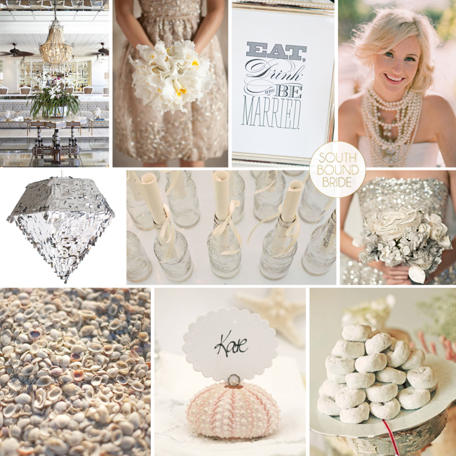
Woohoo, we’re getting our sparkle on today! Reader Tracey sent me a request for help with her summer wedding at the Oyster Box hotel – she and her fiance were leaning towards neutal colours but weren’t yet decided. They’re a young couple, so they also wanted to add a bit of fun to the event, and make their design simple and fresh. I love the Oyster Box as a venue (it’s actually one of my all-time faves) and I thought neutral colours were a great idea as not only will they work perfectly with the hotel’s interiors, they’ll also play up the colours of the beach. Flat neutrals, especially with natural and linen accents, can make for a gorgeous beach-style do. However, with Tracey’s request for fun, I immediately thought of the metallic and shimmer trends we’re seeing at the moment – there’s just something about a few sequins that puts everyone in a good mood. And it’s so easy to bring a bit of New Year’s Eve spirit into your design. Start with a basic palette of lots of clean white, with ivory and cream variations, and a bit of taupe, and then metallics like gold, silver and bronze. Add in fun sparkly accents – shiny bridesmaids dresses, metallic garlands and (my best) a blingy pinata! Pair this with beachy touches like shells and cute ‘message in a bottle’ escort cards. Finally, have fun with the food (this is an easy way to delight your guests, and makes the whole thing a fun experience) – you could have an unusual cake (like donuts) or serve mini ice-cream cones instead of dessert. Tracey can afford to be daring in her wedding attire – I just love the idea of a single (or multiple!) bold statement necklaces. What makes this look easy to pull off is that it’s essentially a classic white wedding with selected over-the-top moments, that add a real punch. And my, but isn’t it pretty? Hope you like your board Tracey – good luck with your planning!

Colours: White, neutrals, metallics

Top row (l-r): Oyster Box foyer; gold sparkle dress {P: Shira Weinberger}; Eat, Drink & Be Married sign {S: La Fete Event Design; P:Jennifer O‘Donnell Photography}; bride with statement necklace look {S: Canvas and Canopy Events; P: Elizabeth Messina}
Row 2: Silver pinata by Confetti System; message in a bottle escort cards {S: Wed Perfect; P: Denise Bovee Photography}; silver sparkle dress {S: Ginny Branch Stelling Styling & Design; P: Harwell Photography}
Row 3: Shells {S: Wed Perfect; P: Denise Bovee Photography}; shell place card {Fairyfolk Weddings on Etsy}; powdered donuts {S: Alchemy Fine Events; P: Justin Lee}: silver accent bouquet {S: Imagine… Weddings and Special Events; F: Couture Flowers; P:The Youngrens}

Inspiration Board: Beach Tinsel | SouthBound Bride

Save

Inspiration Board: Gucci Green

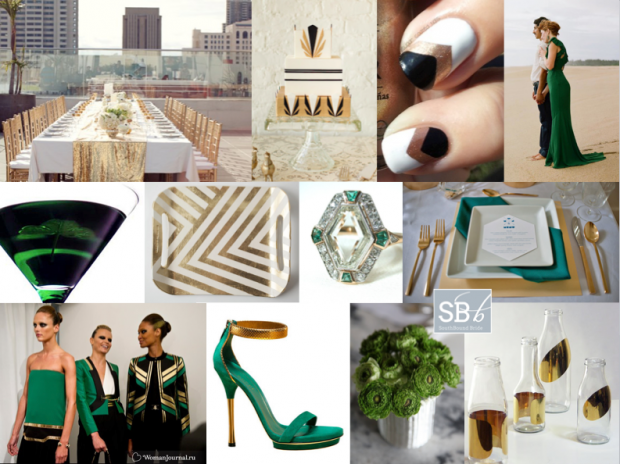
Good morning friends! I felt like doing something a bit different today – a stylish city wedding inspired by the latest catwalk trends. I adore the idea of a rooftop wedding (not enough couples trying this in SA to my mind – just think of the views from the Grand Daddy in Cape Town, for example, or the bar at the Hyde Park Hotel in Johannesburg, and check out two of my favourite Cape Town weddings with city views here and here). This time I’ve looked to Gucci’s Spring/Summer 2012 collection and created a bold palette of emerald green, gold and black (with a touch of geometrical art deco) that would really blow your guests away in the style stakes. It’s so striking. And OMG check out this bride wearing a green Gucci dress – one of the most elegant alternatives to the traditional white dress I have seen. Perfect for swanning around a terrace with your new husband, greeting your guests and drinking Emerald Isle cocktails, no?

Colours: Emerald green, black, gold


Top row (l-r): Rooftop table with gold sequin runner {S: Alchemy Fine Events & Invitations/P: Scott Lawrence}; Art Deco cake {D: Lael Cakes; P:Jen Huang Photography}; chevron manicure; green Gucci wedding dress {P: Q Weddings}
Row 2: Emerald Isle martini; gold chevron tray; emerald and diamond Art Deco ring; green and gold place setting {S: Sweet Emilia Jane; P: Captured by Aimee}
Row 3: Gucci spring/summer 2012; Gucci shoes; green flowers; gold bottles.


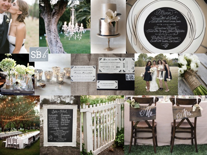
Inspiration Board: Together in Perfect Harmony

Happy Monday, folks! Hope you had a lovely weekend! Today’s inspiration board is a reader request from Robin, who is planning a black, white and silver garden/farm wedding for April next year. Robin had already chosen her colour scheme and bought many of her decorations, but couldn’t find a suitable venue in her area, so in the end decided to host the reception at her in-law’s farm, where there is a beautiful garden. I’m not sure what sort of decor Robin has already purchased, so in creating the board, I focused on how you might translate an elegant, slightly formal wedding to an outdoor setting. In fact, the two work perfectly together! Robin already told me she wanted long tables (love this idea, especially with strings of lights in the trees – what could be more romantic) and was considering a collection of glass containers with white flowers in them, which I also think is a great idea. The key then is to balance out the rustic (as a nod to the farm) with the formal. One great idea is to hire at least one beautiful chandelier, and hang it from a tree as a focal piece of decor, which really sets the tone. Stationery can be quite traditional, and calligraphy makes a really lovely detail, especially at each place setting as with the menu cards below. I was going to suggest either white dresses or black ones for the bridesmaids until I saw the pic below – what a great idea to let them wear a combination! The bride can also wear a black or silver sash, depending on the style of her dress. Silver touches come from mercury glass (which you can easily DIY) and just LOOK at this silver cake – isn’t it gorgeous! On the rustic side, consider hessian/burlap table cloths or runners, twine-wrapped bouquets, and wooden or chalkboard details. Make use of pretty features of the garden, like a gate that doubles as a place to hang escort cards. Just because the venue has changed, doesn’t mean that your style has to – in fact, in this case, I think the indoor and outdoor elements work perfectly together. Good luck, Robin – hope the rest of your planning goes brilliantly!

Colours: Black, white, silver


Top row (l-r): Bride & groom {P: Jemma Keech Photography}; chandelier in tree {P: Leo Patrone Photography}; silver and white cake {Yummy Cupcakes & Cakes}; place setting
Row 2: Flowers in varied glass containers; mercury glass votives; invitation suite on burlap {D: JK Design; P:Karen McNeil Photography}; black and white bridesmaids’ dresses {P: Alyse French Photography}; twine-wrapped bouquet {F: Gild the Lily Too; P:Alison Mayfield for Christian Oth}
Row 3: Long tables {C: Meredith Commender; P: Stephen Karlisch}; framed chalkboard sign {P: Alyse French Photography}; gate escort card detail {P: Lisa Lefkowitz}; chair back calligraphy signs {C: Amy Kaneko Events P: Jose Villa}.


Inspiration Board: Once Upon a Time

Good morning, lovelies! Before we get to today’s inspiration board (which I have been saving rather impatiently for you), I have good news and bad news. Let’s start with the good. Last week, I was absolutely thrilled and honoured to be included in a list on the Fair Lady blog of FL’s favourite tweeters! Not only is it always super satisfying to know that people like what I do here, but you guys, I grew UP reading Fair Lady. When I was a little girl, I would read my mother’s old stack cover to cover and my secret teenage fantasy was to work there one day. So this was extra special supery dupery exciting. It rocked. Merci, FL. (And if YOU don’t follow me on Twitter yet, do!)

Now the bad news. Sigh. I regret (and I really do mean regret – remember I’m an editor by trade, so missing a deadline totally cuts me up, especially when it’s one I set myself) to tell you that the new Cap Classique website will not be launching at the beginning of December. Unfortunately, some technical issues that I have no control over have got right in the way, and while the delay is only about 10 days, with Christmas coming, it only makes sense to put it off until January. Which kind of blows, but when I thought about it, I decided it was kind of cool. New year, new site, new everything. I really am disappointed, and sorry to keep you all waiting. I hope you won’t mind waiting just a liiiiiittle bit longer. Although, now that I’ve had to rejig my whole schedule for December, I do have something quite cool up my sleeve, which you’ll hopefully like. So there you go. Please don’t hate me!

And now, before I get all depro about this again, I am going to cheer us all up with some sparkle. YAY! As you know, gorgeous colours mixed in with metallics have been huge news this year, and I think we’ll see lots more of that this season. Here’s my little take on a sort of royal wedding/princessy theme, which includes my current colour obsession (navy) combined with the prettiest powder blue, champagne and then some sparkly metallics. I can’t get enough of it! It’s almost enough to make a grown woman believe in fairytales… ;)

Colours: Navy, powder blue, champagne & gold

Top row (l-r): Princess bride; navy and gold manicure; table setting (Jill La Fleur/Jose Villa); navy bridesmaid’s dress (Kristin Vining); wedding cake with crown (Jose Villa)
Row 2: ‘Believe’ gold letters; blue and gold sequin garments; metal crown; mini Moets
Row 3:‘Once upon a time’ invitations; place setting with pumpkins (Martha Stewart); bride & groom (The Brand Studio); ‘Happily ever after starts here’ sign (Studio Eleven)

Inspiration Board: Green & Gold

Good morning everyone! My apologies that last week I didn’t get to post everything I had planned – bear with me, as there’s an awful lot going on behind the scenes. For now, here’s this week’s inspiration board and it’s one of my personal favourites! Green and gold are very special colours to South Africans, as they’re our national sporting colours and also represent our beautiful land and its natural resources. So I can’t think of a more appropriate palette for a South African wedding, and don’t they just look beautiful together?! By adjusting the details slightly you could make this work for just about any season, and add more rustic or more sophisticated touches depending on your venue and taste. One of the details I love is the elegant use of green glasses and gold utensils to get the colour scheme across on the table without going overboard. In terms of flowers, you could really go with any white flowers but I ADORE the combination of ranunculus and baby’s breath in this bouquet, and baby’s breath makes a great filler for elsewhere around the church or venue, which can allow you to have a bigger floral presence than you may otherwise be able to afford. Green shoes are a must for the bride, and this is a perfect opportunity to dress your girls in trendy white bridesmaids’ dresses. In terms of DIY, moss monograms are simple and incredibly lovely, and I also love the gold spraypainted wishing tree for your guests to leave messages on. And you guys, how gorgeous is this cake? All in all, I think it makes for a beautiful wedding. Who knew you could be patriotic so prettily?

Colours: White, green and gold

Top row (l-r): Place setting (Rebecca Hansen Weddings); ranunculus bouquet; white bridesmaids’ dresses (Atlas and Campbell); wedding cake with gilt and lace details (Sweet and Saucy Shop)
Row 2: Wishing tree; moss monogram letters; green shoes (Leo Patrone); general decor with hanging mason jars (Jamie Grenough)
Row 3: Bride & groom (Tec Petaja); invitation suite (EvaPaul Design/Rebecca Hansen Weddings); mini toffee apples; baby’s breath with gold monogram letters (Hailey Erickson)

Inspiration Board: Sparkle & Blush

Happy Monday folks! Hope you had a great weekend. I had a great one catching up with friends, although I wish the fabulous spring weather we saw last month would come back! I could do with some more sunshine. Anyway, on with today’s inspiration board, which I have to say, has me feeling all girly and giddy. A bit of glitter will do that for you. As you already know, metallics are big this year and they’re often paired with a gorgeous soft pink. I’ve added just a touch of pistachio to the mix, and I think it looks delicious – an updated version of the sharper candy pink and bright green that was popular a couple of years back. This would work beautifully in just about any venue, and you could adapt it depending on the season. Just perfect!

Colours: Pastel pink and green, gold

Top row (l-r): Bride and groom (Jose Villa); teacups (AveryHouse); glittery dresses (Edyta Szyszlo); cake with crown topper
Row 2: Bride with gold bracelet (Our Labor of Love); glitzy table setting; escort cards (AveryHouse); bride with sparkly shoes (Kellie Kano); pink lemonade (Alice Hu Photography)
Row 3: Cherry blossoms; macaroons; glitter; hearts (Joielala Photographie)