Inspiration Board: French Country Farmhouse

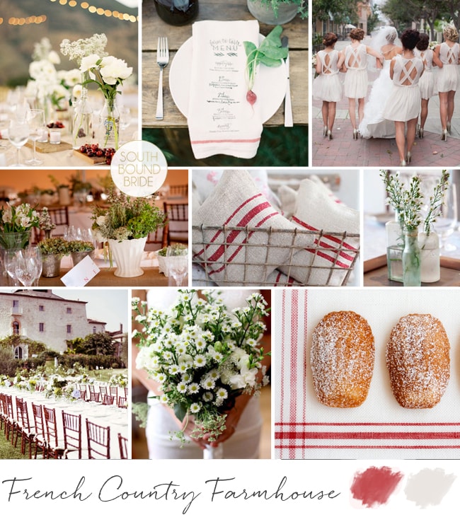
Some of the inspiration board requests I get take a little while for me to generate ideas for, but others I can wrap my head around immediately, and today’s request from the lovely Keri was one of those. Keri told me that she was planning a summer wedding with a palette of sage green, beige, cream and red, and a French country style, and that she wasn’t a fan of anything fancy, shiny or glossy. The first thing that came into my head was ticking fabric, and straight away I could picture her tables (long, of course!) – it also immediately made me think of the gorgeous country florals from Marguerite & Tom’s wedding that I featured some time ago. Keri wanted to keep her flowers white and green, and I think this is a perfect idea, especially using wild, natural arrangements placed in an assortment of bottles and vases (as if someone had just fetched them out of their kitchen cupboard). For that quirky touch of red, there’s nothing as pretty as a punnet of fresh cherries, or just loose cherries draped around the bottom of the vases as they were in this wedding (LOVE it). Use wooden boards under place settings or down the centre of the table, or cover plain boards in burlap to add height to arrangements and a central line in place of a runner. Ticking fabric tablecloths would be ideal, but plain white tables also work perfectly with ticking cloth napkins, tied loosely with twine, perhaps, or accented with a pretty calligraphed menu (you could also play with chalkboard accents for a more bistro feel). Put your groomsmen in braces and give them (and perhaps all the men) adorable straw hats, with madeleine biscuits for the ladies. Speaking of the ladies, I’ve put them in chic white dresses here (love those backs!), but of course sage or neutrals would work too. Hope you like your board, Keri – can’t wait to see your wedding!

Colours: Sage green, beige, cream & red

Top row (l-r): Table decor with cherries {P: Jose Villa; C: Duet Weddings}; ticking napkin {S: Jessica Sloane; P: Jessica Lorren}; bridesmaids {P: Bryan N. Miller Photography; C: Couture Events}
Row 2: Florals on burlap-covered board {C: Wedding Concepts; P: Adel Ferreira}; ticking pillows {Dreamy Whites}; flowers in vintage glass {C: Wedding Concepts; P: Adel Ferreira}
Row 3: Long tables {P: Rebecca Wedding Photography; C: Chic Weddings in Italy}; wildflower bouquet; first dance {P: Andrea Dozier}; madeleines

French Country Farmhouse Inspiration Board


Inspiration Board: Coral & Glam

Tangerine may have been Pantone’s 2013 colour of the year, but if there’s a breakout shade for weddings this season, it’s coral. And boy, am I ever glad! Coral is such a warm shade, and so versatile – I can’t believe how many colours it works with beautifully! It’s also lovely reader Carrie’s favourite colour, so of course she’s chosen it for her summer wedding. And Carrie must be a girl after my own heart, because she also loves a bit of sparkle, and wants to put her bridesmaids in mismatched glittery dresses – how pretty is that? There are some lovely coral or blush and sequin dresses available at the moment, but for this board I’ve gone for one of my absolute favourite bridesmaid combos of recent times – these copper skirt and top sequin and lace mismatches are just amazing and they look so good with the coral and white bouquets! Add in beautiful copper heart Vivienne Westwood shoes, and some good as gold accents and you have the perfect amount of metallic. A good tip with coral is to use it in a sort of ombre way, with everything from a pale blush to the most powerful orange version of the colour, just the way that it is in this adorable stationery suite. Add a few special touches – homemade lemonade, a ruffly chair back, sparkly mason jars, and you have everything you need for coral and glam wedding wonderful. Hope you like your board, Carrie!

Colours: Coral, blush, white, copper & gold

Top row (l-r): Bridesmaids {P: Jarvie Digital Photography}; table layout {S: Envision Wedding Studio; P: AC Ellis Inc.}; pink lemonade {P: White Loft Studio}; blush ruffle chair back {S: Envision Wedding Studio; P: AC Ellis Inc.}
Row 2: Coral & gold stationery suite {P: Jean-Pierre Gary and Kiera Ormut-Fleishman}; coral macaroons; Vivienne Westwood shoes; fireplace ceremony {P: Justin Demutiis Photography; S: Olivier Events}
Row 3: Sparkle mason jars; lace sheath dress with keyhole back {P: Paul Johnson}; cake {Elizabeth Messina}; single bloom centrepiece {Martha Stewart}.


Inspiration Board Revisited {Modern Moroccan}

Happy weekend! I have a special little bonus feature for you today, and just a tiny taster of a stunning wedding I’ll be featuring next week. Gina is the first bride I’ll be featuring who requested one of my inspiration boards, and I wanted to show you a bit of how her original ideas developed before you catch the final result. When Gina first emailed me, she was feeling like she had all these ideas but couldn’t quite picture it coming together, and wanted the design of her wedding to look cohesive. First of all, I should say that this is such a common feeling amongst brides – in fact, I hear this from almost everyone who requests a board – so if you have reached that stage then be reassured that it’s completely normal! In fact, creating a board at this stage in the process (or revising one you already have) is a great idea, because it lets you see the bigger picture (and sometimes spot from a distance when one element isn’t working with the others). Anyway, back to Gina, who had her heart set on a Moroccan theme for her and fiance Ben’s big day, but wanted to make sure it didn’t turn out looking like a tacky theme party.

Gina had a couple of colour schemes in mind, and when I created her board, I chose the one that was clean white and green, with a little touch of deep purple (using a white base with little touches of colour moved away from the Arabian Nights party vibe). Gina had access to Moroccan decor items, and I suggested scattering these around, with hanging lanterns as a key piece. For the tables, I suggested either a print tablecloth or a white one with tiles used as a runner. I also suggested low tables and a bedouin-style breakout area, and directed Gina to a few links, including this gorgeous Sunday Suppers take on Moroccan dining. Here’s the inspiration board I made for Gina:

Read More

Inspiration Board: Summer Breeze

If there’s one colour palette that seems to be winning out for the next South African season (judging by your emails, anyway), it’s a combination of soft pink and pastel green. And who can blame you ladies for picking it? It’s classically romantic, feminine and fresh – everything that a sunny spring or summer wedding aims to be. Lovely reader Riette, who’s getting married at the gorgeous De Uijlnes, has been waiting patiently for her SBB board, and here it is: a rustic and romantic summer farm wedding. Riette asked for some DIY touches and at first glance this may not seem particularly DIY since I haven’t gone for a handmade/craft look (see here for an example of this in the same colours) – however, many of the elements I’ve included can actually be easily DIYed. For example, those frosted fruits make an amazing feature, but can be created in your own kitchen (tutorial here) and birch bark vases and stands are another easy DIY. Buy plain brown card and a white gel pen for lovely place cards (or buy a simple calligraphy font online and print on brown paper if you’re not confident about your handwriting). Coloured pink glass makes a big impact (if you can’t afford to hire coloured wine glasses for every guest, you’ll still get a lot of mileage out of coloured glass candlesticks or vases) and so do delicate delights like pretty pink cupcakes and pink lemonade. But my favourite element is the blush pink wedding dress – many beautiful blush options are on the market now, and it makes a real impact without being matchy matchy with your decor. This elegantly rustic combo will look classic for years to come. Hope you like your board, Riette!

Other pink and green SBB inspiration boards: Polka Promise | Pastel Protea | Sparkle & Blush | Spade in Heaven | Honeysuckle Garden | Bicycles & Tulips

Colours: Pastel pink, green and neutrals

Top row (l-r): Blush wedding dress {P: Elizabeth Messina}; brown paper name tags {P: The Collective Photographers; C: Ariel Yve Design}; cake {P: Brandon Chesbro; C: Southall Eden}; frosted fruit decorations {P: Rensche Mari}; pink lemonade
Row 2: Green and pink bridesmaid dresses {P: Kelly Hornberger Photography; C: Gina Whittington}; invitation {Invitation Gallery}; boutonnieres {P: Laura Murray Photography}; pink cupcakes {C: Sugarbloom Cupcakes}
Row 3: Bride with fishtail braid {P: Michelle Lemley}; birch bark candle stands {P: Limelife Photography; C: Mint Weddings}; bouquet {P: Wayne Yuan; F: Mille Fiori}; table setting with coloured glass {P: Brandon Chesbro; C: Southall Eden}; bride and groom {P: White Ivory}.


Inspiration Board: Denim & Berry

I’ve been focusing on reader requested boards for a while, but today I wanted to do one of my own that’s been brewing in my mind for a few weeks now. South Africans might be celebrating spring, but here in London it’s gone straight into winter, with casserole weather pretty much all of last week, boo. With that chill in the air, my thoughts begin to turn to rich cold season colours, particularly beautiful winter berries, and I’ve paired them here with dusky blue denim. I absolutely adore the idea of denim runners or napkins (ever since I featured this amazing wedding that did it), plus it’s a very of-the-moment colour (see the latest Pantone report, for example), so there’s really no better time for denim to smarten itself up a bit and have a wedding style revival. I’ve softened it up with some whimsical letterpress and charcoal accents, as well as the fresh berries and a tiny touch of gold. Doesn’t it look surprisingly spectacular?

Colours: Monaco blue, dusk blue, plum, violet & gold

Top row (l-r): Rings & denim {Levi Strauss}; bride with bridesmaids {Erin Hearts Court}; bowtie escort cards {Martha Stewart}
Row 2: Purple shoes {Lillian & Leonard}; letterpress invitation {S: Cynthia Warren}; cocktails with fresh berries {P: The Nichols Photography; S: The Nouveau Romantics}; chalkboard menu {P: Lauren Wakefield Photography}; groom in demin suit {P: Tec Petaja}
Row 3: Outdoor table with strings of lights {P: Jimena Roquero Weddings; C: KOMODO Producciones}; bride and groom with bougainvillea {P: Tec Petaja}; denim-style napkin {P: Olivia Leigh Photographie}

Inspiration Board: Colour Burst

Never let it be said that I don’t love my readers! I know how sometimes planning can be overwhelming (especially bringing all your ideas together as the big day approaches), so when I got a wedding 911 from SouthBound Bride Stephanie, I put together this little board for her quick sharp. Stephanie had chosen a lovely deep purple as her main colour, with beautiful bridesmaid dresses for her girls. However, Stephanie was also in love with colour and fun, but was having a tough time convincing everyone else involved with her wedding that she could be vibrant and still classic and beautiful. Her dream palette – purple combined with coral, yellow and pink – was certainly unusual, so I immediately started looking for florals in this combo. As I suggested to Stephanie, if you’re working with bright colours but you want to make sure they don’t become too much, the best thing to do is keep everything else simple and let the flowers really pop. Because flowers are colours from nature, they have natural tones to them, so you don’t get the same hard colour block effect that you might with something synthetic. It’s a softer and more classic look. Luckily I didn’t have to look too long before I found the perfect inspiration shoot, and all I can say is WOW. Isn’t this palette stunning? I’m such a convert. Paired with simple place settings and classic stationery, the florals really do the talking (and they say “hello, I’m gorgeous”). You’ll notice there are a lot of peonies in the board – and yes, peonies are incredible, but they’re also hard for a South African bride to find. However, chat to your florist about other options, as there are many lush colourful flowers (ranunculus or carnations, for example) that will do a great job here. Another tip I gave Stephanie was not to try to bring all four colours into everything – combine two here, two there, and the result is cumulative.
So, what do you think? Stunning, no? Good luck with the rest of your planning Stephanie! I’m sure it will be amazing.

Colours: Deep purple, violet, coral, yellow & pink

Top row (l-r): Bouquet {P: Sara Gray Photography; S: Elizabeth Anne Designs}; purple shoes {P: Simply Jessie Photography}; centrepiece {}; colourful sweet favours {Martha Stewart}
Row 2: Deep purple bridesmaid dress {Bride & Co.}; purple and coral stationery suite {P: KT Merry; D: The Right Side Design}; purple paper straws; centrepieces {P: Sara Gray Photography; S: Elizabeth Anne Designs}
Row 3: Elbeth Gillis wedding dress {P: Cari Photography; D: Elbeth Gillis}; flowers {P: Sara Gray Photography; S: Elizabeth Anne Designs}; purple chalkboard {generated by reader}; cocktail {P: Matthew Morgan; C: Tammy Mitchell}


Inspiration Board: Trading Post

Okay, I have to tell you, I’m in love with this board. Which is a surprise, because turquoise and chocolate hasn’t always been a favourite combination of mine. I think it’s because I’ve seen it done tacky too many times, but when bride Klarissa wrote to tell me about her wedding, I knew this girl had style. After all, she chose an awesome venue – Searle’s Trading Post in Greyton. It’s super quirky and rustic and fabulous, and Klarissa knew well enough to work with its eclectic feel and just accent it with her colours. I adore the idea of a trading post ‘theme’ – a mix of found objects and rustic textures like wood and burlap. I started thinking about the sort of things you might have found at a trading post (or at least ones you might have found at my fantasy imaginary one!). How about pretty birds eggs in nests, for example? (Love these for place holders, or as part of the table decor, and they’re a fun DIY.) Old tins full of flowers. Mason jars, old door knobs, suitcases. I stumbled across this image of a poshokkie (what is the English for that, anyway?) with brown paper packages wrapped up in string – wouldn’t this make an ADORABLE escort card display? I also loved the idea of string decorations (this SBB couple did this brilliantly) and a statement turquoise necklace for the bride. It’s kind of a case of ‘anything goes’, but natural textures are the key to making it work – fortunately in a venue like this one, Klarissa will have no shortage of them. Thanks for waiting patiently, Klarissa – hope you like your board as much as I enjoyed creating it!

Colours: Turquoise & chocolate brown

Top row (l-r): Eggs in nest {Pottery Barn}; bride with turquoise necklace {Intrikate Designs}; suitcases {Retro Images on Etsy}; table setting on rough wood {P: Courtney Dellafiora; S: Valerie Metrejean}
Row 2: Blue dyed mason jar; burlap backed invitation; flowers in vintage tin {P: Heather Saunders Photography; D: The Parsonage}; poshokkie; piano
Row 3: Turquoise dress; mason jars with acorns {Pottery Barn}; cake with string ‘love’ topper {P: White Wall Photography}; vintage doorknobs on burlap runner {S: Elissa Keno; P: Kellie Kano}.


Inspiration Board: Hollywood Masquerade

Inspiration board time, lovelies! I’m back with another reader request, and this one was so much fun to put together! Reader Shiree wrote to tell me about her wedding, describing it as “Old Hollywood meets Phantom of the Opera”. How. Cool. Is. That? She and her fiance have chosen silver, black and white as their colours, and are looking for “over the top elegance” and “masked ball opulance”. Oh my goodness, I have always wanted to go to a proper masked ball, and I just love the way that Shiree is planning to combine the glamour of Hollywood with the mystique of a masquerade. Usually when I’m putting concepts together for a board I’m aware of not including too many big ideas, but this theme is ALL about drama and statement and luxe. Shiree didn’t have a venue planned, but if possible, choose one with a dramatic staircase for the ultimate entrance! Otherwise, you can create that same sense of drama in just about any surrounding (although a high ceiling is a big plus) – I’ve even seen an amazing wedding where a parachute was used draped from the ceiling. Think big. I love the marquee pictured below, with what’s almost an installation of lanterns above the dancefloor – there’s that drama we’re talking about, but it doesn’t have to cost the earth – you can use relatively inexpensive materials, but think big and more (this one’s actually a DIY – see the image credits for the link). Fairy lights are another way to add visual interest – again the more, the better! I also love the idea of other luxurious focal points: bling on the bride’s dress, a cake mirroring that design, a brooch bouquet (the ultimately opulent bouquet, surely?) and a champagne tower (so old Hollywood!). Filigree masks are just my best, and I adore the invitation pictured here, which would then be reflected by a mask at each guest’s place setting (or pinned to a large board instead of escort cards). A good lasercut stationer like Doodles in Cape Town might be able to recreate this look for you. They’re not only the perfect favour, but ensure that when you all hit the dancefloor, it’ll look like a Venetian ballroom. Or just a very fancy party at Elizabeth Taylor and Richard Burton’s house. Hope you love your board Shiree, and I can’t wait to see the final results!

Colours: Black, white & silver

Top row: Staircase; ring; Old Hollywood cake {P: Kristen Weaver}; brooch bouquet {Brooch Bouquets on Etsy}; filigree silver mask
Row 2: Letterpress mask invitation {Chic Ink}; bride {Lazaro}; mask favour at place setting {P: T.H. Jackson Huang}; fairy light curtain {}
Row 3: Dancefloor with light installation; champagne tower {Martha Stewart}; masquerade ball {Vogue US December 1997; P: Steven Meisel; S: Paul Cavaco}.


Inspiration Board: A Preppy Romance

Happy Monday, folks! The inspiration board requests have been flooding in lately, and I’ve been having so much fun turning your ideas into collages. This week I’m featuring two reader request boards that couldn’t be more different (look out for the other on Friday afternoon), starting with this piece of East Coast summery goodness. Philani wrote to tell me about her colour scheme of ‘new leaf green’ (isn’t that the sweetest way of describing it?) and white with touches of bright blue (I’ve gone for a sort of royal blue here, but this could be lightened up as far as aqua if Philani prefers). She described her style as ‘plain but elegant, kind of less is more’, which together with her colour choice immediately made me think of preppy style. Think Jackie O. – simple elegance is what this whole look is about. Stripes are a key component, as are fabrics like cotton and grosgrain, and the look is surprisingly easy to put together, especially if Philani focuses on relatively clean tables with bright green flowers and punches of blue in the napkins or stationery. I adore these bridesmaids in tops and striped skirts, and groomsmen in bowties are a must! For the bride, a relaxed but formal dress – maybe a full skirt with pockets – would be ideal. Serve signature cocktails with striped paper straws on the lawn, and don’t forget lots of lovely ribbon! Hope you like your board, Philani!

Colours: Apple green, royal blue and white

Top row (l-r): Wedding party {P: Jacque Lynn Photography; D: Events by LMG}; green striped bowtie; blue shoes {P: Elizabeth Scott Photography}; escort cards in bed of limes {P: Mishelle Lamarand Photography; D: La Fete}
Row 2: Blue and green love story invitation {D: Hello Tenfold}; blue and green table arrangement {P: Studio 28 Photography; D: The Green Ribbon Party Planning Co.}; green paper straws; wedding dress with pockets {P: Crystal Genes Photography}
Row 3: Room decor {P: Sarah Rhoads Photographers; C: Party Resources}; cocktail sticks with ribbon {P: Love Life Images; D: Simply Chic Events}; green bouquet with blue ribbon {P: Studio 28 Photography; D: The Green Ribbon Party Planning Co.}; bridesmaid with green striped skirt and blue top {P: Jacque Lynn Photography; D: Events by LMG}; green striped cake {P: Mary Ellen Bartley; C: Bijoux Doux Specialty Cakes}


Inspiration Board: La Petit Lavande

I’m very excited about today’s reader request inspiration board, since not only is it a pretty way to start off the week, but it was created for someone I know. Natalie is a university friend of mine – a fellow Minervianer – who got in touch last week to tell me about her wedding. She and her fiance are getting married in the late summer, and want a sophisticated, elegant wedding that still lends itself to being very relaxed and informal. I couldn’t have chosen a better venue for them than La Petite Dauphine near Franschhoek, or in fact, a better colour scheme to suit the venue than the one Natalie has picked: lavender, silver, and a fresh, silvery green. I could immediately picture it – the kind of romantically simple wedding that would be perfectly at home in Jose Villa‘s portfolio or on the pages of Style Me Pretty. We’re certainly looking at a French country influence, so lavender makes not just the perfect colour but a beautiful motif, and Natalie could choose to use it in her stationery as well as to add texture and whimsy (as well as fragrance) on the day. I’d have bridesmaids in lovely long dresses, and the groom with a lavender boutonniere and a stylish grey suit. Long tables, either indoor or out, would have white cotton linen, simple country-style arrangements and bread rolls wrapped in muslin and twine, with a little sprig of lavender tucked into them, at each place setting. All the best things about the French lifestyle would be represented: champagne, cheese, wine (these wine bottle table numbers are a classic, and so easy to DIY), macarons. Have guests write sweet notes to the couple and ‘post’ them in a set of little rustic ‘postboxes’, and at the end of the night take home a little bag of dried lavender to put amongst their clothes and remember the occasion whenever they smell that wonderful fragrance (Natalie could also scatter some along the aisle, as stepping on it would release the aroma). Mix together, add friends and family and some late summer sunshine, and then serve. Congrats again, honey – I can’t wait to follow along with your planning!

Colours: Lavender, silver & green

Top row (l-r): Bride & bridesmaids {P: Samm Blake}; lavender in champagne; lavender boutonniere {P: Jen Huang; D: Lee Vazquez Floral Design}; cheese under bell jar {P: Missy Cochran}; silver frame with cocktail name {P: Samm Blake}; outdoor tables at La Petite Dauphine {welovepictures}
Row 2: Macaroons; post boxes with bird {P: Elizabeth Messina}; lavender invitation suite {Hello Lucky!}; lavender sprigs {P: Kate Grewal}
Row 3: Bride & groom {P: Jose Villa}; wine bottles {P: Missy Cochran}; bread rolls with lavender {P: KT Merry; C: Sara Jean Events: D: Dreamy Whites}; table setting {P: Elisa B. Photography; C: Beehive Events}; ‘love’ bags {P: Harwell Photography; C: Ashley Baber Weddings; D: Gloriosa}