In between all the lush extra-ness of weddings these days, one word I keep hearing is ‘minimalist’ (actually, I keep hearing minimalistic – not a word people, look it up). And this less-is-more approach is what today’s inspiration is all about. Clean lines, geometric shapes, bold florals. It may be simple, but WOW does it ever make a statement! Beautifully put together by Coral of Epanouir flower studio and photographed by Debbie Lourens, this pared down style is one of the key looks of the moment, so if you’re the kind of bride who’d rather wear a slip than a ballgown, carry a single bloom instead of a cascade, and rolls your eyes when you see a flower wall, this one’s for you.

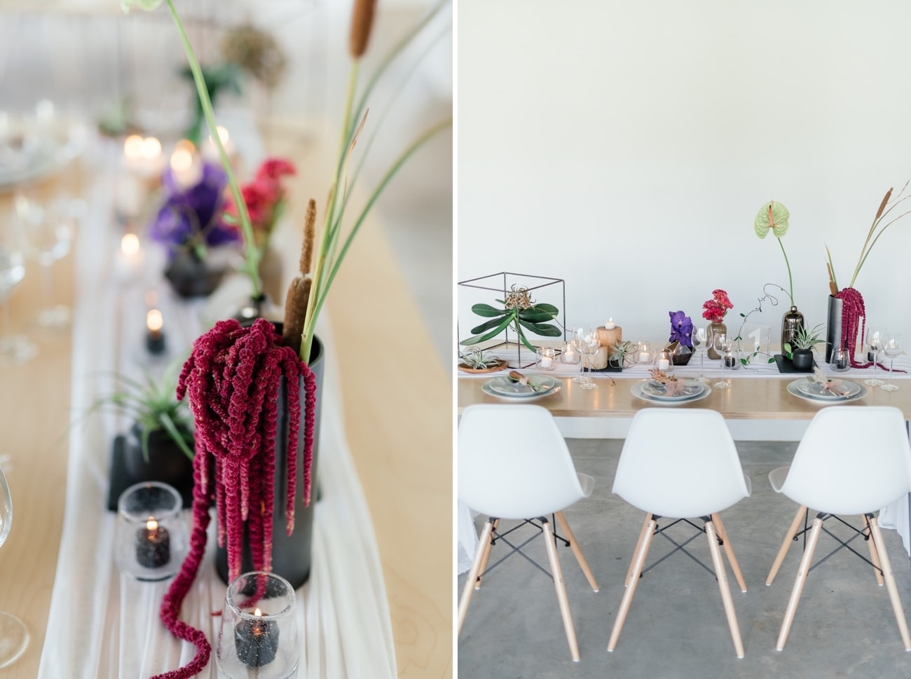
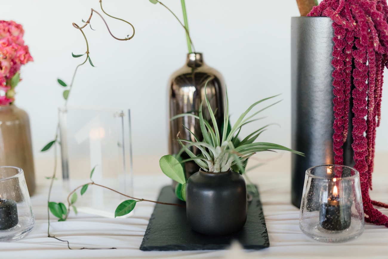
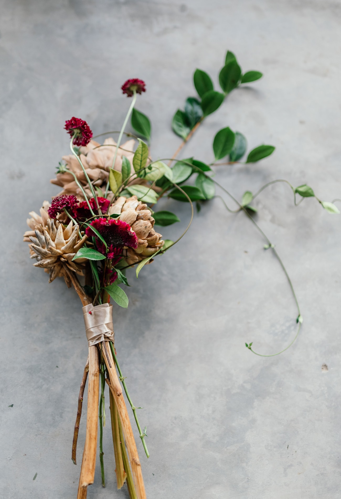
Coral told us about the inspiration for the shoot:
Pared down elegance is going to increase in popularity in our opinion, as people start to move away from the beautiful but ‘busy’ looks of vintage or botanical styling. We are already seeing this trend in many creative areas, from logo and website design to fashion, both wedding and high-street, as well as in photography and graphic design. The concept of less is more should not mean that good design is sacrificed, but that it becomes the key element of the look. It should also not be taken to mean ‘cheaper is better’ but rather that your look is more impactful through careful selection of pieces and combinations of colour and textures. And please don’t think that simple design is always easy. Often the simplest designs are the hardest to get right, as good understanding of your medium is vital to bring out its best without resorting to tricks.
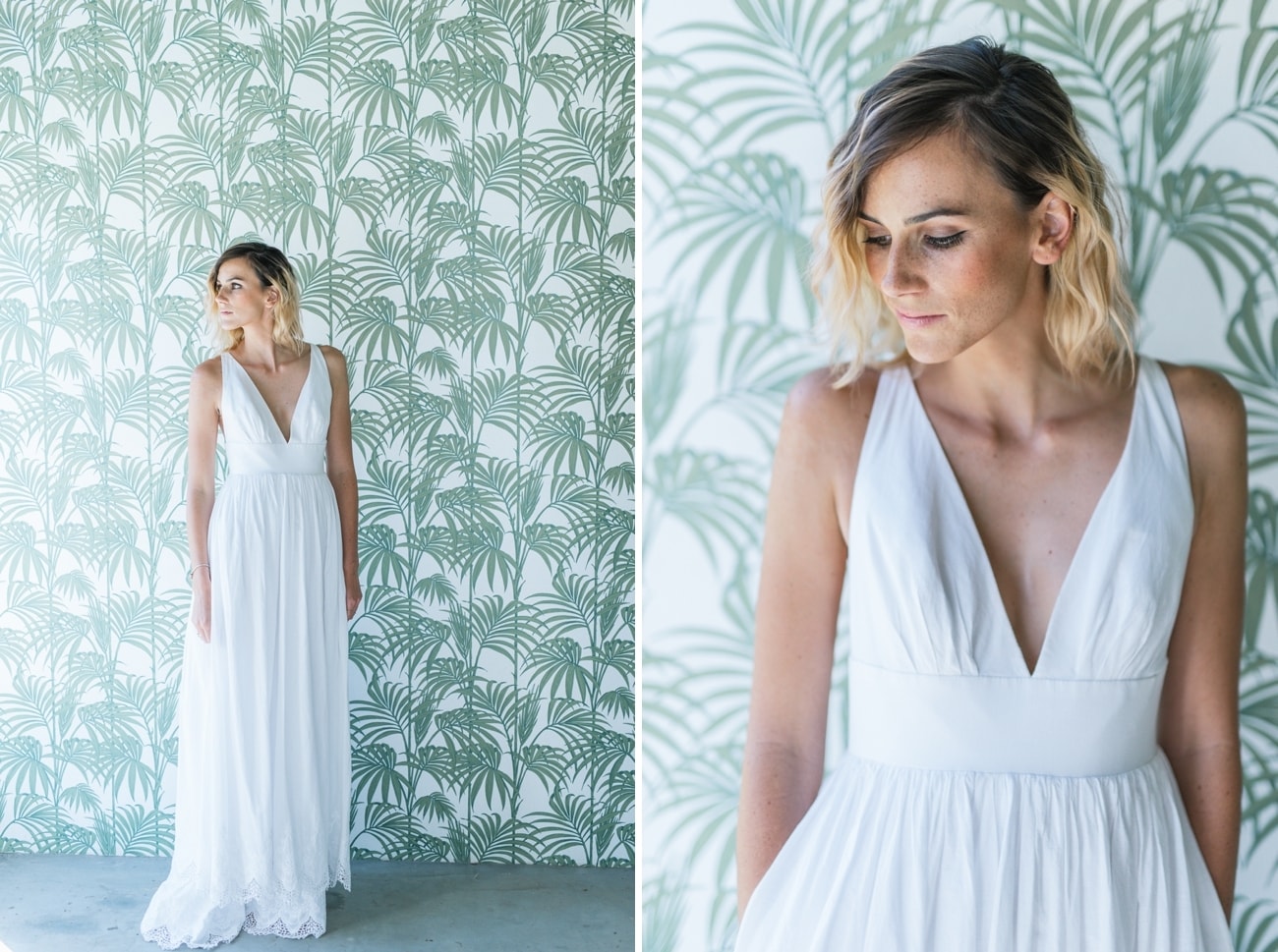
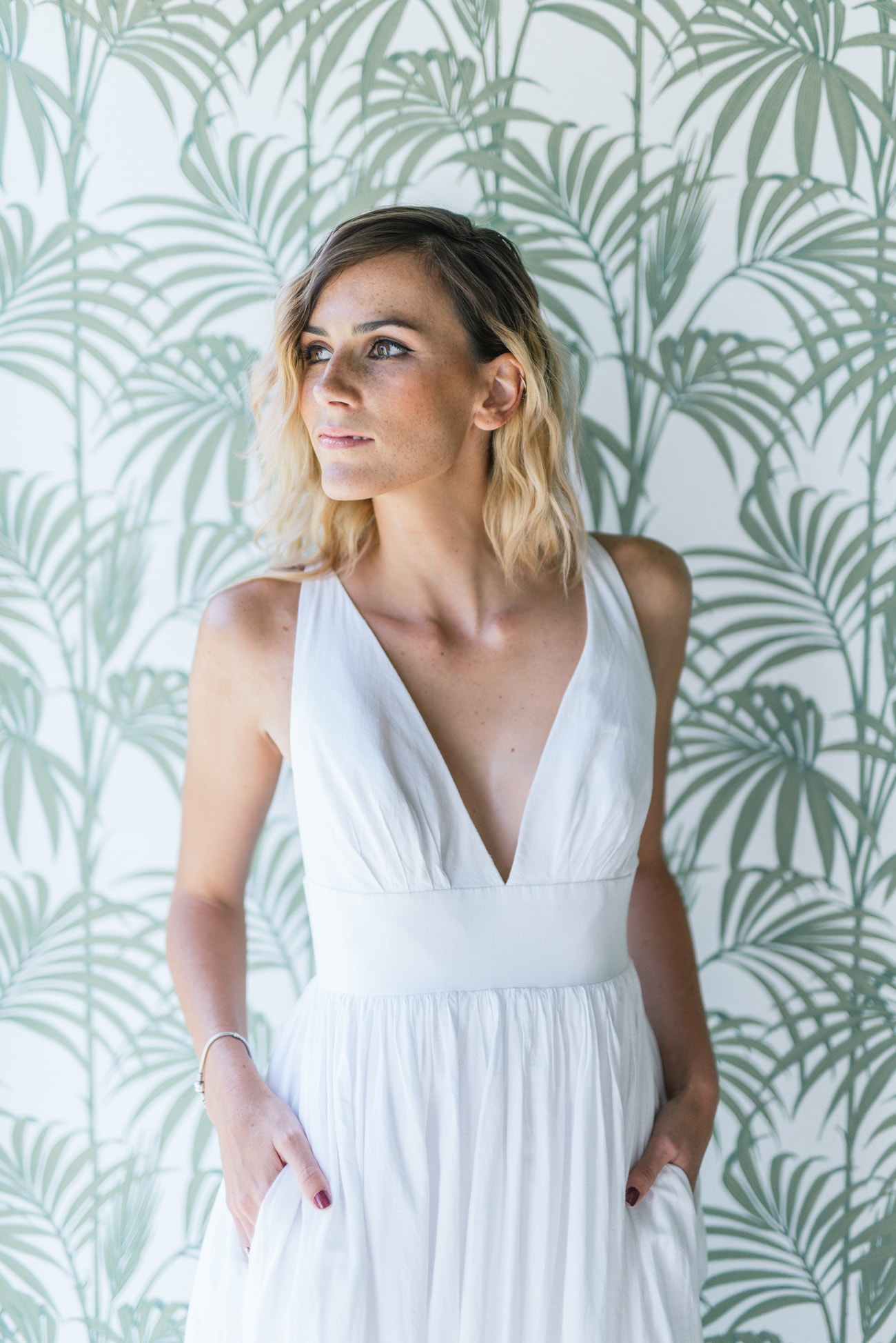
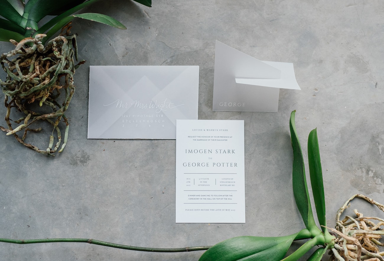
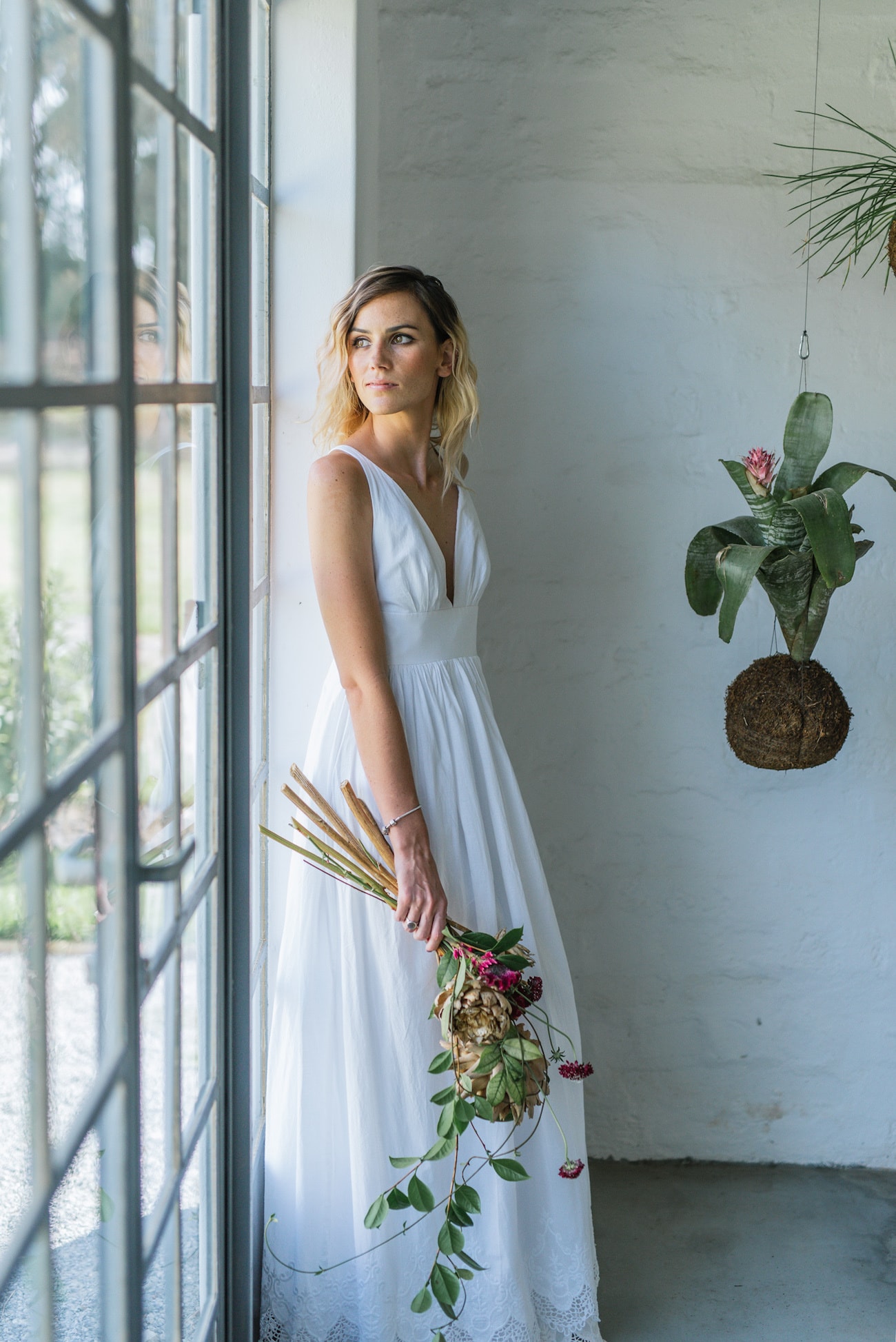
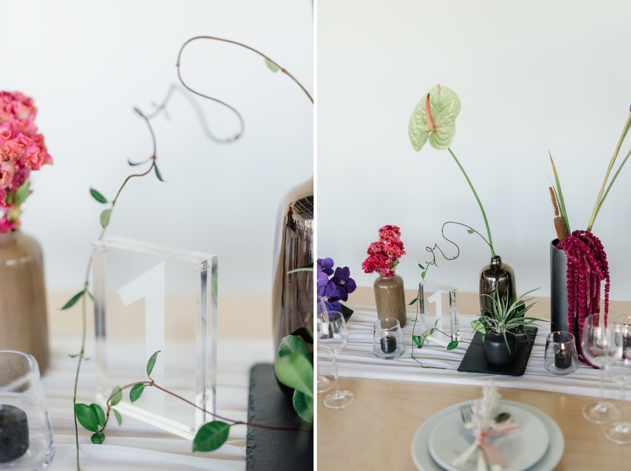
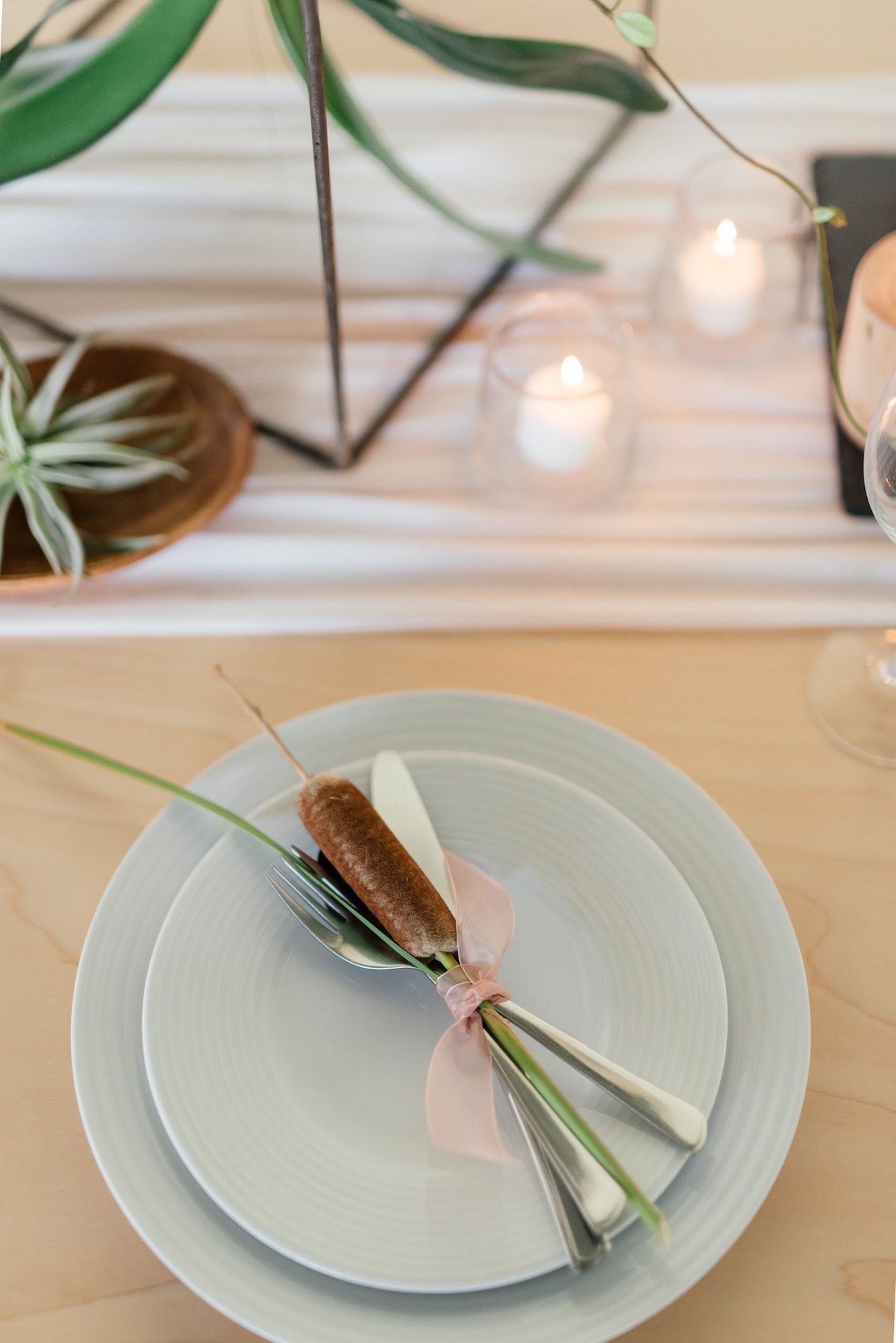
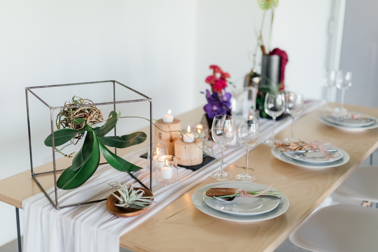
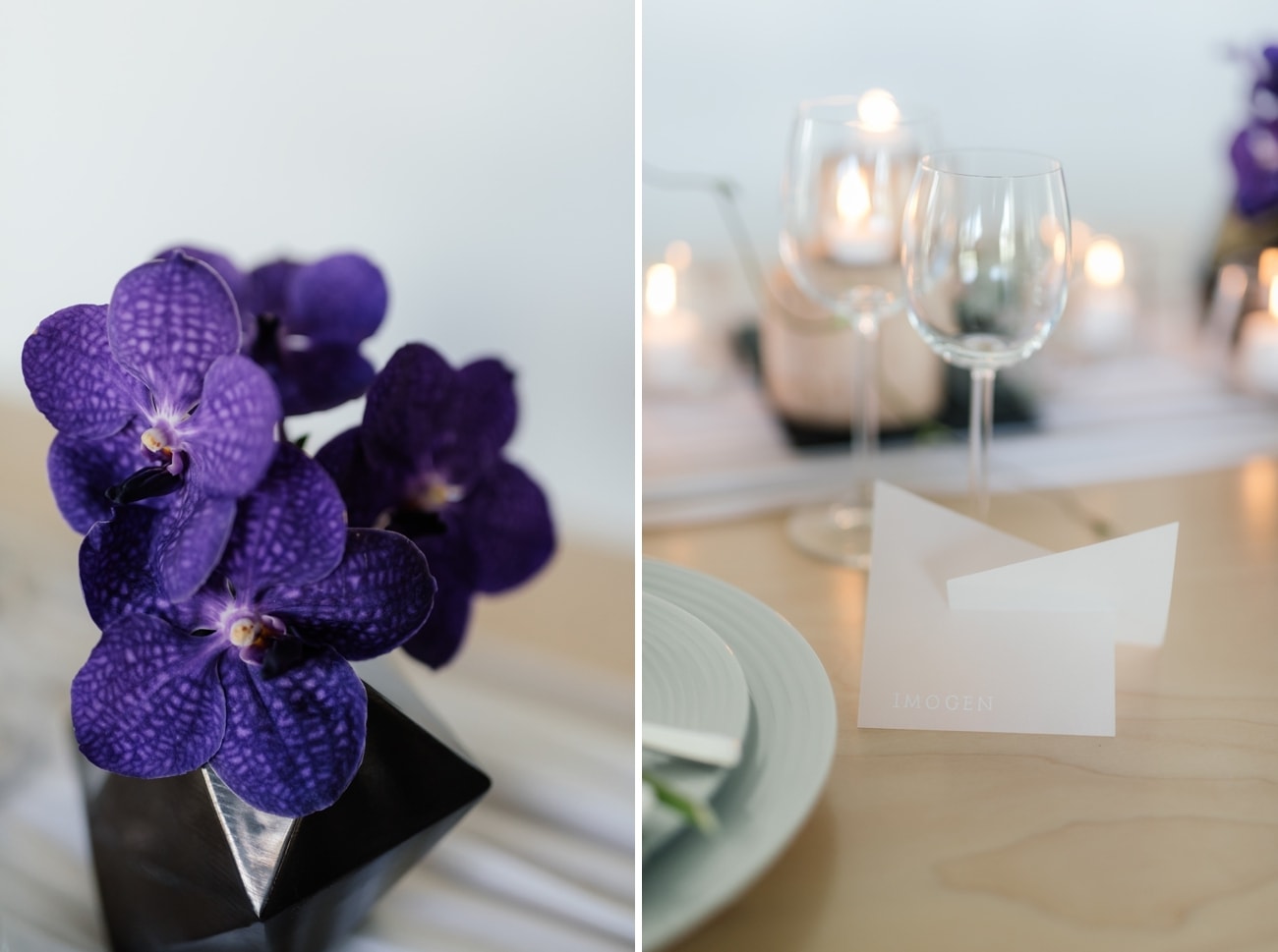
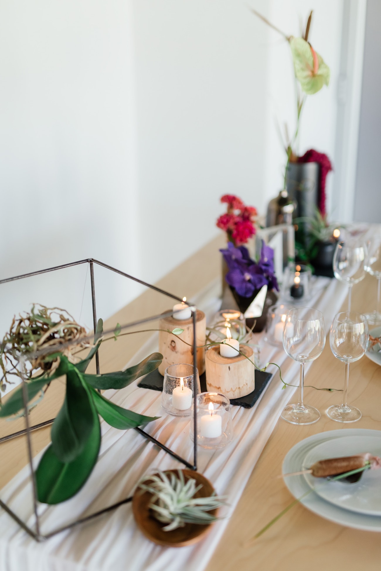
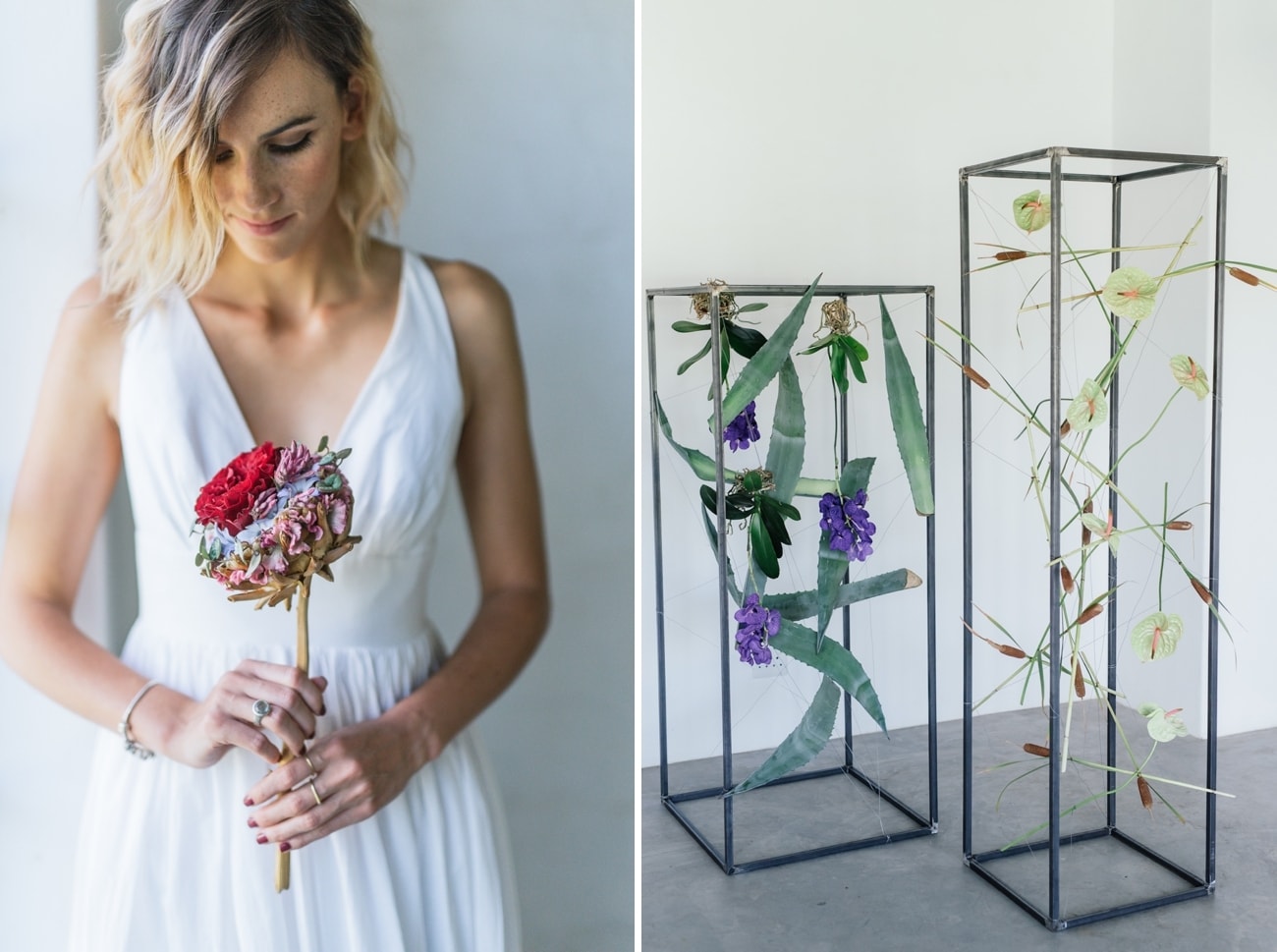
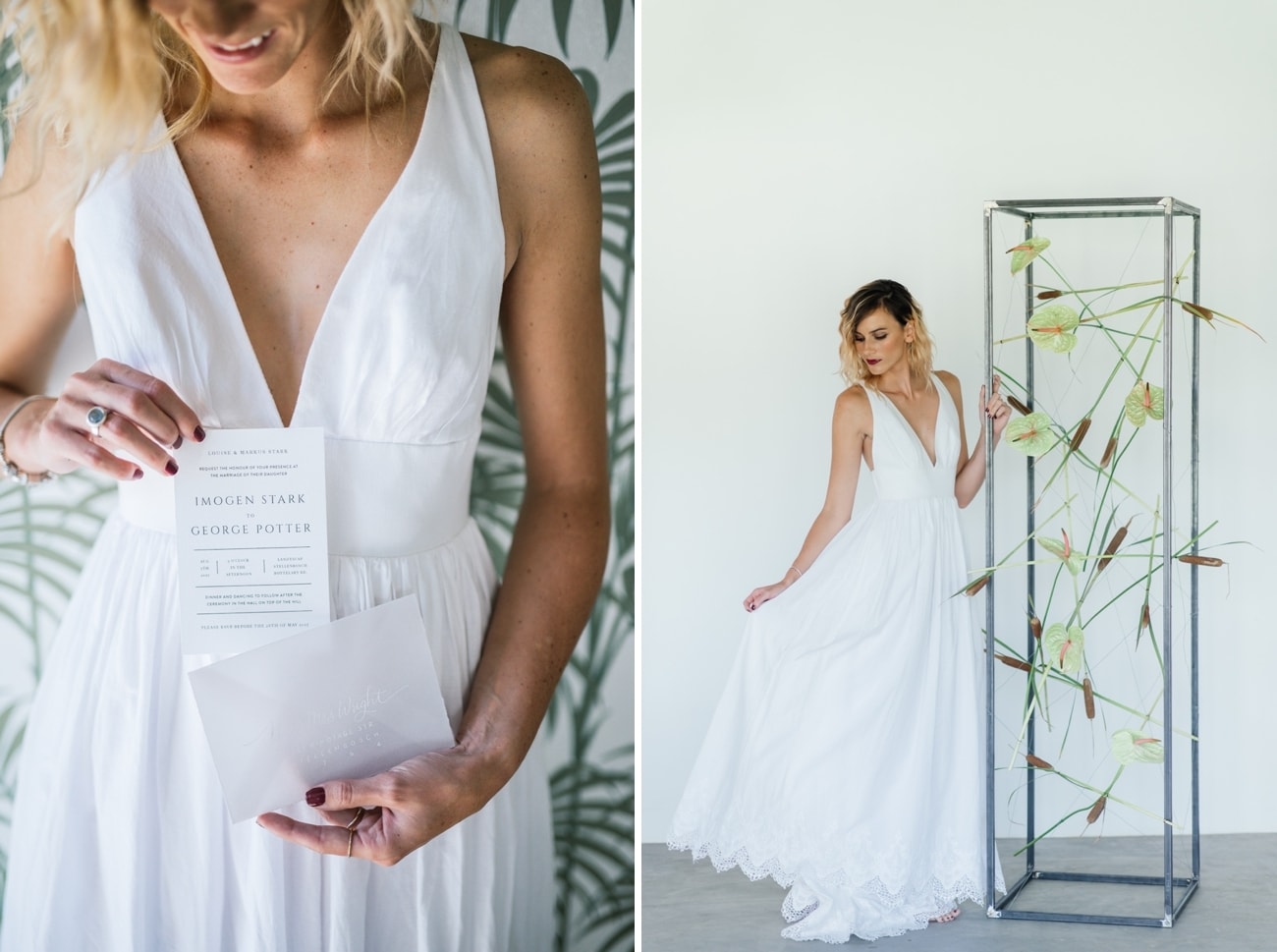
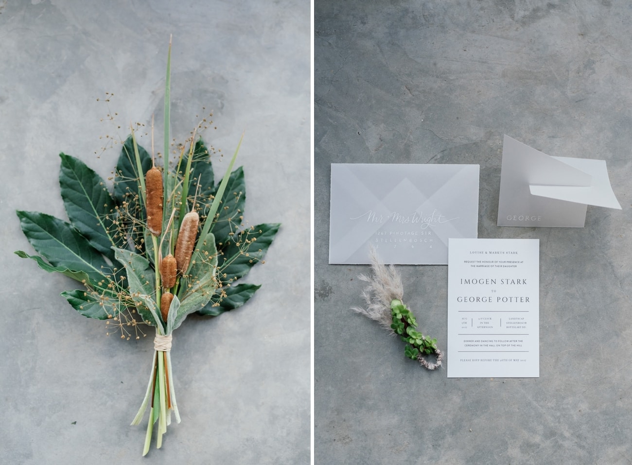
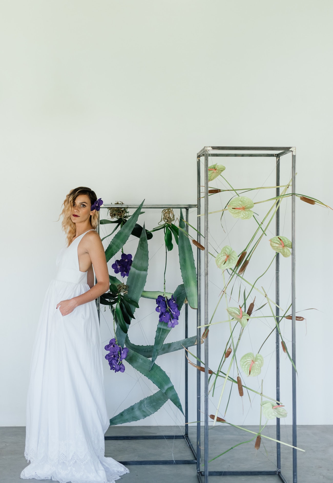
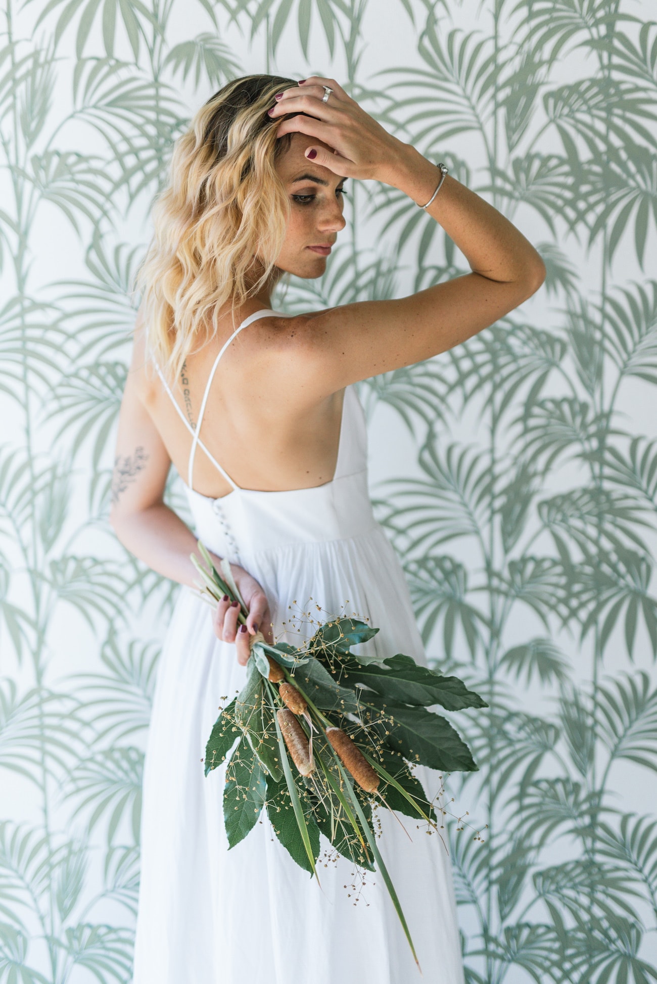
The look we created was based on using varied and interesting containers, lots of texture and materials like wood or ceramics, but in well balanced and limited quantities. Whilst the underlying palette was fairly neutral, we introduced small pops of colour in the flowers to make it come alive and make it feel like a celebration, rather than being overly corporate or sterile. A wedding should still look like a wedding and should leave you and your guests feeling like you have been in a beautiful place, to celebrate a special occasion. For the stationery, we asked Susan to place white calligraphy on velum, which has an opaque/see through feel, to keep the look clean and simple. Our bridal look was also about elegant lines and comfortable fabrics, with natural makeup and dramatic red lips to match the drama in the florals and styling.
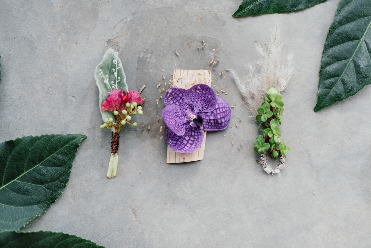
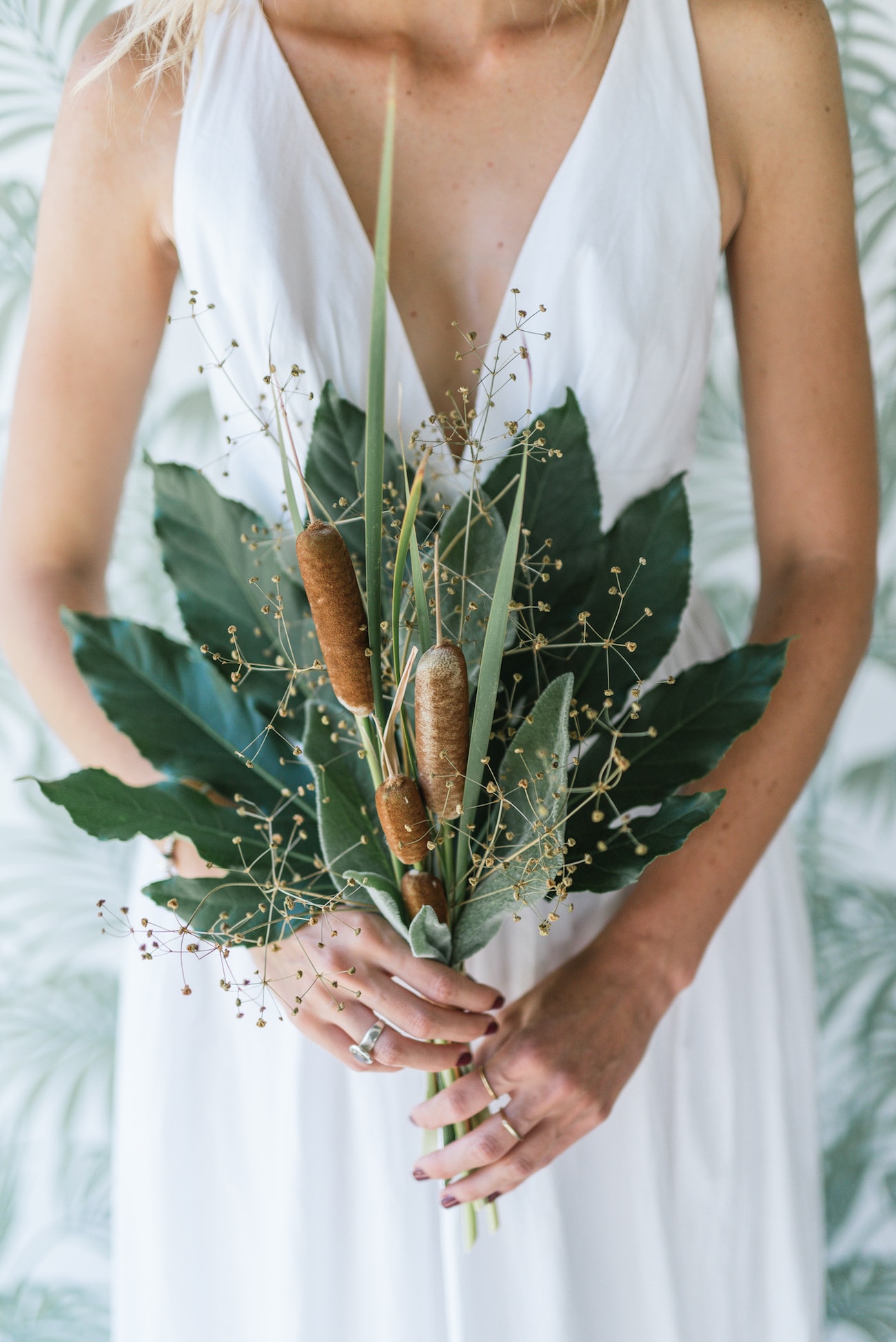
The use of more unusual florals like airplants, exotic orchids, the whole orchid plant, as well as the textured celosias, amaranthus and bullrushes makes the table look interesting without being cluttered. Clusters of a single flower work better for this look, rather than mixing lots of varieties in a single container. It allows each flower to shine. Feature pieces were created using 3D stands to allow each floral element to be appreciated individually and collectively by floating them in space. These would be wonderful to use at your ceremony and can be moved into your reception spaces during drinks – they would make wonderful backdrops for photos of you and your guests and as they are 3D, can be interacted with, rather than just admired.
SERVICE PROVIDERS
Photography: Debbie Lourens | Styling, flowers & décor: Epanouir flower studio | Stationery: Susan Brand | Bride’s dress: Robyn Roberts | Ceramic vases: Vorster and Braye | Hair & makeup: Mari Conradie | Venue: The Styling Shed | Model: Mari Conradie



Beautiful….