Inspiration Board: Colour Burst

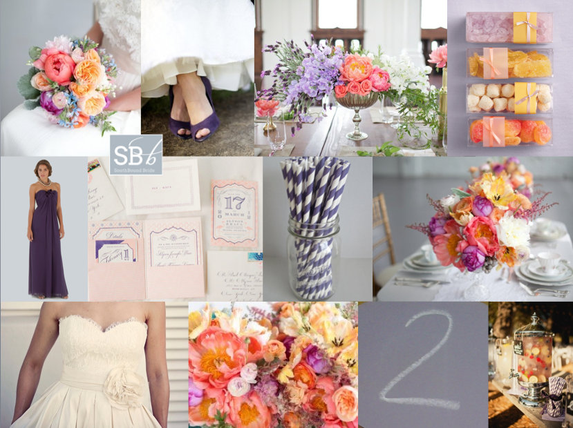
Never let it be said that I don’t love my readers! I know how sometimes planning can be overwhelming (especially bringing all your ideas together as the big day approaches), so when I got a wedding 911 from SouthBound Bride Stephanie, I put together this little board for her quick sharp. Stephanie had chosen a lovely deep purple as her main colour, with beautiful bridesmaid dresses for her girls. However, Stephanie was also in love with colour and fun, but was having a tough time convincing everyone else involved with her wedding that she could be vibrant and still classic and beautiful. Her dream palette – purple combined with coral, yellow and pink – was certainly unusual, so I immediately started looking for florals in this combo. As I suggested to Stephanie, if you’re working with bright colours but you want to make sure they don’t become too much, the best thing to do is keep everything else simple and let the flowers really pop. Because flowers are colours from nature, they have natural tones to them, so you don’t get the same hard colour block effect that you might with something synthetic. It’s a softer and more classic look. Luckily I didn’t have to look too long before I found the perfect inspiration shoot, and all I can say is WOW. Isn’t this palette stunning? I’m such a convert. Paired with simple place settings and classic stationery, the florals really do the talking (and they say “hello, I’m gorgeous”). You’ll notice there are a lot of peonies in the board – and yes, peonies are incredible, but they’re also hard for a South African bride to find. However, chat to your florist about other options, as there are many lush colourful flowers (ranunculus or carnations, for example) that will do a great job here. Another tip I gave Stephanie was not to try to bring all four colours into everything – combine two here, two there, and the result is cumulative.
So, what do you think? Stunning, no? Good luck with the rest of your planning Stephanie! I’m sure it will be amazing.

Colours: Deep purple, violet, coral, yellow & pink

Top row (l-r): Bouquet {P: Sara Gray Photography; S: Elizabeth Anne Designs}; purple shoes {P: Simply Jessie Photography}; centrepiece {}; colourful sweet favours {Martha Stewart}
Row 2: Deep purple bridesmaid dress {Bride & Co.}; purple and coral stationery suite {P: KT Merry; D: The Right Side Design}; purple paper straws; centrepieces {P: Sara Gray Photography; S: Elizabeth Anne Designs}
Row 3: Elbeth Gillis wedding dress {P: Cari Photography; D: Elbeth Gillis}; flowers {P: Sara Gray Photography; S: Elizabeth Anne Designs}; purple chalkboard {generated by reader}; cocktail {P: Matthew Morgan; C: Tammy Mitchell}


Inspiration Board: Trading Post

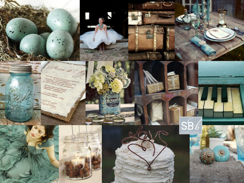
Okay, I have to tell you, I’m in love with this board. Which is a surprise, because turquoise and chocolate hasn’t always been a favourite combination of mine. I think it’s because I’ve seen it done tacky too many times, but when bride Klarissa wrote to tell me about her wedding, I knew this girl had style. After all, she chose an awesome venue – Searle’s Trading Post in Greyton. It’s super quirky and rustic and fabulous, and Klarissa knew well enough to work with its eclectic feel and just accent it with her colours. I adore the idea of a trading post ‘theme’ – a mix of found objects and rustic textures like wood and burlap. I started thinking about the sort of things you might have found at a trading post (or at least ones you might have found at my fantasy imaginary one!). How about pretty birds eggs in nests, for example? (Love these for place holders, or as part of the table decor, and they’re a fun DIY.) Old tins full of flowers. Mason jars, old door knobs, suitcases. I stumbled across this image of a poshokkie (what is the English for that, anyway?) with brown paper packages wrapped up in string – wouldn’t this make an ADORABLE escort card display? I also loved the idea of string decorations (this SBB couple did this brilliantly) and a statement turquoise necklace for the bride. It’s kind of a case of ‘anything goes’, but natural textures are the key to making it work – fortunately in a venue like this one, Klarissa will have no shortage of them. Thanks for waiting patiently, Klarissa – hope you like your board as much as I enjoyed creating it!

Colours: Turquoise & chocolate brown

Top row (l-r): Eggs in nest {Pottery Barn}; bride with turquoise necklace {Intrikate Designs}; suitcases {Retro Images on Etsy}; table setting on rough wood {P: Courtney Dellafiora; S: Valerie Metrejean}
Row 2: Blue dyed mason jar; burlap backed invitation; flowers in vintage tin {P: Heather Saunders Photography; D: The Parsonage}; poshokkie; piano
Row 3: Turquoise dress; mason jars with acorns {Pottery Barn}; cake with string ‘love’ topper {P: White Wall Photography}; vintage doorknobs on burlap runner {S: Elissa Keno; P: Kellie Kano}.


Inspiration Board: Hollywood Masquerade

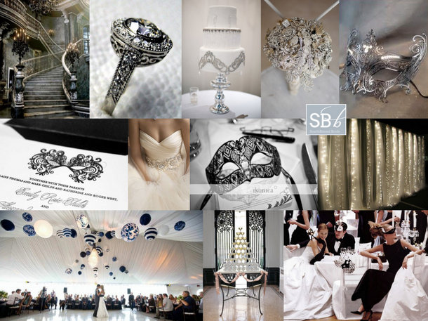
Inspiration board time, lovelies! I’m back with another reader request, and this one was so much fun to put together! Reader Shiree wrote to tell me about her wedding, describing it as “Old Hollywood meets Phantom of the Opera”. How. Cool. Is. That? She and her fiance have chosen silver, black and white as their colours, and are looking for “over the top elegance” and “masked ball opulance”. Oh my goodness, I have always wanted to go to a proper masked ball, and I just love the way that Shiree is planning to combine the glamour of Hollywood with the mystique of a masquerade. Usually when I’m putting concepts together for a board I’m aware of not including too many big ideas, but this theme is ALL about drama and statement and luxe. Shiree didn’t have a venue planned, but if possible, choose one with a dramatic staircase for the ultimate entrance! Otherwise, you can create that same sense of drama in just about any surrounding (although a high ceiling is a big plus) – I’ve even seen an amazing wedding where a parachute was used draped from the ceiling. Think big. I love the marquee pictured below, with what’s almost an installation of lanterns above the dancefloor – there’s that drama we’re talking about, but it doesn’t have to cost the earth – you can use relatively inexpensive materials, but think big and more (this one’s actually a DIY – see the image credits for the link). Fairy lights are another way to add visual interest – again the more, the better! I also love the idea of other luxurious focal points: bling on the bride’s dress, a cake mirroring that design, a brooch bouquet (the ultimately opulent bouquet, surely?) and a champagne tower (so old Hollywood!). Filigree masks are just my best, and I adore the invitation pictured here, which would then be reflected by a mask at each guest’s place setting (or pinned to a large board instead of escort cards). A good lasercut stationer like Doodles in Cape Town might be able to recreate this look for you. They’re not only the perfect favour, but ensure that when you all hit the dancefloor, it’ll look like a Venetian ballroom. Or just a very fancy party at Elizabeth Taylor and Richard Burton’s house. Hope you love your board Shiree, and I can’t wait to see the final results!

Colours: Black, white & silver

Top row: Staircase; ring; Old Hollywood cake {P: Kristen Weaver}; brooch bouquet {Brooch Bouquets on Etsy}; filigree silver mask
Row 2: Letterpress mask invitation {Chic Ink}; bride {Lazaro}; mask favour at place setting {P: T.H. Jackson Huang}; fairy light curtain {}
Row 3: Dancefloor with light installation; champagne tower {Martha Stewart}; masquerade ball {Vogue US December 1997; P: Steven Meisel; S: Paul Cavaco}.


Inspiration Board: A Preppy Romance

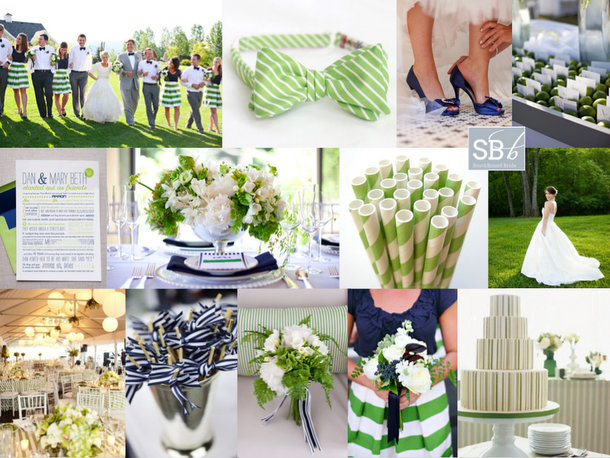
Happy Monday, folks! The inspiration board requests have been flooding in lately, and I’ve been having so much fun turning your ideas into collages. This week I’m featuring two reader request boards that couldn’t be more different (look out for the other on Friday afternoon), starting with this piece of East Coast summery goodness. Philani wrote to tell me about her colour scheme of ‘new leaf green’ (isn’t that the sweetest way of describing it?) and white with touches of bright blue (I’ve gone for a sort of royal blue here, but this could be lightened up as far as aqua if Philani prefers). She described her style as ‘plain but elegant, kind of less is more’, which together with her colour choice immediately made me think of preppy style. Think Jackie O. – simple elegance is what this whole look is about. Stripes are a key component, as are fabrics like cotton and grosgrain, and the look is surprisingly easy to put together, especially if Philani focuses on relatively clean tables with bright green flowers and punches of blue in the napkins or stationery. I adore these bridesmaids in tops and striped skirts, and groomsmen in bowties are a must! For the bride, a relaxed but formal dress – maybe a full skirt with pockets – would be ideal. Serve signature cocktails with striped paper straws on the lawn, and don’t forget lots of lovely ribbon! Hope you like your board, Philani!

Colours: Apple green, royal blue and white

Top row (l-r): Wedding party {P: Jacque Lynn Photography; D: Events by LMG}; green striped bowtie; blue shoes {P: Elizabeth Scott Photography}; escort cards in bed of limes {P: Mishelle Lamarand Photography; D: La Fete}
Row 2: Blue and green love story invitation {D: Hello Tenfold}; blue and green table arrangement {P: Studio 28 Photography; D: The Green Ribbon Party Planning Co.}; green paper straws; wedding dress with pockets {P: Crystal Genes Photography}
Row 3: Room decor {P: Sarah Rhoads Photographers; C: Party Resources}; cocktail sticks with ribbon {P: Love Life Images; D: Simply Chic Events}; green bouquet with blue ribbon {P: Studio 28 Photography; D: The Green Ribbon Party Planning Co.}; bridesmaid with green striped skirt and blue top {P: Jacque Lynn Photography; D: Events by LMG}; green striped cake {P: Mary Ellen Bartley; C: Bijoux Doux Specialty Cakes}


Inspiration Board: La Petit Lavande

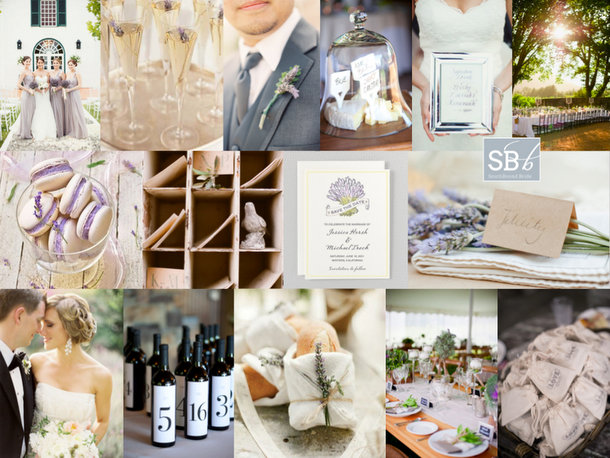
I’m very excited about today’s reader request inspiration board, since not only is it a pretty way to start off the week, but it was created for someone I know. Natalie is a university friend of mine – a fellow Minervianer – who got in touch last week to tell me about her wedding. She and her fiance are getting married in the late summer, and want a sophisticated, elegant wedding that still lends itself to being very relaxed and informal. I couldn’t have chosen a better venue for them than La Petite Dauphine near Franschhoek, or in fact, a better colour scheme to suit the venue than the one Natalie has picked: lavender, silver, and a fresh, silvery green. I could immediately picture it – the kind of romantically simple wedding that would be perfectly at home in Jose Villa‘s portfolio or on the pages of Style Me Pretty. We’re certainly looking at a French country influence, so lavender makes not just the perfect colour but a beautiful motif, and Natalie could choose to use it in her stationery as well as to add texture and whimsy (as well as fragrance) on the day. I’d have bridesmaids in lovely long dresses, and the groom with a lavender boutonniere and a stylish grey suit. Long tables, either indoor or out, would have white cotton linen, simple country-style arrangements and bread rolls wrapped in muslin and twine, with a little sprig of lavender tucked into them, at each place setting. All the best things about the French lifestyle would be represented: champagne, cheese, wine (these wine bottle table numbers are a classic, and so easy to DIY), macarons. Have guests write sweet notes to the couple and ‘post’ them in a set of little rustic ‘postboxes’, and at the end of the night take home a little bag of dried lavender to put amongst their clothes and remember the occasion whenever they smell that wonderful fragrance (Natalie could also scatter some along the aisle, as stepping on it would release the aroma). Mix together, add friends and family and some late summer sunshine, and then serve. Congrats again, honey – I can’t wait to follow along with your planning!

Colours: Lavender, silver & green

Top row (l-r): Bride & bridesmaids {P: Samm Blake}; lavender in champagne; lavender boutonniere {P: Jen Huang; D: Lee Vazquez Floral Design}; cheese under bell jar {P: Missy Cochran}; silver frame with cocktail name {P: Samm Blake}; outdoor tables at La Petite Dauphine {welovepictures}
Row 2: Macaroons; post boxes with bird {P: Elizabeth Messina}; lavender invitation suite {Hello Lucky!}; lavender sprigs {P: Kate Grewal}
Row 3: Bride & groom {P: Jose Villa}; wine bottles {P: Missy Cochran}; bread rolls with lavender {P: KT Merry; C: Sara Jean Events: D: Dreamy Whites}; table setting {P: Elisa B. Photography; C: Beehive Events}; ‘love’ bags {P: Harwell Photography; C: Ashley Baber Weddings; D: Gloriosa}


Inspiration Board: Pretty as a Peacock

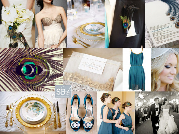
Afternoon, folks! We’re rounding off a pretty awesome week here on SBB with one more piece of pretty and awesome. I’ve been getting tons of requests for inspiration boards from all of you, so I’m working double time to try and create as many of them as I can. Reader Kristin has been waiting a little while for hers, but I hope it will be worth the wait! Kristin is getting married in a hall in summer, and she’s looking for turquoise accents to classic black and white, with peacock feathers and a general air of chic. Initially I was just going to send Kristin over to a board I created right at the very beginning of the blog (you can find it here), which was when the peacock trend was taking off. But then I thought about it, and I thought maybe we could bring the peacock theme a little more up to date. One option would be to go for a very art deco look – peacock was a key motif during the period after all – but instead I decided to add a bit of glitter to the teal, black and white palette – a look that’s very of the moment. The focus is less on actual peacock feathers – although they’re included in select spots: a boutonniere, with the bouquet, and on the bridesmaids’ headpieces – and more on beautiful peacock imagery. I am so in love with the place settings using peacock plates, gold cutlery and an ornate charger – if hiring this isn’t an option, consider a custom printed menu that fits inside a plain white plate, to give you a similar visual effect. I also adore the letterpress invitations pictured here – stationery is a great way to ‘brand’ your wedding in a sophisticated way. Add a bit of glittery texture – if not on the wedding dress (although I always seem to go back to this gorgeous wedding dress!) then maybe on one bridesmaid’s dress, and how cute is the little packet of sequin confetti? Teal/turquoise shoes and BM dresses are a must, but beyond that I’d stick to classic black and white. And there you have it. Hope you like your board, Kristin!

Colours: Turquoise, black, white & gold

Top row (l-r): Bouquet with peacock feathers {P: Jared Rey Photography; C: Gretchen Rose Events}; BHLDN wedding dress; peacock place setting {P: Ryan Ray Photography; D: Razzle Dazzle Event Decorating}; peacock boutonniere {P: Abbey Hepner Photography; C: GuGuLy Event Planning}; letterpress peacock feather invitation {Bespoke Letterpress}
Row 2: Feather with rings {Stacy Reeves}; sequin confetti {P: Greg Blomberg; D: Bows and Arrows}; teal bridesmaid dress; bride {P: Chrystal Cienfuegos Photography}
Row 3: Peacock plate place setting {P: Ryan Ray Photography; D: Razzle Dazzle Event Decorating}; teal shoes {P: Ryan Ray Photography; D: Razzle Dazzle Event Decorating}; teal bridesmaid dresses {P: Elaine Palladino Photography}; bride and groom with sparklers {P: Amy and Stuart}


Pantone Spring 2013 Colour Report

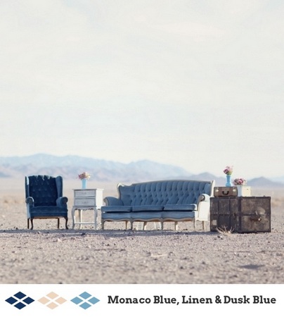
It’s my favourite time of year again – Pantone have just released their latest spring fashion palette, and man, is it a good one! I absolutely love every one of these pretty, preppy colours, from punchy Poppy Red or Lemon Zest to cool Monaco Blue (best name ever) and Linen, which pretty much go with everything. Greyed Jade and African Violet are lovely soft versions of purple and green, and Tender Shoots and Nectarine offer chilled out alternatives to chartreuse and coral. I also love emerald and dusky blue – lovely, cool colours you just want to dive on into. There are SO many combinations of these colours that would look amazing at a wedding, but I’ve put together a few mini palettes to get you started. Which is your favourite?

Read More

Real Wedding at Café Felix {Elmiene & Johan}

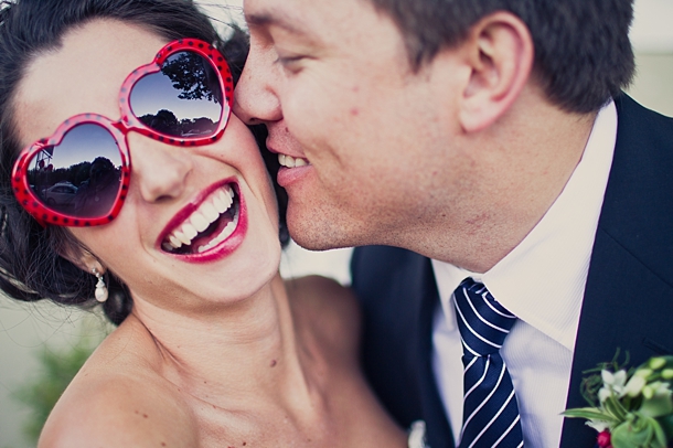
I don’t think I’ve said this before, but my first love as a wedding blogger was inspiration boards. Even before they were ‘invented’, I was always putting together ideas for friends who were getting married and I’ll never forget stumbling across Snippet & Ink and The Perfect Palette and just adoring what they were doing (and that was before I even was introduced to the other board legends who are Magnolia Rouge and Postcards & Pretties). You guys seem to like what I do with the boards every week, but the truth is that even if you didn’t, I’d probably still be making them, because they’re a piece of creative work that gives me a lot of pleasure. So when I started the blog, a day I really looked forward to was when I could feature a wedding that owed some of its inspiration to one of my boards. And friends, that day is today. I didn’t create the ‘Valentine Red‘ board especially for reader Elmiene, but when she wrote to tell me that it had been part of her design concept, I was thrilled – and even more so when I saw pictures of her cherry red, white and navy wedding with its cheeky touches like bright red shoes and heart-shaped sunglasses. I love love love how she included handmade elements like crocheted flowers and sewn hearts and acres of Petersham ribbon. Not to mention her candy-striped cake and cake toppers. It all works perfectly with their venue, Café Felix, which is the perfect mix of elegance and whimsy to offset this super fun wedding. I couldn’t have dreamed it up better myself. The cherry on the cupcake for me is that Elmiene and Jonny had Jaco le Roux as their photographer, as I’ve been looking forward to sharing his lovely pictures with you here on SBB. Which all in all, makes this a very good day for me. Yayness.Read More

Inspiration Board: Country Elegance

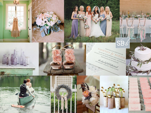
There’s nothing I love better than when I get a request for an inspiration board using a fresh theme or colour combination, and this might be one of my all-time favourites! When reader Vanessa (who is getting married all the way over in the Rocky Mountains of Canada – you don’t have to be in South Africa to request a board!) wrote in with her coral, green, purple and grey colour scheme I immediately knew she was on to a winner. She and her husband-to-be have a theme of ‘simple elegance, wedding in the woods’ – doesn’t it sound beautiful! They’ll be using burlap and lace accents, and combined with these colours, I think that will be beautiful. I would really let the colour combo speak for itself wherever possible – in mismatched bridesmaid dresses, florals, and stationery – either in a four colour display or in mini combinations of one or two of the shades. Add classic touches for elegance – beautiful chairs, anemones, a lavender wreath. Simple tables with burlap and lace runners (and maybe a single sprig of lace-tied lavender at each place setting) complete the look. Hope you like your board, Vanessa – I loved putting it together!

Colours: Mint, coral, lavender & grey

Top row (l-r): Dress {S: Joy Thigpen for Once Wed}; bouquet {P: Leo Patrone Photography; C: Bluebird Events}; bridesmaids {P: Paula O’Hara Photography; D: Laurens Norton}; table setting {P: Elizabeth Messina; S: Canvas and Canopy Events}
Row 2: Purple bottles {Dreamy Whites}; coral shoes {P: Cameron + Kelly Studios; C: Peak Events/KD Event Designs}; coral and grey letterpress invitations {Coral Pheasant}; lavender wedding cake {D: Bash, Please C: Susie Cakes; P: Amy and Stuart Photography}
Row 3: Couple in row boat {P: {oh, darling!}}; lavender wreath {P: Paula O’Hara Photography D: Laurens Norton}; coral, white and purple flowers {P: Summer Street Photography; F: Dogwood Floral Design}; pods in bark vases {Jaden Rai Inspired on Etsy}; coral ombre escort cards {P: onelove photography; S: La Boheme Events; D: Prim and Pixie}.


Inspiration Board: Rustic Tangerine

Hello lovelies – did you enjoy our DIY post today? (Don’t worry though, I’m not leaving you short on weddings this week – I have a stunner for you tomorrow!) Today there’s just enough time for one last little bit of inspiration. This one’s a reader request from the lovely Dee, who is getting married in summer in Zimbabwe. She’s planning the most gorgeous rustic combo of orange and burlap and was looking for suggestions for simple but elegant table decor. I think Dee’s made a lovely choice of colour, and just because orange makes a statement doesn’t mean she needs to sacrifice on elegance – if anything, tangerine is this year’s hottest shade, and one that instantly creates warmth. I’d suggest that Dee focus on just using orange in her florals, so that it pops against the burlap and other decorations, and beautiful flowers always keep things classy. Start with lush bouquets for bride and bridesmaids, and on the tables make use of Consol mason jars – simple, easy, effective. Dee could also add in some found vintage objects, and other rustic textures like chicken wire or wood to add interest. A great place to add detail here is in the place settings – I love the menu printed on to a napkin and the silverware tied with twine, and basic kraft paper luggage tags make a very effective name tag and escort card. Or Dee could make these cute little hearts from hessian and add one to each place setting. A ‘naked’ cake, interesting (church) seating at an outdoor ceremony and a curtain of fairy lights round out the decor. For bridesmaids, I’d stick to neutrals, and consider long grey dresses which not only will make the orange bouquets pop, but will also add to the general air of rustic elegance. Hope you like your board, Dee!

Colours: Tangerine, green and neutrals

Top row (l-r): Bouquet {F: Blossom Sweet; S: Forevermore Events; P: Gideon Phototography}; table flowers in mason jars with burlap runner {F: A Modern Touch; P: The Studio Nouveau}; escort card luggage tags {S: Hey Gorgeous Events; P: Tonya Peterson Photography}; scale {S: The Stylish Soiree; P: Meg Perotti}; bride and groom {P: Half Orange Photography}
Row 2: Un-iced cake {C: Sedona Cake Couture; P: Sedona Bride}; tangerine boutonnieres {F: Kate Foley Designs; P: EE Photography}; invitation with burlap tie {Invitations by Alecia}; church seating {P: Jose Villa}; place setting {P: J. Cogliandro Photography; D: Atheneum Creative}
Row 3: Table decor {F: Roost Flowers; P: Andi Grant Photography}; fairy lights {Mastin Studio via Apple Brides}; burlap heart {P: Tanja Lippert Photography}; wire bell jars {P: McGowan Images}; bridesmaid {F: The Bride’s Cafe; P: Amelia Johnson Photography}.