Inspiration Board: Coral & Grey

Happy Monday! We’ll soon be featuring a stunning wedding in Simonstown, and looking at the pics got me to thinking about vintage naval prints and nautical weddings. Although navy and red is the most obvious colour combination for this theme, I love the subtler beachy beauty of coral and grey, which also happen to be two colours that are bang on trend right now. Then I remembered these gorgeous invitations from Ruby & Willow and I knew I had to do a board. I think the final result is classy and just a little rustic – perfect for a venue by the sea.

Colours: Coral, grey, charcoal and white

Top row (l-r): Bride & groom; Anthropologie whale ornament; coral invitations
Row 2: Coral cufflinks; heart pin boutonniere; ship’s wheel; succelent with rings; coral earrings
Row 3: Shell necklace; vintage naval print; coral peonies.

Inspiration Board: Cherries & Gingham

It’s miserable weather in London at the moment and summer seems a very long way away, but only 3 weeks until I get to fly back to Cape Town and enjoy some South African sunshine (the best kind!). So I thought it was time for some cheerful, summery inspiration. I’m a great lover of cherries, which have been popping up (like other fruit) in a few weddings recently, and I think they go perfectly with pretty black and white gingham print. Add a bit of hay and burlap, and you have the perfect rustic combination!

Colours: Red, black, white and beige

Top row (l-r): Cherry punnets & white flower; wedding dress; lantern; gingham ribbon; cherry favours
Row 2: Cherry pie; gingham napkin; tulips; vintage truck
Row 3: Table number; cherries with flowers; red barn; wedding cake; wooden sign.

Inspiration Board: Lavender Love

Today’s board was inspired by Jules Morgan‘s gorgeous pic of the bride walking through lavender from Jacqui & Neil’s wedding last week. I adore lavender as an accent, and there’s so many ways you can incorporate it. Take your inspiration from Provence and incorporate French touches, add burlap for a rustic vibe, pair it with colours like butternut orange or sage green, or with other blues or purples – the possibilities are endless. Today I’ve kept it simple, putting lavender against crisp, clean whites and grey. If this was my wedding, I wouldn’t have any other purple touches – just the lavender tucked into napkins, forming the bouquet, making the lemonade oh so pretty. I’d have white tables, silver vases, stylish bridesmaid’s dresses in shades of grey. And can you just imagine the smell? Beautiful.

Colours: Lavender, white and grey

Top row (l-r): Bride in lavender field; lavender bouquet; place setting; cheese & wine; croquembouche
Row 2: Bridesmaids’ dresses; LOVE sign; engraved pocket watch; lavender lemonade; shoes
Row 3: Long table; bride & groom; wine barrel cooler; white chairs; lavender favours.

Inspiration Board: Curacao, Peony & Russet

This weekend I’ve been having a play around with the colours included in the Pantone spring colour lineup – love all of them! There are endless combinations to consider for your wedding, all fresh and pretty and effortlessly current. This is one of my favourites (and so easy to use) – trendy aqua always makes an impact, especially against the palest of pinks, and russet provides a great neutral contrast. It works perfectly with pretty garden wedding details, cupcakes, chandeliers, ruffles and, of course, peonies. (Will I ever get tired of these? Don’t think so!) Just add guests and sunshine for the perfect, laid back, happy day.

Colours: Blue Curacao, Silver Peony, Russet


Top row (l-r): Bridesmaids; peony bouquet; chandeliers
Row 2: Cupcakes, Just Married banner; aqua mason jars; chandelier invitation; aqua shoes
Row 3: Flower girl moustaches; bride & groom; dancing shoes; outside reception.

Inspiration Board: Citrus Martini

This week we’re featuring three citrus-themed inspiration boards inspired by Cape venues to show how a single theme can be interpreted in a number of different ways. Which one is your favourite?

**************************************************************

Today’s board is something completely different from the rustic vintage vibe we featured yesterday. It’s all about funky, modern design, using bright orange and yellow, and playful citrusey details. I adore the ceiling-high table arrangements and stationery (which both come from this amazing concept shoot), and the way grey makes the brighter colours pop. Not to mention the use of actual oranges in the bride and bridesmaids’ bouquets – so fun! And what’s a sophisticated orange and lemon-themed soiree without a signature martini? The perfect Cape venue space for this light, contemporary design is The Conservatory in Franschoek, with its huge glass panels and mod grey accents – ideal for a lunchtime wedding where your guests can really appreciate the views. For more on The Conservatory see our venue spotlight, and for more chic modern options, have a look at the Amazing Spaces website.

Colours: Bright orange, yellow and slate grey

Top row (l-r): The Conservatory ; table with branch arrangement; martinis; bride & groom
Row 2: Bridesmaids; ribbon wands; ring; The Conservatory
Row 3: Naartjie name tag; place setting; invitation; tulip bouquet.

If you’d like to see more lovely examples of fruit as part of wedding design, have a look at our feature here.

Note: None of the posts in this series have been sponsored by the featured venues, including The Conservatory.

Inspiration Board: Rustic Orchard

I have something special for you this week! One of the reasons I love wedding design is the way a concept can can have a number of different interpretations, depending on the look and feel you’re going for and (very importantly) your venue. So over the next few days I have not one but three citrus-themed inspiration boards for you, all with very unique looks inspired by three fabulous Cape venues. Which one is your favourite?

Today’s board has the rustic, slightly vintagey vibe that I know so many of you love (as do I). It includes elements like vintage citrus fruit advertising, wooden crates (love these as centrepieces), wreaths and dried fruit slices. I also really like the idea of orange favours/escort cards wrapped in brown paper for that farmer’s market feel. For me, you won’t find a more perfect venue for this look than Beloftebos near Stanford, a beautiful farm setting with an outdoors ‘chapel’ in the middle of a grove of oak trees – it is just spectacular! We’ve already featured one gorgeous wedding here, so check it out if this is your preferred style.

Colours: Muted yellow, orange, green and brown.

Top row: Oranges; wreath; cake; lemonade; couple in orange grove
Row 2: Beloftebos; orange favour; vintage car; vintage advertisement
Row 3: Juggling groom; tablescape; candles; vintage advertisement; ladder.

If you’d like to see more lovely examples of fruit as part of wedding design, have a look at our feature here.

Note: None of the posts in this series have been sponsored by the featured venues, including Beloftebos.

Inspiration Board: Dreams and Love

This week’s board is inspired by the gorgeous Miss Dior Cherie advert (top left) – with its pretty pastels and Parisian backdrop it makes the perfect starting point for a chic and whimsical wedding. Balloons are also bang on trend, with many couples already inspired by the movie Up! Finish the look with dashes of cerise, pale pink and aqua – and don’t forget the macaroons!

Colours: Pastels plus aqua, pale pink and cerise

Top row (l-r): Miss Dior advert; cake; bridesmaid; macaroon placecard holders; bubbles
Row 2: ‘Nothing is real but dreams and love’; Parisian details; cupcakes with flags
Row 3: Flowers; groom details; bride and groom with balloons; bunting table assignments; interior decor

Inspiration Board: Toile & Rose

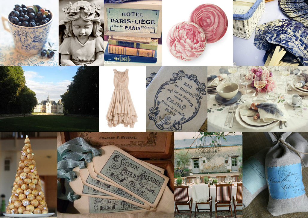
I’m feeling a bit of love for French wedding style at the moment so I put together this little inspiration board using one of my favourite patterns, toile, combined with touches of dusky rose and a hint of grey (which just goes with everything, doesn’t it?). I’m imagining a gorgeous French chateau, chandeliers hanging from the trees, wonderful food, fine wine… Sigh. Vive la France.

Colours: Navy, powder blue, rose and grey.

Top row (l-r): Blueberries; statue; book detail; rose button favours; toile fans
Row 2: Chateau; bridesmaid’s dress; gift bags; tablescape
Row 3: Croquembouche; gift tags; table with chandelier; DIY linen satchels.

Inspiration Board: Shades of Pink & Grey

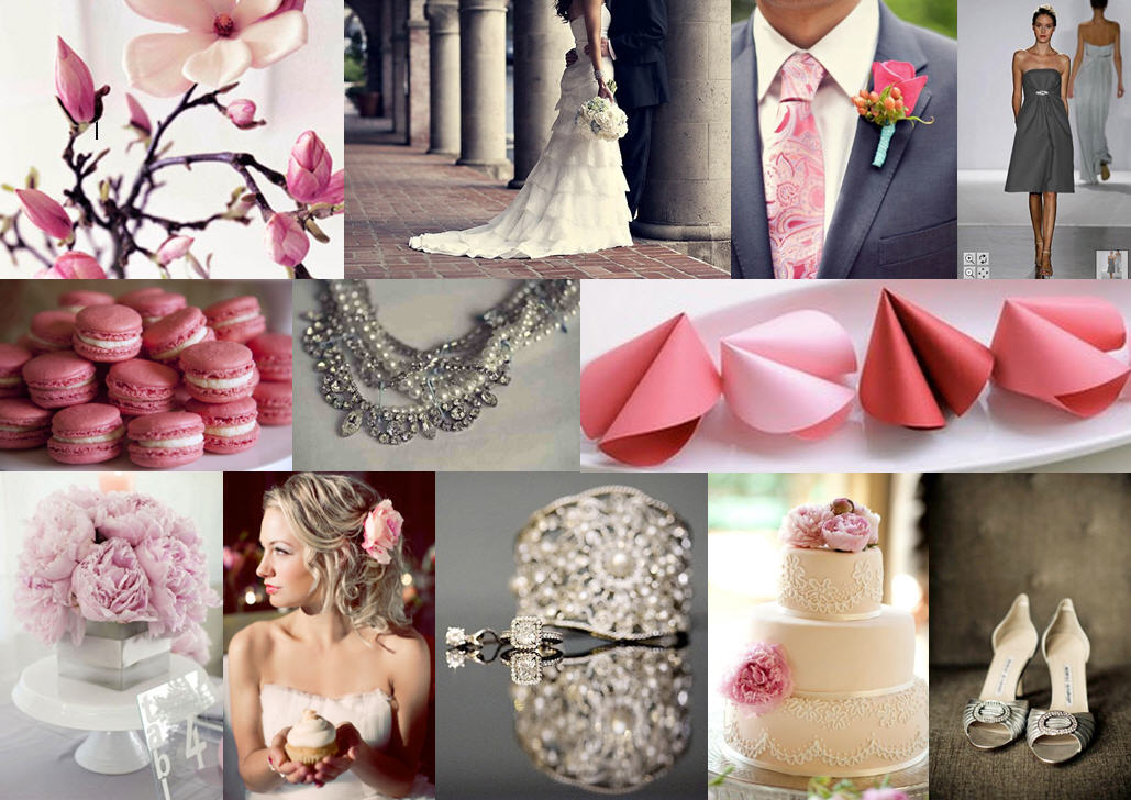
When I saw this fabulous post by Lana from lanalou style, I knew I would have to do a wedding inspiration board based on her idea of shades of pink and grey. I love the flexibility of using a range of different shades of a colour, and pink and grey look amazing (and very fresh) together. Add a bit of sparkle and hey presto, you have a modern, pretty and sophisticated palette.

Colours: Pink and grey

Top row (l-r): Flowers; bride & groom; groom’s tie and boutonniere; bridesmaid’s dress
Row 2: Macaroons; necklace; fortune cookies
Row 3: Peonies; bride with cupcake; diamonds; cake; shoes.

Inspiration Board: Pine & Cider

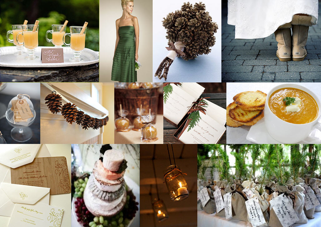
Brrr! For all of you South Africans waking up to a chilly winter morning, here’s a little bit of inspiration to warm you up. Summer weddings are glorious, but I adore winter ones too – what an opportunity to make the most of all those lovely cold comforts: open fires, hot cider, butternut soup… I just love this woodsy combination of forest green and brown, and pinecones make a lovely motif for stationery, etc. And isn’t the pinecone bouquet is just gorgeous? I love the garland as well.

Colours: Forest green and chocolate brown, with touches of mocha and yellow

Top row (l-r): Cider; bridesmaid dress; pinecone bouquet; Uggs bride
Row 2: Lemon cookies; pinecone garland; caramel apples; programmes; butternut soup
Row 3: Wood invitations; cheese cake; mason jar candles; sapling favours.