Aubergine & Vine Wedding Inspiration by Debbie Lourens & Kadou

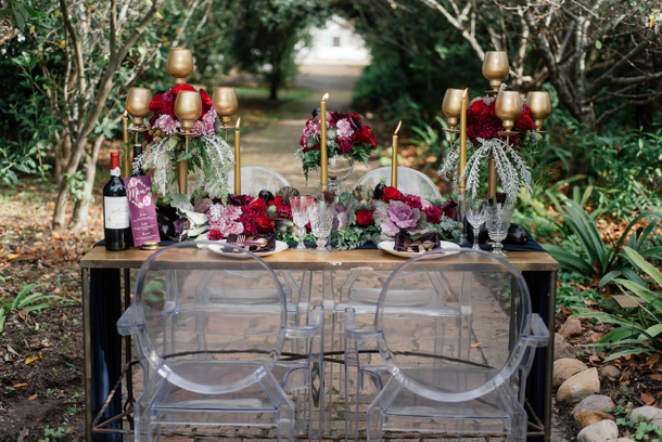
When this little gem of a styled shoot from photographer Debbie Lourens and stylist Kadou crossed my desk, I knew it would be just PERFECT for our vineyard wedding month. Not only was it shot at Spier, but the deep shades featured are so reminiscent of wine and the winelands – aubergine, burgundy, plum, fig, a deep vine green… all accented with glorious gold. This is the kind of colour scheme that often gets used for autumn or winter weddings, but with a vineyard wedding, it would be appropriate all year round as a nod to your surroundings. I just love the way these colours work together, creating something cosy but also very elegant. I also love the way that with an eggplant coloured wrap and a berry lip (courtesy of talented SBB Directory member Corlé Barnard), our model’s look perfectly complements the decor. And a seed pod crown? Adore.Read More

Get the Look: Protea Landscape

The best part of a styled shoot for brides and grooms (apart from basking in the sheer prettiness, of course!) is the wealth of fresh ideas that you can borrow to add an extra special touch to your own celebrations. As part of our Styled Shoot Competition showcase this week, we’re breaking down five of our favourite ideas from each shoot, as well as bringing you tips and advice for recreating the look from the talented team behind each entry. Next up, we’re taking a second look at the Karoo chic of this Protea Landscape shoot by Kadou (who made many of the amazing details by hand, right down to painting the chairs) and Michelle Wiese.Read More

Protea Landscape by Michelle Wiese & Kadou

Day Two of styled shoot inspiration begins! From the beach yesterday, today we’re off to the Karoo, where the arid landscape inspired our latest team of wedding pros to come up with a very special shoot that has so many elements to it. Led by photographer Michelle Wiese and Kadou, they created some dramatic bridal looks and two variations on a homegrown rustic tablescape that include (shut the front door, seriously) a paper protea table garland. I love how some of the starker elements, like concrete and wood textures, geometric elements and an earthy palette contrast with softer touches like a dreamy tulle peplum dress and watercolour washes. And you can’t get a more classic South African motif than our national flower- which turns up in all sorts of fresh ways. Love it!Read More