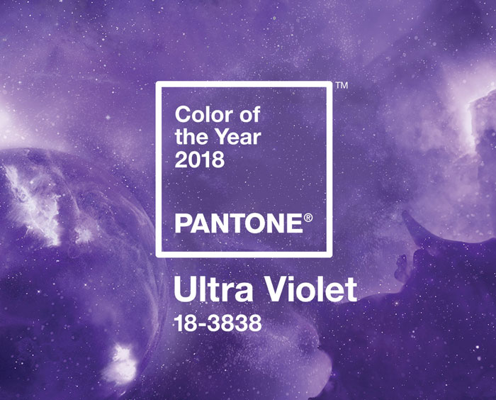
So this month, our editorial theme is ‘Cosmic Love’, and we’ll be using it to explore all things celestial wedding, but linking it at the same time to the latest development in the Pantone Color of the Year universe: Ultra Violet? Why, well, as Pantone themselves say: “Ultra Violet suggests the mysteries of the cosmos, the intrigue of what lies ahead, and the discoveries beyond where we are now… the vast and limitless night sky is symbolic of what is possible and continues to inspire the desire to pursue a world beyond our own”. I also love how Ultra Violet links to some otherworldly design elements, most notably iridescence, set to be a huge trend for 2018 (so expect to see some of that this month too, yay!). I think one of the key things about Ultra Violet is that it’s one of those colours that on its own can be… well, a little too much. It’s a great purple, but it’s still a bold colour and you don’t want to let it take over your wedding. But it combines beautifully with so many other shades: blues and greens, pinks, softer purples (maybe one of my favourite ways to use it), neutrals, pastels and berry shades alike. It lends itself to the current trend of having several colours (or tones) in your wedding palette, instead of playing mix and match. Plus, since you’ll find this shade in many flowers, I’m hoping that we’ll be seeing it in abundant florals the way Greenery did. Today we’re breaking down just a few of the options: a unicorn iridescent board suitable that is bang on trend, a softer country boho palette, a moody purple and grey number which I am loving, and a juxtaposition of purple versus bright red that really pops! Links in bold denote affiliate links. SBB may make a commission on any sales made.
Tag: pantone
Pastel Princess
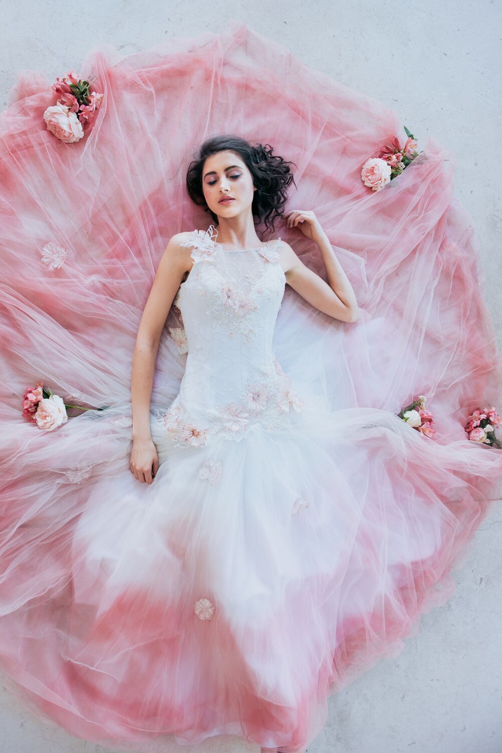
It’s a new week, and a new chance to be inspired, thanks to this gorgeous pastel shoot by Lauren Pretorius Photography and her team! And you just need to look at the pic above to know this one is a little big magical. Pastels are always a good idea, but this shoot takes them to a new level, with a gorgeous watercolour cake, a grown-up pastel table and (swoon of all swoons) two BEYOND gorgeous dresses from Stephen van Eeden. It’s all those little-girl princess bride fantasies brought to life, and I’m super excited to share it with you!
Pantone Colour of the Year 2017: Greenery
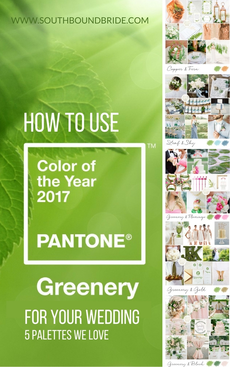
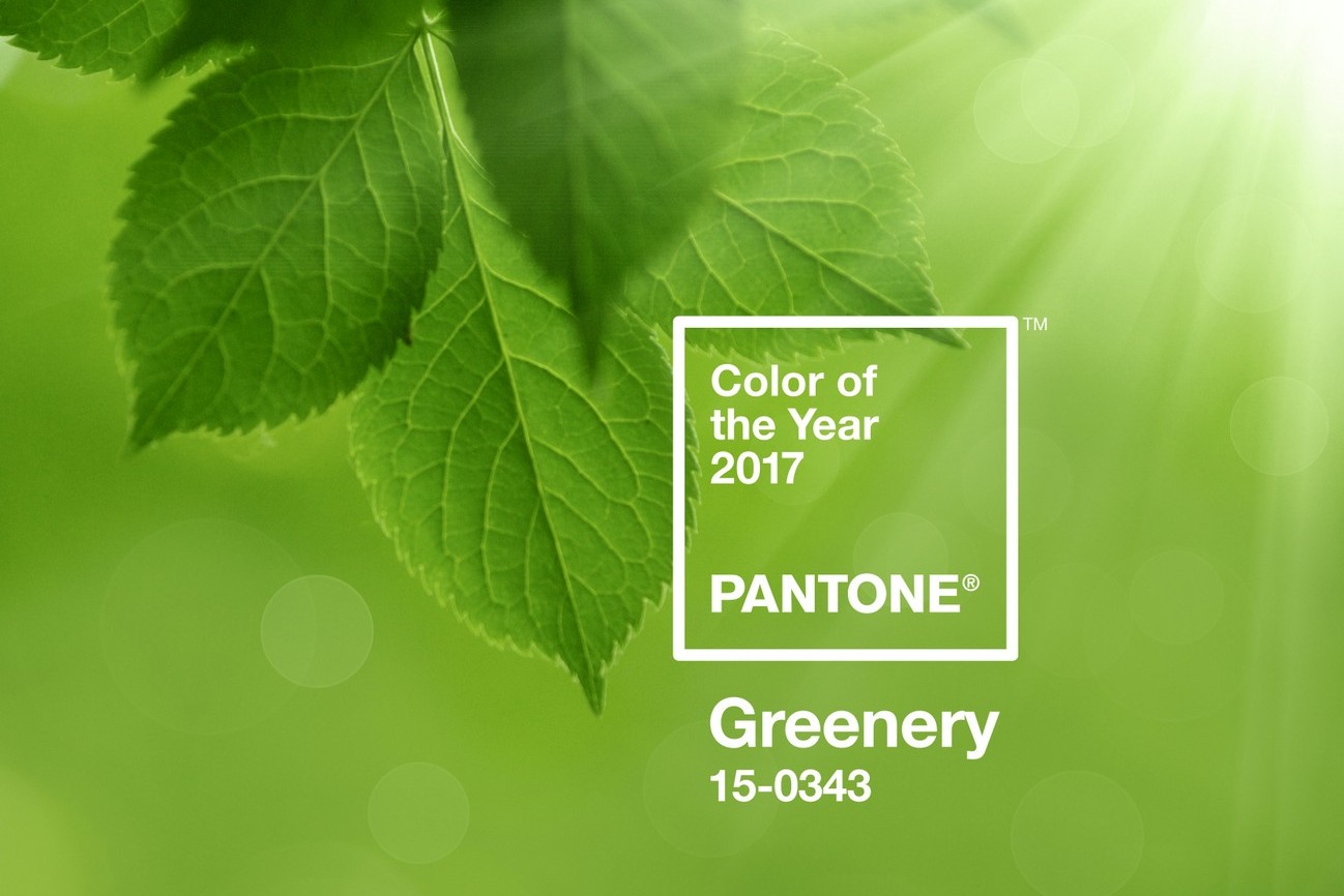
With a new year comes a fresh colour of the year to play with from the folks over at Pantone and while some years I’m not completely on board with their choice (cough cough Marsala), I am ALL about Greenery, the 2017 COY. It’s fresh, it’s bright, it’s organic, and it feels absolutely right for this brand new year. I can’t WAIT to see what all my favourite wedding pros come up with in styling this shade over the next few months, but in the meantime, I had a play around and came up with five palettes incorporating Greenery, as well as several of Pantone’s other Spring 2017 shades. The great thing about Greenery is that it combines into classic choices, but can also substitute for the greens in less obvious palettes with a really fresh effect. For example, we normally see blues combining with soft sage, but use Greenery and you have something pretty and new. The key thing is to use Greenery as an accent colour – a whole wedding in it might be overwhelming, but in clever touches (especially those using actual greenery), you’re winning. Which is your fave? Links in bold denote affiliate links. SBB may make a commission on any sales made.
Pantone Serenity & Rose Quartz Wedding Inspiration
Can you feel it? It’s getting to that time of year again, where it becomes all about summer and holidays and parties and celebrations and the end of another year and the start of new things and new diaries and new dreams and goals and ideas. I don’t know about you all, but I spend most of my year wishing it would go more slowly and then get to November and wish it would go more quickly (because Christmas!). But one thing I’m always sad to say goodbye to this time of year is the Pantone colour of the year because while yes, I often start out lukewarm about it to begin with, by the end of the year I feel like it’s really come into its own as stylists and real brides have played with it and found a hundred new ways to make it beautiful. Of course, gone doesn’t mean forgotten, because even though the wedding and fashion industry move on to the next COY, that last one is still going to be making real weddings beautiful for months and years to come. That’s maybe never more true than with this year, when we got two colours, and both were wedding ready from Day 1. Serenity and Rose Quartz have been like a spring breeze or a summer sunset. I’ve loved them separately, and I’ve loved them together. So it only seems appropriate to celebrate them one more time with this gorgeous modern meets vintage styled shoot. Even better, it showcases the amazing talents of so many of our favourite service providers, including Blue Olive Events, Jack & Jane Photography, Janita Toerien (dress SWOON!) & Candi Makeup. These folks are not just great at what they do, they’re some of the nicest people in the industry, and together with the rest of their wonderful team, they’ve pulled off something truly inspirational. Enjoy!
Pantone Colours of the Year 2016
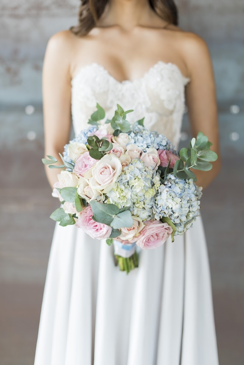
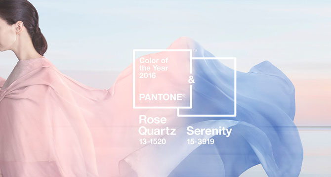
Hello friends! I’m not gonna lie – it’s been a stressful couple of days getting the site up and dealing with a very poorly fur-baby, so I can’t tell you how glad I am to finally be able to get going with 2016’s exciting content! And… exhale. We’re kicking things off in the prettiest way possible, by introducing Pantone’s colours of the year for 2016 (yes, colours, not just colour – in an unprecedented move, they picked two!). For those of you new to wedding planning, let’s just say that you’ll be seeing a lot of these shades in the year to come, and I couldn’t be happier, because serenity blue and rose quartz blush are just incredibly soft and calming and lovely – the perfect pastels for any kind of wedding. Of course you don’t need to use both together, but I really love the combination, so I’ve put together four different looks to show you how pretty it can be, whatever your wedding style. Which is your fave?
Inspiration Board: Marsala Christmas
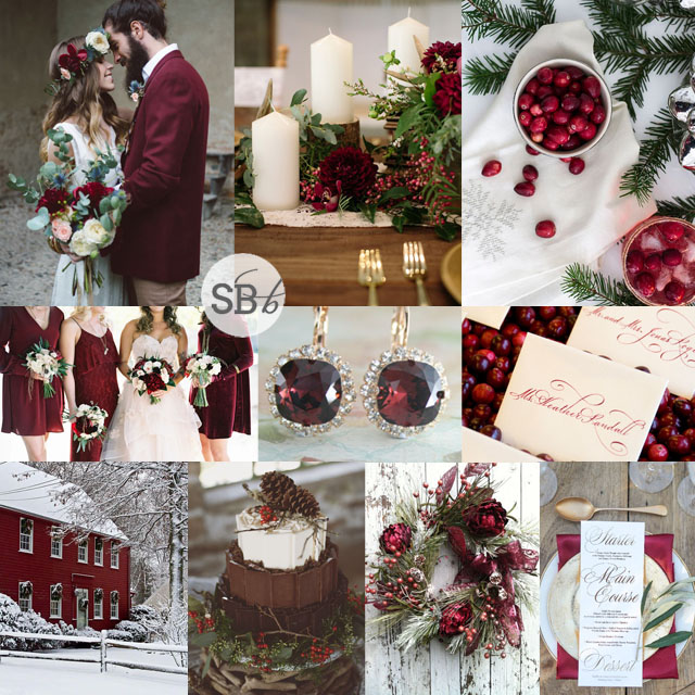
Okay okay, I said I’d never do another Marsala inspiration board, but as we bid farewell to 2015’s colour of the year and welcome a seriously exciting new pair (more on that in January), I thought I’d look back on it just one last time, since it does, after all, offer a fresh spin on Christmas red. I haven’t yet decided what my holiday table will look like, but I must admit I’m tempted by this deep shade of berry combined with natural elements like pinecones and cranberries (ridiculous in a South African summer of course, but who cares). And also, I absolutely must move into that snowy Marsala house RIGHT NOW. (Or at least get myself a print of it in all its glory from artist Kristine Patti.) All in all, I think a Marsala Christmas would be a great way to say goodbye to the year (and the colour) that was – don’t you agree?
Colours: Marsala, white, emerald, wood
Top row (l-r): Bride & groom {Margherita Calati/Il Giorno che Vorrei}; table with candles {Ashley Cook Photography/Dream Design}; cranberry cocktail {Sacramento Street}
Row 2: Bridesmaids {Troy Grover Photographers/Michelle McGregor}; earrings {Endora Jewellery/Etsy}; cranberry escort cards {David Stark/Susan Montagna}
Row 3: Christmas house {Kristine Patti}; chocolate berry cake {Rebecca Hollis/Romancing the Stone}; Marsala wreath {Marigold’s Designs/Etsy}; place setting {Chantall Marshall Photography/Kadou}
Pantone Spring 2016 Colour Palettes Part 3
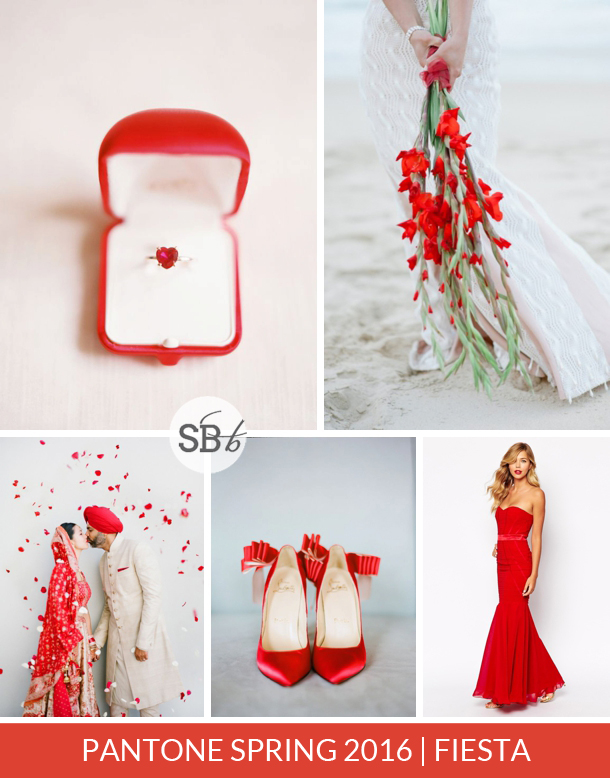
As we come to the end of our spring pastel month, it’s time to introduce you to the last three shades in Pantone’s Spring 2016 lineup. Today we have two beautiful brights and a soft neutral, that goes with pretty much everything else in the palette. Let’s have a looky shall we?Read More
Pantone Spring 2016 Colour Palettes Part 2
Good morning lovelies! It’s time for Part 2 of our introduction to the new Pantone Spring 2016 Palette – be sure to check out Part 1. Today we’re looking at three more lovely shades – two brighter versions off popular pastels, and one particularly gorgeous grey.Read More
Pantone Spring 2016 Colour Palettes Part 1
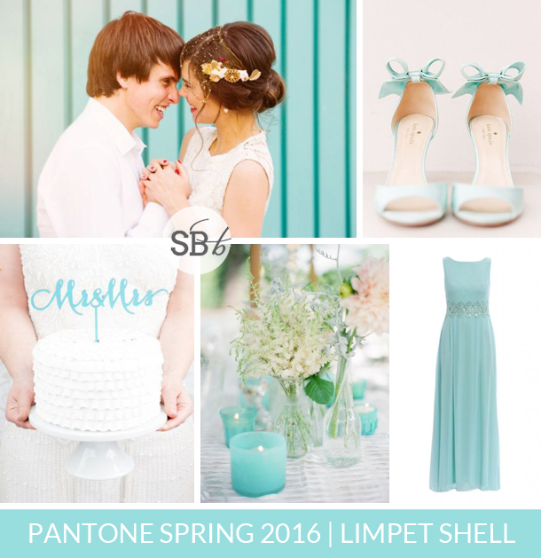
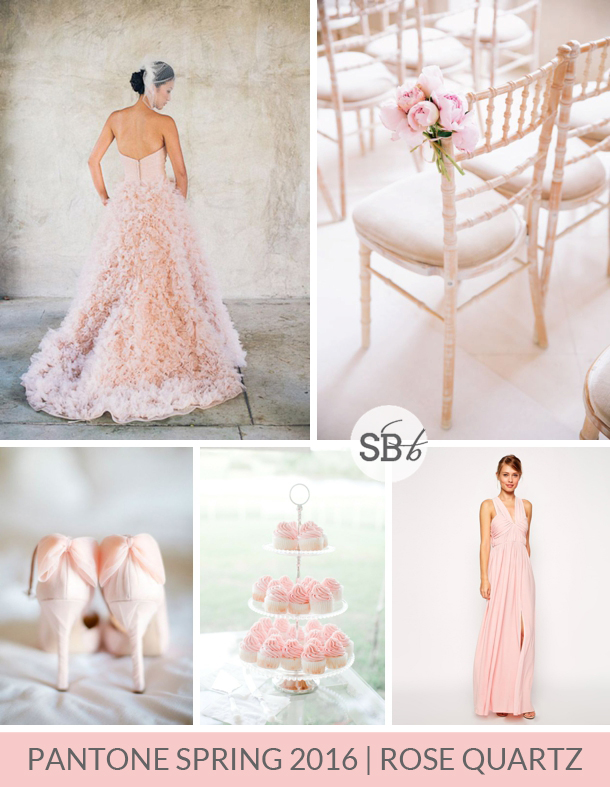
Happy Monday lovelies! Today, hot off the presses from New York Fashion Week, we have Pantone’s latest collection of colours, all dressed up and ready for their debut in the Spring 2016 season. The Spring colours are always my fave, and this time there’s a mix of punchy brights (the likes of which I’ve been enjoying seeing in weddings already!) and soft pastels (which as you already know, I love). I can’t wait to play around with combining them, but first, I thought I would put together some single colour palettes to introduce you to each shade, and I’ve also scouted out a beautiful bridesmaid dress to go with each one! We’re kicking off with the first four shades/boards today, and will be carrying on with this series for the rest of the month.Read More
Inspiration Board: Autumn Grace
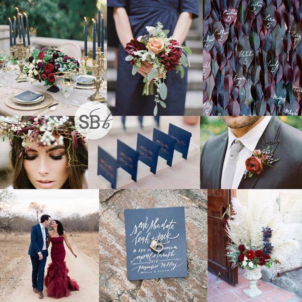
Hello lovelies! We have one last inspiration board to share for our autumn month, utilising some of the colours in the Pantone’s Fall 2015 palette. Truth #1: I wasn’t totally crazy about these colours when I first saw them, but as I’ve been working with them, I’ve found so many pretty possibilities – today’s is definitely my favourite. Truth #2: I swore I’d never do another Marsala inspiration board and I couldn’t help but include it here (although I still maintain this is more scarlet than Marsala, but whatevs). I’m not even sorry, because the deep blue and red paired with a soft touch of sage and a little glimmer of gold look absolutely amazing, and are beyond perfect for a sophisticated autumn wedding. Don’t you agree?
Colours: Pantone Reflecting Pond, Pantone Marsala, Pantone Desert Sage & Gold
Top row (l-r): Table setting {Kurt Boomer Photo/Joy Proctor Design}; bouquet {Amelia Johnson/Karson Butler Events/Sidra Forman}; leaf escort cards {Ann-Kathrin Koch Photography/Knot & Pop}
Row 2: Bride with flower crown {Yolandé Marx/Anneke Roux & Nicola Pretorius from The Pretty Blog}; blue cards {Jose Villa Photography/Pilgrim’s Quill/Jenna Lam Events}; boutonniere
Row 3: Bride in red dress & groom {Emilia Jane Photography}; invitation and rings {Brett Heidebrecht/Kylie Swanson/Lindsay Letters/Juliet Grace Designs}; flowers in urn {Christian Cruz For Max & Friends/Sweet Marie Designs}

