Winner winner, chicken dinner! Today is a good day. There are actually quite a lot of reasons for that, but I can only tell you two of them right now. One, I have a new home! Wooo! It’s a little further into suburbia, but in return for leaving my beloved Putney behind I get my own little home office. Which, as a blogger (and hell, as a Londoner), is seriously exciting. And also, there’s a trampoline in the garden, which I will no doubt make use of after a couple of glasses of chenin. Two, I have a faaaabulous wedding to share with you from the wonderful folks at the Aleit Group. Their features always rate amongst my most viewed, and it’s no surprise, since they’re full of panache and pretty details. Enter Woutrine and Tate, who not only combined romantic and strikingly modern into one gorgeous package, but chose to brand their wedding with a beautiful monogram and used it everywhere. I can’t say this enough times: you cannot go wrong with branding your wedding. It’s memorable, it ties your whole look together, and it actually saves a lot of deliberation over the smaller details. Woutrine and Tate’s letterpress monogram was pure class – I especially love how it turned up on napkins, giant screens, you name it. Their decor (OMG, strelitzias!) also fit perfectly into the incredible 401 Rozendal – what a find! Love the fusion of rustic, sophisticated ballroom details and even a little modern/industrial – it works amazingly, doesn’t it? I’m expecting to see a lot more from this venue. Pictures are by the talented Jan Hendrik.Read More
Good morning everyone! My apologies that last week I didn’t get to post everything I had planned – bear with me, as there’s an awful lot going on behind the scenes. For now, here’s this week’s inspiration board and it’s one of my personal favourites! Green and gold are very special colours to South Africans, as they’re our national sporting colours and also represent our beautiful land and its natural resources. So I can’t think of a more appropriate palette for a South African wedding, and don’t they just look beautiful together?! By adjusting the details slightly you could make this work for just about any season, and add more rustic or more sophisticated touches depending on your venue and taste. One of the details I love is the elegant use of green glasses and gold utensils to get the colour scheme across on the table without going overboard. In terms of flowers, you could really go with any white flowers but I ADORE the combination of ranunculus and baby’s breath in this bouquet, and baby’s breath makes a great filler for elsewhere around the church or venue, which can allow you to have a bigger floral presence than you may otherwise be able to afford. Green shoes are a must for the bride, and this is a perfect opportunity to dress your girls in trendy white bridesmaids’ dresses. In terms of DIY, moss monograms are simple and incredibly lovely, and I also love the gold spraypainted wishing tree for your guests to leave messages on. And you guys, how gorgeous is this cake? All in all, I think it makes for a beautiful wedding. Who knew you could be patriotic so prettily?
I don’t know if all of you know this about me, but I’m half Italian. And although my dad mostly grew up in SA, my grandparents were full blood, full throttle Italian. My Nonna was also the most incredible cook, so early on I learnt to appreciate the beauty of Mediterranean cooking – not just the taste, or the amazing ingredients, but the way Italians cook and eat. Everything is generous: the quantities, the portions (the calories!), the time spent eating (never ever rushed), the sense of sharing and abundance celebrated at every meal. It’s the best. So when I see that in a wedding, I am hooked. Then add that to sunny rustic florals and details (especially in love with the wooden block place settings), a glowing bride and groom who are clearly having the best time, a sunny day and a gorgeous setting and it’s an official swoonfest. So in love with Ciska and Warren’s South Hill luncheon wedding was I, that I shot off an email to photographer Catherine Mac begging her to let me feature it. And because she’s lovely, she said yes! What really struck me about this one was how Ciska wanted the food itself to be the key part of the decor and mood – just like a kitchen is the heart of the home, the meal really was the heart of this incredible wedding. (Oh, and this is also the first wedding I’ve featured that has a ‘first look’ – something I think I like more every time I see it. What do you think?)Read More
As a wedding blogger, it’s an understatement to say that I see a LOT of weddings. And sometimes, they start to sort of blend into one another like one long, pretty dream sequence. But some weddings just kind of stick out in the memory, and today’s in one of those. I first spotted it on the ZaraZoo blog a while back, and I just had to ask photographer Stefan Steenkamp if I could feature it. Lucky for me, lucky for you, he said yes. So why do I love it so much? First of all, I have a total venue crush on Firlane House, where it was held (the bride’s brother owns it – win!). Secondly, a HAMBURGER station? What’s not to love? And finally, I’m a big fan of the laid back French feeling, and the use of ultra modern grey – even the bride is in a gorgeous silver gown (how much are we hearting silver gowns right now?). I fall to the floor ADORE their bunting – is it not one of the most creative and gorgeous ways of using photographs you have ever seen? Go on, you know it is. And it’s no wonder the bride got it so right – she is, after all, the owner of gift shop Rhubarb Room in Cape Town. Some people have all the taste!Read More
Happy 4th of July to all my American readers! Today’s board is another reader request (I’m loving how many requests I’m getting these days!) – this time from the lovely Ingrid – and I have to admit, it was a bit of a challenge. I knew exactly what I was looking for, but it wasn’t easy to find in the right colours. I’m so excited with how it turned out though, and I hope you are too, Ingrid!
When Ingrid emailed me, she knew exactly the sort of colour palette she was after for her Kleinevalleij wedding. She’d also fallen in love with the table arrangements for this unbelievable Style Me Pretty wedding, which pretty much inspired everything else. Let me break down this look a bit. The key is in its contrasts: modern paired with a bit of vintage and a touch of rustic. Succulents and silver? Shouldn’t work, but they SO do. The components – lush purple flowers (dahlias! so gorgeous!), succulents, mercury glass, wooden boxes, moss, distressed ceramics and silver. I’ve added in a few avian details and some blackboards and lilac for even more of that French country style. Doesn’t it look amazing together?
Ingrid’s bridesmaids are going to be getting their own dresses, so she wanted to make it easy for them, and chic little black numbers are a great way forward. To distinguish the girls, I suggested giving them long strings of pearls that they can all wear in a different way, but purple shoes are another alternative (Ingrid could wear sparkly and silver if she wants to stand out). I love that guests would start off with a classic black and white wedding (maybe with a couple of small purple touches in the stationery at the ceremony) and then be wowed by the whole look when they move into the reception hall. I see a lot of weddings currently at Kleinevalleij using some pretty grey/silver damask tablecloths, and these could also work brilliantly here. I don’t know about you, but I’m dying to see how this wedding turns out! (And don’t forget – if you’d like me to create a board just for you, drop me an email and let me know a bit more about what you’re looking for.)
Ok, I have to tell you, I am in LOVE with this wedding. Like, properly. Full-blown, fill your mailbox with orange tictacs, build you a house of candles, stand outside your window with a boombox kind of love. You may even have seen it before, but I don’t care. It is the absolute definition of boho beach perfection and it’s filled with my favourite things. Floral crowns for the bride and bridesmaids, blackboards, proteas, flocks of origami birds, hanging bottle vases, lots of bright whites, sparkly lights and the cutest fringed beach umbrellas. Not to mention a fab venue (Strandkombuis), a beautiful couple who are completely gaga for one another and the most gorgeous, swoonworthy photographs from dream team welovepictures. I have stars in my eyes just looking at it all, and when I heard about the bride’s entrance music (Florence and the Machine’s Cosmic Love) I so choked up. (Take a moment, get out your iPod. It may be the best entrance ever.) Sit back and immerse yourself in the amazingness…Read More
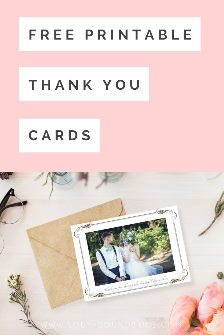
When the last guest has left and the tables have been cleared, there is of course only one thing left to do. Er, ok, two things (get yer mind out the gutter, will ya! ;) ). Thank you cards. Three little words to strike dread into the heart of any post-honeymoon bride. The fact is that while strictly speaking etiquette dictates that you have up to a year to send out those little notes, the sooner the better. Speaking from experience as a guest, they really are appreciated and necessary. But after all of those months of planning when all you want to do is relax into married life, they’re also a schlep. Well, here’s your solution. Not just one, but TWO different options of thank you cards from The Invitation Gallery – one classic and vintage and the other playful and modern. All you need to do is pick one, download and print it (or have it printed by your favourite print on demand service like PSPrint), attach one of your wedding pictures and get down to writing your personal notes. And there’s even an Afrikaans option for our Afrikaans brides and grooms! Links in bold denote affiliate links. The cost to you remains the same, but SBB may receive a commission for any sales made.
For a while now, I’ve been a big fan of Durban photographer Jacki Bruniquel‘s work – I’m sure you’ll agree it’s absolutely gorgeous! I especially love what she does with reflective surfaces – so clever and beautiful. Anyway, so I was thrilled when she contacted me to submit this wedding because not only is it super stylish, but it’s at one of my favourite venues outside Cape Town. The Oyster Box Hotel is the grand old lady of Umhlanga, which just happens to be near where my beloved grandparents lived when I was growing up. I remember visiting them every year and sometimes going to the Oyster Box, which seemed impossibly glam and sophisticated to my little eyes. After a two year rebuild it reopened in 2009 to wow us yet again, this time with beautiful wrought ironwork, inlaid hand-painted tiles and murals and a stunning gazebo you can choose to get married under. I visited it last time I was home (my parents live in Durbs), and totally fell in love with the decor. Not to mention, of course, the iconic lighthouse. And that’s just the visual aspect – they also do delicious food, and the location is completely amazing. I’m not always a fan of hotel weddings, but this one is something special, and just hosting a wedding there makes it special as well. Gaelene and Richard understood that. They kept their wedding simple and classic to best complement their surroundings, with clever, personal touches to make it their own. Gaelene herself described it best: “beauty in the simplicity of things: beach air, sunshine and our wedding vows”. LOVE.Read More
The Cape’s a beautiful place, but if there was one part of it that would have to be my favourite, it’s Elgin. My cousins have a farm there, and I remember going to visit them when I was growing up, and thinking it was just the most beautiful place on earth. It’s all green valleys and apple orchards and farm stalls and now vineyards… pure heaven. So I was stoked when Marina James of Elgin Weddings & Events got in touch to submit some of their gorgeous floral and design work. Then I realised which wedding it was, and did a little happy dance, because I’ve been wanting to feature this one for aaaaages. Not only is it at Rockhaven Farm, one of my favourite venues, and not only was it photographed by the legend that is Christine Meintjes, but it’s rustic, Mediterranean farm wedding goodness in its purest form, and I could just eat it up with a spoon. Everything is just so perfectly shabby chic and at the same time – especially with Sofia’s beautiful dress and birdcage veil – insanely sophisticated. I LOVE it. Some of my favourite stealable ideas: the herbs, the terracotta pots, the frames, the washing line ‘guest book’, and of course the fabulous cheese cake. Everything just works together so coherently, and Marina’s team did a seriously awesome job on the decor. Add in a dollop of Greek hospitality (and food!) and you have the kind of warmth and festivity that the gods themselves would be proud of. Yiamas!Read More
Today’s board is another reader request – my favourite kind! Natasha emailed looking for help with her chosen palette of pewter with a rose or dusty pink. She’d had trouble finding an inspiration board using these colours that embodied the romantic elegance she was looking for from her wine farm wedding, with a touch of formality. I have to say, I LOVE these colours! Pink and grey are very hot right now, but there are many different shades of both colours to work with and pewter is absolutely gorgeous. I think the colours on their own embody the romantic (pink) combined with the more formal and elegant (pewter), which will really help to create the atmosphere Natasha wants.
There are some key foundations to the look I’ve built up here. One is the use of lots of white (since too much pewter could be a little dark), with soft, floaty textures and classic white stationery. A second is the use of calligraphy, which again adds that romantic but formal touch and ties everything else together beautifully. Use it on everything from fun fortune tellers (these make super cute orders of service or place settings) to a table of pretty escort cards to understated place settings (don’t you just love the pink ribbon?). Of course, bringing in the metallics is equally important, which I’ve done here on the wedding dress (I die for this Vera Wang, but a sparkly belt or even brooch detail on a dress would also work beautifully), in the pewter vase and in the bridesmaids’ dresses. Of course, you could just as easily go for soft pink dresses or even a combination of pink and dove grey, but I loved these formal, full-length pewter gowns. Combine with pink bouquets to get both colours across. And speaking of flowers, I adore the single oversized bloom trend and think it would be perfect for this wedding! It adds that little something quirky and different. However, if Natasha chooses to go more traditional, then roses, peonies and anemones are all possibilities, combined with other soft pink and white blooms.
Natasha also asked about favours, as she’s considering white fans for the ladies but is a bit stumped for the boys. One thing to bear in mind is that men tend to forget to take their favours home with them, so in my experience giving them something they can use on the night is ideal. I’ve suggested cigars to play into the elegant theme, but if you don’t want them all disappearing for a little while at some point, then scratchcards, alcohol minis or something edible also work well. Otherwise you could consider bottle openers (in line with the winelands setting), playing cards, or even mini hip flasks.
Hope you like your board, Natasha! And don’t forget, if you would like your own inspiration board, just drop me an email!