Inspiration Board: Lovely Laduree

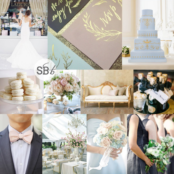
You didn’t think I’d let another Monday go by without a SouthBound Bride inspiration board did ya? This is a little colour combination I’ve been looking forward to working with, even since I saw the stationery set in the first row. I thought it was a gorgeous update to the grey and pink palette that has been so successful – a dark charcoal grey instead of a pale dove shade, a soft rosy blush, a baby blue and of course a bit of glamorous gold. It’s delicious, and I love how the pastels play so well together, but are made elegant and sophisticated by the neutral and metallic. The combination of pastels and gold reminded me a little of gorgeous Laduree macaron packaging, and the rest of the board was born!

Colours: Pastel pink & blue, charcoal and gold

Top row (l-r): Bride at Laduree {Jen Huang}; stationery suite; cake {The Cake Parlour}
Row 2: Macarons; rose centrepiece {Aaron Delesie/Lisa Vorce, Event Design & Production}; vintage daybed; champagne {Arielle Doneson Photography}
Row 3: Grey suit with pink bowtie {Adrienne Gunde Photography}; reception decor {Kristin Newman}; blue and pink bouquet; charcoal bridesmaid dresses {Forever Photography Studio/Something To Celebrate }


Inspiration Board: Pretty Preppy

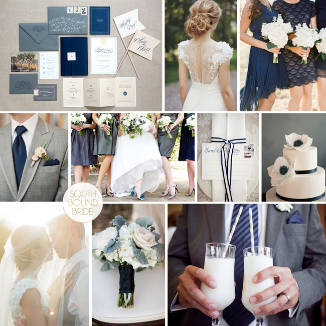
And we’re back – I couldn’t let Monday go by without some inspiration board loveliness, could I? :) Today’s combo has been my new little colour crush for a few weeks now, because seriously, how amazing do grey and navy look together? It’s so chic. I especially love the mix of a dark slate grey with a softer, bluer grey, and then sophisticated navy (plus, of course, lots of crisp white). If you like a country club chic look, this is absolutely perfect, and of course you can also inject a few softer colours like peach or coral if you like. But I actually like it just like this – it’s like a sophisticated, on-trend take on the navy and white stripes that I have been loving over the last couple of years. What do you think?

Colours: Slate grey, dove grey, navy & white

Pretty Preppy

Top row (l-r): Invitation suite {Beaux Arts Photographie}; bride {Sonya Khegay}; bridesmaids {Brett Heidebrecht}
Row 2: Grey suit {Loren Routhier}; bridesmaids {Perez Photography/The French Connection}; place setting {Lizelle Lotter}; cake {Brooke Allison Photography}
Row 3: Bride & groom {The McCartneys Photography}; bouquet {Kali Leenstra/Katy Grifiths/Flora Nova Design}; cocktails {Lizelle Lotter}.


Inspiration Board: Teal & Oatmeal

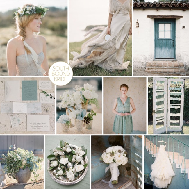
Hang on lovelies, does anyone even know how it got to be the last day of March? Eek. As usual, time is running away from me – after spending the whole of last week buried in tax and accounts, I have spent the weekend catching up with email (a couple of hundred down, several hundred to go…) and getting ready to share some more seriously lovely weddings with you all this week. But first, it’s Monday, and you know what that means! Yep – it means another inspiration board. And I have to say, I am absolutely loving the colour combination on this one. A soft teal – almost a greyed jade – and beautiful neutral oatmealy taupe. And guys, it works sooo well, right? I love the slightly boho vibe to this board – it would work for a country wedding, a farm wedding, and definitely for a beach wedding. Beautiful.

Colours: Teal, oatmeal, white and emerald

Top row (l-r): Boho bride {Adrian Michael}; flowing dress {Jose Villa/Kelly Oshiro Design}; door {Tec Petaja}
Row 2: Stationery suite {Rylee Hitchner/Sarah Robins Powell}; centrepiece {Esther Sun Photography/At Your Door Events}; bridesmaid dress {Elizabeth Messina/Ruche}; door seating plan {Clary Pfeiffer/Eventity Inc.}
Row 3: Flowers in urn; boutonnieres {The Nichols/The Nouveau Romantics}; bouquet {Tanja Lippert Photography/Blooms by Martha Andrews}; wedding dress {Jessica Lorren Organic Photography}

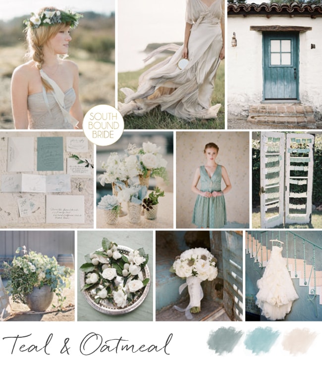
Teal & Oatmeal Inspiration Board | SouthBound Bride


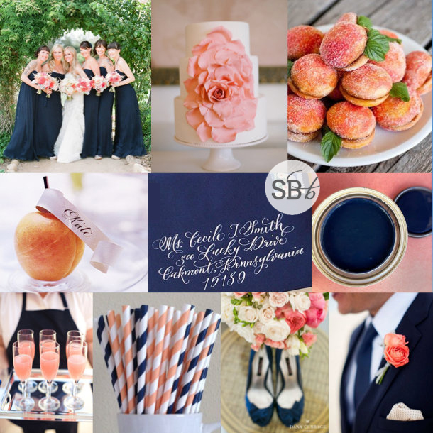
Inspiration Board: Navy, Peach & Apricot

Hello lovelies! I’m back from an AMAZING weekend in Plett with two of my best girls from high school – we had the perfect weather, and such an amazing time chilling and laughing until we cried. But it’s back to work today, and that means inspiration boards here on SBB. Today I’ve chosen a warm but formal combination of navy, peach and coral/apricot – I absolutely LOVE how these colours work together. If you were thinking of navy and pink, this is a lovely, modern alternative, and having both peach and apricot together adds that extra depth and dimension. What do you think?

Colours: Navy blue, peach and coral

Top row (l-r): Bride & bridesmaids {Lane Dittoe Photographer/Galas by Gerry}; cake with ruffle rose {Kristen Ellis/Mindy Weiss}; peach biscuits {}
Row 2: Peach place setting {Rebecca Thuss}; calligraphy envelope {Antiquaria,}; paint
Row 3: Peach bellinis {Pictilio}; stripey straws; shoes & bouquet {Dana Cubbage}; navy suit {Shannon Lee}.


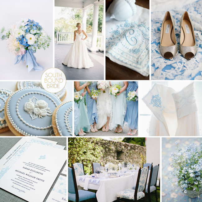
Inspiration Board: Wedgwood & Wildflower

Happy Monday, lovelies! It’s time for our weekly inspiration board, and today I am singin’ the blues. But the good kind. The kind that makes me think 2014 is the year that Something Blue becomes more than part of a motto for the bride. Now, don’t get me wrong, blue goes beautifully with many other colours, but lately I find myself drawn to the cool freshness that an all-blue palette can bring, especially when it combines a couple of interesting shades. It’s preppy and formal enough for a wedding, but bright and interesting too. I fell in love with the bouquet in this board from the second I saw it, and I adore how it mixes casual and formal, as well as two shades of blue with classic white. I thought it would make a great palette, but it wasn’t until I came across some lovely Wedgwood details that it came together – again, it’s the mix of formal and classic with a laid-back modern aspect that makes this so winning in my book! It really is the best of both worlds.

Colours: Cornflower blue, baby blue & white

Top row (l-r): Bouquet {Lisa Vorce/Kate Holt/Jose Villa}; bride {Virgil Bunao/Ooh Events}; monogram handkerchief {Bella Grace Studios/Allure Events}; shoes {Graham Terhune Photography}
Row 2: Wedgwood cookies; bridesmaids {Emily Steffen}; dress with monogram embroidery
Row 3: Invitation suite; wedding table {Carmen & Ingo/Doreen Winking}; flowers.


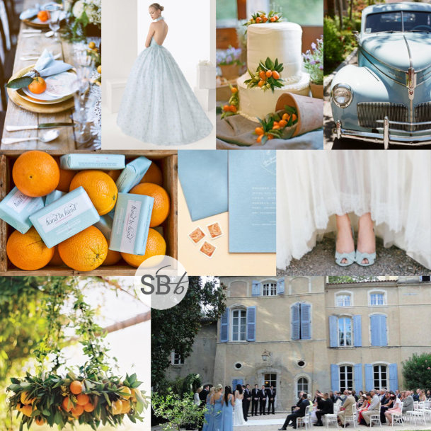
Inspiration Board: Cornflower & Orange Grove

Morning, friends – time for our Monday morning inspiration! Today I’ve put together a board that mixes some of my favourite things – a dash of duck egg blue, a spritz of citrus, and a soupçon of French countryside styling. I absolutely love the way that these colours work together, and it gives me such a feeling of summer and sunshine, but with an elegant edge. Although it’s a look that would happily translate to a number of venues, it has me dreaming of a blue-shuttered chateau in France, with orange garlands and little kumquat decorations on the cake and table, and a gorgeous pale blue wedding dress. Isn’t it pretty?

Colours: Duck egg blue & orange

Top row (l-r): Table setting {Stephanie Williams}; blue wedding dress; cake with kumquat decorations {Lisa Vorce/Mindy Rice}; vintage truck {Joy de Vivre/Michael & Anna Costa}
Row 2: Orange crate with soaps {Hand in Hand}; invitations {Raymond Hom}; blue wedding shoes {Jeremy and Alicia Brown/Vintage Whites Weddings}
Row 3: Orange chandelier wreath {Ryan Ray Photo/Events of Love and Splendor}; chateau wedding.


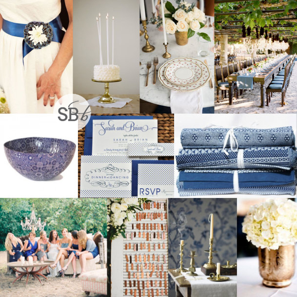
Inspiration Board: Copper & Shweshwe

I’m so excited to bring you today’s inspiration board, because it’s a preview of a mini-shoot I’ll be sharing with you tomorrow, a collaboration between myself and Piteira Photography (yay, can’t wait!). It features one of my absolute FAVOURITE prints, a truly South African design element (and one which is going to be really hitting its stride in 2014): shweshwe. For me, using this iconic South African fabric is the most gorgeous way to bring a homegrown twist to your wedding design, and still be right up to date with wedding trends internationally (prints, after all, are having their day in the sun). You can get shweshwe in quite a range of colours now, but the original indigo is the one I love most, and it’s a stylish and contemporary shade that combines beautifully with many other colours. I wanted to show how the pattern can be used in a really elegant way – for example, at a classic winelands venue – so I combined it with cool wedding white and a contemporary metallic, copper, for a bit of warmth. The colours look really graceful together, especially with the addition of white candles as a third key design element. You’ll have to wait until tomorrow to see where we ended up, but for today, I hope you love our inspiration!

Colours: Indigo, copper & white

Top row (l-r): Sash with shweshwe rosette {Julie Wilhite}; cake with high taper candles {White Loft Studio/Mayflour Cake + Confection}; table setting {}; long tables {Jose Villa}
Row 2: Shweshwe bowl; invitation suite; shweshwe fabric
Row 3: Blue bridesmaids {Caroline Tran/Kelly Oshiro}; copper tag escort cards {Mark Brooke Photography/JL Designs}; brass candlesticks; copper vase {Docuvitae/Kourtney James Perry}.


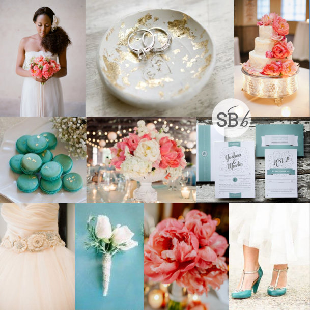
Inspiration Board: Coral, Teal & Gold Leaf

Hello lovelies! Today’s inspiration board is a little reader request via Instagram for bride Angelina, who asked for a board in teal, coral and gold. I haven’t done reader requests in a while, but I was happy to oblige, especially with this gorgeous palette. I should say that a lot of brides who lean towards this sort of palette are thinking of a colour slightly lighter than teal – a turquoise or an aqua, or even a mint – as they go absolutely perfectly with coral (if you love this, check out Tropical Coral & Mint, this coral & aqua inspiration shoot, or our Hawaiian Honeysuckle colour story). But I loved the idea of teal, a slightly deeper shade that adds an extra note of sophistication. And of course, gold is the perfect accent colour. I love me a bit of a motif, and recently I have been noticing with pleasure the textured gilt finish of a gold leaf effect (think we’ll be seeing more of this in weddings this year). It makes an awesome touch here – just the perfect amount of distressed glitter. Oh, and how AMAZING are coral peonies? Sigh. Angelina – hope you like your board!

Colour: Teal, coral, gold

Top row (l-r): Bride with coral peony bouquet {Elizabeth Messina/katflower }; gold leaf ring bowl; coral peony wedding cake {Annabella Charles Photography}
Row 2: Teal and gold leaf macarons {Fiona Kelly Photography/Linen and Silk Weddings}; peony centrepiece; teal invitation suite {Marta Harding}
Row 3: Peach wedding dress {Brklyn View Photography}; boutonniere {José Villa}; coral peony arrangement {Zofia & Co. Photography/Soiree Floral }; teal and gold shoes {Apryl Ann Photography/After Yes Weddings}.


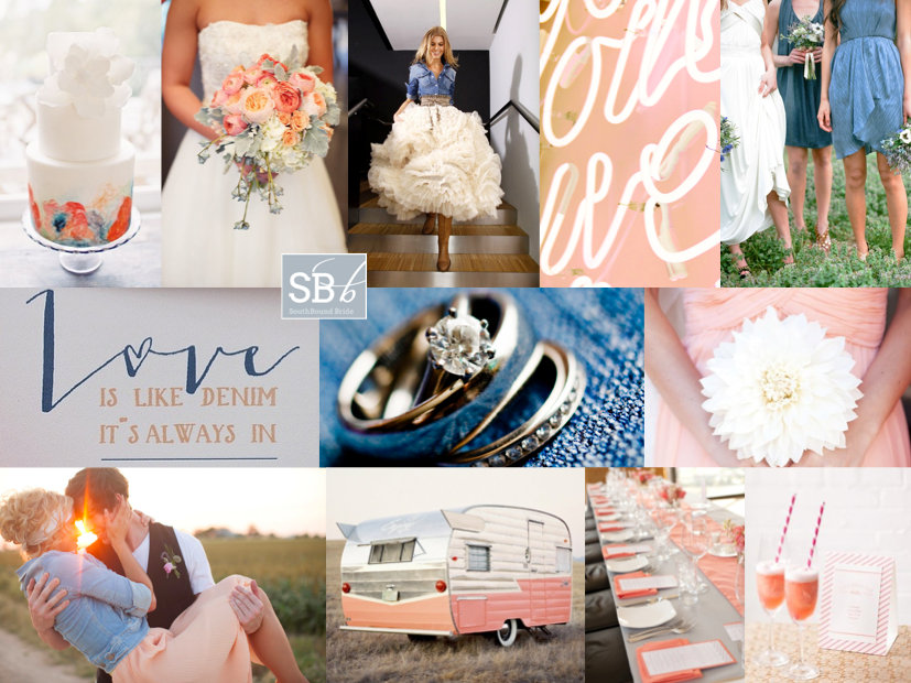
Inspiration Board: Denim, Peach & Coral

Peach and coral together are so my current fave. Or coral and blush. It’s that developing ombre-ness of it that really gets me. But the thing is, that these shades are a bit… well, I don’t know, tropical? without a bit of a cool base to ground them. A certain shade of indigo works wonders. So does navy. But today, I’ve paired them with one of my absolute best blues, because it not only comes with a pretty colour but with texture and chilledness too. I am talking denim, as you can probably guess by now. Denim, which you can actually make chic for a wedding, because, like burlap, it’s a surprising and interesting texture that can be softened or glammed up with the addition of more romantic tones. Play around with modern and classic, traditional and irreverent, for a combination that is 100% you. I love the mixture. But what do you think?

Colours: Blue, coral & peach

Top row (l-r): Cake {Sweet & Saucy Shop}; bouquet {Bryan Rupp Photography/Champagne Wedding Coordination}; bride in denim jacket; peach neon; bridesmaids {Tec Petaja}
Row 2: Love is like denim… {Brancoprata}; rings; bridesmaid bouquet {Brit Rene Photo}
Row 3: Couple {ee Photography/Sweet Sunday Events}; caravan; table setting {Elizabeth Scott}; cocktail {Rebecca Wood}.


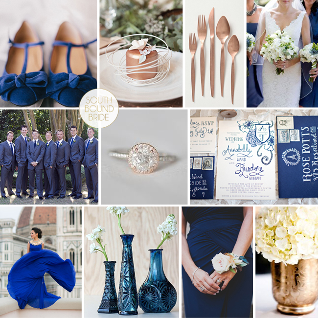
Inspiration Board: Copper & Cobalt

If I had as many boy crushes as I do colour crushes, I’d be falling in love every other day of the week. And here I go having my head turned again, this time by a gorgeous combination of copper/rose gold and blue. It’s amazing. And it totally works using every shade from a blue indigo to a dusk or smokey blue, to bright royal shades to sophisticated navy, so you can vary according to your favourite combination. I suspect that blue is going to be THE colour for 2014, and with metallics not going anywhere, bronze, copper and rose gold are a lovely update on glitzy gold or shimmering silver. What do you think?

Colours: Cobalt blue, copper & white

Top row (l-r): Shoes {Jennifer Laura Design/Val & Sarah}; cake {Fiona Kelly/Always Andri Wedding Design}; copper crockery; bridesmaids {Corbin Gurkin Photography/Loluma}
Row 2: Groomsmen in blue suits {Corbin Gurkin Photography/Loluma}; diamond ring; invitation suite {Kristen Weaver Photography/An Affair To Remember/9th Letter Press}
Row 3: Blue dress; cobalt vases; bridesmaid with corsage {Mr Haack/Jesi Haack}; hydrangea centrepiece {Docuvitae/Kourtney James Perry}