Credit: Deborah-Ann Photography/Wildeflower on SouthBound Bride
So I’m guessing that for those of you who just got engaged, unless you’re in a design or creative field, you may never have heard the term ‘inspiration board’ or even ‘mood board’ before. And suddenly, you’re a bride, and it’s everywhere, right? To be fair, inspiration boards are a little less all over the wedding blog landscape than they were a couple of years ago, but they’re still very much part of the planning experience. Here on SBB, I’ve been creating inspiration boards for many years now (and several for styled shoots that put those ideas into practice as well) and I love doing them, but if you’re a newly minted bride-to-be, it can seem a little intimidating. Well, worry not. Today we’ll cover everything you need to know, step by step. And I’m sharing some of our prettiest boards from the archive. Read on!
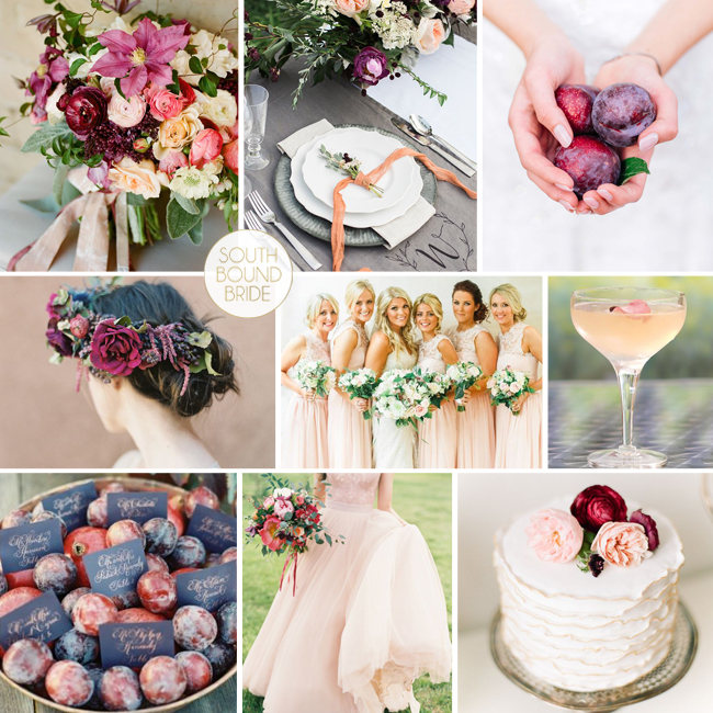
Top row (l-r): Bouquet (Twig & Twine/Adelphi Productions/Christina McNeill); place setting (Hudson Nichols Photography/Bottle Pop Party Co./Fresh Designs Florist); plums (Claire Thomson); Row 2: Flower crown (Heather Hawkins Photography/Bows And Arrows/Makeup Santa Fe); peach bridesmaids (Belle and Beau); peach cocktail; Row 3: Plum escort cards (Adam Barnes); peach wedding dress (Sara Hasstedt/A Vintage Affair Events & Rentals/Violet Floral Design); ruffle cake (Kina Wicks).
So, what is an inspiration board anyway?
First things first. An inspiration or mood board is a kind of collage that has been used for many years by creative professionals such as graphic and fashion designers to communicate a complex creative vision for a project. It started as a 3D concept – literally a pin board with fabrics, drawings, patterns, colour swatches and textures added and taken away until the balance felt right (you can still work this way, of course – use a cork pin board that you can add to and take away from easily). Nowadays, digital boards are the norm, and that’s what you’ll usually find on wedding blogs and the like. The advantage of the digital board is in its portability, of course – you can easily have it on your iPad or phone for reference, or email it to your suppliers.
What an inspiration board isn’t
Here’s the MOST IMPORTANT thing you need to know. An inspiration board is NOT a shopping list. It’s about an idea. It’s not there to limit you. It’s not there to make you feel like your wedding should look perfect, or even exactly the same as your board (read this post if you lose sight of that!). It doesn’t have to reflect the exact choices you make – the dress you pick, the bridesmaid dresses you select, the cake you design. It’s an effective tool, but it is just a starting point.
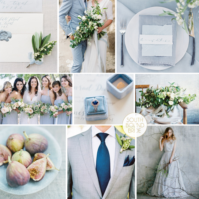
Top row (l-r): Envelopes with blue seal (Michelle Boyd Photography/Westcott Weddings/Bristol Lane Florals/Graceline Art) | Bride & groom (Photographs by Caileigh/Ginny Au/Erich McVey Workshop/Ashley Beyer) | Place setting (Photographs by Caileigh/Ginny Au/Erich McVey Workshop/Ashley Beyer); Row 2: Blue bridesmaids (Austin Gros Photography/Jessica Sloane Event Styling & Design/Vintage Florals) | Blue engagement ring (WOOKIE Photography/Coco Wedding Venues/St Erasmus Via Liberty In Love) | Organic bouquet (Lauren/Ginny Au/Tinge Floral); Row 3: Figs on blue plate (Tulle & Grace /Belle Lumière/Ginny Au/12th Table) | Groom in grey suit & blue tie (Taylor Lord Photography/Lindsey Zamora/Suit Supply) | Bride in grey-blue dress (Cathy Telle).
Why you should have one
- FOCUS: A Pinterest board full of images is awesome, but it can be overwhelming. An inspiration board narrows your focus and helps you turn it into a cohesive vision, testing out what does and doesn’t work together and acting as an anchor for your vision going forward.
- COMMUNICATION: A while back I had an emergency email from a bride who wanted to go with a particular (unusual) colour scheme, but was under a lot of pressure from her family, who felt that it wouldn’t work. We put together a board for her, and she was able to not only see for herself that her ideas did work, but to get them across to her nearest and dearest and reassure them that she hadn’t lost her colour marbles. In the same way, a board is a simple but very effective way to communicate your concept to your suppliers, saving lots of time and frustration, and hopefully inspiring them to add their own ideas in line with your own. Creative collaboration is awesome.
- INSPIRATION: You know that feeling you have at the start when you start planning? You won’t feel like that every day. When your enthusiasm dips and you get bridal fatigue, having your board up somewhere is a great way to get excited again.
Convinced yet? I hope so! Here’s a step by step guide to creating your own inspiration board.
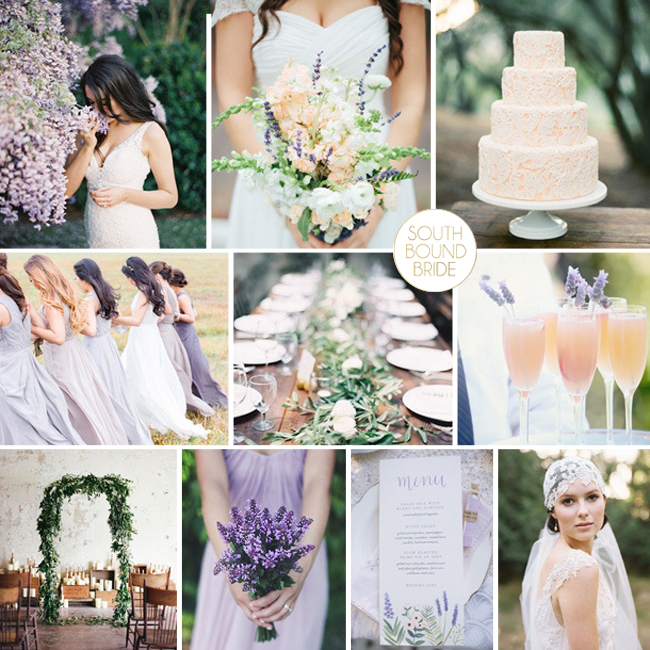
Top row (l-r): Bride {Brett Heidebrecht}; bouquet {Justen Clay Photography}; peach lace cake {Michael & Anna Costa/Joy de Vivre Wedding Design & Coordination/Sweet & Saucy Shop}; Row 2: Bridesmaids {Reverie Supply/For Her and For Him}; tablescape {Rylee Hitchner/Cloth of Gold/Ginny Au/Amy Osaba}; peach cocktails {Simply Bloom Photography, LLC/La Fleur Weddings}; Row 3: Foliage arch {Mint Photography/Pink Parasol Designs and Coordinating/Bristol Lane Florals}; posey bouquet {E. Ribant photography}; menu {Joy Michelle Photography/Anchor Point Press}; bride in juliet cap veil.
1. Gather your images
Don’t rush this part! You don’t have to do it in one session. Of course, if you’ve been curating one or more wedding Pinterest boards, you’re already well on your way. Save your favourite images into a single folder (for your own private use, not publication, obvs). As mentioned above, don’t feel you have to use the actual venue, dress, bouquet or other details you want, especially if you’re still not sure what those will be. An inspiration board is about a feeling and an atmosphere as much as it’s about colours and themes. You can find pics via Pinterest (which has great search capabilities) or Instagram, or by browsing your favourite wedding blogs (it’s worth trying a keyword search). I’d suggest some of each of these kinds of pictures:
- Images that reflect the colours you have in mind (they don’t have to be wedding images, and if you can’t find the combination you have in mind, choose some of each of the colours you want and the board will combine them for you)
- Images of the type of wedding you’d like – garden, beach, brunch, traditional, etc.
- Pictures that reflect the kind of feeling you want to create – whimsical, romantic, fun, laid-back, etc.
- Images of any details you are completely, totally, over the moon in love with. Dreaming of dancing under the stars on an outdoor dance floor? Include that.
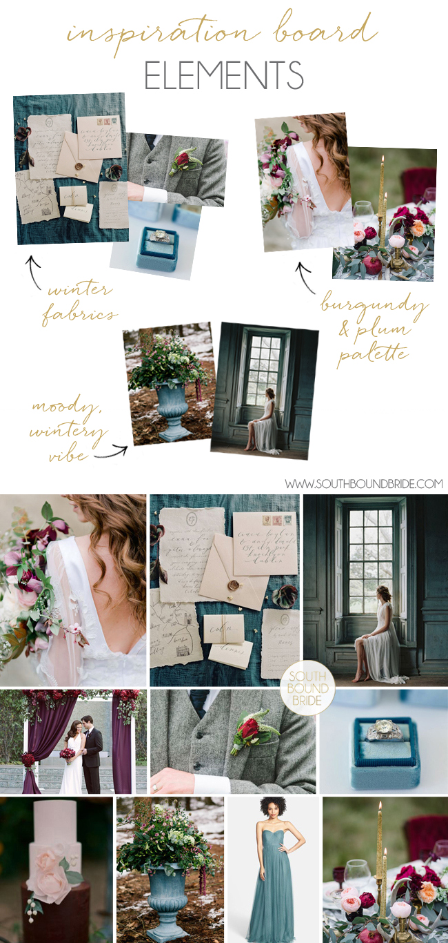
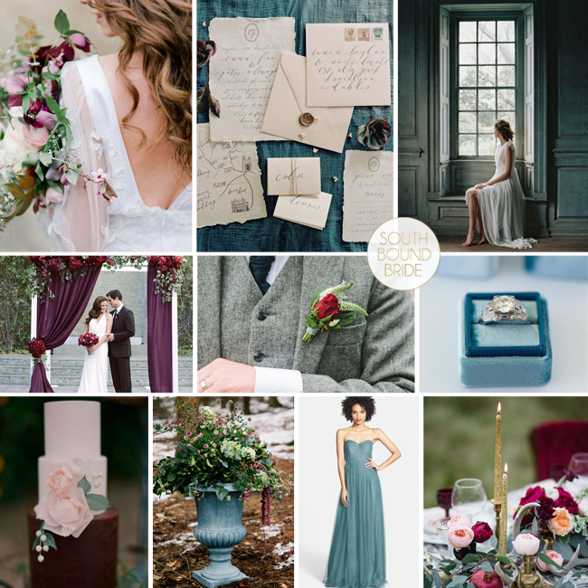
For example, let’s take our Berry & Teal inspiration board. When I created this board, I wanted to create a winter wedding with a focus on texture and rich colour, combining burgundy, plum and teal. Here are some of the images I chose:
Top row (l-r): Bride with bouquet (Nadia Meli/The Blue Carrot/Marianna Lanzilli/The Love Affair Workshop) | Vintage style invitations (Laura Gordon Photography/House of Hannah) | Bride at window (Enchanted Atelier by Liv Hart/Laura Gordon); Row 2: Draped ceremony arch (Brandon Kidd/Be Inspired PR/Chic Celebrations/The Hidden Garden) | Grey tweed suit (Chantal Lachance-Gibson) | Teal ring box (The Mrs Box); Row 3: Cake (Carmen Santorelli Photography/Beau & Arrow Events/Hey There, Cupcake!) | Flowers in urn (Jo Bradbury/Wild Orchid) | Bridesmaid dress (Jenny Yoo) | Tablescape (Emily Millay Photography/A Charming Fete/Twig Florals)
2. Select your favourites
Now it’s time to narrow down your collection. Choose the ones that ‘speak’ to you the most, that give you that little feeling of excitement or satisfaction. This is a creative process, so play – have some fun! There’s no rush. Trust your gut, and when it feels right and complete, and like YOUR style, you’ll know you’re done. I use between 9-12 images per board – 9 is a good number if you’re working in a grid. Remember, you don’t have to get everything in! Just the general feeling and idea.
3. Put it together
Honestly, there are a zillion ways to do this. Those of us wedding bloggers who do boards regularly tend to develop our own style and format. I like to work in a square, across three rows, with thin borders between the images, but that’s just my style (and it’s changed from the format I used to use). For a long, long time I (and many other bloggers!) used Powerpoint for my boards – I eventually moved over to Photoshop since I already use it so often, but you don’t need fancy or expensive software. You can use Word, Powerpoint, Photoshop, Photoshop Elements, Paint… whatever you like using. Canva is a great, free, online design tool that would be great for inspiration boards. Just choose the medium you feel most comfy with.
Top row (l-r): Laser cut chair sign {Host and Toast Studio}; dress with dipped sequin effect {Truvelle}; porcelain envelopes {Red Raven Studios}; Row 2: Table setting {Ben Q. Photography/Lindsey Zamora Wedding Styling + Design/The Southern Table}; rose gold engagement ring {Suzanne Kalan}; flower girls {Jose Villa}; leaf sash {Something Ivory}; Row 3: Candles {Kae & Ales}; bride & groom {Jose Villa/Laurie Arons/Sarah Winward}; shoes {Sarah Postma Photography/J Crew}; candles & greenery {Jose Villa Photography/Brooke Keegan Weddings And Events/Holly Flora}.
But what if you just don’t have the time? Well, lucky for you, a custom inspiration board isn’t your only option. There are hundreds of beautiful boards on sites like this one (if I say so myself) in a huge range of colours and themes and styles, and you may just find one that perfectly suits what you have in mind. You can see the full archive of SBB board here, or check out our Pinterest board. And here are my picks of the best inspiration board creators around the web (and all lovely ladies to boot):



Comments are closed.