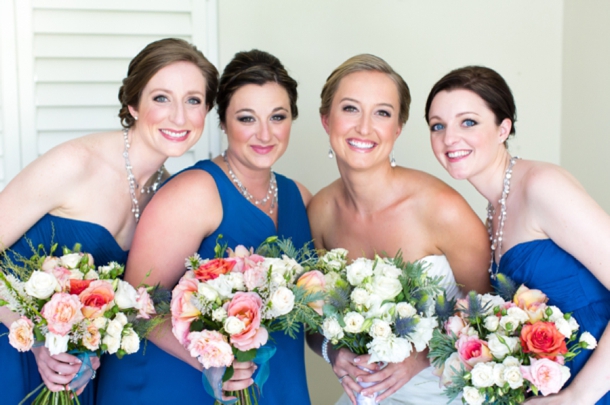
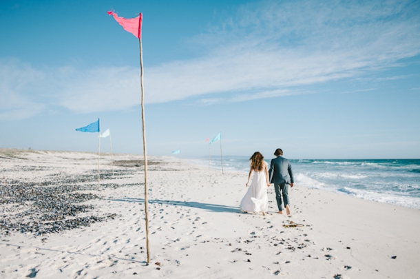
Something I love about my life, and the way that life has turned out for many of my friends, is that we’re all kind of… international. Every time I attend a wedding, there’s a mix of nationalities there, and many of my friends have married outside the South African circle or spent extended time living overseas. People live all over the place, and they move around. Sure, it makes it harder to see everyone (am I the only one who has total envy of the HIMYM crowd for being able to see their besties at McLaren’s all the time?), but it also makes occasions like weddings into reunions and introductions and mixers – a chance not only to spend quality time with wonderful people and re-live old memories, but to make new ones, and meet new people, and get a 360 degree view of a couple’s multi-faceted life. The world, vast and strange as it is, is really rather small. Today’s couple are evidence of that in more ways than one. Not only was their wedding very much an international affair, the small world part is that Bruce’s best man happens to be my cousin. Which is how Emily became a SouthBound Bride, and found her venue and suppliers. It feels a little like I’m celebrating with friends, and it’s especially wonderful to be showcasing the great work of some of my favourite suppliers – Theresa Lazarevic of Creation Events, who co-ordinated the whole wedding brilliantly, Catherine Mac who as usual outdid herself with the photos, and Rockhaven, always a picture perfect rustic venue. I could get into how lovely it all is, but Catherine’s pics and Theresa’s decor really do speak for themselves, so I’ll let you get to sighing over it all!Read More
Tag: coral
Key Colours for Bridesmaid Dresses
Source: onelove photography via Inspired By This
Afternoon, friends! Since January, we’ve been looking at all the key trends for bridesmaid dresses in 2013 – who knew there could be so many? We’ve looked at prints (floral, stripes), styles (Gatsby, skirts) and textures (lace, sequins). Now we’re turning to colours themselves – after all, this is the classic look that many brides will always choose. Next week we’ll look at neutrals (in themselves a trend) but today we’re turning attention to five key colours that have been making a big impression in wedding parties across the world: emerald (Pantone’s colour of the year), mint, coral, peach and navy. For each, I’ve highlighted a few shop finds – somee a steal and others a bit more of a splurge. I love them all!Read More
Real Wedding at Grootvlei {Vicky & Arri}
Get ready, people, because this might be my favourite beach wedding EVER. Bold claim, I know, but just wait until you see it. I don’t know where to start! Of course, I shouldn’t be surprised – this is what happens when two creative people get together and fall in love. Arri is a 3D animator and Vicky is the designer behind the awesome Mocho Loco brand (so you can get a bit of her genius for your own wedding, win). He’s South African, she brings her Argentinian heritage to the table – and you’ll see how much dancing and fun went down, starting right there on the beach. Seriously, this is the only wedding I have seen with the bride and groom hula hooping – it. is. awesome. The couple went BEYOND when it came to DIY – they made everything, and it is all so gorgeous. My favourite is the door entrance to the ceremony area (beach perfection!), and I also loved the swing for two that they sat on during the speeches. The table decor includes some of my favourite DIY elements tied together perfectly with Vicky’s lovely stationery. And my goodness, I can’t not mention Vicky’s beautiful dress! But I keep coming back to the dancing – it’s the heartbeat of this joyous wedding, bringing together family and friends from two continents in an incredible celebration. The amazing Maree Louw of Natural Light Photography was there to capture everything, and capture it she did in the most gorgeous photos. It was so hard to choose, so you’re getting a bit of a photo bonanza today. Okay! Enough raving from me. Here it is! Oh, and PS, if you want to see more, come back later for the video!Read More
Inspiration Board: Love Shines Bright
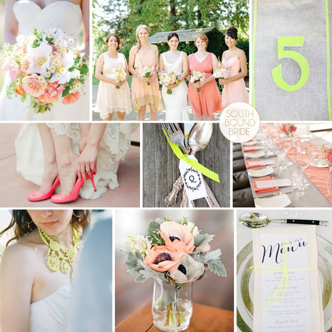
Morning, lovelies! How was your weekend? I am still playing catchup with admin – sometimes it seems never-ending, doesn’t it? But I’m here with an inspiration board to literally brighten your morning. Okes, this might be one of my favourite colour combos ever. When neon brights started making their way into weddings, I was first a little horrified, then intrigued. I decided I liked them, but in a sort of graphic, modern way. But I’ve also been quietly intrigued as to how you could use them in a pretty, soft way as well, one that would suit more brides. And this is pretty much it. A palette of soft grey, coral and then a pop of lumo yellow. Sounds insane, but the brights really bring out the other colours and I just adore the end result! What do you think?
Colours: Mushroom, peach, coral and neon yellow
Top row (l-r): Bouquet {Shoot This Not That}; bridesmaids {Kate Harrison Photography/Enjoy Events Co. Inc.}; neon table number {Shoot This Not That}
Row 2: Coral shoes {Laura Murray Photography/Holly Gerard}; cutlery bundle {Shoot This Not That}; coral table decor {Elizabeth Scott Photography/Sweet November Events}
Row 3: Neon necklace {Imbue Weddings/Byron Loves Fawn}; flowers; menu with neon string {Kate Harrison Photography/Enjoy Events Co. Inc.}
Introducing Summer Rain {The SBB Collection by Invitation Gallery}
A few months ago, I asked you all to head over to the SBB Facebook page and vote for your favourite inspiration board of 2012. This was far and away the one you liked best!
Full inspiration board credits here
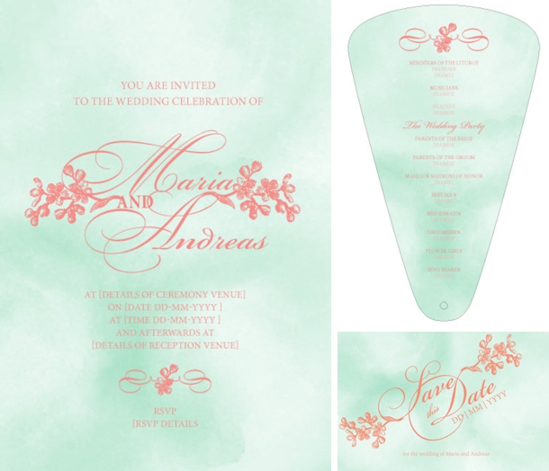
The bright, fresh combination of coral and mint really hit the right note, so in designing the latest invitation suite to join our SBB Collection from The Invitation Gallery, our designer focused on these lovely colours, marrying them with two trends that are very much of-the-moment! Watercolour has been a big design shift in the last year, and it’s all kinds of soft prettiness for a wedding day, so I absolutely love the watercolour background to these invites. Calligraphy fonts are another of my faves, and we have that too! Ladies and gents, allow me to present Summer Rain! (And just in case you can’t get enough of that gorgeous colour combo, I’ve put together a few lovely colourboards to inspire!)
Inspiration Board: Coral & Chalk
Time for a last bit of inspiration before everyone runs off to get their Friday evening cocktails in hand. And much as I love doing reader requests, this is one of my own. We’ve seen a lot of coral in the last year, but I got to thinking how perfect it would be matched up with the slate black of chalkboard and a touch of soft blush pink. It’s fresh, modern and fun, and it could work on a number of venues from a blank canvas country style (such as Kleinevalleij) to a beach wedding to a city rooftop or restaurant. It’s also perfect for a DIY kinda bride. There are, of course, lots of ways you can use chalkboard, but this particular style calls for some of the more irreverent – I love the place mat idea with drawn on knives, forks and a plate and the dessert table backdrop telling guests what everything is. Put favours in a sweet little Anthropologie jar painted in white and coral with a chalkboard label, and line the table with a ‘runner’ of single bold, bright peony blooms. LOVE. (Oh, and PS, if you want to add an extra note of colour complexity, a dash of peach is perfect here.)
Colours: Coral, blush and slate
Top row (l-r): Dotty bridesmaid {Sara Lucero}; groom with coral boutonniere {Yvonne Wong Photography}; cocktails {Abby Grace Photography/Capitol Romance}; cake pop macaroons; coral framed chalkboard
Row 2: Single bloom runner {Martha Stewart Weddings}; chalkboard style invitation; chalkboard spice jar {Anthropologie}; boutonnieres {Charmed Events Planning/Vincent Au}
Row 3: Bride with balloons {Alea Lovely}; dessert table backdrop {Elsie Larson}; chalkboard place setting
Inspiration Board: Spain Meets South
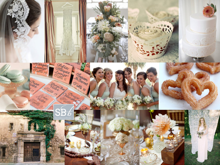
Hello lovelies, I have an extra inspiration board for you today. This one is a request from reader Simone, who’s originally from SA but now lives in Melbourne with her Spanish fiance. So international! The wedding will take place in a beautiful town in central Spain, set on a hilltop with winding streets and castle ruins. What an impossibly romantic location! Being proudly South African, Simone wants to include South African elements, including King Proteas and aloes. Because the venue hadn’t been finalised when she wrote to me, Simone wasn’t sure of much of the design, but she’d picked coral and mint as her colours. I think this is a great choice – not just because they’re on trend, but the soft pink and warm pink will work well in a variety of settings (and, of course, with the proteas). I’d combine them with copper or brass vessels for a lovely Spanish colonial feel on the tables. Another Spanish touch I would make a lot of is lace – this makes a great motif, and doesn’t need to look Victorian vintage. For example, use just a touch in soft mint bridesmaid dresses, in the form of doily cupcake cases and even as a photobooth backdrop! My favourite lace detail is the cake – especially with that protea on top! It’s the perfect Spanish/South African combination. I also thought the tiles as table numbers were a charming touch. Simone is considering serving macaroons (great for the colour) but I love the idea of a late night serving of hot chocolate with churros and koeksusters. In fact, menu is a wonderful way to pay tribute to your home country, just as Princess Charlene did for her Monaco wedding. Another idea from that wedding is to include South African music in your service. Hope you like your board Simone – can’t wait to see your wedding!
Colours: Coral and mint
Top row (l-r): Mantilla; lace dress {Jimena Roquero}; protea centrepiece {Jennifer Sando/White Room Events}; doily cupcake case; cake with protea topper and lace detailing {Jennifer Sando/White Room Events}
Row 2: Macaroons; tile escort cards {KT Merry}; mint lace bridesmaid dresses {Melissa McClure Photography}; churro hearts
Row 3: Spanish doorway; table decor (3 images) {Joielala/Canvas & Canopy Events}; lace photobooth/ceremony backdrop {NGG Studios/Imbue Weddings}.
Inspiration Board: Tropical Coral & Mint
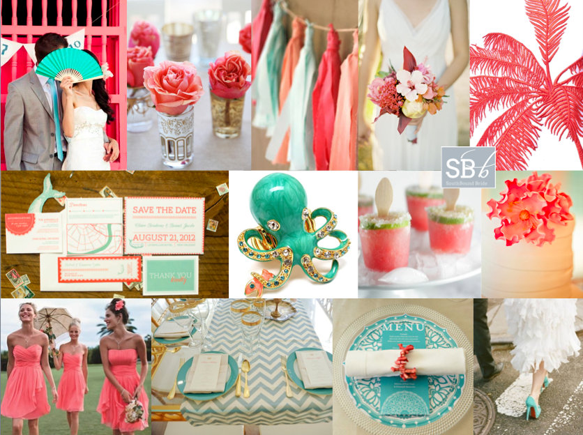
Hidey ho, neighbours. How was your weekend? Mine has been absolutely chokka with work, and a separate project I have on this November which has really been taking me back in time a bit to a year I spent teaching English in Milan… really wishing I could just jump on a plane and spend some time in my second favourite country again! Anyway, we’re transporting ourselves somewhere else completely today, to tropical Colombia, where lucky reader Clara will be getting married at a restaurant venue. She’s chosen mint/aqua, coral, gold, ivory and white, and I have to say, I don’t think she could have picked a more perfect palette. It’s just the right mix of tropical, modern and romantic. My first find was the stationery set below, which I am completely in love with, and which I think completely gets across the location and the colour scheme. I also love the idea of adding in some fun tropical touches, like coral bands on the napkins and this cute enamel statement octopus ring – maybe a fun accessory for the bridesmaids, in their coral sundresses. Clara also likes shabby chic and lace, and while it’s not always easy to mix this with tropical, I’d do it using pretty tea glasses with coral roses, a fringe garland (why not include lace in this?) and a ruffly dress. The flowers are also a lovely mix between classic and tropical, and I love the bold use of a flash of gold. For the tables, I’d keep things simple – maybe using a nice print (chevron or stripes always work well) in the mint or aqua shade, with gold cutlery and glassware (or just keeping to simple white tables with beautiful stationery accents at each setting for a more sober look). Clara also asked about using flowers for the church and the restaurant and I think she has a few options, depending on the size of the party. If it’s intimate, I’d use smaller arrangements in the church placed at different heights, and then re-use these along the table (even bridesmaids’ bouquets can be placed in vases and double up as reception flowers). Or, if you’re going for big statement pieces in the church, place these standing or on stands around the reception and keep table flowers more simple. Finally, you could keep things very simple in the church – maybe forsaking flowers completely and using lots of candles, for example, and save the flowers for the reception. There are no hard and fast rules – do whatever your budget and wedding size allow. Hope you like your board, Clara, and good luck with the rest of your planning!
Colours: Mint, coral, gold, ivory, white
Top row (l-r): Bride and groom {efeunodos/William Banea}; roses in tea glasses; fringe garland; tropical bouquet {José Villa}; palm print {Stella McCartney}
Row 2: Coral and mint beach wedding invitation suite {Boudreaux by Wednesday Custom Designs}; enamel octopus ring; watermelon margarita pops; cake {}
Row 3: Coral bridesmaids dresses; aqua chevron print table decor {Kate Headley}; coral napkin holder {Wedding Concepts/Annemari Ruthven}; aqua shoes {Karen Hill/Loli Events}
Inspiration Board: Coral & Glam
Tangerine may have been Pantone’s 2013 colour of the year, but if there’s a breakout shade for weddings this season, it’s coral. And boy, am I ever glad! Coral is such a warm shade, and so versatile – I can’t believe how many colours it works with beautifully! It’s also lovely reader Carrie’s favourite colour, so of course she’s chosen it for her summer wedding. And Carrie must be a girl after my own heart, because she also loves a bit of sparkle, and wants to put her bridesmaids in mismatched glittery dresses – how pretty is that? There are some lovely coral or blush and sequin dresses available at the moment, but for this board I’ve gone for one of my absolute favourite bridesmaid combos of recent times – these copper skirt and top sequin and lace mismatches are just amazing and they look so good with the coral and white bouquets! Add in beautiful copper heart Vivienne Westwood shoes, and some good as gold accents and you have the perfect amount of metallic. A good tip with coral is to use it in a sort of ombre way, with everything from a pale blush to the most powerful orange version of the colour, just the way that it is in this adorable stationery suite. Add a few special touches – homemade lemonade, a ruffly chair back, sparkly mason jars, and you have everything you need for coral and glam wedding wonderful. Hope you like your board, Carrie!
Colours: Coral, blush, white, copper & gold
Top row (l-r): Bridesmaids {P: Jarvie Digital Photography}; table layout {S: Envision Wedding Studio; P: AC Ellis Inc.}; pink lemonade {P: White Loft Studio}; blush ruffle chair back {S: Envision Wedding Studio; P: AC Ellis Inc.}
Row 2: Coral & gold stationery suite {P: Jean-Pierre Gary and Kiera Ormut-Fleishman}; coral macaroons; Vivienne Westwood shoes; fireplace ceremony {P: Justin Demutiis Photography; S: Olivier Events}
Row 3: Sparkle mason jars; lace sheath dress with keyhole back {P: Paul Johnson}; cake {Elizabeth Messina}; single bloom centrepiece {Martha Stewart}.
Inspiration Board: Colour Burst
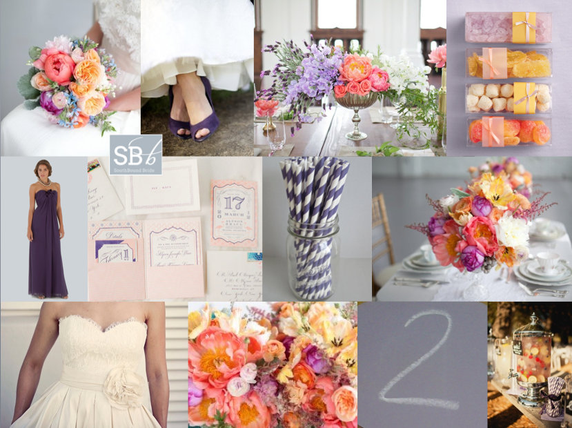
Never let it be said that I don’t love my readers! I know how sometimes planning can be overwhelming (especially bringing all your ideas together as the big day approaches), so when I got a wedding 911 from SouthBound Bride Stephanie, I put together this little board for her quick sharp. Stephanie had chosen a lovely deep purple as her main colour, with beautiful bridesmaid dresses for her girls. However, Stephanie was also in love with colour and fun, but was having a tough time convincing everyone else involved with her wedding that she could be vibrant and still classic and beautiful. Her dream palette – purple combined with coral, yellow and pink – was certainly unusual, so I immediately started looking for florals in this combo. As I suggested to Stephanie, if you’re working with bright colours but you want to make sure they don’t become too much, the best thing to do is keep everything else simple and let the flowers really pop. Because flowers are colours from nature, they have natural tones to them, so you don’t get the same hard colour block effect that you might with something synthetic. It’s a softer and more classic look. Luckily I didn’t have to look too long before I found the perfect inspiration shoot, and all I can say is WOW. Isn’t this palette stunning? I’m such a convert. Paired with simple place settings and classic stationery, the florals really do the talking (and they say “hello, I’m gorgeous”). You’ll notice there are a lot of peonies in the board – and yes, peonies are incredible, but they’re also hard for a South African bride to find. However, chat to your florist about other options, as there are many lush colourful flowers (ranunculus or carnations, for example) that will do a great job here. Another tip I gave Stephanie was not to try to bring all four colours into everything – combine two here, two there, and the result is cumulative.
So, what do you think? Stunning, no? Good luck with the rest of your planning Stephanie! I’m sure it will be amazing.
Colours: Deep purple, violet, coral, yellow & pink
Top row (l-r): Bouquet {P: Sara Gray Photography; S: Elizabeth Anne Designs}; purple shoes {P: Simply Jessie Photography}; centrepiece {}; colourful sweet favours {Martha Stewart}
Row 2: Deep purple bridesmaid dress {Bride & Co.}; purple and coral stationery suite {P: KT Merry; D: The Right Side Design}; purple paper straws; centrepieces {P: Sara Gray Photography; S: Elizabeth Anne Designs}
Row 3: Elbeth Gillis wedding dress {P: Cari Photography; D: Elbeth Gillis}; flowers {P: Sara Gray Photography; S: Elizabeth Anne Designs}; purple chalkboard {generated by reader}; cocktail {P: Matthew Morgan; C: Tammy Mitchell}

