

No ways you guys. It was bad enough that it was September, like, YESTERDAY, but now it’s already halfway through? Oh, I give up. I may as well start on the Christmas carols. Anyway, before I start going on about time rushing by, it’s worth taking a moment to look back at the week that was and all the beautiful inspiration that was to be found there! Here’s my roundup…
SouthBound Bride in Fairlady Bride
I’m just going to take a minute this Sunday morning to share something I’m super SUPER excited about. I try not to be all boasty about stuff (after all, I grew up in Port Elizabeth) but sometimes I think you have to celebrate good things and milestones. And for me, this is an SBB milestone. We’re in Fairlady Bride, you guys.
Now, if I tell you that I’ve been reading Fairlady Bride since FOREVER, you might think I’m just saying that. I’m not. And I can prove it.
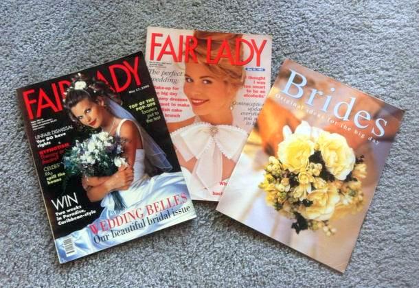
Look at that. I still have issues from before it even WAS Fairlady Bride, when it was still just an annual issue of the main magazine that focused on weddings. When halternecks and giant bows were IN, and Claudia Schiffer and Anne Vine-Morris were the cover girls. Okes, that hairstyle on the left is the very same one I wore to my matric dance – as in, took this issue to the hairdresser and asked him to copy it. (Yep, I’m old. But in 1995 that hairstyle was awesome.) Before wedding magazines were even a thing, let alone blogs. And let me tell you, the wedding issue was a highlight of my year. I was never a girl who fantasized about my own wedding day (thank goodness, or I’d be a little disappointed right now) but I’ve always been fascinated by all the planning and details and loveliness that surround weddings. It took the internet to figure out that I was by far not the only one. And I never would have imagined then that I’d be doing what I do now, that the industry would explode as it has done, and that I would get to spend every day inspired by all of those details and loveliness.
It makes me happy to look back at that little girl, so in love with magazines, and know that today I’m part of this next generation of women’s lifestyle journalism. I’ve worked hard to make SouthBound Bride a place of quality content – the sort of blog that, if I was a bride, I would love to read. I’m always worrying about how to make it more, make it better. So when the lovely Liesl, editor of FLB (and whose gorgeous own wedding you can actually see in this issue), approached me to do this year’s Blogger’s Wishlist, I couldn’t even pretend to be cool and nonchalant. I was thrilled. I am thrilled. And I had so much fun putting together my list of the trends that are inspiring me right now, that I hope will inspire you too.
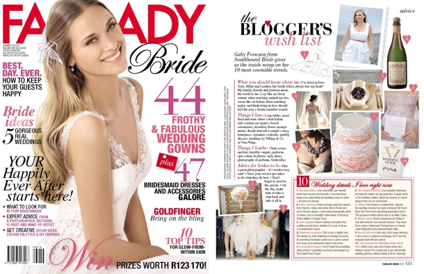
So there it is. Go get your issue (not just to look at me, obvs – there’s tons of cool stuff inside). A huge thank you to Liesl and the Fairlady team for including me, and an equally huge thank you to all my wonderful photographer friends who allowed me to include their images in my feature: Monica Dart, Rensche Mari, Julie Wilhite, Moira West, Vivid Blue, Yolande Snyders, Chanelle Segerius Bruce, Veronique Photography and Cheryl McEwan. Here’s to the next milestone! ;)
Bridal Showers & Hen Nights: Who Pays?
Happy Friday, lovelies! This post comes out of an email I received from a mother of the bride asking for a bit of etiquette advice in planning her daughter’s shower. Having come across some sticky situations with regard to the financial side of bridal showers and hen parties over the years, I thought it would be a good one to discuss. Because, let’s be honest, none of us like to talk about money, but it can cause all kinds of unpleasantness.
In talking etiquette, I find it really helpful to go back to the principles on which the rules are based. The key ones here are:
- Hosting: The rule is that if you host an event, you pay for it.
- Gifts: Generally, guests attending an event where they are expected to give a gift should not have to pay for themselves as well.
- Consideration: In situations where guests are expected to pay, the organiser should always take their budget into account. Aim towards the lower end of the scale, not the highest. Let people know costs upfront, and allow them the opportunity to withdraw. When the costs are shared, you need to be democratic.
Hen Parties/Bachelorette Nights:
In general these days, costs for hen parties are broken up per head. Guests contribute the cost of their activities, their dinners, their drinks and, if it’s a weekend, accommodation and travel costs. It isn’t a hosted activity (although it may be organised by the bridal party) so this is generally acceptable. Gifts shouldn’t be expected. If there are decorations and goodie bags, the bridal party will usually cover these.Read More
Downton Abbey Wedding Inspiration
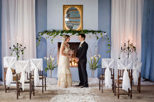
What’s the expression: we plan and God laughs? Well, it’s been that kind of a day. The wedding I had for you had to be put on ice at the last minute, for one. But that is no worries, because it just means that I get to share this piece of loveliness with you all a bit sooner. I don’t know how many of you are Downton Abbey fans (and I can’t believe how behind SA is…) but I definitely am, and I’m totally amped for Series 3. And as much as I’m a Gatsby girl, I also love the alternative wedding style from the same era that Downton offers. While Gatsby is all about loud, wild, flapper style (even if you don’t go all out Baz Luhrmann), Downton is much more refined, more elegant, but just as opulent in its own way. So I was absolutely thrilled when South Africa’s own Nuptial Network got in touch with their latest styled shoot project, which was inspired by Lady Mary et al. And it is gorgeous – you vintage loving brides are going to ADORE it. But what I especially love is how many little touches could be incorporated into any kind of wedding – the subtle sweetness of an ombre cake, the pretty chair ties, the ceremony area (LOVE), the pretty styling of the bride and bridesmaids. The table draped in lace. With lace and silver and lasercut, and pretty pretty flowers, all you need is Carson to lead you in to dinner. Ready, my lords and ladies?
Pantone Spring 2014: Placid Blue & Hemlock
Time for some more inspiration! And I must admit, I am excited to see the reaction to this one. In the last while I’ve been noticing a drift toward the pairing of pale green and blue, and even though Dazzling Blue is the lead colour for this collection, the combination of Placid Blue and Hemlock is my tip for the perfect contemporary wedding look and one I think we’ll be seeing quite a bit of in 2014. It’s such a cool, fresh combination – so chilled and so elegant, and I love how it combines with elegant country details effortlessly, including lots of organic greens and blues. Like diving into a cool pool of water at the bottom of a shady garden. Don’t you love it?
Colours: Placid Blue & Hemlock
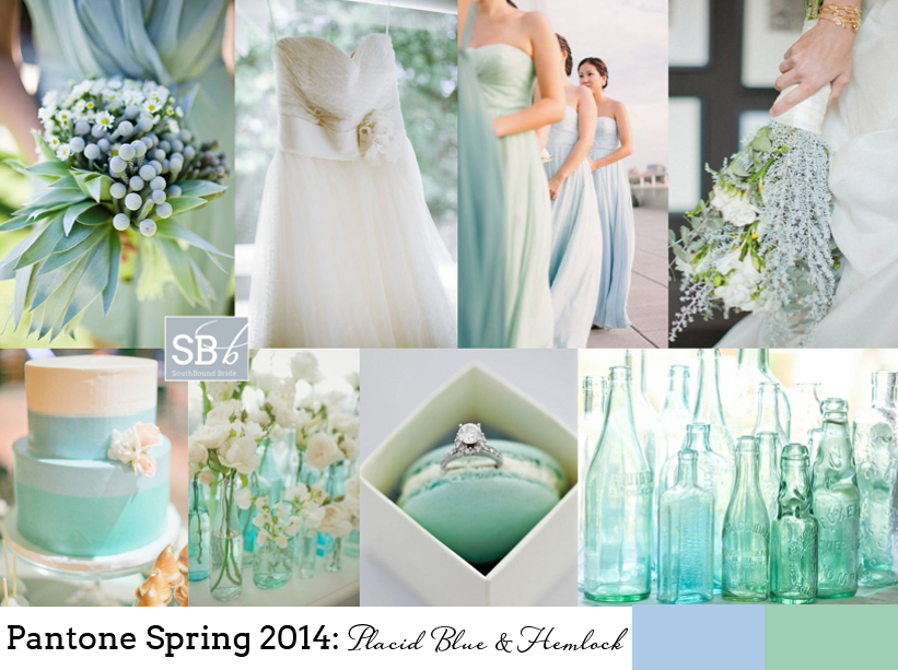
Top row (l-r): Bridesmaid’s bouquet {Anna Kuperberg}; dress {Scott Piner Photography}; bridesmaids {Judy Pak Photography/Bella Bridesmaids}; bouquet {Scott Andrew Studio/Tracy Taylor Ward Design}
Row 2: Cake; flowers in bottles {Pobke Photography/White Room Events}; macaroon with ring; bottles.
Pantone Spring 2014 Colour Report

Happy Wednesday, friends! Today we’re continuing our celebration of the new Pantone colour report with even more fresh inspiration. The great thing about these reports isn’t that anyone expects brides to slavishly follow the new colours or feel like the ones they already have are ‘out’. But it’s a chance to take a fresh look at the colours you’re using, play with new combinations if you haven’t chosen a palette yet. But best of all, it’s an insight into the colours that are coming into homeware and fashion. Why should that matter? Well, as anyone who tried to find coral bridesmaid dresses three years ago will tell you, it does. When Emerald first made an appearance last year, I’d only seen it on celebrities – this year I have been spoilt for emerald images and bridesmaid dress options – even wedding dresses. So picking one or more of these colours might make your life easier if you’re planning a wedding in the next year. So those are the practical aspects. But for today, we’re just going to enjoy the colours. I really love this year’s choices – they’re not far off what we’ve seen before, but a bit more matte or with a bit more depth, or a bit lighter. Pastel blue and green are a big trend for 2014 in my view, and Hemlock and Placid Blue are perfect for that. The neutrals are also lovely – Paloma and Sand – just with a bit of warmth for grey and taupe shades. There are two very pretty purples – Violet Tulip and Radiant Orchid. And then some fabulous brights – Cayenne (LOVE this red), Celosia Orange and a gorgeous pop of Freesia yellow. But the colour that leads the collection is Dazzling Blue, a cousin of the blues that have been showing up for a couple of years now, that has really come of age. Get ready to see a LOT more of this one. This week we’ve already seen two full boards using the Spring 2014 colours, and there’ll be even more later today and Friday, but here I thought I would do some mini boards to inspire – which is your favourite combo?Read More
Beach Beautiful
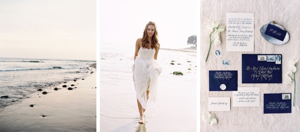
What are the two magic words guaranteed to set any wedding blogger’s heart a-thumping? (And no, they’re not ‘mason jar’.) Jose Villa. Only my favourite photographer, ever. And what are three magic words guaranteed to get South African brides excited? Why, ‘new Wedding Inspirations‘, of course. One of my all-time favourite wedding magazines, and the first thing I picked up a copy of when I landed in SA. So what happens when you put the two together? Well, that’s what I get to share with you today. I’ll explain – the brand new issue of Wedding Inspirations is out now, and it’s an absolute feast. There’s ideas, advice, fashion and some absolutely beautiful shoots. Including this one, which was not only photographed by the aforementioned Jose Villa, but styled by the fab Joy Proctor of Joy de Vivre, a super talented wedding stylist in the States who is bringing her considerable skills to the SA market. It’s a beautiful, romantic and refined coastal look, with selected vintagey accents and a soft but classic colour palette. I’m more than a little in love with it, and I’m so thrilled that our friends at Wedding Inspirations have allowed me to spotlight it here today.Read More
Real Wedding at Blaauwklippen {Janna & Nathan}
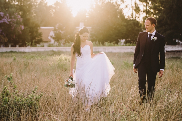
I have to tell you guys, I LOVE reading your love stories. I never get tired of it. And what amazes me is that each one is unique and different and special, like fingerprints or snowflakes. Some really put a big goofy smile on my face, and that was the case with today’s bride and groom. It’s not just the fact that Janna came to South Africa for adventure and found love, or that her groom Nathan is one of the most romantic guys I’ve come across with a real talent for creating moments straight out of a movie. I think it’s that, when you look at the beautiful pictures Charlene Schreuder captured of their big day, and you see them laughing together, completely caught up in the moment and in their happiness, you can’t help but feel a little part of that glow. And that’s really what their reception seems to do – to glow – from the light over the mountains at golden hour, to the fairy lights surrounding their garden courtyard reception. Goofy smiles at the ready? Go.Read More
Pantone Spring 2014: Freesia & Sand
How I do love a new set of colours to play with! And I must say, I think the bold, bright yellow of Pantone’s Spring 2014 collection, ‘Freesia’, may be my fave. It immediately reminded me of the bold yellow stripes that characterise a great place I went to last week in Abu Dhabi, the Monte Carlo Beach Club – everything there is kitted out (tastefully) in preppy yellow and white stripes, and it looks amazing. Paired with ‘Sand’, another of Pantone’s 2014 picks, you have the makings of a perfect beach wedding, or even of a rustic farm look. As always, be sparing with the brights, let them punch out. And punch is certainly what this colour does! Love it.
Colours: Pantone Freesia & Sand
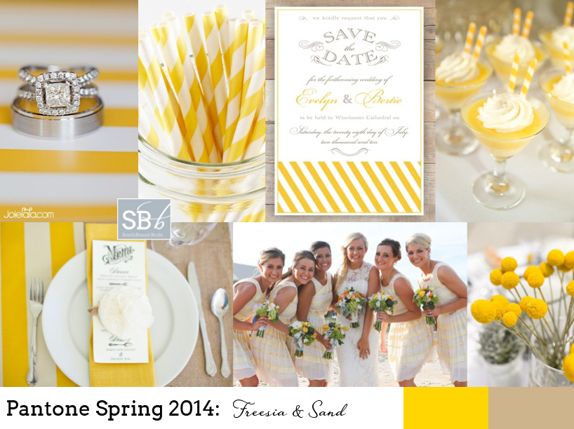
Top row (l-r): Ring {Joielala Photographie}; stripey paper straws; invitation; dessert {Grandes Fetes/Jessica Schilling}
Row 2: Place setting {Krissy Allori Photography + Courtney Jade Photography/Double Take Event Styling}; bridesmaids in yellow stripes; billy buttons {Nineteen Eighty Five/Christine Meintjes}.
Pantone Spring 2014: Placid Blue & Paloma
Morning, lovelies! It’s that time of the year again, when Pantone releases their spring colours. My favourite. I’m still being inspired by last years’ crop, in fact. That was, until I got a whole new ten colours to dream about. I’ll be doing a full roundup on Weds of the whole set of colours, but this week I’ll also be bringing you inspiration boards of my favourite colour combos, starting with today’s. I just love this soft blue, ‘placid blue’, especially when combined with the softest grey, ‘paloma’. So romantic! It’s also a lovely alternative if you’d been considering pastels or a blush and grey mix for your wedding, and I have a feeling we’ll be seeing a lot more of placid especially. Or just consider wearing a blue wedding dress in the shade – so unusual and gorgeous. I’ll be back with another board this afternoon, but meanwhile, what do you think?
Colours: Pantone Placid Blue & Paloma
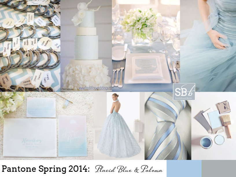
Top row (l-r): Horseshoe escort cards {paper antler via style me pretty}; blue wedding cake with ruffles {Hey There, Cupcake!}; place setting {Jose Villa/Beth Helmstetter}; blue dress {Alicia Swedenborg}
Row 2: Watercolour invitation suite {Bubblerock/Quelque chose de Bleu}; blue wedding dress; blue and grey tie; paint samples {Lauren Bamford}.