Inspiration Board: Coral & Chalk

Time for a last bit of inspiration before everyone runs off to get their Friday evening cocktails in hand.  And much as I love doing reader requests, this is one of my own. We’ve seen a lot of coral in the last year, but I got to thinking how perfect it would be matched up with the slate black of chalkboard and a touch of soft blush pink. It’s fresh, modern and fun, and it could work on a number of venues from a blank canvas country style (such as Kleinevalleij) to a beach wedding to a city rooftop or restaurant. It’s also perfect for a DIY kinda bride. There are, of course, lots of ways you can use chalkboard, but this particular style calls for some of the more irreverent – I love the place mat idea with drawn on knives, forks and a plate and the dessert table backdrop telling guests what everything is. Put favours in a sweet little Anthropologie jar painted in white and coral with a chalkboard label, and line the table with a ‘runner’ of single bold, bright peony blooms. LOVE. (Oh, and PS, if you want to add an extra note of colour complexity, a dash of peach is perfect here.)

Colours: Coral, blush and slate

Top row (l-r): Dotty bridesmaid {Sara Lucero}; groom with coral boutonniere {Yvonne Wong Photography}; cocktails {Abby Grace Photography/Capitol Romance}; cake pop macaroons; coral framed chalkboard
Row 2: Single bloom runner {Martha Stewart Weddings}; chalkboard style invitation; chalkboard spice jar {Anthropologie}; boutonnieres {Charmed Events Planning/Vincent Au}
Row 3: Bride with balloons {Alea Lovely}; dessert table backdrop {Elsie Larson}; chalkboard place setting


Inspiration Board: Sugarplum Fairy

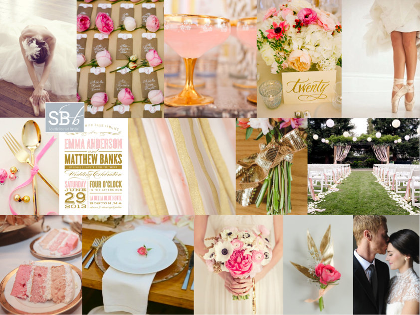
Hello lovely friends – hope you all had a fabulous weekend. London was COLD, so I spent it wrapped up warm inside! Last Thursday I indulged myself in all things Sparkle & Blush, but today I’m moving on to a whole new pink and glitter inspiration board obsession. This one was created especially for reader Marielen, who is planning a spring wedding in Canada. She’s a fan of everything ballerina, and wanted something classic, modern and romantic, as well as warm and inviting, in pinks and golds. Well, pink and gold is one of my absolute favourite combos, and Marielen could just go for basic ballerina blush, pairing it with gold glitter (which is itself a lovely combo), but I really love the addition of a hot pink (this is also a great colour combo if you’re going to use graphic black and white as a base). It just adds that extra bit of warmth and brings the look bang up to date. Adding a bit of ballerina style is no problem – there are many gorgeous ballet-inspired dresses around at the moment, and I do love a bride in ballet slippers. Make sure bride (and maids) are in chic buns, and accessories with lots of tulle and ruffles and ribbon – both in the bridal party and at the reception. I love the use of roses here – they really are a classic – and especially the sweet escort cards and also a little rose bud at each place setting. Another lovely touch is the glittery ribbon for the bouquet. And speaking of ribbon, an idea I really love (that is a subtle but very pretty reference to the ballet stage) is to have a ribbon curtain for the aisle – how gorgeous does it look? It’s something you could do inside (against a blank wall) or out as pictured here, and will really make an impact! If possible, you can also re-use the curtain (now ungathered) behind the main table at the reception. I must say, I really love this look – hope you do too, Marielen!

Colours: Blush pink, candy pink, hot pink, gold glitter

Top row (l-r): Ballerina {Asian Bees}; rose escort cards {A Bryan Photo/Calder Clark Designs}; blush cocktails {Insight Creative/Carbine Avenue}; centrepiece {A Bryan Photo/Calder Clark Designs}; ballet shoes {Yan Photo/Honey of a Thousand Flowers}
Row 2: Gold cutlery; pink and gold invitation {Fine & Dandy Paperie}; pink and gold ribbons {Insight Creative/Carbine Avenue}; sparkly bouquet tie {Confetti Pop }; aisle {Edyta Szyszlo/lovely little details}
Row 3: Pink ombre cake {Edyta Szyszlo/lovely little details}; place setting with rosebud {Q Weddings/Suzanne Court Catering & Events}; bouquet {nbarrett photography/Lavender Joy Weddings}; pink flower boutonniere {Confetti Pop}; bride and groom {Rebekah Westover Photography/Attention 2 Detail Events}.


Pantone Fall 2013 Colour Report

Goodness, but time is rushing by! It seems like just yesterday that the Pantone Spring 2013 colour report came out, and I’ve had so much fun working with the colours this year, including colour of the year, Emerald. But with the days finally starting to get longer on this side of the world comes the Fall report, and as before, the colours are bolder and brighter and perfect for a statement look. This time around they all really remind me of Morocco, and what I’m really looking forward to doing is pairing them with soft neutrals as well as each other, as they are here. So how might you go about using them? As usual, I’ve put together a selection of mini-boards to give you some ideas! Which is your fave?

Read More

Inspiration Board: V is for Violet

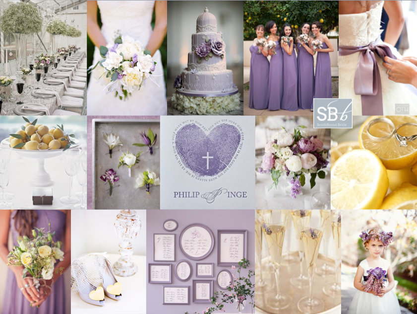
Good morning, SouthBound Brides, and a special welcome to all the new readers with Valentine’s Day proposals! You know, as you all start planning, some of you will find that you have a clear vision – a palette you’ve always loved, a style that’s distinctly your own, a venue that dictates where you go with your decor. But for others, it’s harder. You like some of this, some of that. I get the feeling that the bride who requested today’s pretty board falls into this category (and if you do too, worry not – it’s completely normal!) In her mail, Shylet asked for a board for her summer Zimbabwean wedding. She wanted it to be chic and contemporary, but she also wanted it to be vintage. She wanted extravagant centrepieces and a cake, but she also wanted DIY. It could be a bit of a mishmash, but I think I know what Shylet is after. See, what many brides now think of as vintage – lacey, girly, prettiness – doesn’t have to be old fashioned at all. And items can be DIY without looking crafty. It all starts with a great palette, and Shylet definitely has that covered – with purple, yellow and grey as her colours (I opted for a pretty violet that goes so nicely with a fresh lemon zest yellow!). In putting the board together, I immediately thought of this SBB wedding – notice how the tables have dramatic tall arrangements (made of baby’s breath, which saves a ton) as well as lower arrangements for colour. It’s a very effective look. The bride also chose an amazing cake, which was a replica of the stunning Peggy Porschen creation below. Team this with soft bouquets and frosted lemons on platters for a really elegant look. I’d limit DIYs to things like this pretty wall of table plan frames, or maybe to interesting favours (Martha Stewart’s Good Things are the perfect place to look for this sort of idea) – that way you can feel that you’ve made your personal mark without changing the overall sophistication of the look. Hope you like your board Shylet!

Colours: African violet, lemon zest, grey

Top row (l-r): Table setting {Adene Photography/Marina Moorcroft}; bouquet {Lavender & Twine Photography/Flowers By Roni}; cake {Nick Tucker/Peggy Porschen}; bridesmaids {Alejandra Vidal at Imaginale Design/Lettie Peterson at Rust and Lace}; dress with sash {Christian Oth Studio}
Row 2: Sugared lemons {Martha Stewart}; boutonnieres {Martha Stewart}; letterpress thumbprint invitations {Essie Letterpress}; peony centrepiece {Kate Preftakes Photography/Flowers by Fancy}; lemons {Jessica Schilling Photography}
Row 3: Bridesmaid’s bouquet {Jackie Wonders/Kristen Tencer}; shoes {Veil and Bow/Salt Harbor Designs}; table plan frame wall {Martha Stewart}; lavender champagne {Debra McClinton}; flower girl {NK Photography}.


Inspiration Board: My Funny Valentine

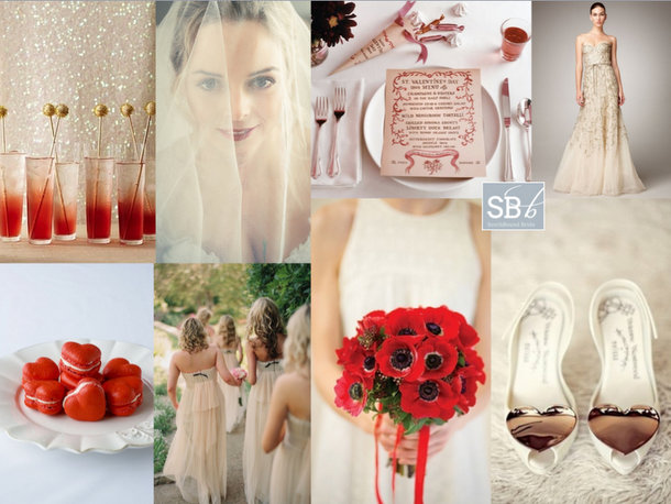
Hello friends! And a happy Valentine’s Day to you all – hope you have a wonderful, romantic day, whatever you choose to do. And don’t forget to take a moment to remember all the other people you love, since nobody says V Day has to be only about romantic love. (For me, I’m sending out a big hug to my mom and especially dad, who has sent me a card every Valentine’s Day of my life – love you guys! xx) Anyway, we have quite a bit of V Day goodness coming to you today, and I thought I would kick it off with this little inspiration board (last time I did this, a lovely bride actually based her wedding on it!). It had to be red and white, but instead of the classic red, I thought I would go for a colour combo that’s part of the current Pantone stable – poppy red together with linen. The bright red and off-white neutral work so beautifully together, and when you add a little glow from gold, it really comes together. So here it is, folks, my little valentine to you all…

Colours: Poppy red, linen, gold

Clockwise (from top left): Cocktails {Martha Stewart}; bride with red lips {Tasha Seccombe}; Valentine menu {Cynthia Warren}; glitter dress {Monique Lhullier}; gold heart shoes {welovepictures}; poppy bouquet {Sutherland Kovach}; nude bridesmaid dresses {Elizabeth Messina}; heart macarons.


Inspiration Board: Duck Egg & Peach

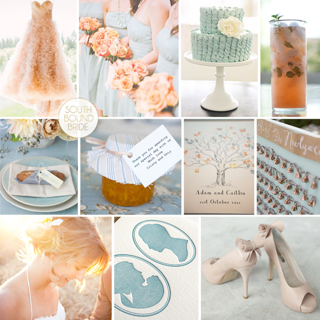
Happy Monday, friends – hope you had a lovely weekend! Are you all ready for Valentine’s Day? Last week we combined pretty peach with modern mint for an inspiration board that was probably my most shared in a while, and today we’re working with peach again, this time paired with a beautiful duck egg blue. As soon as reader Alana wrote to tell me about her colours I absolutely fell in love with them, and I’ve been really looking forward to this board. Alana is getting married in early spring/late winter at Kruger, so while this is a perfect warm weather palette I’ve included some more sophisticated touches for an indoor venue. Alana wanted a touch of vintage, so I included letterpress silhouettes and pretty bow-decked shoes. Peach bouquets (and a peach wedding dress!) look beautiful with the soft blue bridesmaid dresses, together with peach cocktails and an adorable blue cake. Greet guests with rolls wrapped up in blue napkins and fresh preserves, and serve cool peachy cocktails. Alana also asked for a few quirky touches – I loved the idea of bells for your guests (to be rung after the ceremony) and my all-time favourite quirky yet elegant touch is umbrellas suspended above the dance floor. It makes quite an impression, but is actually relatively easy to pull off. Hope you like your board Alana!

Colours: Duck egg blue & peach

Top row (l-r): peach wedding dress {Cluney Photo }; duck egg blue bridesmaids {Veil and Bow}; blue ruffle cake {Sweet & Saucy Shop}; peach cocktail {Cookie + Kate}
Row 2: Bread roll place card {Martha Stewart}; marmalade favour {Tink Photography}; thumb print guest tree {Verity Stubbs/Ginger and Mint Photography/Christina Prochazka/Chrisp Pictures}; bell favours {Beaux Arts Photographie}
Row 3: Bride & groom {Melanie Wessels}; silhouette letterpress {Farrell and Chase}; peach shoes {Insight Creative/Carbine Avenue}

Inspiration Board: Mint & Peach

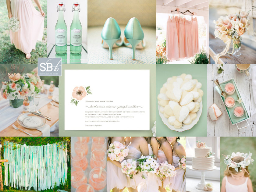
It’s inspiration board day, and I have a little feeling you guys are going to looooove this one. First off, mint and peach are pretty much a combination made in colour palette heaven, and they just happen to be what I think will turn out to be the colours of the year. Peach brings warmth (but gentle, like) and mint brings cool with a hint of sweetness, like a sip of ice-cold lemonade on a sunny day. Reader Tam wrote in to tell me about her wedding using these colours, and she used words like ‘relaxed’, ‘romantic’, ‘elegant’ and ‘less is more’. With beautifully rustic Rockhaven as her summer venue, I immediately pictured a wedding that was soft and flowey (for want of a better word!) – very much Beth Helmsetter/Style Me Pretty/Jose Villa. Flowers are important, and I adore both the bouquet and the table arrangement on this board (notice how apart from the lemonade, the flowers do most of the work on this table – gorgeous cutlery, crockery and other details become a bonus rather than the main event). Bridesmaids wear long, loose dresses in peach, with a garland for the flower girls (who I’d put in simple white cotton dresses and leave barefoot). Guests are served cool cocktails and iced biscuits, before having their photos taken in front of a pretty mint ribbon backdrop in the gardens during cocktail hour. For the stationery, I’d definitely make use of the current trend for hand-painted watercolour – less is definitely more in this stunning suite. The concepts are simple, the execution is perfect, and it all adds up to a shedload of pretty. Hope you like your board, Tam!

Colours: Mint, peach and white

Top row (l-r): Barefoot bridesmaid {Clary Photo}; mint lemonade {Bryllupsglimt}; mint shoes {Lane Dittoe}; peach bridesmaids’ dresses {Leo Patrone Photography}; peach bouquet {Jill La Fleur/Flower Wild}
Row 2: Table setting {Jessica Lorren Organic Photography}; peach watercolour invitation {Minted}; sugar cookies {Paige + Blake Green}; rose biscuits & rose yoghurt {Food & Cook}
Row 3: Mint ribbon backdrop {J.R. Clubb/Ryan Farr}; peach cocktail {onelove photography/Stephanie Grace Designs}; bridesmaids {Joy Thigpen/Jose Villa}; cake {KT Merry/Nine Cakes}; flower girl {KT Merry Photography}.


Inspiration Board: Meet Me in Buenos Aires

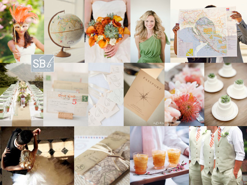
Good morning, lovelies! I hope you had a fantastic weekend. I’m back from Abu Dhabi, feeling chilled out and even a little tanned, and ready for the week ahead. I’m still catching up from my jetsetting, and getting used to being four hours back again. But that aside, travel is just my best thing, and appropriately, today’s inspiration board is all about travel! Today we have another reader request, from German reader Esther. Now how’s this for an international tale of love – Esther and her Swiss fiance met in Buenos Aires (how ironic, when their home countries are so close together!) and they’ve decided to get married in Cape Town, which I obviously think is the best idea ever. Esther loves a bit of old fashioned elegance, and she wants to bring both Brazil and Africa into their design. She adores succulents (and succulent green) and would like to accent this with orange from pincushion proteas as a tribute to South Africa. Love this! I’d work with a neutral white backdrop, with bridesmaids in soft green and bold bouquets (but otherwise keeping the orange fairly soft). I’d also incorporate the elegant vintage with a travel theme, including maps, a globe ‘guest book’ and postcard escort cards. There are some really lovely Argentine traditions Esther can include – first off, the cake pull (where ribbons are baked into the cake, one with a ring attached, and all the single women pull them out in order to find out who will be married next), cocktails (although I’ve borrowed the pictured peach caipirinhas from neighbouring Brazil), a tango first dance and carnival carioca (where, late at night, guests don hats and props and have their own little carnival on the dancefloor – a perfect double use for your photobooth props!). It adds up to a sophisticated personal tribute to the couple’s history, rather than a theme party. Hope you like your board, Esther, and welcome to our beautiful country!

Colours: White, soft green, orange

Top row (l-r): Bride with carnival mask {Marisa Holmes/Wedding Italy}; globe {Rebecca Arthurs Photography}; pincushion and succulent bouquet {Q Weddings/Statue of Design}; green bridesmaid dress {Elizabeth Messina}; couple with map {Courtney Brooke}
Row 2: Table setting {Allyson Magda Photography/Glow Event Design}; postcard escort cards {KT Merry}; cake pulls {Nancy Ray/Kickstand Events/Weddings Etc. }; vintage passport invitation {Azzura Photography}; pincushion proteas {KT Merry/David Fittin/Parrish Designs}; individual cakes with succulents {Christa Elyce Photography/Ellanesque Weddings/Sugary + Chic Boutique}
Row 3: Tango {source unknown}; stationery with map; peach caipirinha {Simon Bevan}; groomsmen with orange ties {Esther Louise Photography}.


Inspiration Board: Emerald Aisle

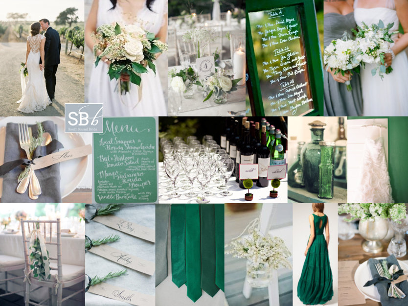
Happy Monday lovelies! As you read this, I’ll be arriving in sunny Abu Dhabi – how exciting! It’s been ages since I travelled anywhere (or saw the sun!) and I can’t wait. So forgive me if I’m not on email/Facebook much this week – although the blog will continue as usual, starting with this lovely inspiration board for a lovely reader who has chosen emerald and grey as her wedding colours. I’m so excited to see you guys embracing the colour of the year! I’ve been seeing everything from emerald and aqua to emerald and gold all over the place this fortnight, but not so many grey pairings. Since I didn’t know anything else about the wedding design, I thought it would be good to show how you don’t always need to use blocks of what is in fact a very strong colour in order to use it. For this palette, you’ll find emerald in some of the stationery, in the frame of a window used for table names, and in the groomsmen’s ties, but all the rest of the emerald comes from more organic sources like glass and foliage. A touch of rosemary on a pretty grey napkin, a bit of greenery at the back of a chair, a beautiful bouquet. Everything else is white and grey, and I think it looks so elegant, don’t you? If you’d like to make a statement, I love the idea of the bride putting on a second, emerald dress later at the reception, but actually I think this is quite a simple look to get right. Although my love for calligraphy is clearly going strong! Hope you like it friends! Will any of you be using 2013’s colour of the year in your palette? (If you’d like more emerald ideas, click here.)

Colours: Emerald & grey

Top row (l-r): Bride and groom {Jose Villa}; bouquet {}; table setting {Isabelle Selby Photography/Exquisite Affairs Productions}; table names on window frame; bride and bridesmaid {Ali Harper Photography/Consultants Unlimited}
Row 2: Place setting with rosemary {Lyndsey Hamilton/Elisabeth Millay}; calligraphy menu; drinks table {Robert and Kathleen Photographers}; green bottles; wedding dress {Kurt Boomer}
Row 3: Chair decoration {Isabelle Selby Photography/Exquisite Affairs Productions}; rosemary name tags {Lyndsey Hamilton/Elisabeth Millay}; green ties {source unknown}; chair with decoration {Samm Blake}; emerald evening gown; place setting {Lyndsey Hamilton/Elisabeth Millay}.


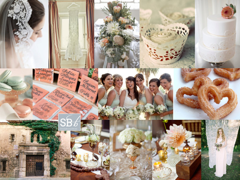
Inspiration Board: Spain Meets South

Hello lovelies, I have an extra inspiration board for you today. This one is a request from reader Simone, who’s originally from SA but now lives in Melbourne with her Spanish fiance. So international! The wedding will take place in a beautiful town in central Spain, set on a hilltop with winding streets and castle ruins. What an impossibly romantic location! Being proudly South African, Simone wants to include South African elements, including King Proteas and aloes. Because the venue hadn’t been finalised when she wrote to me, Simone wasn’t sure of much of the design, but she’d picked coral and mint as her colours. I think this is a great choice – not just because they’re on trend, but the soft pink and warm pink will work well in a variety of settings (and, of course, with the proteas). I’d combine them with copper or brass vessels for a lovely Spanish colonial feel on the tables. Another Spanish touch I would make a lot of is lace – this makes a great motif, and doesn’t need to look Victorian vintage. For example, use just a touch in soft mint bridesmaid dresses, in the form of doily cupcake cases and even as a photobooth backdrop! My favourite lace detail is the cake – especially with that protea on top! It’s the perfect Spanish/South African combination. I also thought the tiles as table numbers were a charming touch. Simone is considering serving macaroons (great for the colour) but I love the idea of a late night serving of hot chocolate with churros and koeksusters. In fact, menu is a wonderful way to pay tribute to your home country, just as Princess Charlene did for her Monaco wedding. Another idea from that wedding is to include South African music in your service. Hope you like your board Simone – can’t wait to see your wedding!

Colours: Coral and mint

Top row (l-r): Mantilla; lace dress {Jimena Roquero}; protea centrepiece {Jennifer Sando/White Room Events}; doily cupcake case; cake with protea topper and lace detailing {Jennifer Sando/White Room Events}
Row 2: Macaroons; tile escort cards {KT Merry}; mint lace bridesmaid dresses {Melissa McClure Photography}; churro hearts
Row 3: Spanish doorway; table decor (3 images) {Joielala/Canvas & Canopy Events}; lace photobooth/ceremony backdrop {NGG Studios/Imbue Weddings}.