Afternoon, friends! Since January, we’ve been looking at all the key trends for bridesmaid dresses in 2013 – who knew there could be so many? We’ve looked at prints (floral, stripes), styles (Gatsby, skirts) and textures (lace, sequins). Now we’re turning to colours themselves – after all, this is the classic look that many brides will always choose. Next week we’ll look at neutrals (in themselves a trend) but today we’re turning attention to five key colours that have been making a big impression in wedding parties across the world: emerald (Pantone’s colour of the year), mint, coral, peach and navy. For each, I’ve highlighted a few shop finds – somee a steal and others a bit more of a splurge. I love them all!Read More
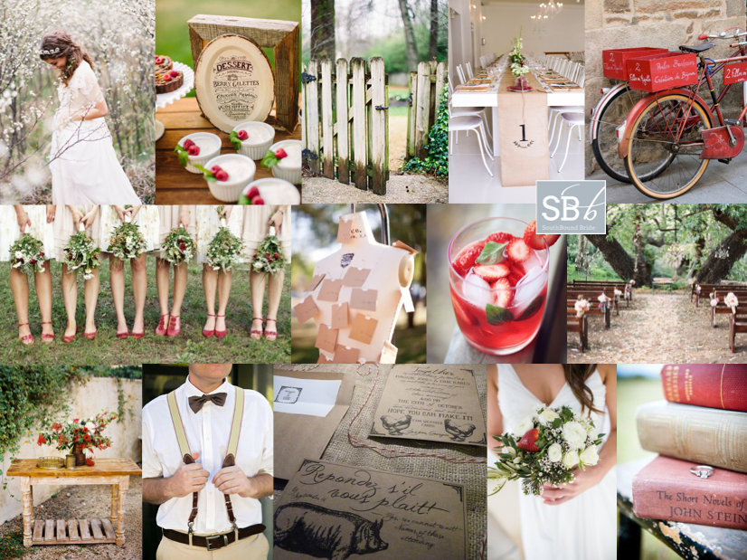
Happy Monday, folks – here’s to a super-productive week! Today we have a pretty, rustic red and white board, that would be just perfect for an autumn wedding. There’s a little touch of French bistro, and textures of wood, kraft, burlap and berry. So pretty! Red and white is a combo that I often see in real weddings, but it’s often used either in a more modern way or as a stark accent against a classic white wedding. But here it’s a gorgeous alternative to the pretty pastels or muted neutrals that you usually see for a rustic wedding. Lovely, isn’t it? Don’t be afraid to play with your ideas on colour a bit when planning your wedding – just because you have chosen a specific style doesn’t mean that you have to use the same palette as many others before you. Often just this little twist can make a look really fresh and interesting. My favourite touches here are the mannequin escort cards, the tin dessert menu, the gorgeous burlap runner with table number and the bridesmaids’ mismatched shoes. Which do you like best?
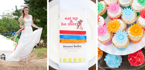
Something fun for you, this Friday afternoon! One of everyone’s favourite weddings so far this year, Leigh and Andrew’s colourful handmade celebration in KZN had so many brilliant DIYs and a real playful feel that not only included younger guests in the fun but delighted the older ones too, I’ll bet! The fortune tellers/quack quacks/cootie catchers were one of my favourites, especially because the couple got friends involved beforehand with folding the favours and with writing fun actions and dares on the inside. Bride Leigh said that it made for a great surprise for her, as well as the guests! There are lots of tutorials and templates for these available online, and in fact you can download Leigh & Andrew’s exact template here. For something different, I’ve created a variation with the fun ‘eat, drink & be married’ slogan. Print it out on plain, coloured or brown paper, and you can also spice it up with some pretty washi tape detailing to match your theme. Download the template here.Read More
So I’ve been doing this blog thing for over three years now, and although some posts and ideas disappear into the archives, some keep getting hits again and again. But lately, instead of just feeling pleased (thanks for the love!) I’ve been feeling a tiny bit embarrassed. I started wondering if the posts had got a little outdated. I’m happy to say that having read them again, I still think they’d be useful, but it also got me thinking about all the new ideas that have popped up in that time (and still do so). These trends would have died out by now if that hadn’t happened. And while I am the last person to tell you not to use something you love (if it resonates with you, I don’t care how many times you’ve seen it on Pinterest, do it), I thought it was about time I revisited the SBB archive and brought you some updated inspiration. So here I am! Wedding trends 2.0.
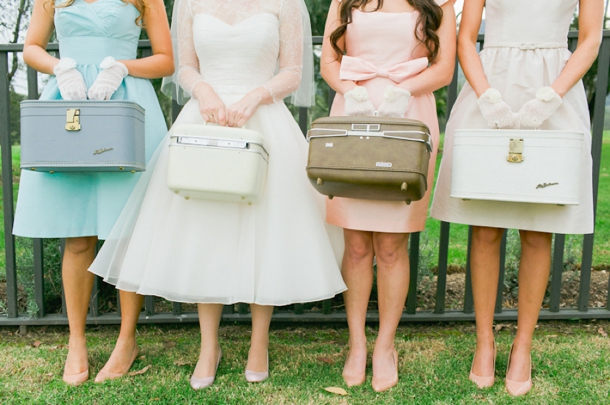
Today we’re looking at travel themed weddings – I find it quite funny that I called it a ‘mini-trend’ in my original post (still one of our Top 20 most read articles!) when clearly it’s a theme that has run and run – just recently a planner told me it’s by far her most requested theme. Some of that has to do with the vintage decor movement, but with so many couples either meeting abroad, coming from different places, or just enjoying travelling together, I can see why it’s so popular. And just like everyone’s journeys are personal experiences, you can make your travel themed wedding personal too. In the original post, I covered all the basic motifs: maps, luggage, airmail, postcards, etc. and there’s still lots there for you to start with, but here I’m going to be looking at recent ideas or looks or fresh twists that made me stop and take notice. Like those bridesmaids with vintage vanity cases above – love that! Although to be fair, they didn’t actually carry them down the aisle – maybe a bit much, I don’t know.Read More
Morning, lovelies! How was your weekend? I am still playing catchup with admin – sometimes it seems never-ending, doesn’t it? But I’m here with an inspiration board to literally brighten your morning. Okes, this might be one of my favourite colour combos ever. When neon brights started making their way into weddings, I was first a little horrified, then intrigued. I decided I liked them, but in a sort of graphic, modern way. But I’ve also been quietly intrigued as to how you could use them in a pretty, soft way as well, one that would suit more brides. And this is pretty much it. A palette of soft grey, coral and then a pop of lumo yellow. Sounds insane, but the brights really bring out the other colours and I just adore the end result! What do you think?
We’re heading towards the end of our series on the top bridesmaid looks for 2013, and I must say, I have loved pulling them together! I honestly don’t know how you all are choosing which one to go with, because I love them all. And today’s is no exception – as you may have figured out by now, I’m a huge fan of ombre, the French term for graduated colour – see more of this wedding look here. It also happens to work perfectly with the watercolour trend that’s making everything so pretty right now. There are lots of ways to bring ombre into your wedding, but one of my favourites is through bridesmaid dresses – it’s the perfect evolution of the mismatched look. But what IS the difference between ombre and mismatched bridesmaids? Well, the key is really in the colours, of course. With mismatched, you could pick a colour (green, for example) and let your girls buy whatever dresses they liked, as long as they’re blue. With ombre, you’ll need to be a bit more OCD about it, picking an exact shade along the same colour spectrum for each bridesmaid, starting at an intense colour and ending at a light one, spaced out according to the number of BMs you have. Sound complicated? Well, it can be – one way to make it a bit easier is to have dresses made (the same or in different styles) so you have a bit more control. Take paint samples with you when you go shopping for material or dresses – each will usually show you an ombre colour family, so they’re the perfect reference. But even if you go high street, it’s not as difficult as you might imagine, and to show you, I’ve put together three ombre looks from current high street finds. My favourite is the peach ombre look – it just works so perfectly!
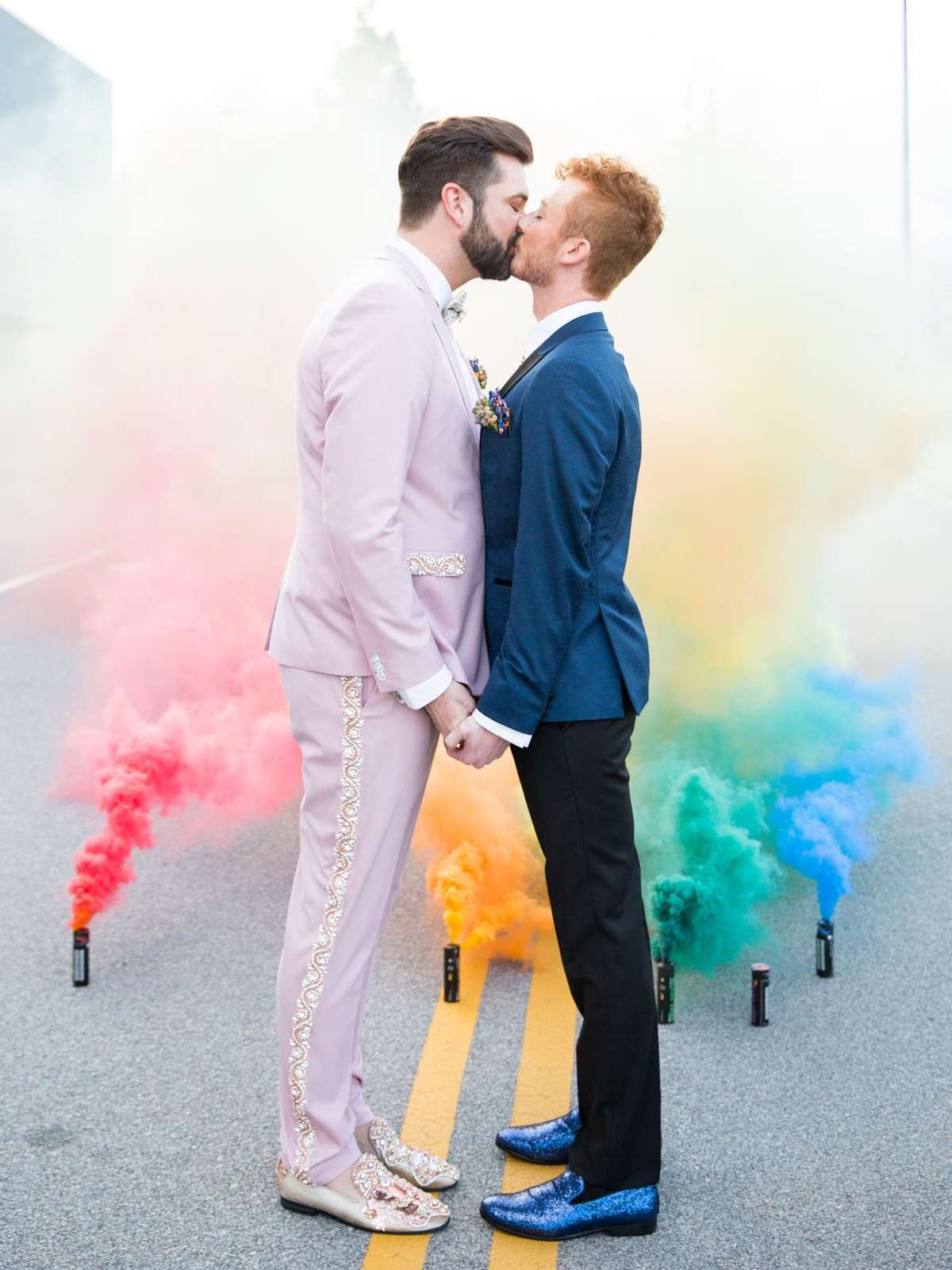
*UPDATED FOR 2021* So it’s come time to choose your wedding colours and you just can’t narrow it down. You want a big, bright, bold celebration that’s a riot of alllll the colours. Or maybe you’re a same sex couple and you want to infuse rainbow elements into your gay or lesbian wedding as a nod to the pride flag and that #lovealwayswins. Whatever the reason to choose a rainbow wedding, it’s a joyful choice. It really allows you to play with colour and produce something fun and relaxed. And there are so many ways to make rainbow wedding details work, whether you go all-out on a rainbow-themed wedding or just include one or two rainbow wedding ideas. For example, rainbow bridesmaids are a fun look that also allows you to dress your girls according to their style and colouring instead of having a one-shade-fits-all approach. Or you could have your girls in neutrals carrying a rainbow of bouquets or each wearing a different colour of shoes, etc. Get creative! When it comes to the tables, it’s also a good idea to keep the base relatively neutral so that the colours in the flowers really pop. You could have deconstructed arrangements in mismatched containers (stick to one colour per container – this works well in groupings of different heights or along a long table) or have your florist create an ombre runner. Colourful glassware or crockery are other ways to make a rainbow wedding table work. And let’s not forget the rainbow cake! If this is a look you love, read on for more rainbow wedding ideas and products to inspire.
*Links in bold denote affiliate links. The cost to you remains the same, but SBB may receive a commission for any sales made.
Hello lovelies – how has your Tuesday been going so far? Mine didn’t get off to an ideal start, but never mind that, because we have such a lovely styled shoot to brighten things up this afternoon. And I’m particularly excited about this one, in that it was created especially for us by an awesome team from the Nuptial Network, using some of the beautiful stationery from the SBB Collection at Invitation Gallery. I’ve loved seeing rainbow brights make their way into weddings in the last couple of years, and while this isn’t strictly a rainbow-themed affair, it’s colourful and rustic and a look that is really easy to recreate. I love it for a summer farm wedding, for example. The basic details are budget friendly – glass jars with different coloured flowers, fruit used for its natural hues (I really love how natural colour makes a table pop) and, of course, the stationery. This particular suite (Will We Have Rainbows by Mister and Missis) is one of my faves – it has such a fun, playful carnival vibe, and it also works perfectly with the neon trend that is going on at the moment (without looking like someone threw up 1992). I hope you’ll all be as inspired as I am by it – come back this evening and I’ll have a bit of a style guide for you if you want to recreate this yourself. But for now, let’s get colourful! Huge thanks to photographer Abigail K., co-ordinator Mosaic Wedding Company and the rest of the Nuptial Network team (full credits at the end).Read More
Hello lovelies, now for inspiration board number 2 today. This one’s a reader request – always fun to do, as you guys come up with such a unique set of ideas that reflect your personalities and relationships. This particular board was requested by Shimoné, who together with her husband-to-be really loves the sea. Even though they’re planning an elegant garden wedding, they wanted to bring this love into their wedding, so they chose a gorgeous ocean-inspired palette of powder blue, teal, gold and white. I also took this as a starting point for some of the design details, adding a gentle watercolour/ombre element to reflect the salt water, and with sea urchins as a sweet little motif. These are sold on Etsy with little succulents inside, which makes a very cute place setting/favour and is one you could make yourself. I also like the idea of spray painting these shells gold to sit at each place setting, with or without a plant inside. The rest of the scheme is simple and classic – white flowers, especially on the huppah (the wedding will have lots of traditional Jewish elements, and this is one of my favourites), soft flowy bridesmaid dresses with statement necklaces, vintage furniture in breakout areas and gold-flecked macaroons. Simple, classic, but very lovely. Hope you like your board Shimoné!
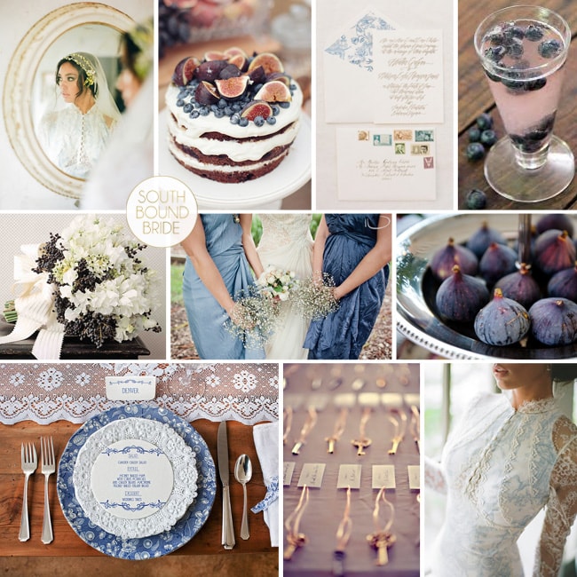
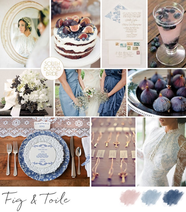
Hello lovelies, it’s time for our first inspiration board of the day. The last time I did a toile board was waaay back at the start of SBB, which I ended up turning into a gorgeous inspiration shoot (more on this soon). But now, with prints being all the rage in weddingland, toile has really come of age. And why not – it’s romantic, it’s vintage and it’s just the perfect shade of blue to set off warm pinks or peaches or corals. Too much can be… well, too much, so less is definitely more, but I couldn’t help including the gorgeously romantic toile detail dress from Claire Pettibone’s current collection. I’ve paired the toile here with fig – that rich dusky pink, and just a touch of brass. For a uniquely South African twist, I love Fabric du Sud from Carol Mills, which is all about toiles with a homegrown theme. Loving this! What do you think?
Colours: Dusky pink and blue, navy, brass and white