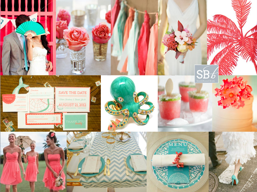
Inspiration Board: Tropical Coral & Mint

Hidey ho, neighbours. How was your weekend? Mine has been absolutely chokka with work, and a separate project I have on this November which has really been taking me back in time a bit to a year I spent teaching English in Milan… really wishing I could just jump on a plane and spend some time in my second favourite country again! Anyway, we’re transporting ourselves somewhere else completely today, to tropical Colombia, where lucky reader Clara will be getting married at a restaurant venue. She’s chosen mint/aqua, coral, gold, ivory and white, and I have to say, I don’t think she could have picked a more perfect palette. It’s just the right mix of tropical, modern and romantic. My first find was the stationery set below, which I am completely in love with, and which I think completely gets across the location and the colour scheme. I also love the idea of adding in some fun tropical touches, like coral bands on the napkins and this cute enamel statement octopus ring – maybe a fun accessory for the bridesmaids, in their coral sundresses. Clara also likes shabby chic and lace, and while it’s not always easy to mix this with tropical, I’d do it using pretty tea glasses with coral roses, a fringe garland (why not include lace in this?) and a ruffly dress. The flowers are also a lovely mix between classic and tropical, and I love the bold use of a flash of gold. For the tables, I’d keep things simple – maybe using a nice print (chevron or stripes always work well) in the mint or aqua shade, with gold cutlery and glassware (or just keeping to simple white tables with beautiful stationery accents at each setting for a more sober look). Clara also asked about using flowers for the church and the restaurant and I think she has a few options, depending on the size of the party. If it’s intimate, I’d use smaller arrangements in the church placed at different heights, and then re-use these along the table (even bridesmaids’ bouquets can be placed in vases and double up as reception flowers). Or, if you’re going for big statement pieces in the church, place these standing or on stands around the reception and keep table flowers more simple. Finally, you could keep things very simple in the church – maybe forsaking flowers completely and using lots of candles, for example, and save the flowers for the reception. There are no hard and fast rules – do whatever your budget and wedding size allow. Hope you like your board, Clara, and good luck with the rest of your planning!

Colours: Mint, coral, gold, ivory, white

Top row (l-r): Bride and groom {efeunodos/William Banea}; roses in tea glasses; fringe garland; tropical bouquet {José Villa}; palm print {Stella McCartney}
Row 2: Coral and mint beach wedding invitation suite {Boudreaux by Wednesday Custom Designs}; enamel octopus ring; watermelon margarita pops; cake {}
Row 3: Coral bridesmaids dresses; aqua chevron print table decor {Kate Headley}; coral napkin holder {Wedding Concepts/Annemari Ruthven}; aqua shoes {Karen Hill/Loli Events}

 

Inspiration Board: Cleopatra’s Gold

Good morning, lovelies – did you have a fantastic weekend? Get up to any Halloween antics? Today’s board is one of my own inventions – sort of a mix between my recent Moroccan influences and a decadent art deco interpretation of Egyptian style. The colours – black, white and gold – are classic for an evening celebration of course, and paired with pretty luxe details like these beautiful bridesmaid dresses, gold-detailed glasses and those sandals, would make for a really lovely wedding. The bride’s makeup would be dramatic, and she’d wear a stunning mantilla – maybe with a flash of sequins on her dress and a henna tattoo. With so much going on with the table settings (love these print tablecloths, by the way, even if Kim Kardashian did use them), I’d keep the rest of the decor relatively simple – isn’t this tent-like draping a simple and lovely way to do things? The stationery would be a designer’s dream, and I’d combine several rich patterns in the three main colours. I would LOVE to see someone pull this off!

Colours: Gold, black & white

Top row (l-r): Bride in chair {P: Jose Villa}; bridesmaids {P: My Big Day Photos}; rings {P: Michelle Turner Photography; P: Leah Michelle}; glasses {P: Katie Neal Photo; D: Alchemy Fine Events and Invitations}; art deco mural
Row 2: Invitations; makeup {P: My Big Day Photos}; gold sandals {Elie Tahari}; gold beanbag; mantilla veil {P: Picotte Weddings; D: Wedding Nouveau}
Row 3: Table setting in gold, black and white {P: Katie Neal Photo; D: Alchemy Fine Events and Invitations}; henna tattoo {P: Picotte Weddings; D: Wedding Nouveau}; sequins {P: My Big Day Photos}; draped reception {P: Frenzel Photographers; C: Jesi Haack Weddings}.


Inspiration Board: Coral & Glam

Tangerine may have been Pantone’s 2013 colour of the year, but if there’s a breakout shade for weddings this season, it’s coral. And boy, am I ever glad! Coral is such a warm shade, and so versatile – I can’t believe how many colours it works with beautifully! It’s also lovely reader Carrie’s favourite colour, so of course she’s chosen it for her summer wedding. And Carrie must be a girl after my own heart, because she also loves a bit of sparkle, and wants to put her bridesmaids in mismatched glittery dresses – how pretty is that? There are some lovely coral or blush and sequin dresses available at the moment, but for this board I’ve gone for one of my absolute favourite bridesmaid combos of recent times – these copper skirt and top sequin and lace mismatches are just amazing and they look so good with the coral and white bouquets! Add in beautiful copper heart Vivienne Westwood shoes, and some good as gold accents and you have the perfect amount of metallic. A good tip with coral is to use it in a sort of ombre way, with everything from a pale blush to the most powerful orange version of the colour, just the way that it is in this adorable stationery suite. Add a few special touches – homemade lemonade, a ruffly chair back, sparkly mason jars, and you have everything you need for coral and glam wedding wonderful. Hope you like your board, Carrie!

Colours: Coral, blush, white, copper & gold

Top row (l-r): Bridesmaids {P: Jarvie Digital Photography}; table layout {S: Envision Wedding Studio; P: AC Ellis Inc.}; pink lemonade {P: White Loft Studio}; blush ruffle chair back {S: Envision Wedding Studio; P: AC Ellis Inc.}
Row 2: Coral & gold stationery suite {P: Jean-Pierre Gary and Kiera Ormut-Fleishman}; coral macaroons; Vivienne Westwood shoes; fireplace ceremony {P: Justin Demutiis Photography; S: Olivier Events}
Row 3: Sparkle mason jars; lace sheath dress with keyhole back {P: Paul Johnson}; cake {Elizabeth Messina}; single bloom centrepiece {Martha Stewart}.


Real Wedding at The View Boutique Hotel {Manilla & Mark}

Hello, lovelies. We had some minor technical gremlins today, but I have fought them off just for you and can’t wait to share this incredible Johannesburg wedding which I know will get your evening wedsite browsing off to an amazing start! It begins with a film-worthy romantic meeting, through a phenomenal, original, beautiful dress and a gaggle of elegant green-clad bridesmaids and dashing groomsmen, on to a sweet ceremony and a bright and breezy carnival-tastic reception, and ends on a packed dance floor. (As all the best weddings do.) And you guys, these photos by Rensche Mari will have you gasping. Seriously. This is the kind of wedding that makes me love what I do, so without further ado…Read More

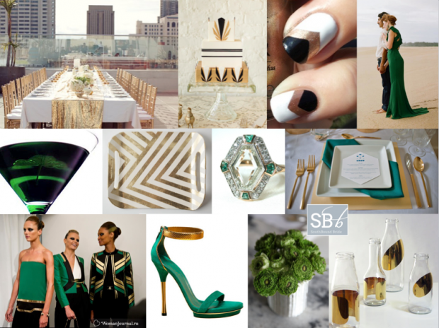
Inspiration Board: Gucci Green

Good morning friends! I felt like doing something a bit different today – a stylish city wedding inspired by the latest catwalk trends. I adore the idea of a rooftop wedding (not enough couples trying this in SA to my mind – just think of the views from the Grand Daddy in Cape Town, for example, or the bar at the Hyde Park Hotel in Johannesburg, and check out two of my favourite Cape Town weddings with city views here and here). This time I’ve looked to Gucci’s Spring/Summer 2012 collection and created a bold palette of emerald green, gold and black (with a touch of geometrical art deco) that would really blow your guests away in the style stakes. It’s so striking. And OMG check out this bride wearing a green Gucci dress – one of the most elegant alternatives to the traditional white dress I have seen. Perfect for swanning around a terrace with your new husband, greeting your guests and drinking Emerald Isle cocktails, no?

Colours: Emerald green, black, gold


Top row (l-r): Rooftop table with gold sequin runner {S: Alchemy Fine Events & Invitations/P: Scott Lawrence}; Art Deco cake {D: Lael Cakes; P:Jen Huang Photography}; chevron manicure; green Gucci wedding dress {P: Q Weddings}
Row 2: Emerald Isle martini; gold chevron tray; emerald and diamond Art Deco ring; green and gold place setting {S: Sweet Emilia Jane; P: Captured by Aimee}
Row 3: Gucci spring/summer 2012; Gucci shoes; green flowers; gold bottles.


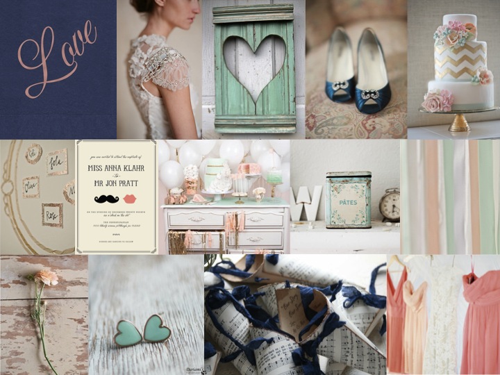
Inspiration Board: Mint to Be

Good morning, everyone! Did you all have lovely weekends? It’s Inspiration Board Monday here on SBB, and I have to say, this might be my new favourite colour combination. I stumbled across it somewhere, and I knew I had to turn it into an inspiration board. There’s something about the way that coral and mint (two of the trendiest colours in weddings right now) work together that I just love, and when you add in navy it just has a whole new depth to it. I would have thought that it might come out a little retro or mod, but (while you could certainly use these colours that way) the board I’ve come up with is all sweet, slightly French shabby chic, with a touch of glam gold and lovely lace. Put your husband-to-be and his groomsmen in navy suits, and carry lush coral bouquets with your girls – the key to this look is knowing which of the colours to combine when, so that it doesn’t look too matchy matchy. Done right, this could make the prettiest of weddings.

Colours: Mint, coral, navy and gold

Top row: Love napkin {The Stationery Studio}; Claire Pettibone dress; heart shutter; blue shoes {Shewanders Photography via Wedding Chicks}; chevron cake {Erica O’Brien Cake Design}
Row 2: Table plan {via 100 Layer Cake}; invitation {Minted}; dessert table {Tracey Kiansky Photography via The White Library}; antique tin {Dreamy Whites}; ribbons {Andi Mans Photography and Design via The Wedding Chicks}
Row 3: Ranunculus {via Wedding Chicks}; mint heart earrings {Dariami on etsy}; confetti cones {Pink Cherry Mama on etsy}; coral bridesmaid dresses {Jose Villa via The Wedding Chicks}.

And don’t forget that you can request your own inspiration board by clicking on the button below:

Real Wedding at Dieu Donné {Zoe & Grant}

Good morning! If you guys loved the autumn inspiration on the blog yesterday (and you did), you are going to die when you see what I have for you today. Zoe and Grant have been massively patient with me – I have been waiting to share this wedding at Dieu Donné for months, but I knew it was the one I wanted to kick off the new SouthBound Bride. It’s so unusual, with its autumn theme (a season South African brides are only just starting to discover, I think) and the details are so thoughtful, quirky and personal. Like pretty leaves instead of confetti, or the paper birds and cats hanging in the trees along the aisle. In fact, don’t get me started on that aisle – I LOVE IT. And I especially love how it became a feature with the addition of fairy lights in the evening. So clever. In fact, the whole thing’s clever and beautiful and atmospheric, and the amazing Jules Morgan has captured it perfectly through her lens. Zoe and Grant – thank you SO much, and I hope it was worth the wait!Read More

Inspiration Board: Once Upon a Time

Good morning, lovelies! Before we get to today’s inspiration board (which I have been saving rather impatiently for you), I have good news and bad news. Let’s start with the good. Last week, I was absolutely thrilled and honoured to be included in a list on the Fair Lady blog of FL’s favourite tweeters! Not only is it always super satisfying to know that people like what I do here, but you guys, I grew UP reading Fair Lady. When I was a little girl, I would read my mother’s old stack cover to cover and my secret teenage fantasy was to work there one day. So this was extra special supery dupery exciting. It rocked. Merci, FL. (And if YOU don’t follow me on Twitter yet, do!)

Now the bad news. Sigh. I regret (and I really do mean regret – remember I’m an editor by trade, so missing a deadline totally cuts me up, especially when it’s one I set myself) to tell you that the new Cap Classique website will not be launching at the beginning of December. Unfortunately, some technical issues that I have no control over have got right in the way, and while the delay is only about 10 days, with Christmas coming, it only makes sense to put it off until January. Which kind of blows, but when I thought about it, I decided it was kind of cool. New year, new site, new everything. I really am disappointed, and sorry to keep you all waiting. I hope you won’t mind waiting just a liiiiiittle bit longer. Although, now that I’ve had to rejig my whole schedule for December, I do have something quite cool up my sleeve, which you’ll hopefully like. So there you go. Please don’t hate me!

And now, before I get all depro about this again, I am going to cheer us all up with some sparkle. YAY! As you know, gorgeous colours mixed in with metallics have been huge news this year, and I think we’ll see lots more of that this season. Here’s my little take on a sort of royal wedding/princessy theme, which includes my current colour obsession (navy) combined with the prettiest powder blue, champagne and then some sparkly metallics. I can’t get enough of it! It’s almost enough to make a grown woman believe in fairytales… ;)

Colours: Navy, powder blue, champagne & gold

Top row (l-r): Princess bride; navy and gold manicure; table setting (Jill La Fleur/Jose Villa); navy bridesmaid’s dress (Kristin Vining); wedding cake with crown (Jose Villa)
Row 2: ‘Believe’ gold letters; blue and gold sequin garments; metal crown; mini Moets
Row 3:‘Once upon a time’ invitations; place setting with pumpkins (Martha Stewart); bride & groom (The Brand Studio); ‘Happily ever after starts here’ sign (Studio Eleven)

Inspiration Board: Berries & Stripes

I’m just going to go ahead and say it: I LOVE today’s inspiration board. It started with the image top left, and has grown into a board I want to put on my party best and climb inside of. Because how can you not love the marriage of city sophistication and wine farm charm? Classic elements like swirly calligraphy invitations, white roses, chandeliers and a gleaming getaway car mix perfectly with softer country touches – hypericum berries, a wedding signpost, dining under the vines. Serve guests a choice of champagne or this swish gold take on mason jar cocktails during pre-dinner drinks, and wow everyone with a beautiful, sophisticated cake (from local caketress Roxanne Floquet). I love the way that the grey pinstripes bring everything together, and the palette of grey, black, white and gold with little pops of berry red smacks of sophistication. Of course, a swish bride deserves a swish dress, and I’m totally obsessed with this one! Like I say: I love all of it. Hope you do too!

Colours: Grey, black, white, gold and red

Top row (l-r): Red hypericum boutonniere (Andy Duback); wedding car with gifts (Jose Villa); wine bottle table numbers (Missy Cochran); grey striped ribbon bouquet wraps (Cari Photography)
Row 2: Calligraphy letterpress invitations; gold shoes (Jose Villa); wedding signpost (So Happi Together/Gabriel Ryan); gold mason jar with stripey straw; champagne with berries
Row 3: Bride & groom (Yvette Roman); rose bouquet with red hypericum berries (Stephanie Hunter Photography); cake with ribbon and crown details (Roxanne Floquet); vineyard chandelier tables (Jose Villa).

Inspiration Board: Green & Gold

Good morning everyone! My apologies that last week I didn’t get to post everything I had planned – bear with me, as there’s an awful lot going on behind the scenes. For now, here’s this week’s inspiration board and it’s one of my personal favourites! Green and gold are very special colours to South Africans, as they’re our national sporting colours and also represent our beautiful land and its natural resources. So I can’t think of a more appropriate palette for a South African wedding, and don’t they just look beautiful together?! By adjusting the details slightly you could make this work for just about any season, and add more rustic or more sophisticated touches depending on your venue and taste. One of the details I love is the elegant use of green glasses and gold utensils to get the colour scheme across on the table without going overboard. In terms of flowers, you could really go with any white flowers but I ADORE the combination of ranunculus and baby’s breath in this bouquet, and baby’s breath makes a great filler for elsewhere around the church or venue, which can allow you to have a bigger floral presence than you may otherwise be able to afford. Green shoes are a must for the bride, and this is a perfect opportunity to dress your girls in trendy white bridesmaids’ dresses. In terms of DIY, moss monograms are simple and incredibly lovely, and I also love the gold spraypainted wishing tree for your guests to leave messages on. And you guys, how gorgeous is this cake? All in all, I think it makes for a beautiful wedding. Who knew you could be patriotic so prettily?

Colours: White, green and gold

Top row (l-r): Place setting (Rebecca Hansen Weddings); ranunculus bouquet; white bridesmaids’ dresses (Atlas and Campbell); wedding cake with gilt and lace details (Sweet and Saucy Shop)
Row 2: Wishing tree; moss monogram letters; green shoes (Leo Patrone); general decor with hanging mason jars (Jamie Grenough)
Row 3: Bride & groom (Tec Petaja); invitation suite (EvaPaul Design/Rebecca Hansen Weddings); mini toffee apples; baby’s breath with gold monogram letters (Hailey Erickson)