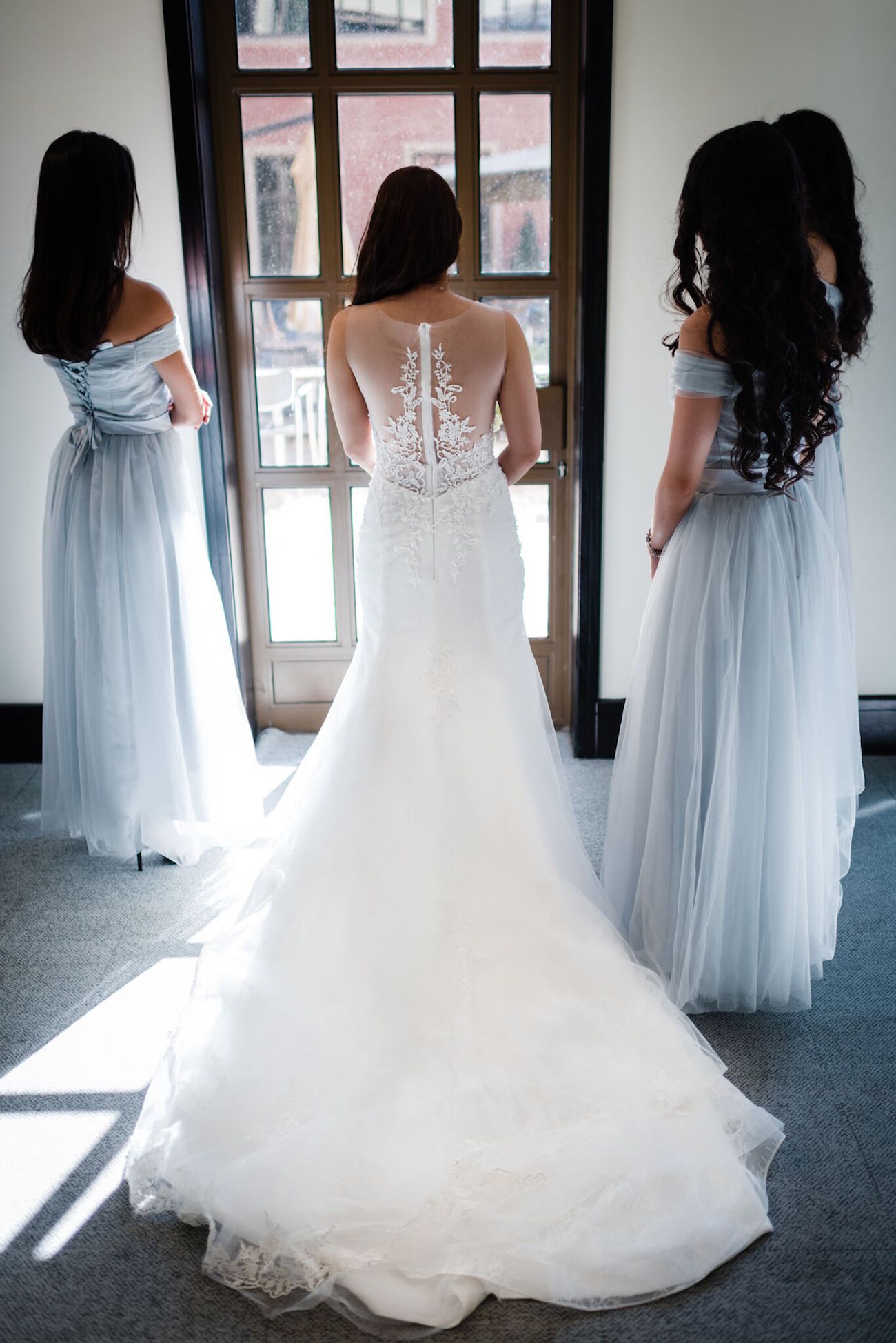
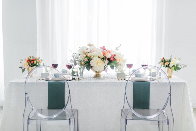
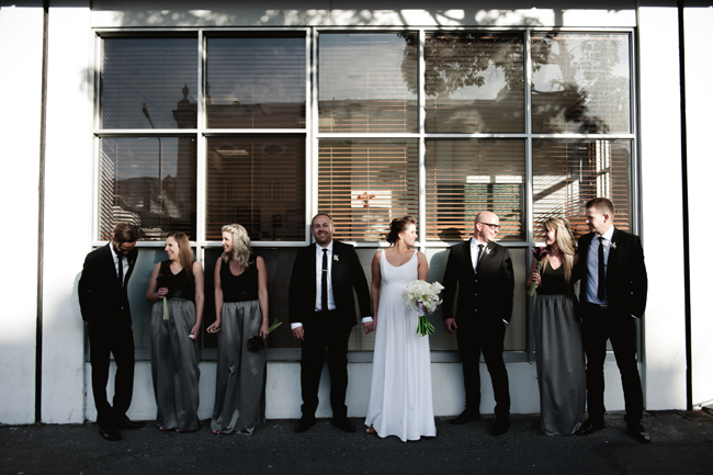
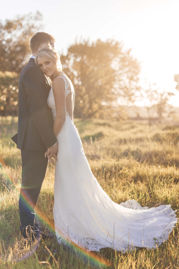
Today is very exciting, because not only do I get to share this chic wedding with you, but we’re also introducing four new venues to the SBB Collection, all members of the renowned Forum Company. Forum venues and elegant modern celebrations go together like James Bond and martinis, and today we’re showcasing Kate and David’s wedding at The Campus in Johannesburg, an incredible city space – all clean lines and clear glass and smooth marble. It goes perfectly with the white on white orchid design that this stylish couple chose for the ceremony portion of their big day, which also perfectly illustrated the traditional meets modern, east meets west style that they were trying to create. And after the formalities were over, they kicked off their heels (Louboutins, in Kate’s case!) and threw a party at one of their favourite Chinese restaurants – so fun! I can’t not mention Kate’s incredible Elie Saab gown – the back of which just leaves me breathless! Or her bridesmaids’ fluttery, silver-grey dresses – they all looked like a bunch of supermodels together. There to capture all that gorgeousness was Wynand van der Merwe.
Tag: modern
Romantic Modern Wedding Inspiration from Aisle Society
Happy Monday, lovelies! And it is indeed a happy Monday for me, because today I get to share something that’s really close to my heart and which, as I come up to the six year anniversary of founding SBB, has me feeling ever so proud and excited for the future! Over the last months, you’ve heard me mention Aisle Society, and you may remember that a couple of months ago I was lucky enough to go and hang out with my fellow Aisle Society bloggers in the Bahamas (more on that soon!), but you may have been wondering exactly what IS this new website? Is it just a new wedding blog? Well, the answer to that is no – Aisle Society is actually a curation of more than 30 of the world’s best wedding bloggers’ content, updated daily. Think of it as a hub – a place to go and find any kind of inspiration your wedding-loving heart desires, and then ultimately follow that link and see more of the things that inspire you. The AS bloggers come from all over, and we cover a huge range of different niches, from fashion-based inspiration to location or wedding style. And because the content’s already been featured on our own sites, you know it’s quality. Like the cream of Pinterest. Plus, you get to curate your own feed – not have it dictated to you by the kind of algorithms that everyone from Facebook to Instagram now employs. You can add certain bloggers or themes or colours or whatever you like to ‘your society’ and then, when you find a supplier that you love, not only find their information right there, but you can also make an enquiry. It’s awesome, and this afternoon I’m going to be giving you some practical step by step advice on how to plan your wedding using AS, but first, I wanted to share some gorgeous inspiration (because that’s what we’re here for, of course!). This is the Aisle Society brand shoot, created by two of the amazing founder members, Lauren of Every Last Detail and Ami of Elizabeth Anne Designs, and a brilliant, beautiful team of creatives and models. I’m also delighted to be featuring Alexis June Weddings, whose photography I have loved from afar since, like, ever, and who I got to hang out with in the Bahamas as well. SO – enough from me. Let’s get our swoon on, shall we?
Graphic Inner City Wedding at HQ Restaurant by Jules Morgan
It’s a happy day for me when I get the opportunity to share an city wedding for a change, although happily more brides and grooms these days are opting for a bit of urban chic. And why not – after all, if it’s reflective of your style, you can make it absolutely amazing, especially in a city as fabulous as Cape Town. With both of them being architects, perhaps it’s no wonder that Elbé and Ross decided to get married in amongst their favourite buildings and inner city vibe, and they chose a graphic, monochrome style with a touch of metallic and geometric detailing to make it really pop. I just love this look SO much – everything from the incorporation of textures like leather and cement to Elbé’s contemporary pared-down bridal style (complemented beautifully by jewellery from Kirsten Goss). From their church ceremony to their laid-back restaurant reception, all on Heritage Square, it was a collection of their favourite things shared with their favourite people. And speaking of favourites, one of our own, Jules Morgan, was on the scene to deliver these beautifully atmospheric images.
Tulips & Twinkle Lights Wedding at Val de Vie by Claire Thomson {Suzanne & Simon}
Okay, choosing my favourite flower would be like asking me to pick a favourite book or film. Too many I love. But tulips are definitely right up there. There’s just something about these blooms that’s so… elegant. Crisp, modern. Architectural, almost. But at the same time, they’re soft and romantic. Which basically describes today’s wedding to a tee – so it’s no wonder that tulips played a big role in Suzanne and Simon’s wedding design. I absolutely ADORE their clean, sophisticated wedding style in white and soft neutrals, with twinkle lights and naked bulbs for warmth, and a few raw, rustic elements for charm. I especially love the bower created for their main table, and OMG Suzanne’s dress is amazing! You all are going to looooove this one! Talented photographer Claire Thomson took these gorgeous images.Read More
Vineyard Chic Hidden Valley Wedding by Lauren Kriedemann {Georgie & Brad}
When people ask me how I choose weddings for the blog, I often talk about the ‘ooh factor’ – those little inspiring details that make me go ‘ooh’ (yep, I make the noise and everything). But when I saw today’s gorgeous bride in her Johanna Johnson dress, it was more like a WOW than an ‘ooh’. And everything just got more gorgeous from there – crisp modern whites on the tables, stylish chalkboard details, and an unexpected (but oh so lovely) pop of red on the elegant bridesmaids. I just love everything about Georgie & Brad’s big day, especially that in amongst all of that style, the priority was on a day that was relaxed, happy and romantic, and the talented Lauren Kriedemann was there to capture every bit of it, as only she can!Read More
Real Wedding at Hidden Valley {Chris & Richard}
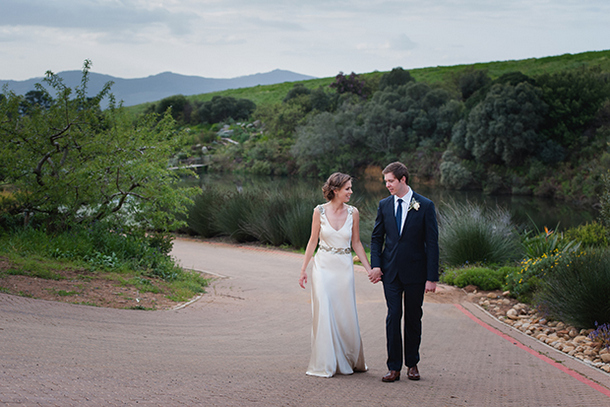
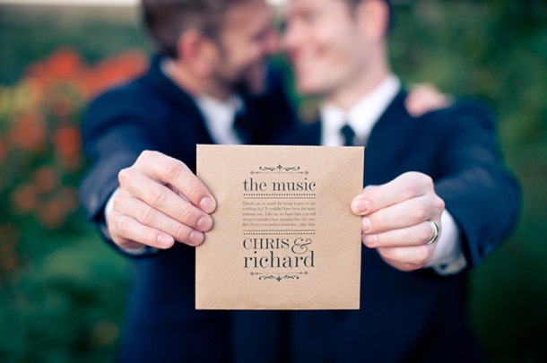
I’m blogging this wedding with such a huge smile on my face. It’s not just because of the modern, innovative styling I’m about to show you, or the fact that it works perfectly in a classic Cape winelands setting (how I hope this inspires other couples!). It’s not even because so much of the wedding was DIY, or because the grooms planned it faultlessly from abroad according to their vision, or because the venue was a surprise (!) or because it had clever personal details that reflected their mixed Australian and South African heritages. It’s because every time I look at the smiles of these two boys, and the smiles of everyone at their wedding, it makes me happy. So much love. And when love comes in a gorgeous package… well, that’s just fabulous. Wesley Vorster was there to capture every chic masculine detail, from the large exposed lightbulbs (obsessed) to the fab typographic stationery on kraft paper, to the abundant proteas in vintage glass bottles, to the sleek suits worthy of the best Italian tailor. I’ve been dying to share this one with you, and I hope you love every bit of it as much as I do!Read More
Modern Pastels Styled Shoot
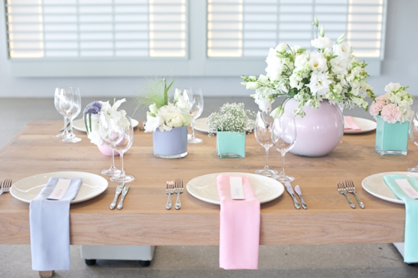
I have such lovely inspiration to share with you all this afternoon! When photographer Veronique Mills got in touch to share this lovely styled shoot she put together with Just Jack at Landtscap, I jumped at the chance to share their take on modern pastels (set beautifully against the clean blank canvas that is Landtscap). I loved the candy colours (how cute are those milkshakes?) and the opaque painted vases, and I especially loved that Veronique explained the table had been DIYed for less than R500 – you can see a full breakdown of her costs at the end. That’s the great thing about a good styled shoot – you can take one or two elements are really make them your own, like DIY vases, or using napkins for pops of colour, or even the pretty pastel nails the models are sporting! And the cherry on top? That CAKE. I think it might be my favourite Nelle Cakes creation yet!Read More
Inspiration Board: Mellow Yellow
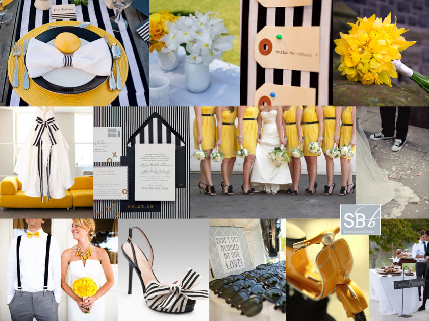
Sometimes I get the COOLEST requests for inspiration boards, and I have been looking forward to this one for a while. Reader Leigh-Anne mailed to tell me about her trendy urban meets country chic summer wedding, with bold black and white stripes and punches of yellow. The relaxed but elegant celebration will feature a number of fun touches to reflect their hip personalities, including black Converses, a braai menu, orchids, peonies and a Vespa! Wow. The board kind of created itself! First stop was a great table setting (check out this wedding for more) – I love the striped table runners and the yellow chargers, and bringing in an organic yellow (lemons) is a fun nod to the country chic aspect. I love the soft flowers, especially this yellow orchid bouquet, and the white painted mason jars are the coolest. Stripes of course are a big motif – as well as the table runners and invitations (how stylish are those envelope liners?), I have fallen in LOVE with these striped Bruno Frisonis, but alternatively you could pair a yellow shoe with a striped sash (I know Leigh-Anne is planning some Louboutins). Bridesmaids could also do stripes, but I love these black belted yellow numbers (especially if paired with soft white bouquets) and stylish heels. I love the idea of the groom in a yellow bowtie and suspenders (reflecting the stripes) – and they go perfectly with the Converse look. I love the sound of a braai menu, and it made me think of what photographer Christine Meintjes told me about her sister’s wedding, where they had a braai station with all sorts of mini braai treats during cocktail hour. So cute. Finally, for equally stylish guests (and fun photos), give cheap shades as a favour, and then ride off into the sunset on a yellow Vespa. Just one last tip for Leigh-Anne, not pictured here, is to grab some black and white striped washi tape – there will be a zillion fun last-minute uses for it. Good luck with the rest of your planning Leigh-Anne, can’t wait to see your wedding!
Colours: Black, white and yellow
Top row (l-r): Place setting {Stephanie Saul Photography/Jessica Frey Photography/House of Flowers}; flowers in white mason jars; escort cards {Erin Hearts Court/La Partie Events}; yellow orchid bouquet
Row 2: Dress with striped sash {Erin Hearts Court/La Partie Events}; striped envelope liner invitation {Cheree Berry Paper/Edyta Szyszlo}; yellow bridesmaids dresses {Krissy Allori Photography + Courtney Jade Photography/Double Take Event Styling}; groom in Converse {Marianne Taylor}
Row 3: Bride and groom {Aaron Shintaku/JL Designs}; shoes {Bruno Frisoni}; sunglasses favour {Marianne Wilson Photography}; yellow Vespa {Carla Mendes}; braai station {Catherine Mac}.
Inspiration Board: And It Was All Yellow
Monday, Monday, can’t trust that day… But you can trust that I’ll be brightening up your Monday with a brand new inspiration board on the blog! And this time it’s even brighter than usual, with a yellow-themed board created just for reader Bronwyn. She’s having a summer wedding in Johannesburg, and wants a modern theme for her big day. She’s looking for something clean cut, including square tables, as well as a few quirky ideas. I just loved putting this one together! Yellow is a bold colour choice, but I can’t emphasise enough what a happy colour it is, and I really think that it gets everything off to a wonderful start. With Bronwyn’s ideas as a starting point, I immediately thought of two elements. The first is chevron – the pattern you’ll see under the ring and on the runner below. Chevron is huge in design at the moment, partly because it has links to Art Deco and the 1920s trend, but also because it’s a great balance of clean cut and preppy with a little retro twist to it. And it is just sooo pretty! So I would definitely use chevron as a key motif for this wedding – in stationery, on table runners, etc. There are tons of chevron ideas to play with – just tap it into Pinterest to see a selection. The second element I thought would be great is a focus on typography, which like Bronwyn’s specification, is also modern and clean cut (and brings in the black and white part of the colour palette beautifully). Again, there are lots of ideas around, but at the wedding I’ve included below, the couple really went to town, having hanging ‘banners’ above the reception space with absolutely gorgeous type. You could also type up quotes or meaningful words in your chosen font and frame them to create an installation on one wall at the reception. Add in a few industrial elements (naked lighbulbs, for example, or the quirky but very cool clip escort card idea), use square white vases on the tables, and bring in bold pops of yellow in your flowers (love the tulip bouquet), shoes, bridesmaid dresses, and even your veil. What a gorgeous wedding – I for one can’t wait to see how it all turns out. Hope you like your board, Bronwyn!
Colours: Yellow, black and white
Top row (l-r): Ring {P: Gabe Aceves Photography}; yellow shoes {P: Jennifer Longaway}; reception space with typography accents {P: Erica Loeks}; tulip bouquet{P: Yolande Marx Photography}
Row 2: Naked bulb strings {P: Belathee Photography}; invitation {Minted}; typography banners {P: Erica Loeks}; bright yellow bridesmaid dresses {P: Jennifer Weems Photography}
Row 3: Yellow birdcage veil {P: Chad Cress; Veil: Jade Rose Designs}; yellow flowers in white, square vases; chevron runners; clip escort cards {P: Lara Robby Photography}.
Real Wedding at Kelvin Grove {Annerie & Murray}
It’s no secret how much I love the Cape countryside, with its breathtaking winelands and lush farms, and all the incredible wedding venues that take advantage of the rural settings and spectacular scenery. But I also get really excited when a wedding comes across my desk that taps into the vibrant heart of Cape Town instead. Anyone who’s spent any time there will know what an amazing city it is, and there’s so much largely untapped potential for vibey, modern weddings that your guests will really remember (and not have to shell out for accommodation either, bonus!). Case in point: Annerie & Murray’s GORGEOUS red and black number at Kelvin Grove. It’s clear from the first glance that this is a couple who are alive with vibrancy and passion and who brought that energy to their Big Day. My best bits: playing card ’boutonnieres’, streamers instead of confetti as they shared their first kiss, the clever vinyl and apple place settings, the groom’s suit and tie (and of course the bride’s lovely dress) and their couple shoot, which might be one of my favourites ever. It’s modern wedding perfection, and is brought to you through the fabulous photos of Wesley Vorster, who I’m thrilled to have on Cap Classique for the first time! Get ready to be wowed!Read More

