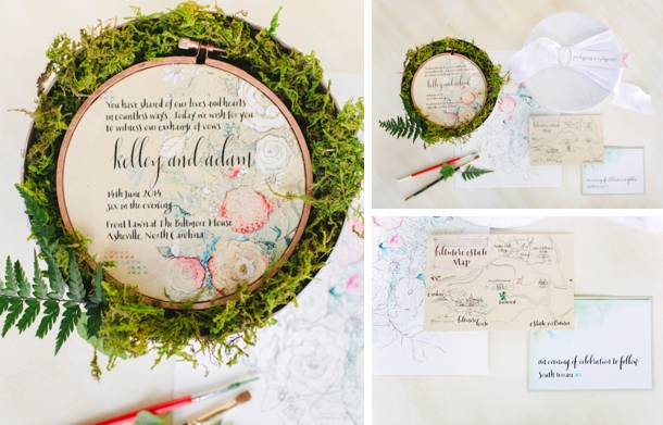
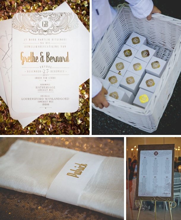
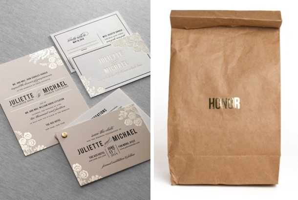
So as you all know, April is our month for intimate weddings, and one of the things we love about a small guest list is that you can allocate a bit more of your budget to extravagant details. Hands up, I’m a bit of a stationery fiend, and there’s also nothing I love more than sending and receiving little parcels, so when I see creative, elaborate invitations (especially those that require more than the usual envelope to send) I get really excited (yep, I’m dorky like that). The thing is, I know that those sorts of invitations don’t scale up well to 120 guests on a normal budget. So as I say, this is one of those details that’s absolutely perfect for a small, intimate, beautifully styled affair. Here are 10 of my all-time favourite wedding invitation packages, made by some of the most talented and creative designers in the industry!
Tag: stationery
Best of 2014: Stationery
Hello lovelies! We’re making another weekend house call to stop in and share some of the beautiful stationery that has graced the pages of SouthBound Bride this year. Being a paper aficionado (and designer) herself, Candice has been trawling through the archives to bring you fifteen stand-out stationery moments from both weddings and styled shoots, and featuring the work of some of our favourite SA talents, including Seven Swans, indieberries and Lezanne’s Designs (whose designs feature a fantastic three times in this countdown!). Over to you, Candice…
Glamorous Gold Art Deco
Spring Printable by Mocholoco
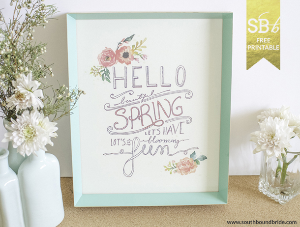
Happy Friday, lovelies! With the equinox coming up, we have such a lovely little spring printable for you today from the talented Vicky at Mocholoco. As well as being an awesome stationer, Vicky is also one of our real SouthBound Brides (her gorgeous DIY beach wedding was one of my favourites of 2013), and is also about to relaunch her website, so to celebrate, she created this gorgeous watercolour-style poster – the perfect addition to your desk (or desktop). I’m not sure if brides and grooms always realise the huge amount of thought and process and creativity and hard work that goes into producing bespoke stationery pieces, and I’m personally pretty fascinated by how it’s done. So instead of just presenting the finished product, I asked Vicky to give you all a little glimpse behind the scenes into her process. Blood, sweat and glitter! Thank you SO much, Vicky – be sure to click through to her site to see more of her lovely work.
20 Creative Save the Date Ideas
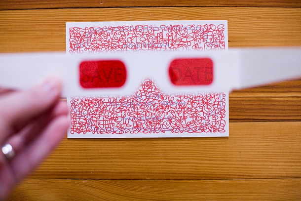
Hello lovelies! It’s FRIDAY! We love Fridays. Whatever you have planned, here’s hoping you have a fab weekend. And here’s wishing our American friends a happy July 4th! Today I’m rounding up 20 creative ideas for save the dates, to spark your imaginations for your very own STDs. (Yep, most awkward wedding abbreviation ever.) While many people often feel that an actual invitation should be relatively traditional, the Save the Date is a chance to go a bit off the map, play with your theme (or just your personalities) and surprise and delight your guests. Think 3D, texture and fun. Of course, we love electronic STDs too, but if you’d like to do something tactile, here are 20 of my all-time favourite ideas, each of them guaranteed to get your guests excited about the nuptials to come. Yay!
Fairytale Bride #2: The Stationery
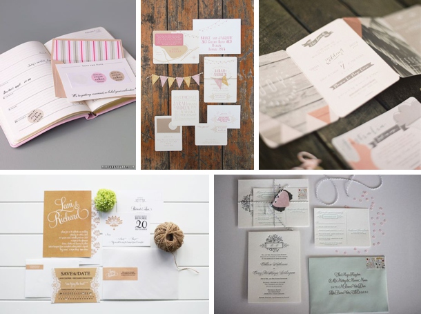
Oh stationery…it really is a beautiful thing. It has the ability to set the tone for the whole wedding journey. It is that first glimpse that guests get to see…that first little taste of the magic that awaits them; our enchanting golden ribbon that ties our wedding together from start to finish. Not only has it allowed us to introduce our look and feel, but also let our creative selves shine! We have had SO much fun dreaming up the designs and exchanging endless happy emails with Seven Swans to get our pretties looking absolutely stunning. Colours, types of paper, fonts…oh the joy! Here are some of the inspirations I started with…
Image sources (clockwise from top left): 1- via Martha Stewart; 2-Ruby & Willow via Magnolia Rouge; 3- Byron Loves Fawn/One Lantern via 100 Layer Cake; 4- Abigail Seymour Photography/The Aerialist Press via Wedding Chicks; 5- Starry Night Paperie
Our wedding logo
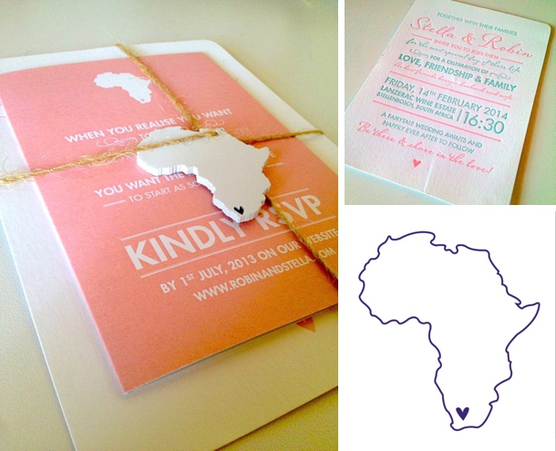
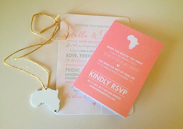
Apart from us having our dreamy, fairytale wedding style, we felt that there had to be a specific theme (or rather a logo) running throughout the wedding. Something that could act as our stamp from start to finish; Almost to give us an opportunity to brand our special day, but in a very personal and meaningful way. Cape Town has captured our hearts and we want to share this love with our family and friends. We soon realized that there is no better way to visually show this ‘love’ and represent our special day, than the stunning African continent with a heart over Cape Town. Even further fitting since 90% of our guests are traveling to Cape Town from other continents! And that is how ‘Robin and Stella’s wedding logo’ was born. Believe me, this won’t be the last time you come across this beauty. We have included it throughout the whole wedding through sweet little touches here, there and everywhere!
Our Save the Dates
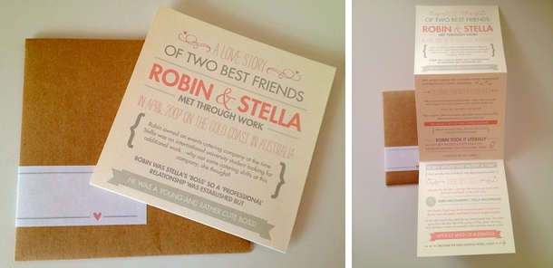
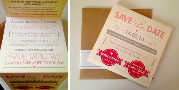
Who doesn’t like a bit of storytelling!? Because it gets engrained in our precious little heads from very early in life (especially the fairytales!), I’m sure we all have a love for it. That is one of the main reasons we decided to take the storytelling route for our first stationery item and transformed our love story into our Save The Dates. The second main reason for going this route is that our relationship has been nothing ‘normal’ since the beginning. We felt it necessary to capture, both verbally and visually, the journey we have been on so far. We couldn’t be happier with how our beautiful creations turned out. Notice the two stickers at the back…those are meant to be placed in our guests’ diaries/planners. Our guests absolutely loved them and they make us smile from ear to ear every time we look at them.
Our invitations
Think romantic, not too formal but very delicate in nature. A lot more elegant than our Save the Dates but both pieces of stationery tied together through our wedding colours – ivory, blush, mint green, grey and coral. A bit of twine to bring in the rustic feel and finished off with a little wooden African continent (with heart of course!). I am in love ☺ We also included a mini information pamphlet for our guests, which covers our 3-day wedding itinerary, a checklist for what our guests need to do, as well as some information on the wedding gifts. Practical, yet beautiful.
My top stationery tips:
- Find a stationer that you fall in love with by not only looking at their work but also by meeting them (virtually or in person). You want someone that will get excited with you in the planning and design process because they love what they do so much. We certainly did. Thank you Anelle and Ella from Seven Swans for your unrelenting happiness and positive attitude. It has been an absolute joy working with you!
- If planning a wedding where a lot of your guests are traveling from near or far to be there, create a wedding website! Don’t replace your paper stationery with a website but include the web address in your stationery. It will save you so much time as you can direct guests to the website for any questions and updates.
All other stationery above, Seven Swans. Images: Bride’s own
The series so far: The Proposal
DIY Wedding Postmark
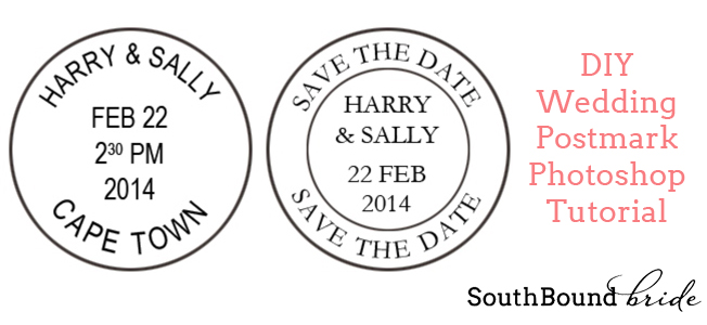
A few weeks ago, I highlighted some gorgeous travel-themed invitation suites, and today I thought I would follow that up with a little DIY that might help brides and grooms who want to create a similar look but maybe aren’t Photoshop whizzes. I feel you guys, because when I started this blog three years ago, sshhh! but I only knew how to use Paint. Seeryus. Those of you who have been with me for a while will know how tragic that first banner was. Anyway, the point is, sometimes we all need a bit of step-by-step guidance. One element I really liked in a number of the suites that were featured was the inclusion of customised postmarks, with the bride and groom’s names and wedding date and location. Whether you incorporate it into an invitation design, or have it turned into an actual rubber stamp (love that idea!) this Photoshop tutorial will show you how to create one these sweet little jetset wedding details for yourselves.Read More
Lasercut Wedding Invitations
Source: Love Me Do Photography/Where Do You Go To Design Co. via 100 Layer Cake
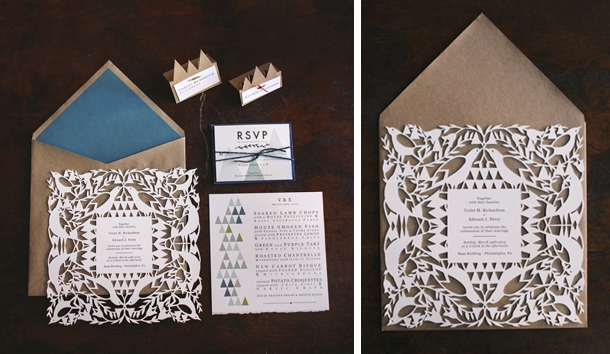
There’s a lot of gorgeous happening in wedding paper design right now – with letterpress on one hand and foiling on the other, and watercolour and calligraphy and hand drawn beauties in the middle, I don’t know which to call my favourites. But if there’s one trend that South African brides and grooms have been embracing for a while now, it’s lasercuts, and stationery is no exception. Just like letterpress and foil embossing, lasercut adds a really special texture to any paper product and its fine detailing allows not only for intricate detail but the use of unusual materials like wood or perspex as well as paper. The possibilities are vast, and I think we’ve only just begun to see the creative juices start to flow with this design form. Even so, there’s a lot of very beautiful invitations going around at the moment – here are ten of my personal faves to inspire you!Read More
Real Wedding at Tanglewood {Maria & Gerrit}
Serendipity. It’s the loveliest of words, isn’t it? Happy accidents. And with some couples, it really seems to fit, so it was no surprise to me that when I read Maria’s story of her beautiful wedding it was a word that she used herself. See, Gerrit and Maria have a serendipitous beginning – both religious, they decided to ready themselves for a lasting relationship with a marriage course at their church, and it was there that they found each other. They share a surname – another happy accident – and you can see from the love and happiness surrounding them on their wedding day that that’s just one of many things that they share. And goodness me, how much am I in love with Maria’s incredible grey silk dress and floor-length mantilla combo? Wow. Not to mention the really fresh styling of their decor, in bold green, navy and pink with an adorable cartoon stationery touch. My favourite part is the ficus trees they’ve used as centrepieces – such a unique touch, but one that is part of their story, as all the best wedding day details are. This is really a wedding to pore over and fall properly in love with, and that’s in no small part down to the stunning images from Cari Photography – love, love, love!Read More
Foil Favourites
Credits: Dauphine Press via Sweet Paper (left); source (right)
I honestly thought that all my stationery-loving heart had beat its fastest when I discovered letterpress, especially when we started seeing letterpress combined with hand drawn calligraphy fonts. Amazing. But the latest big trend in wedding invitations has taken it one step further. Foil, you guys. It is the gorgeous-est. And from a few beautiful collections last year to an absolute explosion of foil stamped goodness for 2013, this is one trend that is absolutely made for brides. It’s pretty, it’s tactile, it’s classic… and every time I see a new foiled invite I have the urge to run my fingers over it and go ‘ooh, shiny shiny!’. I’m a magpie, what can you do.Read More
Introducing Summer Rain {The SBB Collection by Invitation Gallery}
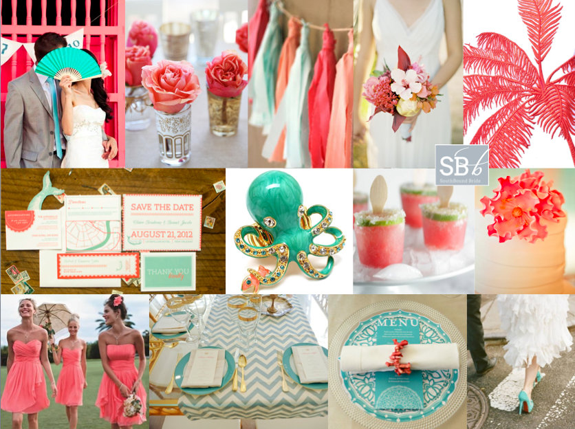
A few months ago, I asked you all to head over to the SBB Facebook page and vote for your favourite inspiration board of 2012. This was far and away the one you liked best!
Full inspiration board credits here
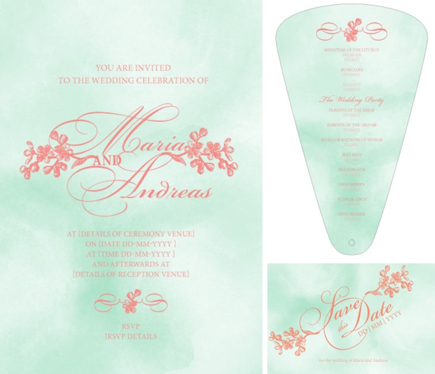
The bright, fresh combination of coral and mint really hit the right note, so in designing the latest invitation suite to join our SBB Collection from The Invitation Gallery, our designer focused on these lovely colours, marrying them with two trends that are very much of-the-moment! Watercolour has been a big design shift in the last year, and it’s all kinds of soft prettiness for a wedding day, so I absolutely love the watercolour background to these invites. Calligraphy fonts are another of my faves, and we have that too! Ladies and gents, allow me to present Summer Rain! (And just in case you can’t get enough of that gorgeous colour combo, I’ve put together a few lovely colourboards to inspire!)

