Before this Sunday comes to an end (although on this side of the equator with the sun still out, it feels like it might be endless), I wanted to share some recent press that SouthBound Bride has been delighted to have. I only do a select number of photoshoots every year, so I’m always really thrilled when they get featured in print and online, and especially so when they get picked up way beyond what we’d initially hoped!
WEDDING FLOWERS
First up is a gorgeous shoot I did with Anneli Marinovich late last year, which you’ll be seeing more of soon. It has been featured in the May/June issue of Wedding Flowers, which both Anneli and I are delighted by. There were SUCH gorgeous details on this shoot (even if we had to battle some wind to shoot them!) so if you’re in the UK make sure you pick up a copy while you still have a chance, as it’s almost time for the new issue.Read More
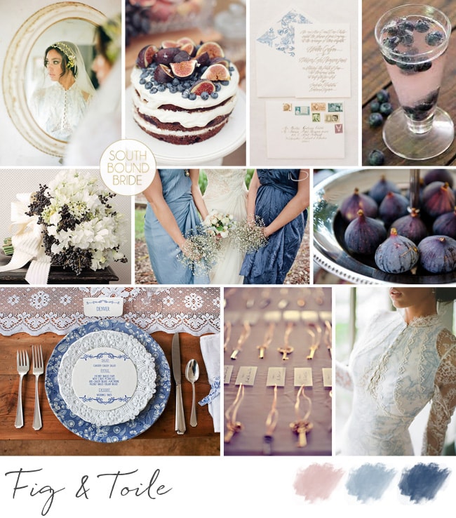
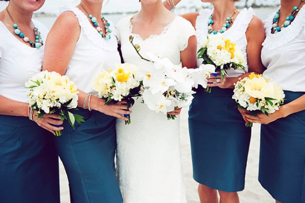
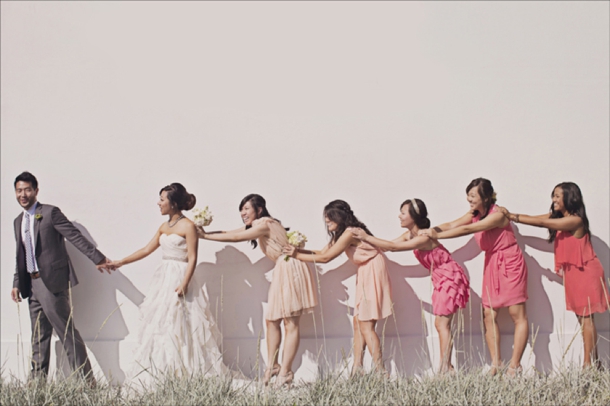
We’re heading towards the end of our series on the top bridesmaid looks for 2013, and I must say, I have loved pulling them together! I honestly don’t know how you all are choosing which one to go with, because I love them all. And today’s is no exception – as you may have figured out by now, I’m a huge fan of ombre, the French term for graduated colour – see more of this wedding look here. It also happens to work perfectly with the watercolour trend that’s making everything so pretty right now. There are lots of ways to bring ombre into your wedding, but one of my favourites is through bridesmaid dresses – it’s the perfect evolution of the mismatched look. But what IS the difference between ombre and mismatched bridesmaids? Well, the key is really in the colours, of course. With mismatched, you could pick a colour (green, for example) and let your girls buy whatever dresses they liked, as long as they’re blue. With ombre, you’ll need to be a bit more OCD about it, picking an exact shade along the same colour spectrum for each bridesmaid, starting at an intense colour and ending at a light one, spaced out according to the number of BMs you have. Sound complicated? Well, it can be – one way to make it a bit easier is to have dresses made (the same or in different styles) so you have a bit more control. Take paint samples with you when you go shopping for material or dresses – each will usually show you an ombre colour family, so they’re the perfect reference. But even if you go high street, it’s not as difficult as you might imagine, and to show you, I’ve put together three ombre looks from current high street finds. My favourite is the peach ombre look – it just works so perfectly!
What is it about proteas, you guys? Is it something innately South African in me, that falls in love with them every time I see them and even more so when I see and smell one up close, hold it in both hands, marvel at its size, sturdiness, delicacy? Maybe, but then the whole world is currently falling madly in love with our national flower. When I started in weddings, there were already lots of SA brides using them, and I used to get comments about how unique the bouquets I featured were, but now I see them in weddings from all over. I like to think that maybe, just maybe, myself and my fellow SA bloggers and photographers and brides may have a little something to do with spreading the word about this gorgeous flower, in all her many guises. You’re welcome, The World. Anyway, what’s got me musing on all this is today’s lovely wedding, which has pincushion proteas at its very heart. I love these spiky blooms – especially when paired with the kind of no nonsense prettiness of shiny tin vases, fynbos, and the rich green of a spring morning in the bushveld as they were in Luisa and Simon’s wedding. The look contrasts perfectly with the easy elegance of their Shepstone Gardens venue, reflecting the ‘opposites attract’ nature of our bride and groom’s relationship. Andrea Carlyle was there to take these gorgeous pictures.Read More
*UPDATED FOR 2021* So it’s come time to choose your wedding colours and you just can’t narrow it down. You want a big, bright, bold celebration that’s a riot of alllll the colours. Or maybe you’re a same sex couple and you want to infuse rainbow elements into your gay or lesbian wedding as a nod to the pride flag and that #lovealwayswins. Whatever the reason to choose a rainbow wedding, it’s a joyful choice. It really allows you to play with colour and produce something fun and relaxed. And there are so many ways to make rainbow wedding details work, whether you go all-out on a rainbow-themed wedding or just include one or two rainbow wedding ideas. For example, rainbow bridesmaids are a fun look that also allows you to dress your girls according to their style and colouring instead of having a one-shade-fits-all approach. Or you could have your girls in neutrals carrying a rainbow of bouquets or each wearing a different colour of shoes, etc. Get creative! When it comes to the tables, it’s also a good idea to keep the base relatively neutral so that the colours in the flowers really pop. You could have deconstructed arrangements in mismatched containers (stick to one colour per container – this works well in groupings of different heights or along a long table) or have your florist create an ombre runner. Colourful glassware or crockery are other ways to make a rainbow wedding table work. And let’s not forget the rainbow cake! If this is a look you love, read on for more rainbow wedding ideas and products to inspire.
*Links in bold denote affiliate links. The cost to you remains the same, but SBB may receive a commission for any sales made.
Hello lovelies – how has your Tuesday been going so far? Mine didn’t get off to an ideal start, but never mind that, because we have such a lovely styled shoot to brighten things up this afternoon. And I’m particularly excited about this one, in that it was created especially for us by an awesome team from the Nuptial Network, using some of the beautiful stationery from the SBB Collection at Invitation Gallery. I’ve loved seeing rainbow brights make their way into weddings in the last couple of years, and while this isn’t strictly a rainbow-themed affair, it’s colourful and rustic and a look that is really easy to recreate. I love it for a summer farm wedding, for example. The basic details are budget friendly – glass jars with different coloured flowers, fruit used for its natural hues (I really love how natural colour makes a table pop) and, of course, the stationery. This particular suite (Will We Have Rainbows by Mister and Missis) is one of my faves – it has such a fun, playful carnival vibe, and it also works perfectly with the neon trend that is going on at the moment (without looking like someone threw up 1992). I hope you’ll all be as inspired as I am by it – come back this evening and I’ll have a bit of a style guide for you if you want to recreate this yourself. But for now, let’s get colourful! Huge thanks to photographer Abigail K., co-ordinator Mosaic Wedding Company and the rest of the Nuptial Network team (full credits at the end).Read More
Hello lovelies, now for inspiration board number 2 today. This one’s a reader request – always fun to do, as you guys come up with such a unique set of ideas that reflect your personalities and relationships. This particular board was requested by Shimoné, who together with her husband-to-be really loves the sea. Even though they’re planning an elegant garden wedding, they wanted to bring this love into their wedding, so they chose a gorgeous ocean-inspired palette of powder blue, teal, gold and white. I also took this as a starting point for some of the design details, adding a gentle watercolour/ombre element to reflect the salt water, and with sea urchins as a sweet little motif. These are sold on Etsy with little succulents inside, which makes a very cute place setting/favour and is one you could make yourself. I also like the idea of spray painting these shells gold to sit at each place setting, with or without a plant inside. The rest of the scheme is simple and classic – white flowers, especially on the huppah (the wedding will have lots of traditional Jewish elements, and this is one of my favourites), soft flowy bridesmaid dresses with statement necklaces, vintage furniture in breakout areas and gold-flecked macaroons. Simple, classic, but very lovely. Hope you like your board Shimoné!
Hello lovelies, it’s time for our first inspiration board of the day. The last time I did a toile board was waaay back at the start of SBB, which I ended up turning into a gorgeous inspiration shoot (more on this soon). But now, with prints being all the rage in weddingland, toile has really come of age. And why not – it’s romantic, it’s vintage and it’s just the perfect shade of blue to set off warm pinks or peaches or corals. Too much can be… well, too much, so less is definitely more, but I couldn’t help including the gorgeously romantic toile detail dress from Claire Pettibone’s current collection. I’ve paired the toile here with fig – that rich dusky pink, and just a touch of brass. For a uniquely South African twist, I love Fabric du Sud from Carol Mills, which is all about toiles with a homegrown theme. Loving this! What do you think?
Colours: Dusky pink and blue, navy, brass and white
It’s Friday folks, and that means time for some pretty dresses! I am always saying that South Africans are secretly taking over the world, and it always makes me smile when I come across homegrown talent over here. That was the case when I found myself fawning over some beautiful gowns on my last visit to Blackburn Bridal in London, and was told that they were by South African (now London-based) designer, Clinton Lotter. So I thought that this was the perfect collection to bring to you today. It’s available exclusively at Blackburn, so UK based brides should head over there to try some of these delicious creations on.Read More
Evening, lovelies! Time for some more bridesmaid fashion inspiration, but today instead of looking at dresses, the trend we’re focusing on is bridesmaid skirts. I think this trend started with LDS weddings in the US, but I absolutely love how stylish and sophisticated the look is, and it’s actually really budget friendly. As with all the trends I’ve highlighted so far, there are lots of ways of working bridesmaid skirts and tops – identical skirts and tops, mismatched tops, mismatched skirts, casual tops, formal ones… you can pretty much customise it to whatever look you want. In fact, I think bridesmaid separates a particularly good option if you’re struggling to find dresses that fit with the style you envision – definitely consider the skirt option, whether simple or textured, short or long. I’ve actually worn this as a bridesmaid before (my friend Abbie was so ahead of her time!) and I have to say that it was comfortable, flattering and really pretty. So here are my favourites from t’internets. *Links in bold denote affiliate links. The cost to you remains the same, but SBB may receive a commission for any sales made.
Get ready for wedding gorgeousness you guys! I have been dying to share Lana and Albertus’ wedding for a while now, and you don’t have to look much further than the sparkly bridesmaid dresses to see why! But in fact, that’s just one (very) pretty detail in what is otherwise a light and bright, clean yellow wedding with sweet origami touches and a lovely summery feel. It all comes together so perfectly! Chevron is something we’ve been seeing a lot of, and I think the print is used so perfectly here – nice, subtle touches like the groomsmen’s ties, the ring pillow and the dance floor. The result is a look that’s very much of-the-moment, but to be honest, I don’t feel that you’ll look back on this and feel it’s very dated in years to come, as the basic blank canvas is very classic. And isn’t that what so many brides aim to achieve? Great job, guys! And speaking of great jobs, as always I am LOVING the pics from the awesome Moira West – she always captures the look of a wedding so beautifully.Read More