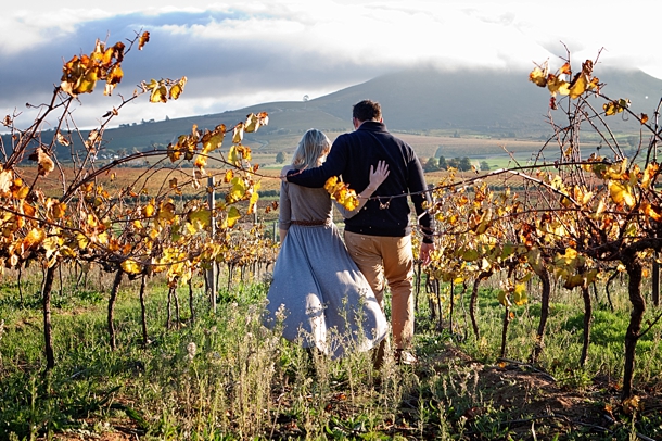
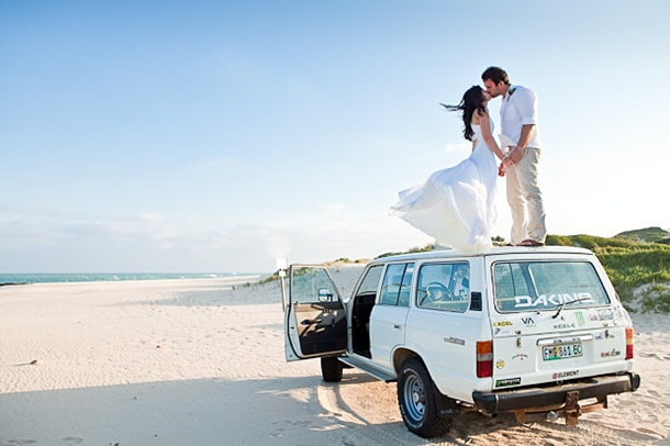
Almost thirteen years I’ve been living overseas now (how the hell did that happen?). People at home often ask if I get homesick, and the truth is, mostly I don’t. Not that I don’t love my home country or miss my family, but I think mostly if you just don’t indulge it, it goes away. Although someone should have told that to me three months ago when I was on a solo road trip through Limpopo and Enya’s Exile came on the car stereo (ugly cry deluxe), or about five minutes after I finished watching Invictus. Seeing today’s engagement shoot was another one of those moments. Not only are Kara and Lance a truly lovely couple, but they recreated their engagement on Lance’s family farm, Anura (where our Real Life Bride, Cheryl, was also married). It brought rushing back to me the absolutely breathtaking, awe-demanding beauty of the Cape winelands, and what it was like to wake up there every day for my four years at university. It sort of made me hurt a little, right in my heart, the way you do when you see your first love again. But in a good way, I think. It’s a tribute to Vibe Photography that the pics are not only a glowing keepsake of Kara and Lance’s pre-wedding happiness, but a celebration of the countryside they love so well. Perfection. Enjoy. Now, ahem, if you’ll excuse me, I’m off to play some Toto. (Oh, and speaking of Toto, how CUTE is their dog?)Read More
Author: gaby
Real Wedding at Merwida {Robyn & Warren}
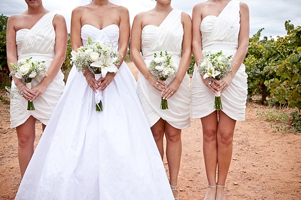
Well fiddle-dee-dee. Who needs Rhett Butler and a plantation house when you can have an elegant manor wedding right over in Rawsonville! Today’s lovely bride and groom chose Merwida as the spot for their reception, a country house based on the design of Tara from Gone with the Wind. They were married right at the top of the tree-lined driveway, followed by games and a classic white on white wedding reception with dancing under the stars. What I love best about this wedding is the way that it marries a chic, classic style with a little touch of carnival – isn’t it lovely? And it just shows that you can pick and choose the ideas and styles that you like best from contemporary weddings, and you don’t need to go the whole nine yards with a theme or concept like carnival to inject a little fun into your reception. The beautiful images are by SBB friend and sponsor Kathryn van Eck – I just love her clean, fresh style! Oh, and PS: when the groom surprised his bride with a guitar serenade? Totally my favourite. Bet there wasn’t a dry eye in the house!Read More
Reader Survey 2012
Good morning, friends! Can you believe it’s been four months since I relaunched SouthBound Bride? On the one hand, it seems like it’s been forever, and the old branding and website is a distant memory. On the other, these months have flown by! But now that we’ve all settled into our new home, looked around a bit, found our favourite spot on the furniture, I have a favour to ask of you, my lovely readers. If you could give five minutes of your time to answering this year’s reader survey before today’s inspiration board appears shortly, I would be hugely grateful. I promise there’s not too many questions, but it’ll give you a chance to give feedback on the site – on what works for you and what doesn’t, what you love and want more of, and what you think could be improved. Last year’s survey resulted in real developments – for example, lots of you said you wanted to see more real weddings, and South African weddings and suppliers outside of the Cape, and now that’s exactly what we do, with three real weddings a week from around the country. Or the fact that you asked for more on hen nights and bridal showers, and that’s been a growing area. So I really do take on board what you say, and I would love it if you would take part. This isn’t just for brides and grooms – wedding suppliers, there are a few questions in there specifically for you too!
I’m hoping you’ll do this just because you want to make the site the best it can be for you, but as an extra incentive, I’ll be giving away a little prize to one random person (you don’t have to leave your name and email address unless you want to enter the draw). The final contents will depend on what kind of reader wins it, but it will definitely include a copy of the fantastic Irrevent A-Z Wedding Guide: South Africa, which is a brilliant read no matter which side of the industry you’re on.
A huge, huge THANK YOU in advance… You can enter the survey by clicking on the image below or right here.
Inspiration Board: La Petit Lavande
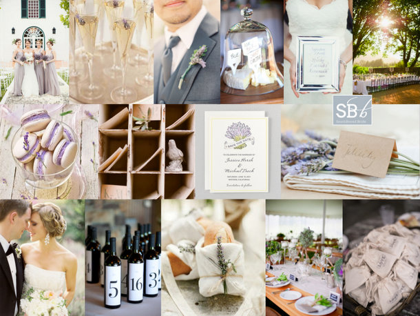
I’m very excited about today’s reader request inspiration board, since not only is it a pretty way to start off the week, but it was created for someone I know. Natalie is a university friend of mine – a fellow Minervianer – who got in touch last week to tell me about her wedding. She and her fiance are getting married in the late summer, and want a sophisticated, elegant wedding that still lends itself to being very relaxed and informal. I couldn’t have chosen a better venue for them than La Petite Dauphine near Franschhoek, or in fact, a better colour scheme to suit the venue than the one Natalie has picked: lavender, silver, and a fresh, silvery green. I could immediately picture it – the kind of romantically simple wedding that would be perfectly at home in Jose Villa‘s portfolio or on the pages of Style Me Pretty. We’re certainly looking at a French country influence, so lavender makes not just the perfect colour but a beautiful motif, and Natalie could choose to use it in her stationery as well as to add texture and whimsy (as well as fragrance) on the day. I’d have bridesmaids in lovely long dresses, and the groom with a lavender boutonniere and a stylish grey suit. Long tables, either indoor or out, would have white cotton linen, simple country-style arrangements and bread rolls wrapped in muslin and twine, with a little sprig of lavender tucked into them, at each place setting. All the best things about the French lifestyle would be represented: champagne, cheese, wine (these wine bottle table numbers are a classic, and so easy to DIY), macarons. Have guests write sweet notes to the couple and ‘post’ them in a set of little rustic ‘postboxes’, and at the end of the night take home a little bag of dried lavender to put amongst their clothes and remember the occasion whenever they smell that wonderful fragrance (Natalie could also scatter some along the aisle, as stepping on it would release the aroma). Mix together, add friends and family and some late summer sunshine, and then serve. Congrats again, honey – I can’t wait to follow along with your planning!
Colours: Lavender, silver & green
Top row (l-r): Bride & bridesmaids {P: Samm Blake}; lavender in champagne; lavender boutonniere {P: Jen Huang; D: Lee Vazquez Floral Design}; cheese under bell jar {P: Missy Cochran}; silver frame with cocktail name {P: Samm Blake}; outdoor tables at La Petite Dauphine {welovepictures}
Row 2: Macaroons; post boxes with bird {P: Elizabeth Messina}; lavender invitation suite {Hello Lucky!}; lavender sprigs {P: Kate Grewal}
Row 3: Bride & groom {P: Jose Villa}; wine bottles {P: Missy Cochran}; bread rolls with lavender {P: KT Merry; C: Sara Jean Events: D: Dreamy Whites}; table setting {P: Elisa B. Photography; C: Beehive Events}; ‘love’ bags {P: Harwell Photography; C: Ashley Baber Weddings; D: Gloriosa}
Inspiration Board: Pretty as a Peacock
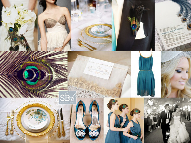
Afternoon, folks! We’re rounding off a pretty awesome week here on SBB with one more piece of pretty and awesome. I’ve been getting tons of requests for inspiration boards from all of you, so I’m working double time to try and create as many of them as I can. Reader Kristin has been waiting a little while for hers, but I hope it will be worth the wait! Kristin is getting married in a hall in summer, and she’s looking for turquoise accents to classic black and white, with peacock feathers and a general air of chic. Initially I was just going to send Kristin over to a board I created right at the very beginning of the blog (you can find it here), which was when the peacock trend was taking off. But then I thought about it, and I thought maybe we could bring the peacock theme a little more up to date. One option would be to go for a very art deco look – peacock was a key motif during the period after all – but instead I decided to add a bit of glitter to the teal, black and white palette – a look that’s very of the moment. The focus is less on actual peacock feathers – although they’re included in select spots: a boutonniere, with the bouquet, and on the bridesmaids’ headpieces – and more on beautiful peacock imagery. I am so in love with the place settings using peacock plates, gold cutlery and an ornate charger – if hiring this isn’t an option, consider a custom printed menu that fits inside a plain white plate, to give you a similar visual effect. I also adore the letterpress invitations pictured here – stationery is a great way to ‘brand’ your wedding in a sophisticated way. Add a bit of glittery texture – if not on the wedding dress (although I always seem to go back to this gorgeous wedding dress!) then maybe on one bridesmaid’s dress, and how cute is the little packet of sequin confetti? Teal/turquoise shoes and BM dresses are a must, but beyond that I’d stick to classic black and white. And there you have it. Hope you like your board, Kristin!
Colours: Turquoise, black, white & gold
Top row (l-r): Bouquet with peacock feathers {P: Jared Rey Photography; C: Gretchen Rose Events}; BHLDN wedding dress; peacock place setting {P: Ryan Ray Photography; D: Razzle Dazzle Event Decorating}; peacock boutonniere {P: Abbey Hepner Photography; C: GuGuLy Event Planning}; letterpress peacock feather invitation {Bespoke Letterpress}
Row 2: Feather with rings {Stacy Reeves}; sequin confetti {P: Greg Blomberg; D: Bows and Arrows}; teal bridesmaid dress; bride {P: Chrystal Cienfuegos Photography}
Row 3: Peacock plate place setting {P: Ryan Ray Photography; D: Razzle Dazzle Event Decorating}; teal shoes {P: Ryan Ray Photography; D: Razzle Dazzle Event Decorating}; teal bridesmaid dresses {P: Elaine Palladino Photography}; bride and groom with sparklers {P: Amy and Stuart}
Q&A with Essie Letterpress
Happy Friday, my lovelies! And time for me to introduce you to another fabulous South African service provider. Essie Letterpress is one of SBB’s sponsors, which I’m thrilled about because I love their work so much – not just the beautiful letterpress printing they offer, but the designs they produce as well. It makes me want to reach into my screen and stroke the invitations (is that a publishing thing? an obsession with paper?) just so I can feel those delicious indentations and smell the ink. My love affair with letterpress aside, Vanessa and Ben of Essie Letterpress are just the nicest people to work with, so I asked them to share some behind-the-scenes info and advice with my readers.
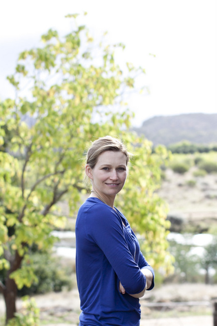 Hi Vanessa – thanks so much for taking the time to answer a few questions about your business! How did you get into letterpress?
I was living in San Francisco twelve years ago, whilst studying interior design, when I first came across letterpress, as one of my housemates was doing a part-time course. I immediately fell in love with it! I went on to work as an Interior Designer, but when I moved to a farm from Cape Town two and half years ago and wanted to do something creative, I instantly thought about starting a letterpress printing company. There was also a gap in the South African market for letterpress, so it seemed like the perfect venture.
As well as straightforward letterpress printing, what other services or products do you offer?
We offer a design service, and on the printing side we have just started doing hot foiling as well.
Engagement Shoot Allsorts
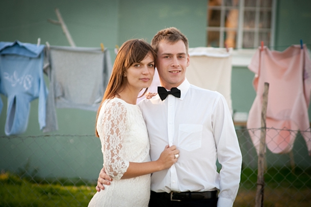
Styling an engagement shoot is never the easiest thing – how do you settle on the perfect look and location to sum up the two of you as a couple (and make you look hot)? After all, you might be a couple who like to glam it up on a Saturday night, but think there’s nothing better than wellies and a walk in the countryside on a Sunday. One way that many couples work around this is to rock two or three different outfits during an engagement shoot, and today’s is a perfect example of how to do that beautifully! Megan and Eugene were photographed by Inecke de Kock in three different outfits and locations, and each says something special about the couple. I love their save the date calendar idea, as well as how they had fun including some of the local kids in their more formal shots. So cute! Thanks for sharing, Inecke!Read More
Real Wedding at Val de Vie Estate {Lee & Garth}
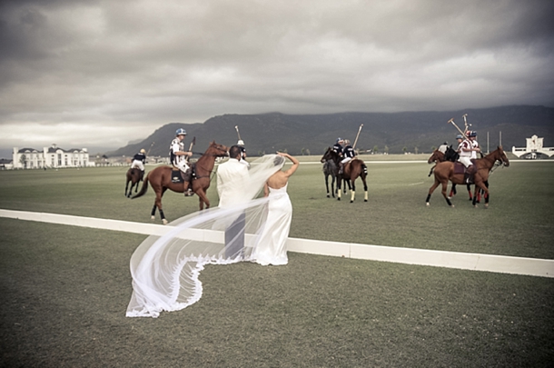
You know what one of my favourite things about being a South African in London is? It’s that when I say “ja”, people think I’m posh. Because actual posh people say ja here (or, actually, yah, but it sounds the same to a Londoner apparently). I mean, you can be from the back of beyond in SA, and you can make an impression in one of the most class-driven nations in the world. That’s hilarious. The reason I bring it up, though, is that today’s wedding takes place on a polo estate, so we are totes talking like Made in Chelsea, yah? OhEmGee, and wait till you see the gorgeous grounds of Val de Vie, which I have been dying to showcase since, like, forever. I love that they offer the unique twist of a polo display to a wedding. Definitely more Kate Middleton’s wardrobe (classy and fabulous) than Harry’s night in Vegas (awkward). And I think Kate would be proud of today’s bride, who’s as graceful and beautiful in her stunning dress and headpiece as any princess. She and husband Garth enjoyed the culmination to their own fairytale romance, and Warren Williams was there to take lovely pictures on the day.Read More
Pantone Spring 2013 Colour Report
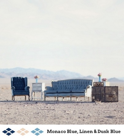
It’s my favourite time of year again – Pantone have just released their latest spring fashion palette, and man, is it a good one! I absolutely love every one of these pretty, preppy colours, from punchy Poppy Red or Lemon Zest to cool Monaco Blue (best name ever) and Linen, which pretty much go with everything. Greyed Jade and African Violet are lovely soft versions of purple and green, and Tender Shoots and Nectarine offer chilled out alternatives to chartreuse and coral. I also love emerald and dusky blue – lovely, cool colours you just want to dive on into. There are SO many combinations of these colours that would look amazing at a wedding, but I’ve put together a few mini palettes to get you started. Which is your favourite?
Real Wedding at Die Walskipper {Carmen & Evert}
Ah, Jefferys Bay. Home of the Supertubes. During my high school surf chick phase (and by that, I mean, wore Roxy t-shirts, not actually had the balls to surf) this is where you could find me during the Billabong, sitting on the beach trying to look cool and pretend I wasn’t eyeing up all the pretty surfer boys whose tans were better than mine was ever going to be. I loved JBay, so I’m stoked that today’s wedding at Die Walskipper gets to be from there. It perfectly reflects JBay’s laid back beachy style, and there’s such clever use of readily available materials. For example, brown paper printed up with ‘sand, see en liefde’ (sand, sea and love) used as a wall hanging and again as a table runner. Shell lanterns, string globes, a typography motif. Tin cups and twine-wrapped napkins. Tropical leaves instead of flowers (except for a beautiful protea bouquet). It’s coastal rustic at its finest, and perfectly reflects Carmen and Evert’s casual style. Pictures were taken by Monica Dart, and they’re absolutely mesmerising – I love how Moni combines her fine art eye with documenting genuine moments, and you just have to look at guests’ faces to see what a special day this was.Read More

