Hello friends! Isn’t this week just the best? So thrilling to see another South African gold in the pool last night, and an absolutely brilliant one at that. Go the Chad. Just one post today, as I’m heading off to Wimbledon to watch some Olympic tennis. So exciting! I don’t know exactly what we’ll get to see live, but I know Andy Murray’s playing in the afternoon, so I’m sure the atmosphere will be amazing! But right back in Weddingville, we’re getting excited about shoes. For a change. Okay, yes, we’re always excited about shoes here, but in this case it’s shoes that reflect the mismatched bridesmaid trend we’ve been seeing in the last couple of seasons. A couple of weeks ago we spoke about one type of lovely mismatched accessory (flowers) and today it’s all about letting your BMs’ feet do the talking. Get ready to say “shoe-wa-wa!” Read More
As a wedding blogger, it’s sometimes a bit of an odd experience going through someone else’s wedding pictures. The ones I tend to leave out (when I’ve been sent a full set) are the family shots, pictures of the guests, dancefloor pics. Those are personal pics, not really for a blog, but they do give me an amazing insight into a couple. And let me tell you, Nombuso and James have a lot of love around them, not to mention friends and family that really know how to party! There’s so much joy and good feeling and even pride on every guest’s face, that you just know what an awesome couple they are. Of course, that’s not the only reason I love this wedding at Beaumont Wines. I’m a big fan of the English country style they’ve employed in neutrals, with little pops of pastel and raspberry pink. I’m a big fan of their adorable cake, their old fashioned jars of sweets for favours, their hessian (burlap) bunting. The haybale seating at the ceremony (so cute!). The cool lanterns on their dancefloor (what a lovely alternative to the large round lanterns we usually see.) The bride’s shoes – how I do love those Westwoods! All in all, it’s a truly lovely wedding, perfectly captured by Glee Photography – enjoy!Read More
Hooray for Mondays, SouthBound Bride! And it’s no surprise I have the Olympics on my mind today. I was going to do a gold, silver and bronze board, but having just done mixed metallics last week, I thought I would focus on Olympian Blue, one of the beautiful colours from Pantone’s Fall 2012 lineup, mixed in with a bit of shiny gold, for obvious reasons. Hopefully there’ll be at least one gold to South Africa’s name by the time you read this! This blue is lovely and fresh, but it’s also quite intense, so I’ve added a light denimy blue in as well, and gone for a look that’s kind of a cross between urban and rustic, and just a bit Anthropologie. It works beautifully with the BHLDN dress top left, which I have been in love with for the last year. Another detail I absolutely adore is the calligraphed tiles for place cards (no surprise, an innovation from Martha Stewart). And for a final Olympic touch, there’s a pretty laurel-inspired gold headband. Hope you like it, and hope you’re all enjoying the games this week! (To find out more about the Pantone range and see some colour combos, check out this post.)
My goodness am I excited to share this little beauty with you! I spied with my little eye, something beginning with coral and aqua on the Wedding Concepts blog last year when this shoot, which was styled and co-ordinated by the WC team, was featured in Wedding Inspirations magazine. That single pincushion protea place setting really stuck in my mind, and I was so thrilled to get hold of a copy of the magazine and devour every gorgeous pic by one of my photography faves, Annemari Ruthven. So you can imagine I was even happier when the lovely Hannes of Wedding Concepts asked if I’d like to feature it right here on SBB. Um, yes please, Hannes! The thing with styled shoots (and it’s a reason some blogs don’t always feature them) is that it’s unlikely you can replicate the whole thing on the grand scale of a wedding, unless you’re getting set to be a Real Housewife of Constantia maybe. The art of it all is to be inspired, by the mood of the shoot perhaps, by the colours (although don’t forget you can translate a look you like to a whole new palette), or by a single detail or set of details. And that’s what’s so great about this one, because it is just teeming with original and inspiring ideas. First, the colour scheme – we’ve seen it before, and both coral and aqua are huge colours right now. But this shoot shows you how to be bold AND classy in the way that colour is used. Natural textures like the pincushions and coral itself, set against the clean lines of milk glass and graphic stationery are the way to go. The table base is neutral, but through ribbons, flowers and lovely homeware items, the palette comes through. And that’s not where it ends. I love unexpected touches: the bride’s boho styling, the macaroon lollipops, the Bloody Mary bar, or DIY details like the ribbon garland or the paint dipped glass vases. It’s awesome, and I hope you enjoy poring over it just as much as I have!Read More
You know, sometimes when you travel, it makes you appreciate all the wonders and beauties of the world, and how luck you are that you can plane, train or automobile your way around them. And sometimes, travel makes you appreciate what you have at home. It’s like that for me with the South African coast. Sure, I’ll never say no to a tropical island, and there’s something very appealing about bobbing around in the smooth Mediterranean. But you only have to sit on a pebbly beach in Brighton for five minutes to miss our soft, pale sand, and there’s nothing quite like the roar of our not just one, but two oceans. I think that’s one of the reasons why beach weddings are always highlights for me, especially when they manage to recreate some of that wild, natural beauty. That’s what today’s stunning wedding at Grootvlei does – the palette is like a stormy day at sea with light breaking through the clouds (which is appropriate, considering the proposal). Soft greys and whites, with flashes of natural green. Orchids and succulents (which I never would have expected to work together, but are so elegant). A driftwood altar. The pictures by Stephan Marais are so gorgeous, I just knew I had to share them with you! {Oh, and PS, I love Grootvlei’s mussel motif – such a cool texture for a beach venue.}Read More
You know, there’s a story behind why origami cranes are considered lucky for weddings. Supposedly, the qualities you need to fold 1,000 cranes (patience, good communication, perseverance, and so on) are the same ones that you’ll need to have a successful marriage. But the origami cranes in today’s wedding teach something different. These were folded by a friend of the bride, and this detail, as well as the many other handmade touches from friends and family, reminded the bride and groom of the support they have in their marriage. Isn’t that just so lovely? Of course, the loveliness doesn’t stop there. The first thing I fell in love with from Roslynde and Louis’ wedding (apart from her pretty name!) was the wooden proteas carried by her bridesmaids – aren’t they just the coolness? Followed very closely by her dove grey dress, with the prettiest lace detailing. Not to mention some brilliant rustic details – plantable bird thank-you cards, hanging succulents in little bottles, a feast of ribbons (I think I even spied some measuring tape on one of the succulent tins – another great DIY-able detail). Oh, what the heck, I love it all. Melanie Wessels (welcome Melanie!) did the photographic honours.Read More
Good afternoon, lovelies – hope today has been treating you well? I’m stoked to be bringing you another in our ‘Behind the Menu’ series, where we celebrate weddings where food is at the centre of proceedings. Being a bit of a foodie myself, I love looking at how a great menu is customised for each couple, although by the end of working with these pics I am dying to eat the food! Never more than today, in fact, because this lucky Dutch bride and groom had several incredible courses including a fresh crayfish entree. One of my all-time favourites! It really makes me miss home, and especially remember my last meal before going off to university, when we spent the day at Betty’s Bay with my cousins and feasted on crayfish they’d brought in fresh from the sea that morning. Wow. Food flashback! Anyway, I love that the executive chef at Stir Food, Gustaav Boshoff, included it here, alongside a menu that really shows off the best of South African cuisine. Oh, and PS, how much do I love the hanging floral decor? Just gorgeous. Perfect execution from The Aleit Group, as always!
Yay for summer, SouthBound Brides. It’s finally hit London, and I am loving it! Yesterday I spent a brilliant afternoon with the lovely ladies of The Pretty Blog over at Peggy Porschen, eating cake and drinking champagne, and was home in time for sundowners in the garden. Delightful! Today’s Bloemendal wedding has the same lazy, hazy, glorious feeling that a good summer afternoon always gives me – Kim du Toit’s pictures are so dreamy and yummy! I adore the romantic details done just right – the peachy neutral palette, the mismatched bridesmaids dresses, the outdoor photobooth, the papel picado gardlands, the ribbon backdrop, OMG. I’ve seen these in lots of inspiration shoots, but I love that this couple incorporated it into their décor. Having it over the door to the venue meant that it was a focal point both inside and out, and they placed the bridal table in front of it accordingly. Very clever! But it’s no surprise the bride has great taste, since she’s one of the team over at the fantastic Secret Diary Designs, one of my favourite SA wedding stationers. I know you ladies are going to lap this one up!Read More
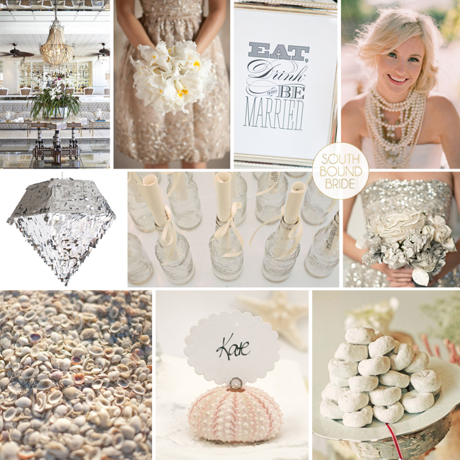
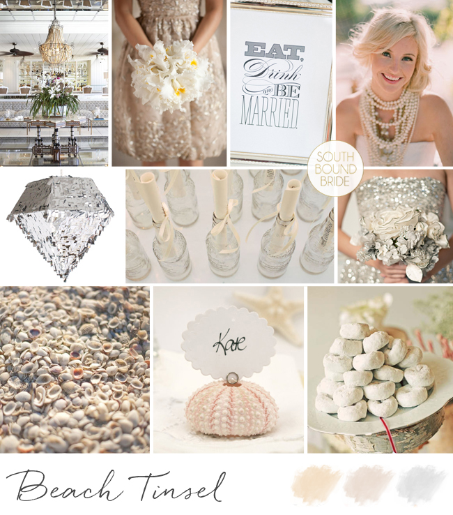
Woohoo, we’re getting our sparkle on today! Reader Tracey sent me a request for help with her summer wedding at the Oyster Box hotel – she and her fiance were leaning towards neutal colours but weren’t yet decided. They’re a young couple, so they also wanted to add a bit of fun to the event, and make their design simple and fresh. I love the Oyster Box as a venue (it’s actually one of my all-time faves) and I thought neutral colours were a great idea as not only will they work perfectly with the hotel’s interiors, they’ll also play up the colours of the beach. Flat neutrals, especially with natural and linen accents, can make for a gorgeous beach-style do. However, with Tracey’s request for fun, I immediately thought of the metallic and shimmer trends we’re seeing at the moment – there’s just something about a few sequins that puts everyone in a good mood. And it’s so easy to bring a bit of New Year’s Eve spirit into your design. Start with a basic palette of lots of clean white, with ivory and cream variations, and a bit of taupe, and then metallics like gold, silver and bronze. Add in fun sparkly accents – shiny bridesmaids dresses, metallic garlands and (my best) a blingy pinata! Pair this with beachy touches like shells and cute ‘message in a bottle’ escort cards. Finally, have fun with the food (this is an easy way to delight your guests, and makes the whole thing a fun experience) – you could have an unusual cake (like donuts) or serve mini ice-cream cones instead of dessert. Tracey can afford to be daring in her wedding attire – I just love the idea of a single (or multiple!) bold statement necklaces. What makes this look easy to pull off is that it’s essentially a classic white wedding with selected over-the-top moments, that add a real punch. And my, but isn’t it pretty? Hope you like your board Tracey – good luck with your planning!
I am thrilled about this post, you guys! Thrilled, with a capital TH. One of the sheer pleasures I have in working in this wedding industry, apart from connecting brides and vendors, and hearing and telling your stories, is to work with photographers who take my breath away. Many of them are in South Africa, but today I’m featuring the work of a Portuguese duo who have not only wowed me with their collective styling and photographic genius, but have become dear online friends as well (hopefully to be realised in real life too, one day!). Andre and Sofia from Branco Prata are just the king and queen of romantic, dreamy pics, and I can’t believe my luck that they’ve agreed to share some of that with you all today. You know, I love a shoot with props, but this little e-session shows that with the right photographer, even a simple stroll through a park can result in some of the most beautiful pictures I have ever seen. Seriously, I could have shared dozens with you – it was so hard to choose! But here are my favourites of the lovely Patricia and Andre, a doctor and nurse who were married in a beautiful wedding in Porto in June. Andre and Sofia – thank you so much for gracing these pages with your loveliness! It’s always such a pleasure working with you! (Psst! You can see more of this exquisite e-sesh right here.)Read More